Orange color in the interior: how does it affect a person and how best to use it?
Orange color is rightly considered one of the brightest, and such its expressiveness and catchyness frightened designers and ordinary people thinking about interior design for a long time. Now times have changed, and today you should not limit yourself when choosing a palette, and an unusual orange can be an excellent solution that will emphasize your individuality in the design of an apartment.
Influence on a person
In general terms, orange is a mixture of red and yellow. One of them assumes maximum activity and energy, provokes action, while the other is perceived as some kind of abstract warmth, positive. As a result, it turned out to be one of the most positive warm tones, which will definitely suit everyone who is inclined to sociable and emotional behavior and can create. In particular, orange is included in the list of favorite colors of the absolute majority of children.
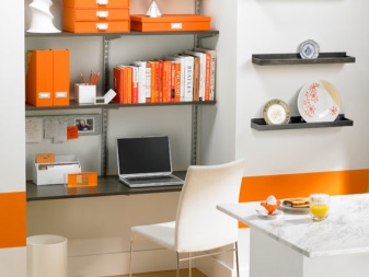
Orange has been shown to stimulate both the brain and the digestive system. In a metered amount, orange is able to cheer up great, but you need to make sure that there is not too much of it, because the psyche quickly gets tired from excessive brightness, and enthusiasm is replaced by apathy. Moreover, as point accents, such a shade is very necessary in the office or in the kitchen.
If there is something orange in the room, then, most likely, it will be the main accent on it - such an accessory cannot be overlooked. At the same time, the orange is so warm that it is not advised to use it in hot and stuffy rooms - it will only aggravate the sensations. In this case, dark shades of color should be chosen to visually reduce large rooms, and vice versa, in small rooms only light colors are appropriate.
Shades
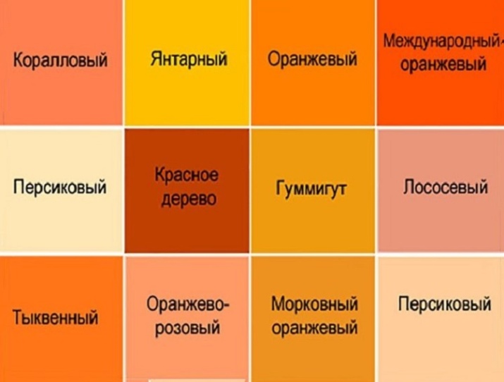
Orange is unusual in that among its many tones there is not one that is even remotely cold - the entire color scheme is kept strictly in a warm palette. This happened for a reason, because many delicious southern fruits that require heat and sun for ripening have orange shades named after them: these are apricots, and orange, and pumpkin, and peach. You can also add honey to all these delicacies.
At the same time, in a room, excessive brightness can inappropriately press, so relatively modest and muted tones such as terracotta, bronze, salmon or ocher are usually chosen for interior decoration.
True, if you use orange in a reasonable dosage, then you can focus on maximum expression - in this case, classic orange, coral or amber will come to the rescue.
Combinations with other colors
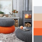
Orange goes well with most of the well-known colors, but it is usually not combined with other bright tones - for an interior it will be too powerful an emotional message. Perhaps the best suited to orange and its shades are pastels - the white and orange design looks quite calm, but at the same time, it cheers up a little. By the same analogy, a gray-orange combination looks good, as well as a combination of orange with beige.


For those for whom the above options do not provide a sufficient amount of colors, there is a combination of orange and yellow.
It's still the same very warm design, only with a reduced amount of aggression - like summer in childhood. Alternatively, you can combine warm colors with cold ones - for example, orange against a background of accentuated blue will remind of vacation and the sea, which is sometimes very appropriate in our climate.
As for the truly bright combinations, they are very much an amateur. For example, in nature, orange and light green are combined quite often, but contemplating their combination constantly, even while in a room, is difficult for perception. Remember that orange itself is an accent, so it needs a calm background rather than the company of another overly bright tone.
Application in various premises
Each room in an apartment probably has a special purpose and should create an appropriate mood, therefore it would be naive to assume that all housing is finished according to the general principle. This is the case with orange - somewhere it is more appropriate, and somewhere less. It is definitely not worth giving up on it, especially if you really want to, you just need to clearly understand where and how much it is needed so that it does not look out of place brightly.
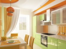
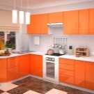
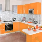
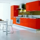
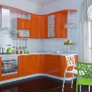
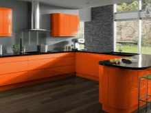
Kitchen
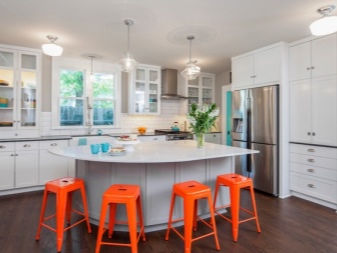
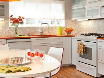
This room is considered to be one of the best for using orange in the interior, because there are few places less suitable for maximum rest and relaxation. At least here you just eat. A good appetite is stimulated by this color, and orange hues also increase sociability.
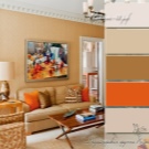
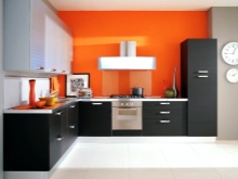
For the kitchen, orange and white would be a good combination.
At the same time, recently, orange often appears even on aprons - “delicious” prints with the image of fruits are becoming more and more popular. A similar theme is very common in the production of wallpaper, which can be used to paste over the wall at the dining table. Finally, today you can even buy an orange refrigerator, and in combination with other furniture of the same color, it will create a unique sense of the integrity of the design and the thoughtfulness of the interior.
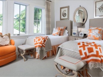
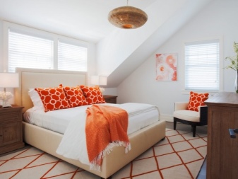
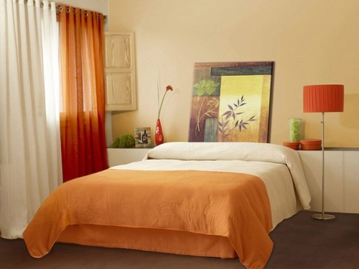
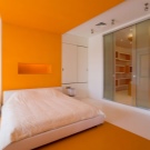
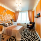
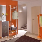
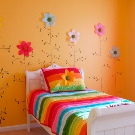
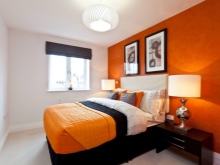
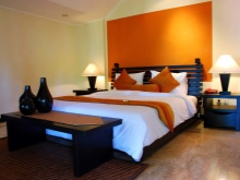
Bedroom
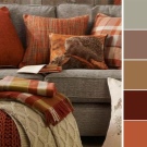
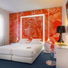
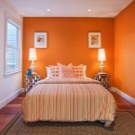
In the bedchamber, it is very important not to overdo it with brightness, because such colors usually stimulate activity, while in the bedroom everything should be conducive to relaxation, and not distract from it. For this reason, those shades in which aggression is not traced at all are most appropriate here - these are, first of all, salmon, apricot and peach.
The described color options look great if it is textiles, especially since there is always a lot of it in the bedroom. Here, the choice for such a shade remains either the bed itself, which can be covered with a bedspread of the appropriate tone, or curtains. At the same time, it cannot be said that truly bright orange options are completely forbidden, but if there are such accessories, then they should be relatively small accents, clearly visible, but generally not distracting from sleep.
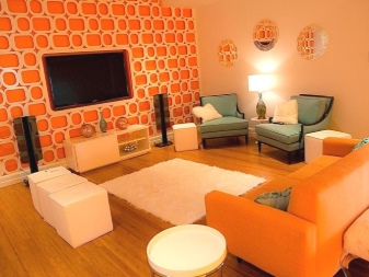
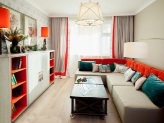
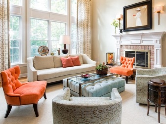
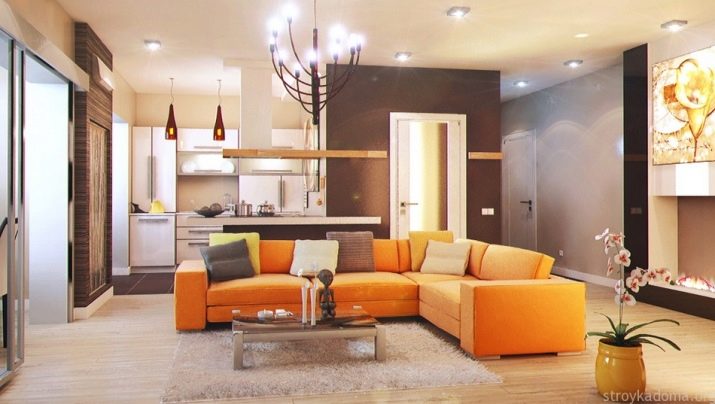
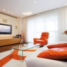
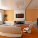
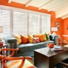
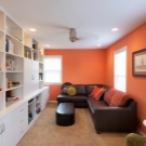
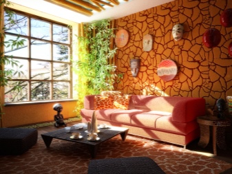
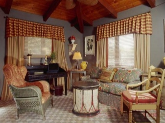
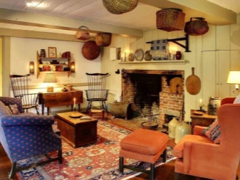
Living room
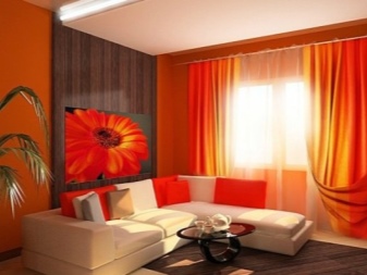
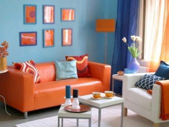
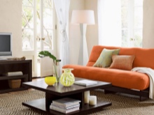
In the living room, orange tones are used as a bright accent, which is designed to activate interest in communication, because this is where you receive guests, and you also gather with your family here. On average, there can be quite a lot of orange here, but the whole room is not given to him - rather, it is a clearly visible bonus. As an example, a combination of an orange leather sofa is often cited, which stands exactly in front of a window, curtained with the same curtains.
If in the rest of the rooms you can still do interior design in strict accordance with popular styles, then the living room is the calling card of your entire apartment, therefore it is customary to maintain it in a certain direction.
If you think that there must be a place for orange in your living room, pay attention to ethnic styles, minimalism and country, while for the classics such bright shades are likely to be alien.
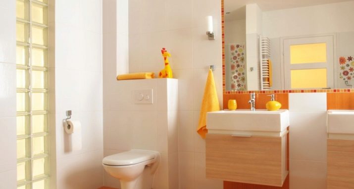
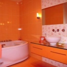
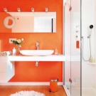
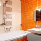
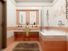
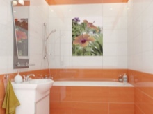
Bathroom
In this room, the degree of appropriateness of orange depends on how you perceive water procedures.If this is a great way for you to rest and relax after hard work, then the abundance of active orange will be out of place - it will again set you up for a fighting mood, therefore it should be used carefully and only in muted versions. The situation looks fundamentally the opposite, if you are used to cheer up with a refreshing shower in the morning - here the classic orange will greatly contribute to the achievement of the main goal.
An additional plus of orange in the bathroom interior is that all its shades are warm - undressing and diving into the water is still easier when there is no doubt about the warmth of the general atmosphere around.
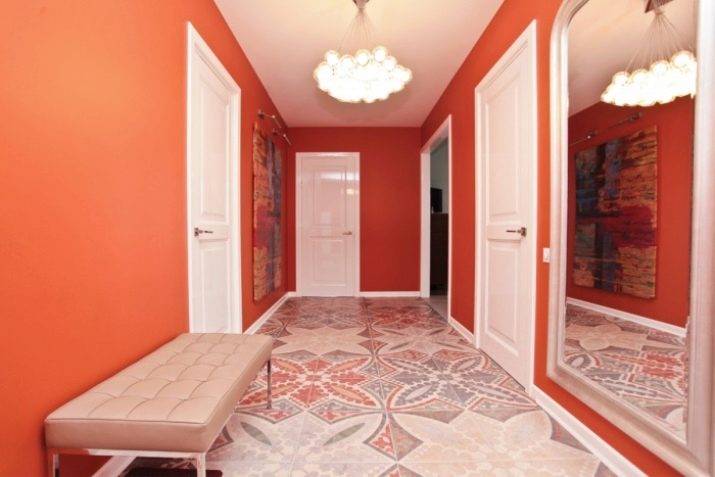
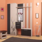
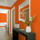
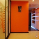
Hallway
In most apartments, this room is perceived purely as an auxiliary one, but it is here that orange shades can be very appropriate. For most people, returning home is a welcome event, but it is the entrance hall that meets the owner first, and it is on her shoulders to create the atmosphere of arrival. Since orange is one of the shades that tune in a positive way, its use here can once again remind you that since you are already at home, then everything will be fine.
At the same time, it is unacceptable that it is the entrance hall that leaves the most vivid impression in the entire apartment, because neither the owners nor guests should stay here for a long time.
For this reason, restrained shades are chosen - for example, something like ocher would be the best solution.

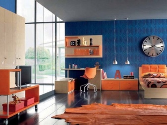
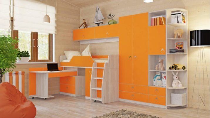
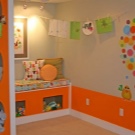
Children's room
We mentioned above that most children love orange, so its use in a nursery almost always seems appropriate. Even the floor or ceiling can be painted in this color, not to mention the walls, furniture or accessories. It should be remembered that in the first years of life, the baby does not need excessive brightness, otherwise you simply cannot put him to sleep, and somewhere from adolescence, children usually refuse to perceive excessive brightness as a sign of "childhood."
Thus, it is possible to focus on bright orange in the interior in a child's room from about 3 to 12 years old, but here, too, certain features must be taken into account. For example, emphasized brightness will help shake a too calm baby who does not show proper interest in the world around him, but some children are already too active, and for them such stimulation will definitely be superfluous. At the same time, it is important to make it clear to the child that different places and different times are allocated for study and recreation, therefore it is advisable to focus on orange only in the play area of the nursery.
What interior style is it suitable for?
Orange has not been widely used in professional design for a long time, since it does not fit into most classic styles, unless we are talking about some tones close to woody. Classics have a craving for everything strict, even typically bright colors there usually seem less expressive.
Ethnicity, for example, is another matter. Folk styles of different countries are accustomed to the use of any available means and materials, besides, the result could be visually too boring, therefore it was often the color in bright colors that made it possible to avoid inappropriate grayness in everything.
A similar logic is exploited by modern minimalism - the rejection of "unnecessary" details in the form of the same texture sometimes provokes melancholy, since the eye has nothing to catch on, so that a bright accent becomes the highlight of the interior.
For country music, orange shades are in general almost key, without them it will simply not be possible to withstand a room in the appropriate style.
Unusual examples
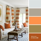
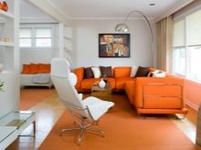
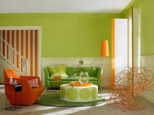
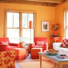
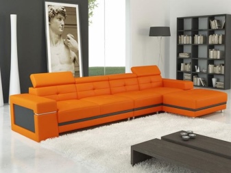
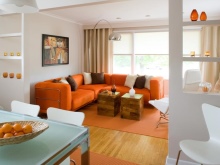
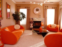
The first example shows how sunny and cheerful a living room can be if you use a classic white and orange combination in it. In combination with bright natural lighting, accents on orange sofas simply will not allow household members to be sad - the interior itself helps to raise the mood.
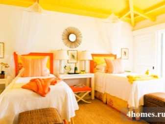
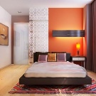
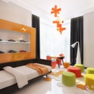
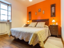
If you want a drop of warmth and summer to penetrate into the bedroom, you can add orange there, too, but carefully. In this case, the main emphasis is placed on the wall at the head - before going to bed it is not really visible, but in general, it “insulates” the room. In addition, this design echoes with pillows and textiles, creating a holistic look.
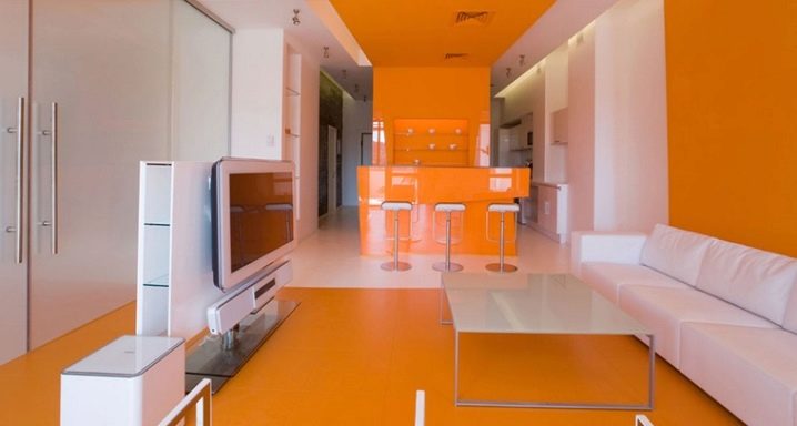
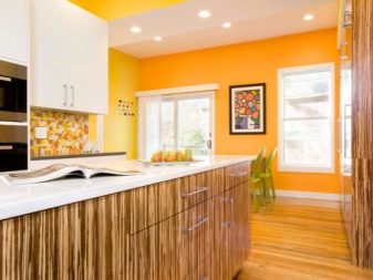
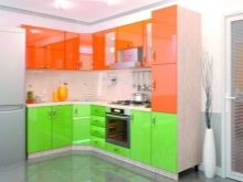
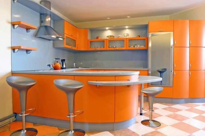
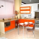
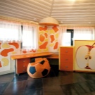
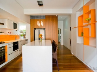
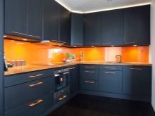
Using the kitchen as an example, we see an example of true originality. The designer was not afraid to turn to a rather daring combination of orange and black, but the abundance of natural light should dispel the slightly gloomy impression of such a choice. As we can see, all the side parts of the furniture were left orange, including the bar counter, which once again emphasizes the uniqueness of the customer's taste.
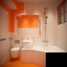
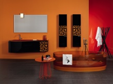
In the bathroom, nothing will interfere with sophisticated relaxation if the orange is selected in soft colors. For example, this deep honey-colored transparent bath is associated with warmth, but does not stimulate activity, but allows you to relax.


The comment was sent successfully.