Beige color in the interior
When it comes to interior design, the importance of color should not be underestimated. The beige tone was undeservedly pushed aside by "more attractive" colors. It's time to turn to him again and reveal all the main possibilities of such a tone.
Peculiarities
The color beige has an important psychological specificity. It expresses the reliability of people, their desire for stability. Beige interiors are mainly used by practical individuals who try not to get involved in other people's conflicts. Basically, such people tend to save money. As for the meanings in the interior, everything is simple, beige:
- helps to calm down;
- increases self-confidence;
- makes the environment fresh.


This tonality is recommended for:
- kitchens;
- corridor;
- bathroom.


Shades
The general characterization of beige would be incomplete without the indication that it has many varieties and shades. For a practical composition, shades are best suited:
- milk (adds splendor);
- cappuccino (softens the interior);
- chocolate (makes the atmosphere richer and more solid);
- caramel (pleasing to the eye);
- sandy (always looks calm and balances color experiments).


What colors does it match?
It is generally accepted that the beige palette belongs to the natural group of tones. As a result, it combines very well with natural colors. White is pretty good for beige. But one must understand that such a combination is not always good.
Inappropriate use of it threatens the appearance of a boring, monotonous interior.
When combining white and beige paints, apply no more than 2 beige shades in one room. Violation of this rule threatens that the atmosphere will become oversaturated with inharmonious colors. It is recommended to introduce additional juicy, bright accents. In a white-beige combination, it is advisable to use various textures. But people are justifiably interested in the combination with other tones in the interior.
Gray and black colors in combination with beige are useful for a calm, balanced person. This setting is perfect for a cozy and happy stay. The beige and gray furnishings promote relaxation of the nervous system and help to distribute accents.
Experts note that this shade is recommended for the Scandinavian style.
The beige and brown singing is perfect for living rooms and kitchens. But the combination of such paints will also be harmonious in sleeping rooms. The chocolate beige decor looks best in daylight. Brown (or chocolate) is good to do:
- textile products;
- furniture;
- other decorative items and structures.

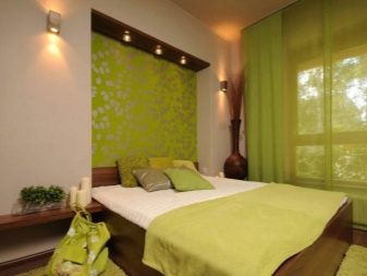
The green color will make the interior more natural, the combination of shades looks as comfortable as possible for the eye. You can use all shades of green: rich grassy, emerald green, dark green. The last combination is recommended for use in an oriental interior. The best places are: the nursery, the kitchen area, or the sleeping room.
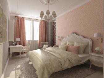
A beige color diluted with a pink tint will add sensuality. For obvious reasons, this combination is used more often when decorating rooms for women and girls. Stylistically, the pink-beige color is compatible with a variety of design trends. But it follows from the compatibility table that blue is much better in some cases. Its combination with brown has already become a kind of classics in interior design.
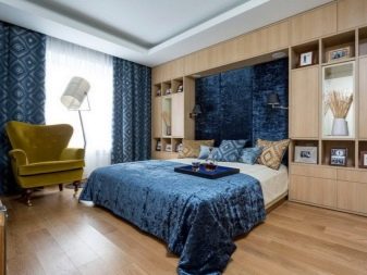
Important! The correct combination implies assigning the role of the background to the beige paint. At the same time, blue tones become a rich accent that only emphasizes the dignity of the design.
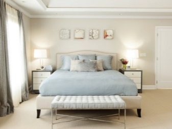
Beige and blue space:
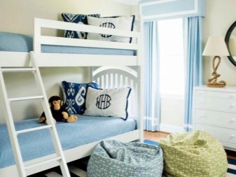
- perfect for bedrooms and children's rooms;
- looks wider than it really is;
- helps to overcome the lack of lighting;
- looks airier than simple beige furnishings.
Beige paint can be combined with yellow, forming a rich combination. Sunny yellows are especially good. They make rooms more elegant and at the same time visually lighter. As for the purple color, it is quite complex.
It must be used with caution, since this decision causes mixed opinions among different people.
Therefore, one should always be interested in the opinion of all household members before mixing beige and purple colors. But the blue color is pretty bad. Excessive enthusiasm for them can give a beige room an outwardly untidy character. Dirty gray and green colors should be treated the same way. The beige and blue combination requires good lighting to reveal its design potential.
The lilac color also deserves attention. It should be either bright or present in a large space. Otherwise, the beige components are lost and may look lackluster. If you choose the best option with a green tone, the main attention should be paid to olive and salad paints. For a visual refresh of the beige paint, a cool sky blue color is recommended.
The gray-beige setting has even received a special design name - gray. To avoid excessive boredom and neutrality, small bright accents are laid. The pink and beige mixture makes the room look nicer, fresher. However, you absolutely shouldn't add too much pink paint. Dynamic interiors require a rich pink, but in the bedroom or in the guest room, quieter shades are needed.
Color rules
Walls can be decorated with beige. For this, both wallpaper and paints and varnishes are used. The calm appearance of such an interior does not prevent it from demonstrating sophisticated and refined notes. The decor looks more expensive than it actually is.
Moreover, the beige wall is able to harmoniously enter any stylistic direction.
To further improve the atmosphere, you can add bright accents to the same walls, use textures... There are a lot of opportunities to embody original creative ideas. Curtains can also be beige. Matching tulle or curtain colors are casual and elegant at the same time. The room as a whole will look nobler, more solemn. It has long been proven that beige curtains:
- give the transmitted light softness and warmth;
- keep its saturation;
- add coziness;
- allow you to slightly muffle a too variegated palette;
- do not take away visually space;
- psychologically make life easier in frosty weather;
- can be done in a wide variety of styles.
Such curtains and drapes should have an emphatically elite texture. This is a great way to show off a chic touch in the interior. But if such a goal is set, a very high-quality matter is also needed. As for beige furniture, it will fit in any room. This color is recommended for kitchens and bathrooms.
Beige sofas, wardrobes or bedside tables are versatile and will harmoniously fit into any design concept. You can choose “tasty”, visually pleasing shades. Among them are caramel, brownish, creamy and creamy tones. This kind of furniture makes the room feel warmer. Even an ordinary bed will look nicer.

There are a few simple rules that should be taken into account in addition.So, usually beige is used as a background, and bright colors are used as expressive decor. Another solution involves brightly colored walls, dark flooring and light-colored furniture. Last but not least, you should think about combining light and dark varieties of beige.
You can show originality by using it together with terracotta color. The beige color can reveal its "abilities" in the most unexpected places - the main thing is to apply it thoughtfully. A striking example is beige panels, stairs, tapestries.
Such elements will look weightless. They will definitely add elegance.
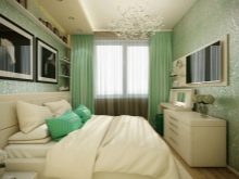
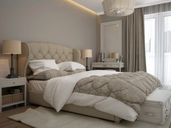
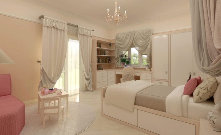
In the bedroom
For greater calmness and harmony, it is recommended to combine beige with dark colors. To create a rich accent, bedspreads, pillows and other accessories are used. ...
Errors can be eliminated if you think over the optimal use of shades and halftones, as well as the combination of textures. Woolen and fur accessories will add extra softness to the room.
As for the style, beige is mainly associated with classic subjects... Usually, where it is used, there are a lot of textiles and accessories. Beige is very good in any historical style - even in the antique, even in the medieval or modernist key. The natural origin of the tone makes it compatible with ecological and Scandinavian styles. Beige is also suitable for rooms in the spirit of minimalism.


In the living room
In such a room, the role of beige is to stimulate calm conversations. You can complement it with almost any part of the color scheme. Keys are considered the best options:
- green;
- purple;
- turquoise;
- classic pink.
If the living room is small, you can use white and sand tones. This solution will add both space and visual comfort. Beige colors are suitable for the Russian rustic style or for the Provence style. It is quite allowed to dilute the once chosen tones with other inclusions. To do this, both add additional decor and repaint the walls (depending on what the owners see fit).

To eliminate mistakes in the selection of colors, you need to consult with professionals in advance. The walls are mainly finished with 1-2 tones of beige. Cream and orange inclusions help to make the room more dynamic. You can add severity due to blueberry or burgundy tones, and fans of experiments can also try turquoise paint.


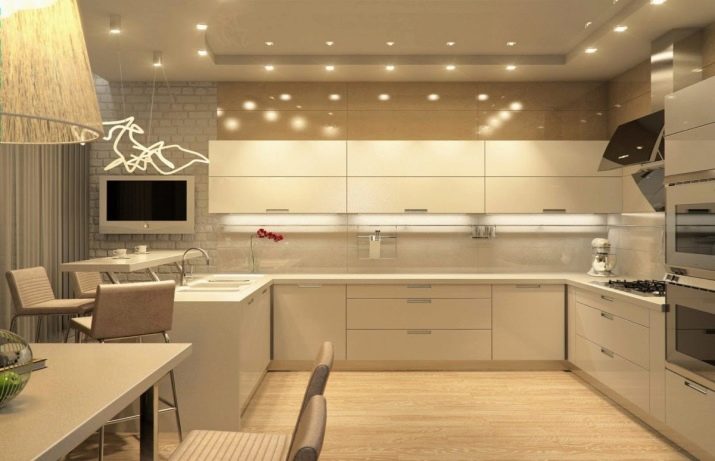
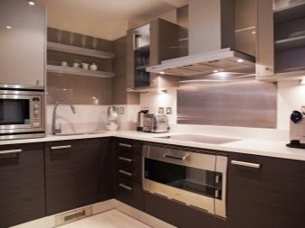
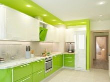
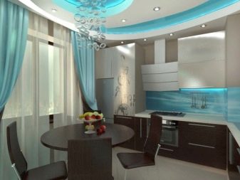
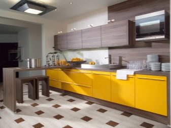
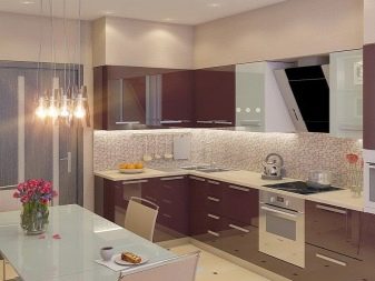
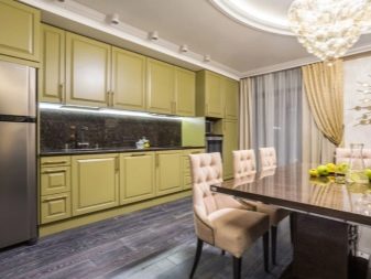
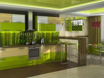
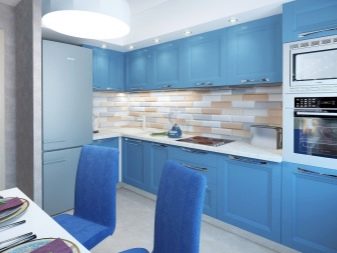
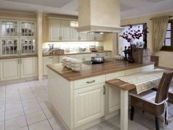
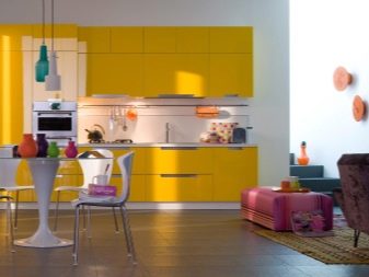
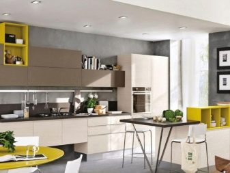
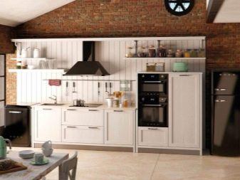
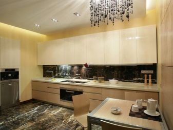
On the kitchen
In a lit kitchen room, beige walls can be used in combination with a blue or light blue refrigerator. Beige is also combined with yellow, orange or green paints. If the room is not oversaturated with light, preference should be given to the warm part of the range. The color of the ceiling is not too important.


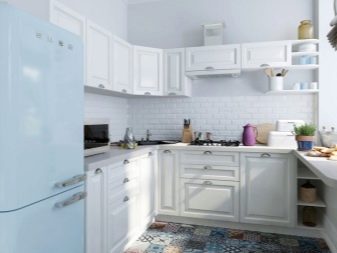
Most often, they choose the classic white options.
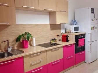
Running in the kitchen has reached its peak in modern times. People value cleanliness, style and soulfulness. In combination with black and white paints, a space is obtained that does not need to be cleaned daily. Design connoisseurs believe that a black refrigerator and stove look very original. This color is also suitable for work planes. The inclusion of red elements immediately heightens the degree of extravagance. As separate decorative inclusions, you can use the following colors in the kitchen:
- light brown;
- yellow;
- green.
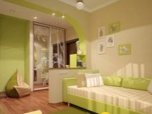
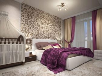
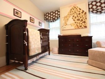
In the nursery
There is often a myth that beige is not suitable for children's rooms. In this case, they usually refer to the soiledness of such solutions. Psychologically, however, they fit perfectly. The appropriate tone is appropriate for both boys and girls. The main thing is that suitable color combinations are selected.
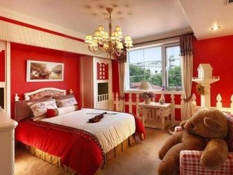
It is easy to guess who suits pinkish, scarlet and red tones, and who suits emerald and chocolate colors. Brightly colored accents in individual elements of the room are quite appropriate. Such solutions will appeal to both children and parents.It is necessary that the choice of a specific option be agreed with the whole family. Otherwise, conflicts and misunderstandings are inevitable.
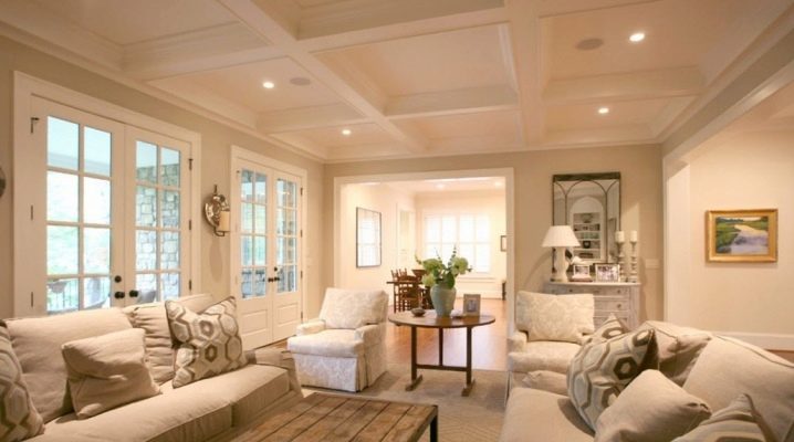
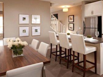
Beautiful examples
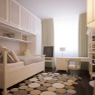
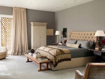
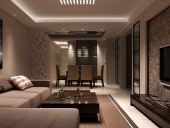
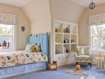
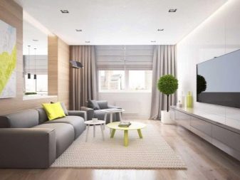
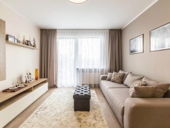
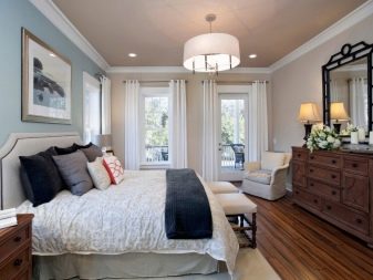
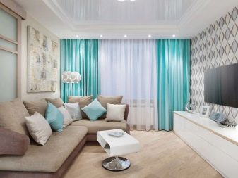
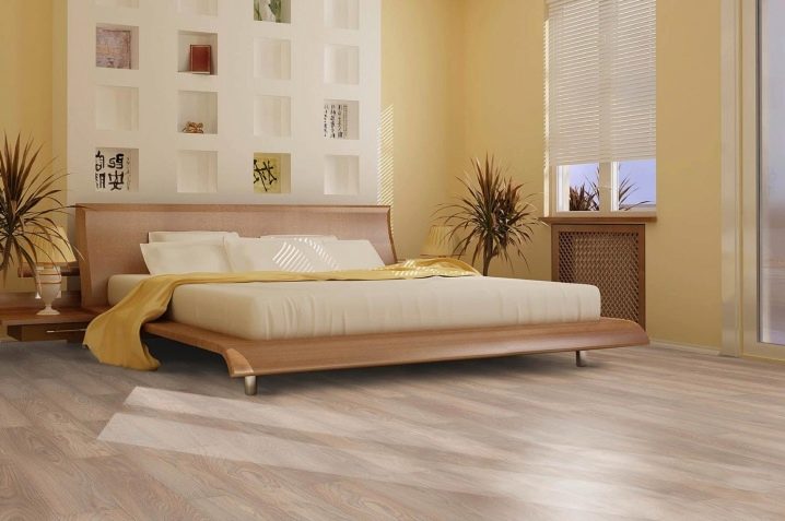
The photo shows what a beige room might look like. The main color was applied to the walls and used in individual decorative elements. A white wall with many niches looks beautiful. Potted plants are used to further decorate the space. A light-colored laminate on the floor completes the composition.
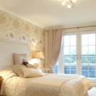
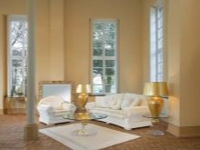
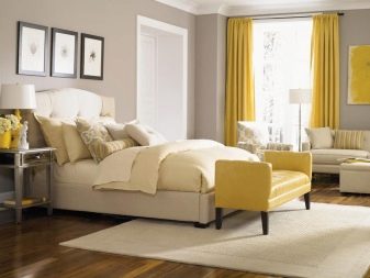
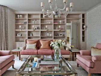
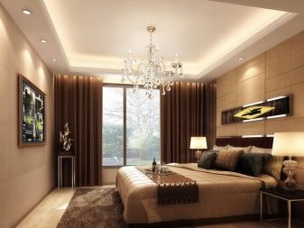
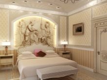
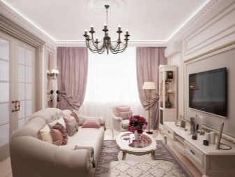
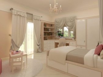
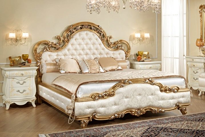
And here you can see a more solemn interior. The gilding and play of light in white surfaces are deliberately made as a leitmotif. A beautiful carpet was purposefully used. Apparently, the decoration is done in the Art Nouveau style. Curved furniture also looks elegant.
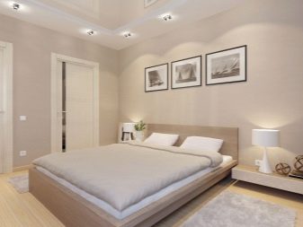
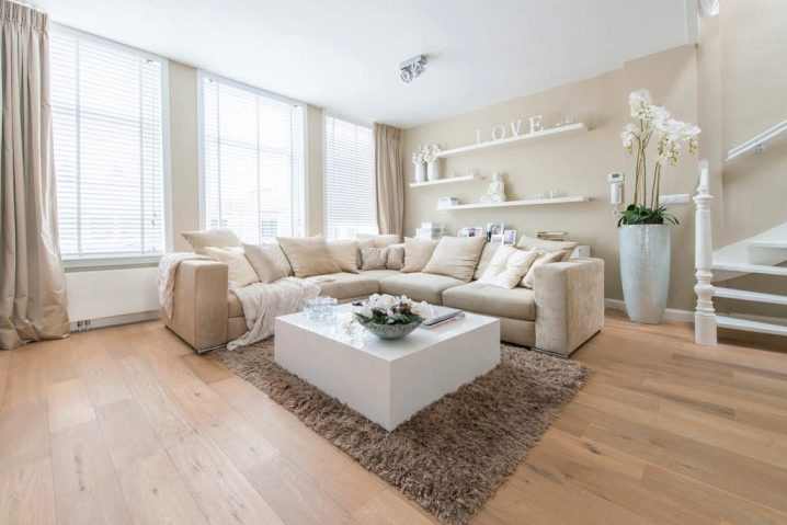
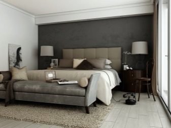
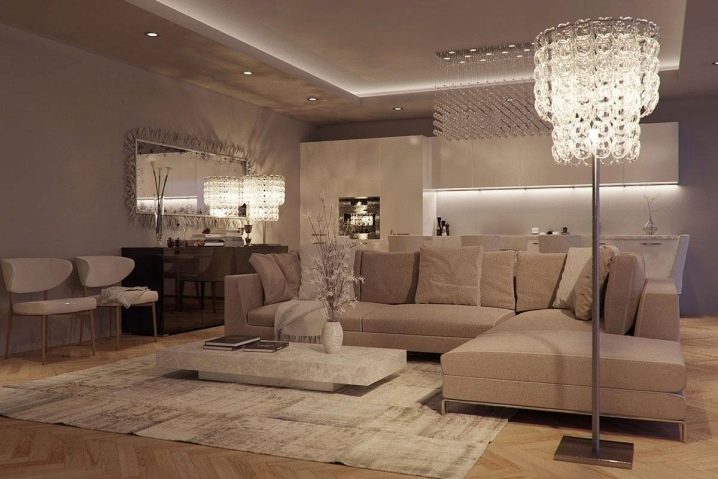
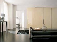
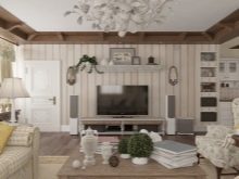
If you have any doubts that a pure beige composition will look beautiful, you should look at this photo. To improve the appearance of the space, a number of textures and convex elements on the wall are used. Even a beige lampshade on a matte white lamp looks good. However, this decision was clearly achieved with the help of professional designers.

Decorating the interior yourself, you need to make a composition more varied in color.
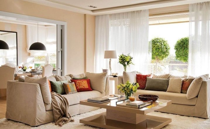
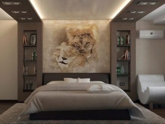
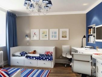
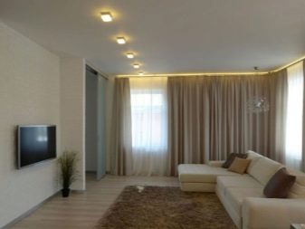
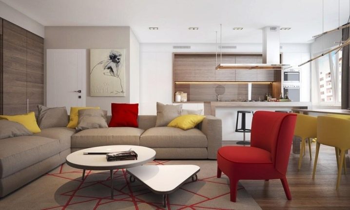
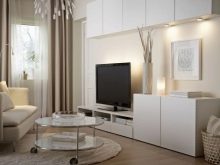
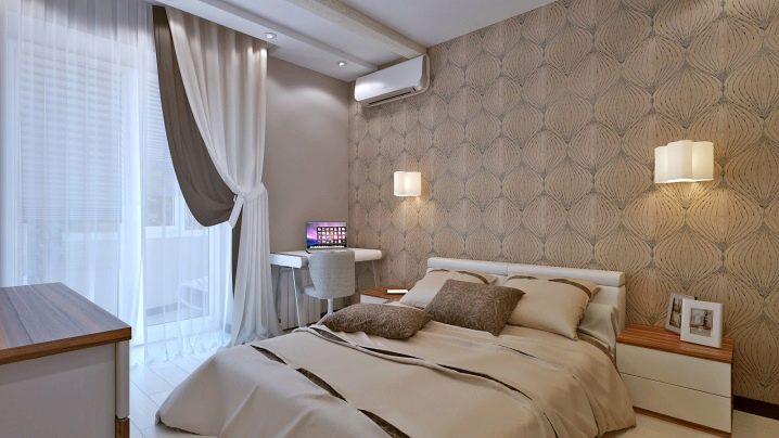
Do not think that beige can only be used in traditional interiors. In this room, lamps of a rather modern look are used and even a laptop is placed as an accent. Both dark and light tones are harmoniously used.
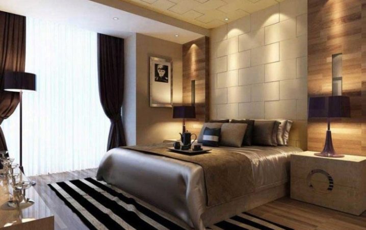
And here it is easy to see how to use beige in a room decorated by changing light and shade. Skillfully chosen color schemes are one of the reasons why things don't look too dark.
For an overview of the gray-beige kitchen, see the video below.
For the design features of the beige living room, see below.


Thank you for the useful and interesting article! Color can evoke a pleasant or negative message, but attitudes towards color can change over time.
The comment was sent successfully.