Pink color in the interior and its combinations
Pink is a multifaceted color, presented in a huge variety of shades. Most of these colors are in demand for interior decoration of various premises. Almost everyone can find for themselves the most attractive shade of this warm color, but not everyone knows how to correctly and most profitably use this tone in the interior design of their apartments. In order for the result to be truly pleasant, it is necessary to familiarize yourself in advance with the features of the color, the interior styles most preferable for it, as well as the options for use in various rooms. All of the above nuances will be discussed in detail in this article.
Basic rules of application
So that such an expressive color does not look intrusive in a room setting and does not get bored a month after the repair, it is necessary to take into account a number of rules, according to which pink shades are used in the interior.
- Most shades of pink should not be placed in large quantities in the room, especially for bright fuchsia or yoghurt pink. Even if you think that the last tone is able to bring tenderness to the interior, in large quantities it will not add such a pleasant effect.
Therefore, it is best to use it in a small area or to decorate them with decorative elements.
- To prevent the interior from acquiring a monotonous look, it is necessary to skillfully combine the selected warm shade with neutral or other tones that are in harmony with pink.
- You also need to be careful with contrasts. Mixing warm pinks with opposing cool shades can create an overly intrusive and heavy contrast, especially if the color mixing occurs on a large surface. It is better to use pink as one option, presented in a light tone, as well as contrasting ones - dark or saturated, like fuchsia. The latter can be used in accessories and small parts.
- Think carefully about lighting. There are tones of pink that are more profitable to illuminate with warm light, while others look better in a cold spectrum. If you do not take into account this nuance, the planned color will not look the way you originally planned.
- Consider the factor that light pink or powdery shades visually expand the space, and pieces of furniture with a similar color will seem more dimensional.
- It should also be borne in mind that such warm shades may not be implemented in all styles. Before including pink in the chosen concept, analyze all its features and the acceptability of similar tones in it.
Variety of shades
Each shade of the rich pink palette has its own characteristic. To know what is the difference the most popular tones, you need to familiarize yourself with their descriptions.
- Powdery tone - a very delicate and unobtrusive light pink shade, which was also named "dusty rose". This color actually looks in a matte format, it is used to cover parts of walls, furniture, and is used in textiles.
In one room, the color of powder should not be too much.
- In glossy interior details, such as furniture parts, lighting housings, mirror frames, it is important to use a shade "pink gold". It is warm and compared to the usual glossy colors (like bronze, copper, gold or silver), this tone looks original and at the same time adds a certain chic to the atmosphere.
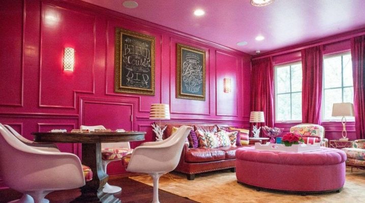
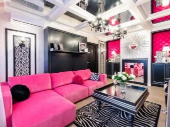
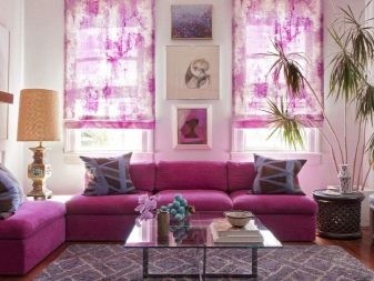
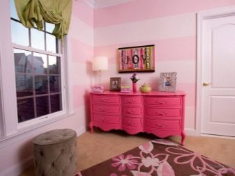
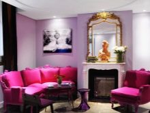
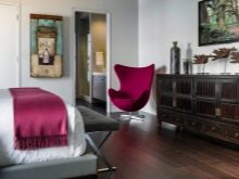
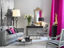
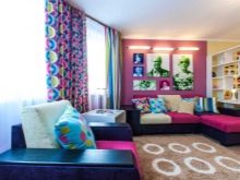
- The accent tone in the interior is fuchsia. It is a rich, close to crimson shade that is used in small quantities. Sometimes it can be seen in the design of upholstered furniture, minimalist paintings, accessories and lamps can also be painted in it.
- Tea rose Is the perfect tone for those looking to diversify the traditional pink palette. It looks like a mix of pale pink and beige, looks quite warm and inviting. They often make wall prints with the image of the corresponding rose variety.
- As the name implies "ashes of a rose", this shade is a calm tone of pink, as if slightly dusty. Otherwise, this color is also called dirty pink. Like powdery, it is best embodied in matte textures, and it is also often used for painting walls, upholstery and textile accessories.

Combination with other colors
Knowing the most popular and current shades of pink, you should also pay attention to what other tones this color is combined with, and how best to implement the most successful combinations in the interior. As you know, a color mix can be based either on an ensemble of similar colors, or on contrast. In the case of a pink palette, the following color combinations will look most organic.
- The combination, which has been repeatedly tested in interior design - dirty or powdery shades of pink combined with light gray. Usually, the latter color acts as a background color, and accents are created with the help of warm and delicate pink. But sometimes there is an almost equal proportion between the shades in the interior. In combination with ashy tones, items painted in the color "rose gold" will look good.


- If you want to make the room visually as spacious as possible, colors are suitable for finishing it. light pink and white colors. Bedspreads and accessories of a light or tea-pink shade are added to the main white. Sometimes a door of a room or a section of a wall can be painted in a warm color.

- To make the environment in the room warmer while maintaining the size of the apartment, instead of white in a combination to beige is added to pink. In combination with the color of a delicate rose, it will add romance to the decor of the room, without turning it into a "doll house".


- If you decorate a room using a lilac palette, it is appropriate to use fuchsia... Just a few pieces of furniture painted in such a bright shade of pink will help you to “liven up” the environment and make the atmosphere warmer.

- In some styles and rooms, the combination is acceptable delicate pink tone with yellow. The latter tends to be bold, diluting the rest of the restrained palette. One piece of furniture is usually painted in such yellow, for example, a sofa. This is enough to make the room lively.
Sometimes this accent piece can overlap in color with a small accessory.
- In case of connection pink with green when decorating an interior, it is worth remembering that among the different shades of both of these colors there are very organic combinations. Khaki and tea rose very softly complement each other, giving the room a cosiness. Dark emerald looks appropriate in combination with powdery in equal proportions. Deep green can be combined with fuchsia, with the latter color being taken in smaller quantities.
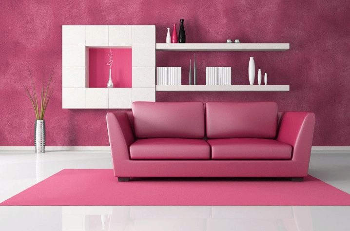
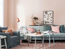
- Considering shades of brown then almost any of them are successfully combined with light pink tones. The harmonious ensemble can be seen in textiles as well as in furniture that combines pink upholstery and natural wood.

- An incredibly delicate and at the same time unusual ensemble is created by combining pink and mint... The main rule here is the strict predominance of one color, with the other the space is partially filled. For example, if the walls are pink, the curtains might be mint. Also, when painting the walls in one of the colors in a different shade, an arch or a certain small area of the room can be decorated.
- If you decide to combine a shade of a warm palette with blue or blue, then do it as carefully as possible. Usually, soft pink tones are taken for such purposes. It is also relevant to use the rule that either most of the furnishings are made out in pink or in a cold tone. And the opposite, in order to avoid imbalance, is used only in a few elements of textiles.
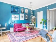
Also, walls in such rooms can be painted beige to balance opposite colors with each other.
Suitable interior styles
Remember that there are interior design concepts in which the shades of pink look the most appropriate. They are able to reflect the essence of specific styles and expose certain details in the most favorable light. Remember the following interior directions that provide an opportunity to experiment with pink shades.
- Provence with its inherent floral print, it rarely does without the use of pale pink paints in the decoration of walls and textiles. Powdery, tea and yoghurt tones can be found in wallpaper, curtains, pillows. Most often they are paired with milky, ivory, and sometimes even mint or dirty blue.
- Salmon or rich pink is perfect for a shabby chic concept. It assumes an abundant number of different accessories in the room, soft lines of textiles and elegant furniture. With the help of this style, girlish apartments are created, in which, in addition to pink, white is usually also featured.
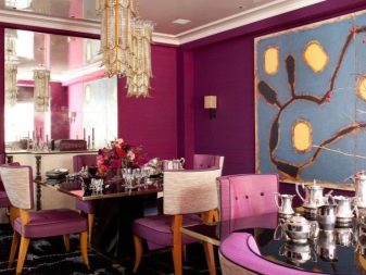
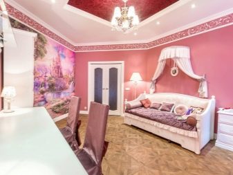
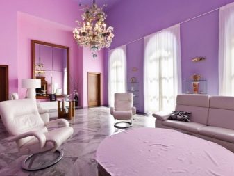
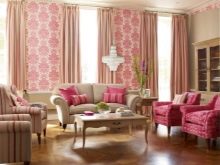
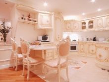
- In pompous baroque you can see peach-pink tones combined with gold. Warm color can be incorporated into light wood upholstery, walls or drapes. If dark colors prevail in such a room, then with the help of fuchsia, an emphasis is created on upholstery and textiles.

- In a modern minimalist concept absolutely any tone of the pink palette can be used. They paint walls, single pieces of furniture, carpets, vases. The main thing is the absence of prints on these items.
Use in different rooms
It is also worth remembering that the use of pink shades in the interior should correspond to the purpose of the room. Therefore, each room has its own recommendations.
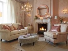
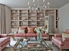
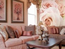
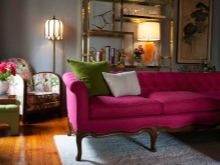
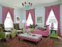
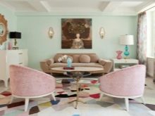
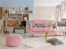
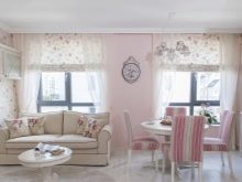
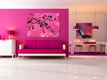
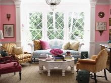
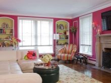
- In the living room it is preferable to use muted tones in not very large quantities. This is because the furnishings of this room should be cozy, but more neutral. A too bright tone may not please all guests and give the room a repulsive atmosphere. You can incorporate dirty pink shades into decorative pillows on the couch, carpet, shelves.
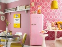
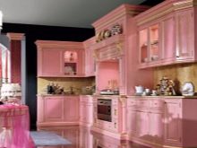
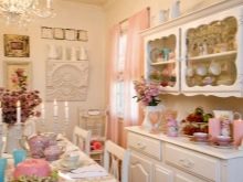
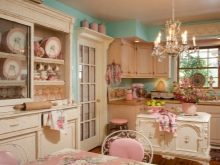
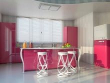
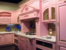
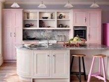
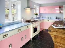
- On the kitchen bright pinks can be appropriate if the interior of the cooking room is created in a retro style. Walls can be painted pink at its equal ratio with other rich shades, for example, green.
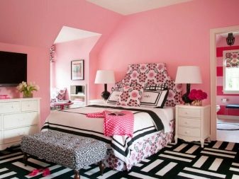
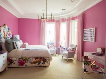
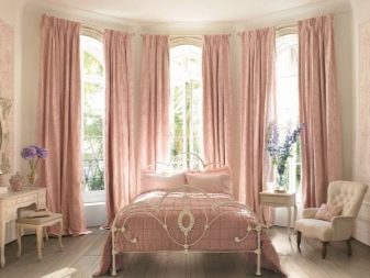
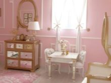
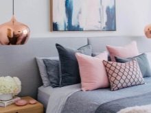
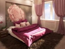
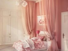
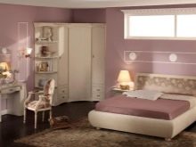
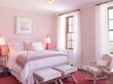
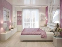
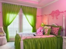
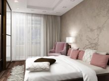
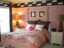
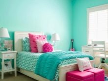
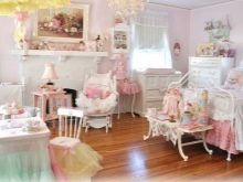
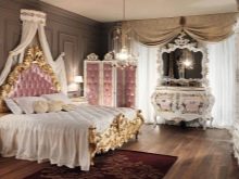
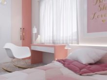
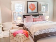
- Bedroombeing a rather romantic place, it allows the inclusion of warm colors in wallpaper, curtains, bedspreads. If you prefer curtains, then thick curtains in dirty pink tones will look great with light tulle. The ceiling should be either white, or, if you still want to add pink to it, it should only be its lightest shades.
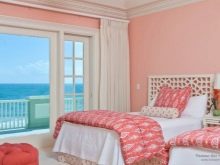
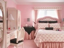
As an accent piece in the bedroom, an armchair can be present, the upholstery of which is painted in a more juicy pink color.
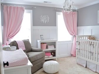
Successful examples
If you cannot decide on the concept or which of the shades you should use for your apartment, check out the ready-made examples.
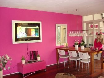
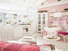
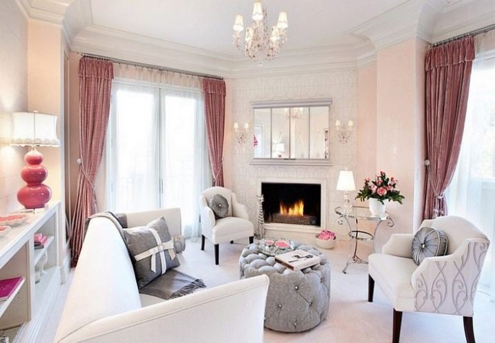
- To freshen up a light interior, you can not only use curtains of muted pink tones, but also complement the furnishings with the presence of fresh flowers in harmony with the general color scheme.
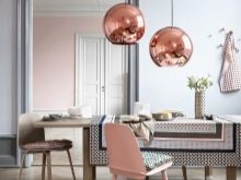
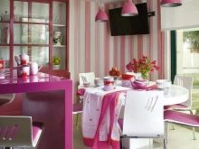
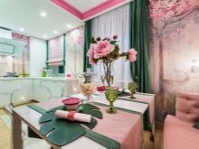
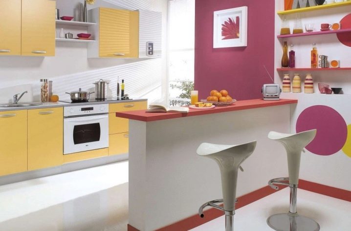
- If the kitchen and dining area is separated by a bar counter, then this border can be drawn using pink not only on the surface of the walls, but also in the design of the shelves.
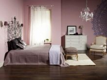
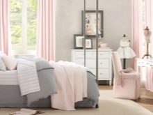
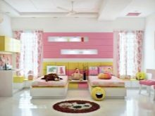
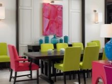
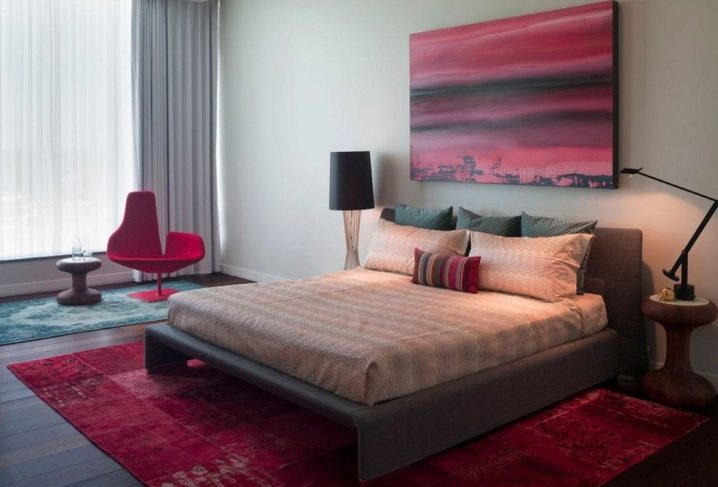
- The presence of bright appliqués and fuchsia paintings on the light gray walls will give the bedroom a harmonious look and a dynamic atmosphere. You can also complement the interior with a carpet to match the paintings.
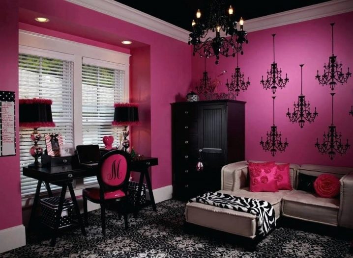
- Extravagant personalities will like the combination of rich pink and black in the design of the office. Moreover, in addition to the working area, there must be a rest area in which this combination will be diluted with gray.
For tips on decorating a pink interior, see below.


The comment was sent successfully.