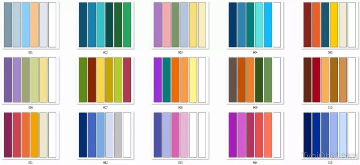
The combination of colors in the interior
Any color has a psychological effect on a person's condition, endows him with calmness or anger, improves performance, or, conversely, suppresses activity. Various combinations of shades in a living room should be guided by the personal preferences of the person, the purpose of the room. Bright bedroom walls can impair sleep, dark tones in the active zone lead to stagnation.
The variety of shades, the saturation of the gamut, the temperature allows you to translate color ideas into reality, create a unique interior for a comfortable life and work.
Before drawing up the palette of a room, you should familiarize yourself with the rules for combining colors and their effect on a person.

Concept and classification
Color is a property of an object or plane, the ability to reflect the sun's rays. According to the accepted classification, the paint is divided into chromatic and achromatic. In terms of temperature, it is warm, cold, in saturation - light, dull, bright, faded.
The first group is represented by all the familiar colors. The main colors, they are also primary - blue, red, yellow. The secondary group appears during the mixing of the first paints - green, orange, purple. Achromatic tones - black, white, gray.
The black-and-white scale is necessary for drawing up the compatibility of colors and for their saturation. The white color scheme contrasts with other pure colors, black, allowing you to visually expand the workspace, lighten the subject, create volume in geometric shapes, patterns with a floral motif.
Black is opposed to white, mutes the gamut, makes objects smaller, narrows the room, enhances warm shades against its background. Black color contrasts with bright tones (pink, red), with neutral (beige, sand), with pastel colors, making it visually more saturated (pale green, pale blue and others).
The combination based on disharmony and the taking of primary and secondary groups (blue - red, purple - green) is neutralized by a border of white, black, gray paint.
Warm colors are located nearby: yellow, orange, red. On the other side, cold colors are opposed to them: green, blue, purple. The pink tone and its derived shades belong to the cold spectrum. The relationship with the amount of warm paint added to the cold color scheme affects the final color, resulting in a warm and cold tone. These complex colors allow you to expand the color palette.
Light shades depend on the amount of white added to them, black is responsible for dullness. Bright tones are clean, there is no admixture of white or black. A dull scale is created based on gray.
Impact and color selection
Before painting the walls in a chosen color or when buying furniture of a bright shade, it is worthwhile to correctly draw up the color harmony of the selected room. For example: objects of saturated color are not always appropriate in rooms designed for sleeping.
Effect of color on humans
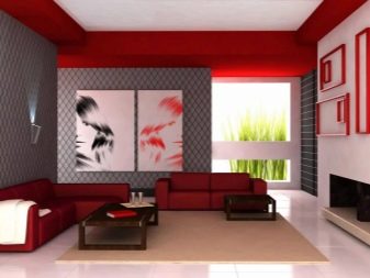
- Red. Active color, carries energy, raises the temperature, creating a feeling of warmth, accelerates the heart rate. The color is aggressive, impetuous.Pure red should be used in small quantities as an accent color, in the form of decorative items: a chair, chandelier or cabinet. Needs dilution with clean, calm colors to reduce shade activity. Various brick, burgundy dark and cherry shades based on red are appropriate in large quantities, they are used for painting walls, upholstery of large-sized furniture, and so on.
The duller and less saturated the red color becomes, the softer the effect it has on a person.
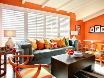
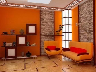
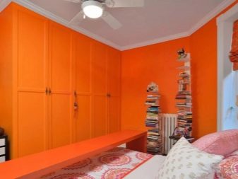
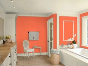
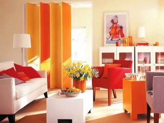
- Orange... Slightly worries, adjusts to a friendly mood, warms, cheers up. The shade of orange is perfect for living rooms or meeting rooms. The warm temperature sets you up for casual communication while staying active. An excess of orange leads to anxiety.
This color goes well with cold achromatic colors, standing out against their background.
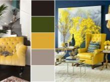
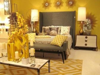
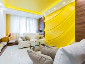
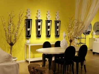
- Yellow... A joyful color, gives optimism, leads to absent-mindedness. Can be used as a substitute for orange. An active color that inspires confidence. Decreasing the saturation and increasing the temperature makes the yellow more calm and restrained. A mustard shade is appropriate in a dining room, living room of a classic style.
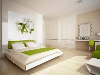
- Green. This color is used for bathrooms, walls of offices are painted in dark cold shades. Green in its variety is able to improve a person's performance without overwork. Leads to meditation, concentration. Looks good as an accent color. In combination with white, it refreshes the interior, evens out the temperature.
- Blue... Inclines to romanticism, relieves stress. Royal color. Suitable for any premises, except for the kitchen. Pastel shades of blue are visually warmer and more calm. A clear blue tone should be balanced with creamy, pale orange and other warm colors.
With an excess of blue tone, anxiety arises, mood drops, activity slows down.
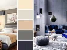
- Blue. Relaxes, promotes relaxation, inspires confidence. A dark, deep blue hue is good for bedrooms or indoors, helping to reduce stress levels and soothe the eyes. This color scheme is combined with monochromatic colors and requires warm accents with equal saturation to maintain the temperature.
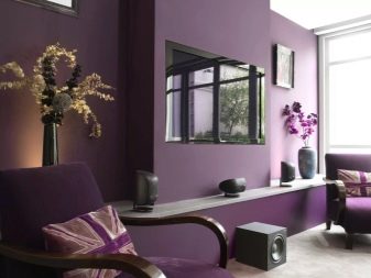
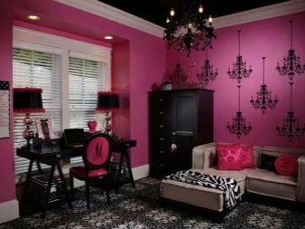
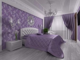
- Purple. Symbolizes inspiration. Together with blue paint, it is suitable for bedrooms. Creates the intimacy of space, privacy, protection. The color is laconic, it is best used for painting large areas. An excess of purple (in its various colors) is alarming.
- Gray. It symbolizes orderliness, restraint, regularity, disposes to melancholy. The gray tone is neutral, suitable for decorating any interior style. Universal shade. The addition of warm tones restrains the monotony of the paint, its negative features. Dark gray colors will replace the black scale in the interior, serve as a substrate for decor items (paintings, mirrors, cabinets, and so on), set off bright, pure colors.
- Black. The color of concentration, with long-term perception, brings melancholy. It is desirable to use black tone as an accent color. Kohler visually makes objects closer, smaller. Chipping large areas black is acceptable when mixing the main shade with other tones to remove depressive color perception.
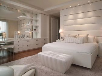
- White. The shade, symbolizing lightness, purity, has a positive attitude. The bright white tone is fatiguing. In a large volume, it causes depression, alienation, coldness. It is necessary to dilute it with color accents. The light tone is combined with any paints. The introduction of warm shades into the color scheme smooths out the sharp directionality of the tone, softens, soothes.
Suitable for bathrooms, kitchens, north-facing bedrooms.Gives additional light by reflecting rays, increases space.
- Brown. It carries confidence, resilience, poise, creates comfort. Pure brown shade - strong, sharp, diluted tone - soft, feminine. A varied range of brown color scheme is used for painting walls and kitchen items, bedrooms, loggias. Partially used in bathrooms. Excessive use of tone leads to depression, despondency.
When using complex colors (peach, pistachio, "Tiffany" and others), you should focus on the prevailing shade in the color scheme and its meaning.
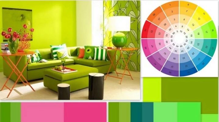
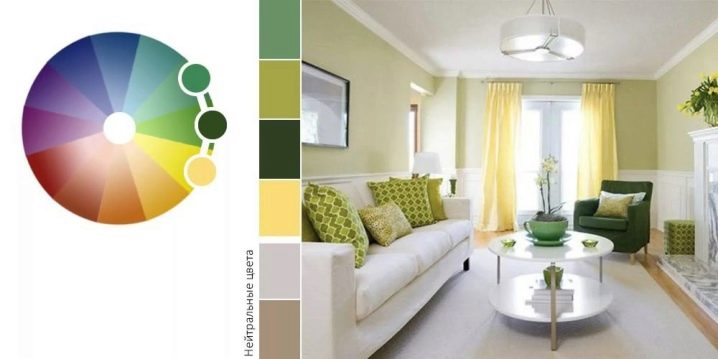
The color wheel and its application
For a designer, Ethen's 12-sector wheel is a must for determining the best color combinations. Primary colors are blue, yellow, red. The result of their combination is purple, green, orange. Transitional - color mixed with white, black paint, expanding the palette in temperature, saturation.

There are several harmonious color combinations.
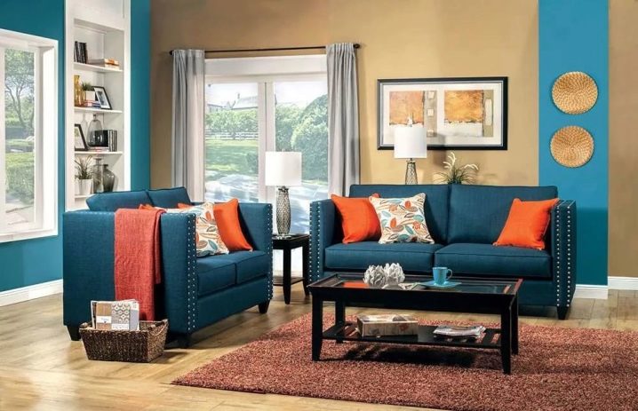
- Additional. Shows the compatibility of opposing colors - purple with yellow, blue plus orange, green with red. The arrangement of the colors with each other enhances the saturation of each color. Combining colors creates a shade that is close to gray, but not pure. Psychologically, finding shades nearby creates a sense of achromatic colors.
- Complementary method, or contrast compatibility... All compositions are built according to the scheme of nuance or contrast. Complementary compatibility is obtained from complementary colors; the effect is enhanced by repeating the placement of paints in other areas. The maximum contrast is achieved by mixing a pale tone with a colorful tint.
Contrasting decor is easily perceived from a distance and is used in landscape and interior design projects.
- Nuance composition. It is represented by the use of neighboring shades of the same temperature, saturation (violet-blue-green, pale yellow-orange-red). A nuanced composition gives the room dynamics, optimism, vigor, but a long stay in such a space tires, slows down reactions.
- Triad. Harmonization of three colors, built on the principle of a triangle, passing three spectral cells inside itself - violet-orange-green, yellow-blue-red, and the like. The use of bright colors allows you to achieve the "aggressiveness" of the interior, sharpness, dynamics. The rich triad is used to decorate living rooms, playrooms, fast food cafes - wherever activity is required.
In creating a bedroom on the principle of a triad, it is recommended to use two colors in a muted range, lighten them by adding white paint.
- Analog triad. Acts on the same principle, but the paints are taken nearby: purple, violet-red, red or blue-blue-green, green.
- Divided harmony. The composition is based on three colors. Combining separate harmony is built in the following way: a key color plus two additional colors located on the back of the circle. These colors are located at a distance of one spectral cell from each other. For example: yellow is the main and blue-violet, red-violet colors are complementary.
- Alternative combination. It is combined of four tones, the composition is built on a separate harmony scheme without missing a color cell, that is, yellow is the base, additional colors are violet-blue, violet, red-violet.
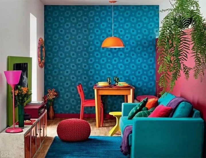
- A similar combination. Application of several shades, maximum 5. This layout is made up of colors located close to other paints. In creating a soothing interior, each shade should be discreet in saturation or one temperature.Additionally, there is a reliance on the rule of a harmonious ratio of many shades: 2 key colors in the interior occupy 65% of the total space, the following shades - 30%, and one tone acts as an accent - 5%.
- Separate complementary composition... In the three of this design, the opposite color is used, plus 2 adjacent paints. To compose the palette, a triangle-shaped figure is used. For example, purple, green-yellow, yellow; green, blue, red-orange. In separate-complementary harmony, it is necessary to choose a key color, only then select additional paints.
- Tetrad. Harmonization of four colors. The method is based on the choice of the main shade, two additional, one accent tone. Various options for harmony: one main tone, two accent shades, one additional tone. Visually, paints are selected in the form of a geometric shape - a rectangle. Combinations - green, blue, orange, red; blue-violet, red-violet, yellow-green, yellow-orange.
- Square combination. The selected colors are two cells apart. For example, green, yellow-orange, red, blue-violet. The use of the key color in its pure form in a square scheme should be supported by a side hue of low saturation, two accent tones - of moderate saturation.
- Six-color composition... Works in the same way with the previous methods. Colors are selected using a hexagonal shape. Choice option: yellow, green, blue, purple, orange, red.
A table of ideal harmonies of a key color with others
Main paint | Companions |
White | paints of any temperature and saturation |
Red | pewter, gold, black, saffron, khaki, stormy |
beige | warm with a range of colors |
Gray | cornflower blue, cotton candy, canary, carmine, fiery, black, azure, pastel colors |
pink | chestnut, deep burgundy, wet stone |
Brown | wheat, nickel, flamingo, curry, gold |
Orange | bitter chocolate, amaranth, graphite |
yellow | magenta, marengo, coniferous, black, earthy |
green | madder, black, burgundy, amber, gold |
blue | pumpkin, cobalt, violet, pomegranate |
blue | burgundy, gainsborough, raspberry, honey |
purple | sea buckthorn, pear, light green |
black | achromatic colors, scarlet, canary, emerald. |
Complex paints
Main tone | Additional |
peach | bleached peach, coffee, pastel lilac pink |
pistachio | sky blue, wisteria, amethyst |
coral | violet, mint green, creamy |
sea wave | gray on white, fuchsia, pastel pink |
crimson | eggplant, gray, purple with the addition of red |
mustard | olive, beige, diluted with white, light chestnut |
salmon | pink with the addition of white, mauve on a white backing, carrot |
jade | lightened cyan, golden, marine deep blue |
Styles and palette
Each style has its own narrow palette of suitable shades that characterize the chosen direction.
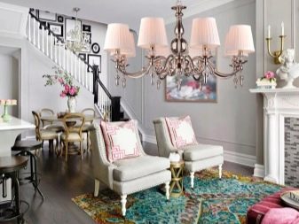
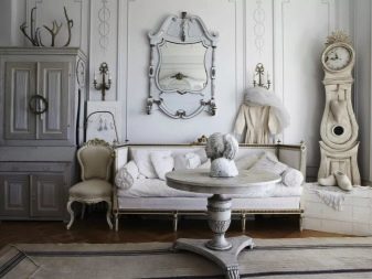
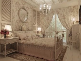
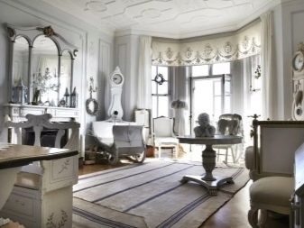
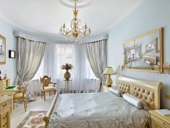
- The classic interior is presented in a calm color scheme. The room must be zoned, stucco molding is used, many wooden surfaces, expensive upholstery fabrics, gilding, fabric wallpaper, tapestries, carpets. Classic-style rooms are filled with air, furniture does not clutter up the space, the lighting is dim, diffused, the windows are draped with curtains. Design elements are large, massive, sparkling.
The palette consists of pastel pink, blue, cream, beige, light gray, pale brown, dark green, gold, silver and other tones and their combinations.
- Neoclassicism. Retains the classic direction, color palette, but the interior is diluted with modern furniture and appliances.For neoclassicism, the following range is inherent: olive, mint, white, ocher, graphite, blue, pink, burgundy, black, beige, dusty lilac.
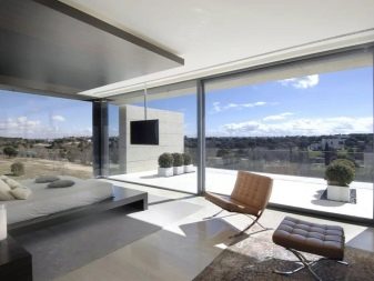
- High tech. Modern design made of glass, wood, plastic. Interior items are made in a futuristic design. Standard furniture is uniquely shaped and equipped with additional functions. The direction of the style is cold, persistent, masculine. Palette: silver, asphalt gray, blue-black, shades of white, metallic paints, olive, lilac, deep brown.
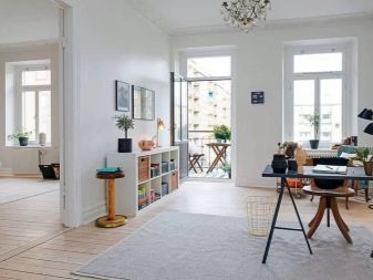
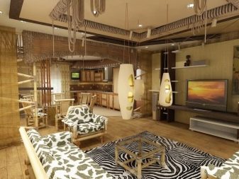
- Minimalism. It is characterized by free space filled with furniture made of wood, metal. Most often the windows are not curtained, the walls of the rooms are painted in white or other neutral shades, the plants are almost absent. The style is calm, cold, masculine. Colors: any pastel, green, beige, golden, bronze, sand, pale lemon, black.
- Country. Country house style. Warm colors create coziness, dispose to rest and tranquility. The interior is filled with natural materials, furniture in classic and modern design. Colors: beige, greenish-gray, burgundy on a red backing, carmine, brown, green.
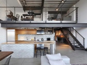
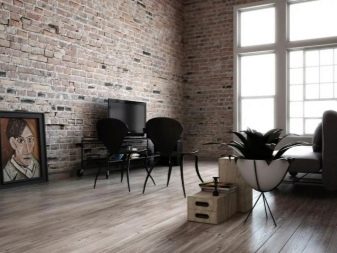
- Loft. Factory style filled with natural materials, lots of metal objects, exposed wiring, storage system. The palette is built around brick tones, black, white, red, the entire spectrum of gray, yellow.
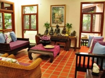
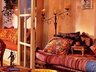
- Thai style. It is characterized by bright colors reminiscent of tropical greenery, sea, sand, deep blue sky. The interior is cheerful and refreshing. Palette: sea, beige, green, carrot, deep purple, melon, emerald, pomegranate, brown.
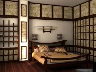
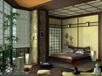
- Japanese style. Restraint and brevity, freshness, airiness. Traditional Japanese style is done in white with wood surfaces. Paints: willow, brown, red-orange, diluted pink, pine.
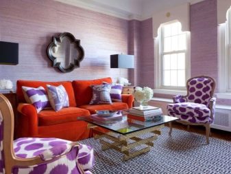
- Romantic. The style is reminiscent of classic interiors with additions in the form of bright accents, floral textiles. Used wallpaper with a floral motif, images of animals. Tones: fuchsia, rich light green, violet, ultramarine, purple, pastel pink, blue, beige, gray.
- Scandinavian direction. The style of the palette of tones resembles minimalism. Differs in the presence of a large number of warm colors, accent colors, greenery, natural materials. Colors: brown, deep gray, white, pastel blue, beige-yellow, light green, blue, dusty shades.

- Ethnic style. The color palette is selected from key colors corresponding to the selected country. Most often, colors are presented in bright shades (fuchsia, azure, Moroccan orange) with an abundance of golden tones. To create a French atmosphere, white, light tones are taken, green, indigo, rose quartz, and scarlet are added.
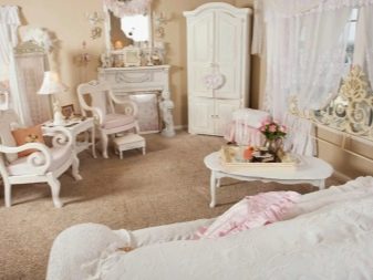
- Shabby chic. Feminine direction. The interior is built on the principle of comfort, calm colors with contrasting accents. There are floral motifs, ceramics, frills. Tones: light green, girlish pink, transparent white, pastel colors, beige, yellow.
How to match the decoration with the environment?
After familiarizing yourself with the principle of the color wheel, you can begin to practice. Let's analyze the best combinations of interior items with each other.
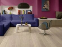
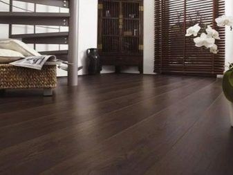
Floor
There are basic rules for choosing the color of the flooring.
Light range:
- expands the space;
- reflects the sun's rays, making the room brighter;
- used with pale wall colors;
- looks best in the sleeping area, bathroom, living room.
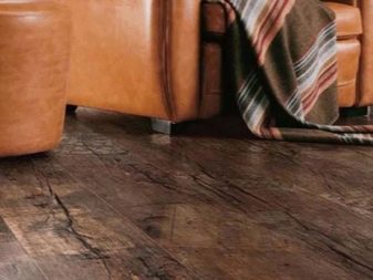
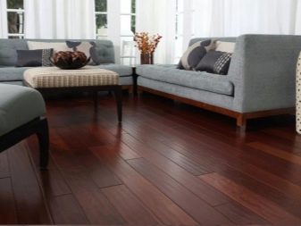
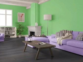
Dark gamut:
- can be combined with any tone of wall decoration, provided that the floor covering is one or more tones darker;
- with high-quality lighting, makes accentuating objects pronounced against the background of a dark floor;
- does not match with dark-colored room doors;
- used in rooms for any purpose.
A neutral gray floor harmonizes with white or black colors, and a yellow tone. Suitable for bedrooms, bathrooms, kitchens, used in the design of apartments in the style of Provence, minimalism.
Walls
The walls can be painted in any color. From the purpose of the room, paints are able to create an active, neutral or inert space. Active colors act as an accent. They harmonize with contrasting bright colors, with a neutral, calm scale.
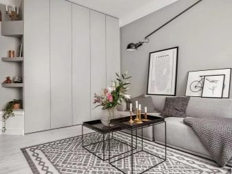
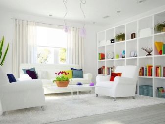
Pastel paints are the most common solution... They work as a neutral substrate in the interior of any direction. Decor items, floors, ceilings of all colors are suitable for this color scheme. A universal option.
Ceiling
In most cases, ceilings are painted with snow-white paint or other light shades. The whitewashed top can be combined with all tones, floor coverings and decor items. The paint is applied with a glossy or matt effect. To create contrast, it is necessary to have rich colors used on the walls or appearing in the upholstery of furniture. Used in all rooms of the apartment.
If you want to paint the ceiling in a dark range, you should know that:
- painting with black paint is carried out only on large areas with high ceilings (from 3 meters);
- harmonizes exclusively with white tone and its derivatives, light furniture, floor;
- used in the style of minimalism;
- visually creates a feeling of high cost in rooms with panoramic windows.
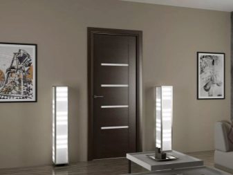
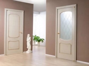
Interior doors
Natural shades of wood used for interior doors are suitable for any stylistic direction. Platbands, like skirting boards, should be made in the same color palette as the doors themselves. White tone is suitable for classic interiors. Doors that are dark or painted in cool shades are used in minimalism and require careful application. Dark tones enhance the contrast of colors in a neutral room.
Furniture
After creating a fine finish, the room is filled with things of a suitable color scheme. The choice of furniture is based on two rules: it should be darker than the wall covering and lighter than the floor.
A monochrome sofa is located in the same living rooms. He does not attract attention to himself, does not visually diminish the space. If the interior is created in neutral colors or in a bright oriental theme, large furniture is selected in pastel shades. Colored sofas of various colors are selected according to the principle of contrast, separate alternative harmony. Bright furniture matches wood of any tone.
Important! Colorful furniture needs to be supported with lamps, pots or chairs of the same shade.
Successful combinations for different rooms
Consider the options for the harmony of colors in rooms for different purposes.
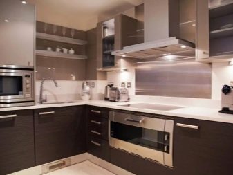
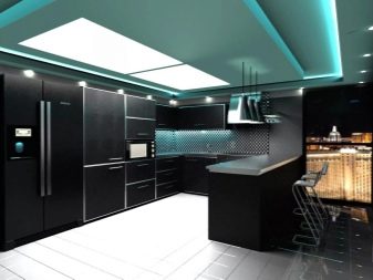
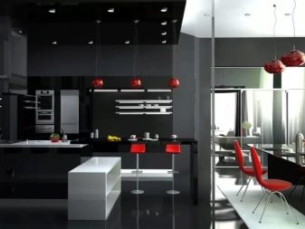
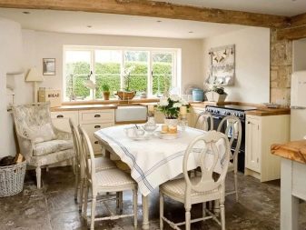
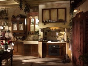
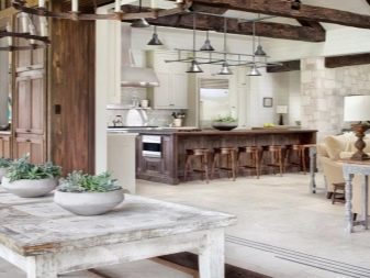
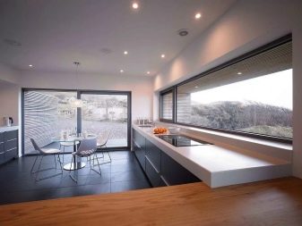
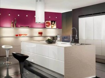
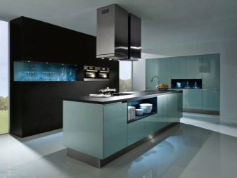
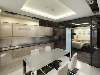
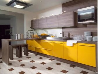
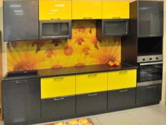
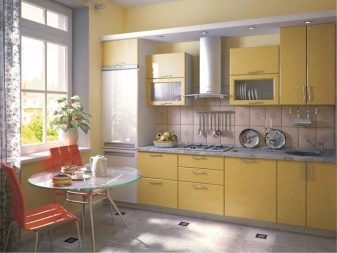
Kitchen
The color palette of the kitchen space is based on the stylistic direction of the room. As a rule, the color of the furniture is combined with the wall covering, the floor with the door, dishes with textiles. The presence of contrasts enlivens the interior, dilutes the passivity of colors. In a quiet beige interior, it is necessary to add color spots in the form of plates, appliances.
If the headsets are decorated with wooden surfaces or imitate it, then you should give preference to pastel shades of pink, green, blue, add gray and brown paint. This solution is used in modern, neoclassical kitchens.
High-tech dictates the harmony of gray key colors with bright metallic, neon tones or dark rich colors: eggplant, olive.
The loft stands out with a white brick apron, wooden furniture, unique metal decor: dishes, hobs, wall-mounted appliances. The colors are diluted, dark: dusty purple, gray olive, and so on.
Rules for harmony of colors in the kitchen.
- Combination of a key shade with the texture of the finish: tiles, siding, plaster. Paints should differ from each other by at least one tone.
- The use of contrasting paints for visual zoning of the room.
- The monochromaticity of the surface is diluted with stencil patterns, various ornaments, stripes.
- The furniture set is several tones darker than the walls, but lighter than the floor.
Accents in contrasting colors set off the key color of the interior. Indigo enlivens the gray-blue color, the "sea wave" is suitable for the orange spectrum, the blood-scarlet is combined with the achromatic scale.
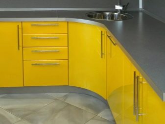
The yellow fronts of the kitchen set stand out brightly against the background of a pale purple apron or walls. Other options: peach tone with a lightened blue tint, red on a graphite background.
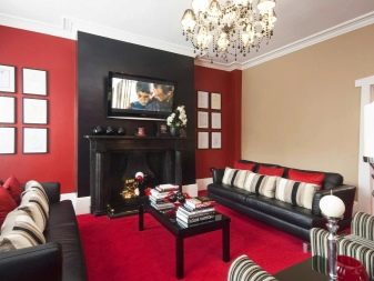
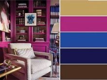
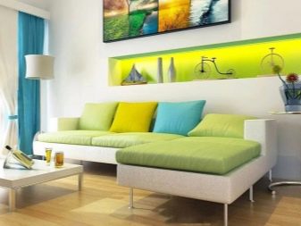
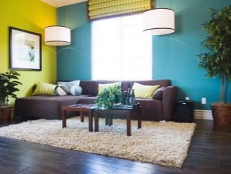
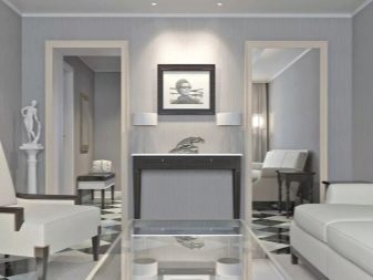
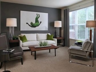
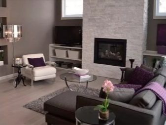
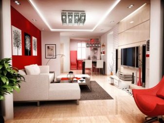
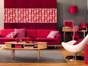
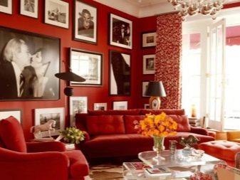
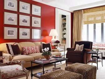
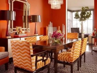
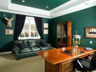
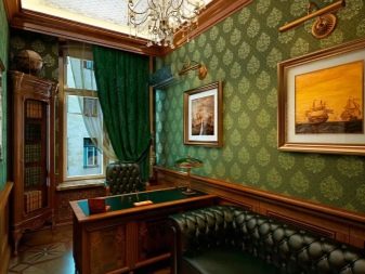
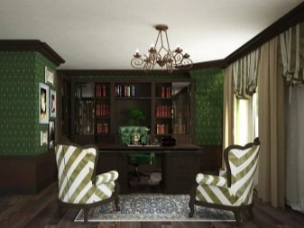
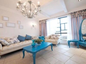
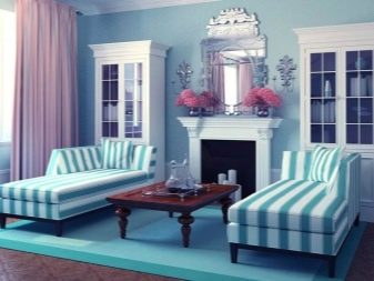
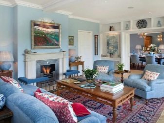
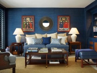
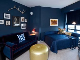
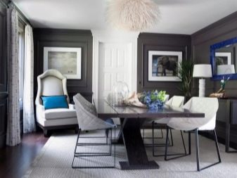
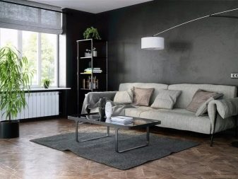
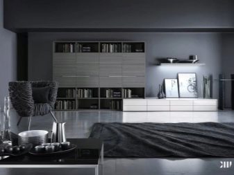
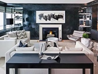
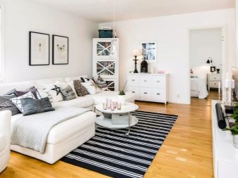
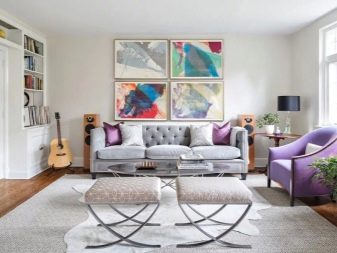
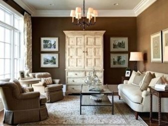
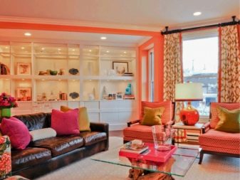
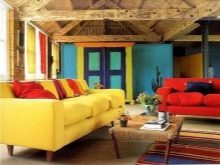
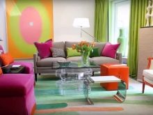
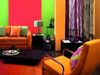
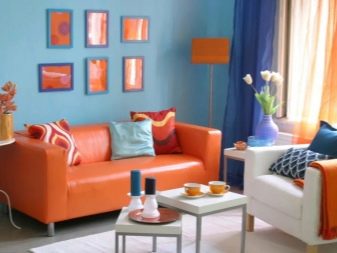
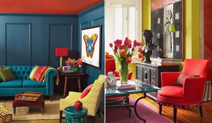
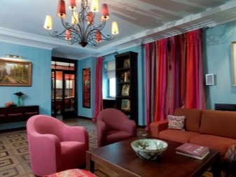
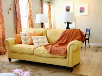
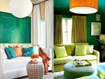
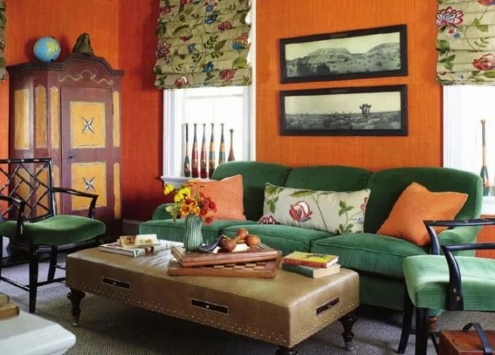
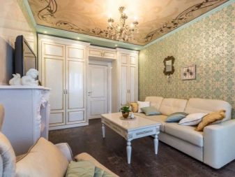
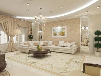
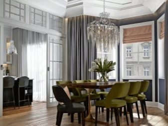
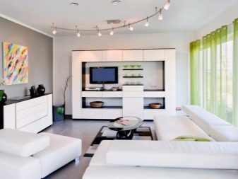
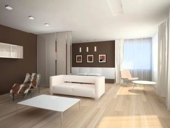
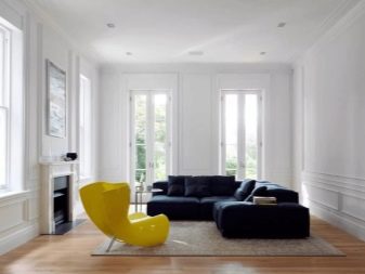
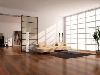
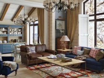
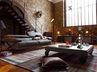
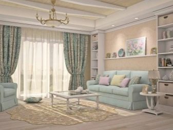
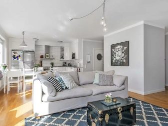
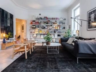
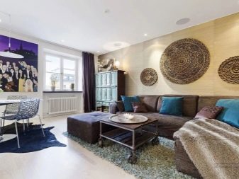
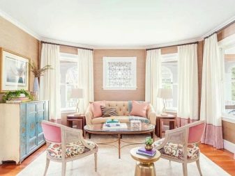
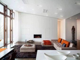
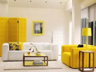
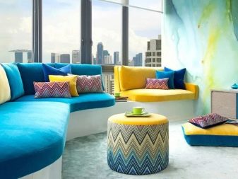
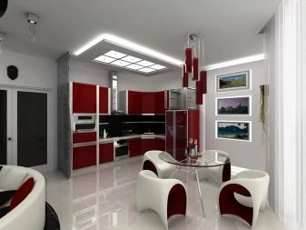
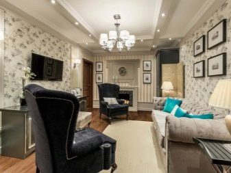
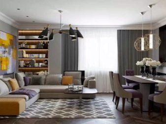
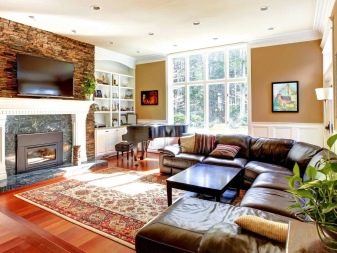
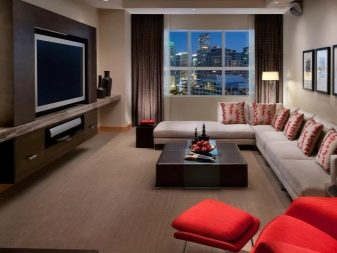
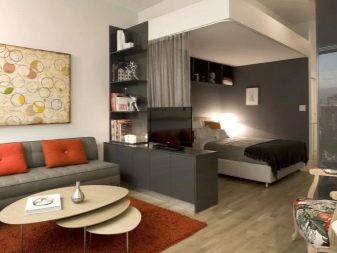
Living room
The spectral choice of living room color is based on the area of the room. Shades based on white will expand the recreation area, add air and space. Dark colors are responsible for zoning, comfort.
The purpose of the living room also affects the color palette. Family gathering and meeting guests dictates a balanced range. Parties, activities, celebrations - a bright fashion range that evokes colors.
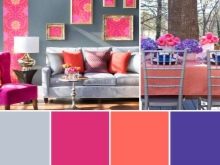
The reception area is decorated in a gray tone with a purple direction, the work area is painted in olive color, the dining area looks impressive in scarlet colors with golden accents. Blue and black are only suitable for large areas with panoramic windows, to relieve visual stress, the interior is diluted with light decor with the addition of mustard, mint, white and other tones.
The organization of a sleeping place in the living room requires simple solutions: coat color, lavender, mustard, graphite, wenge, emerald.
Pictures of bright colors are used as accents, whose colors intersect with textiles, furniture upholstery, armchair covers, curtains, carpets in pastel colors. It is advisable to paint the ceiling in the living room with light paint, the use of a different tone requires changing the color of the parquet and baseboards towards darkening, helping to achieve a balance of the interior, the color composition.
Placing a large amount of furniture in the living room leaves a choice of three colors, excessive overload of colors will lead to fatigue and irritability.
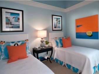
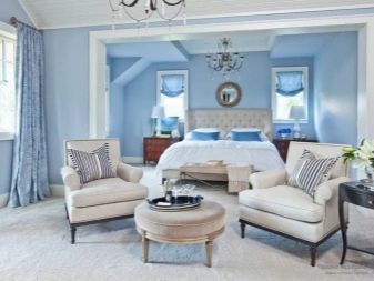
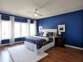
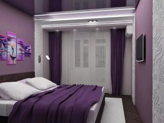
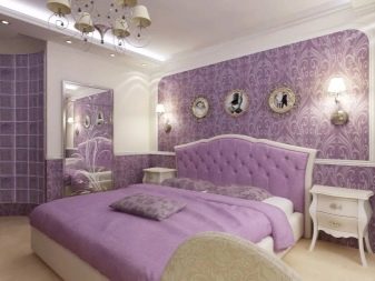
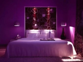
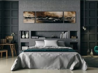
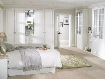
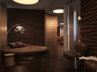
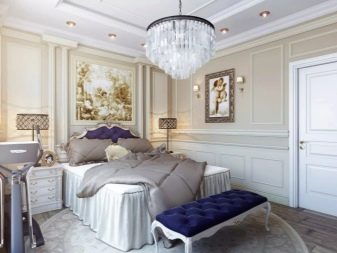
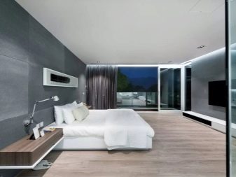
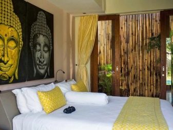
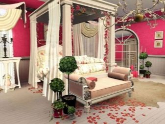
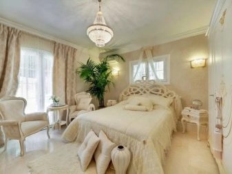
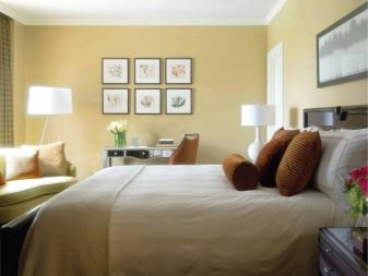
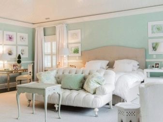
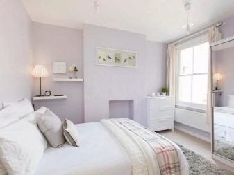
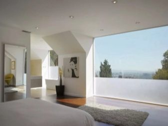
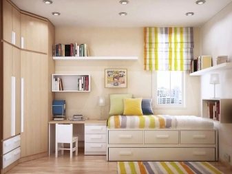
Bedroom
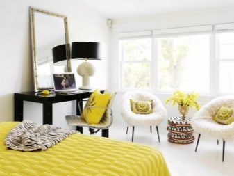
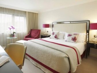
The palette is built based on the data of the room owner: his age, gender, preferences, desired functionality of the room. In the woman's bedroom, the emphasis is on pink, peach, and eggplant. Men's bedrooms are painted in neutral colors, blue tones. It is preferable for a married couple to decorate the walls in scarlet and white tones.
Common options: a combination of turquoise with emerald, indigo and graphite, blackberry with canary yellow, pistachio and carmine, caramel with chocolate, milk plus coral, lemon with gray.
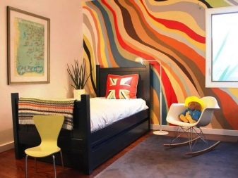
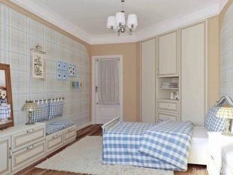
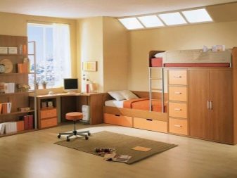
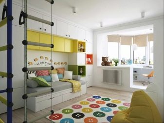
Children's bedrooms are always painted in pastel colors so as not to cause fatigue in children, a decrease in thinking abilities, and activity. Light rooms are richly decorated with bright contrasting colors through toys, furniture, books, paintings.
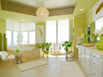
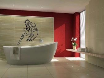
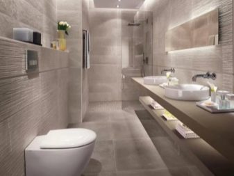
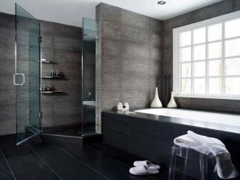
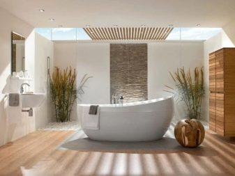
Bathroom
Bathrooms are usually small in size. The use of dark paints can negatively affect the human psyche; the presence of a window in the bathroom will bypass this rule. White, pastel, olive and blue colors are very advantageous. The palette is reflected in the color of the tiles, plumbing. Color accents are set by means of wooden furniture, an overhead sink, appliances, textiles. Example: gray-green, larch, strawberry, light green, gray.
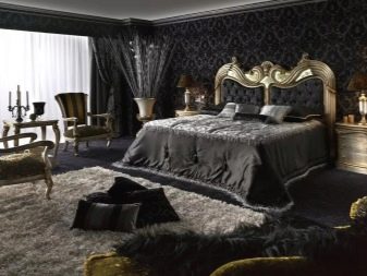
Influence is also exerted by the use of textured tiles, patterns, shower curtains with plant motifs. Dark colors are used to create a classic design filled with luxury and gilding.In the bathroom, the floor and ceiling remain light, like the surrounding objects, while the walls are painted in rich muted shades: wine, cobalt, viridan, mahogany, plum.
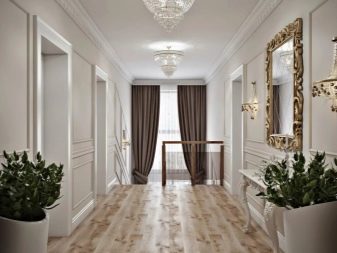
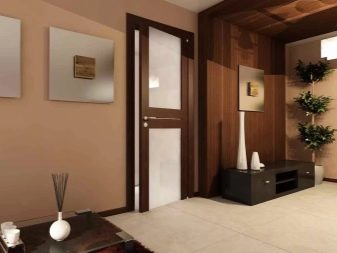
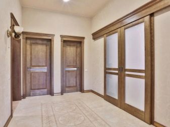
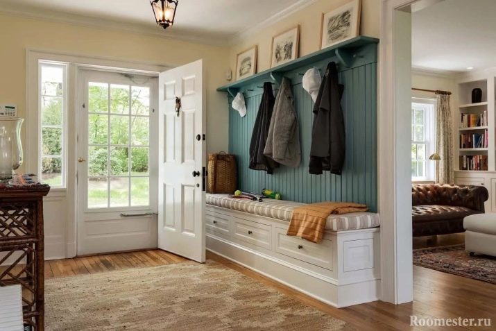
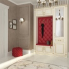
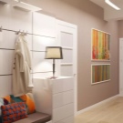
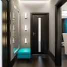
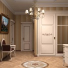
Hallway
The hallways are painted in the key colors of the entire interior. When zoning, the shade changes to the opposite or several tones lighter or darker with the addition of texture. Built-in wardrobes are decorated with mirrored panels, wood material of the same color scheme with a kitchen set or interior doors, or painted in neutral shades.
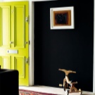
The use of a bright tone allows you to dilute the monotony of the room. Example: Applying a neon yellow front door in a graphite hallway, or a cherry-colored ottoman in a creamy hallway. Color spots enliven the design, set it up in a positive way.


The comment was sent successfully.