All about the color "beech"
In their professional activities, designers often use beech-colored furniture. This color harmoniously fits into any design solutions, allows you to create an atmosphere of comfort and warmth both in the hall and in the nursery. We will tell you how shades of beech are used in the design of houses and apartments in our review.
Peculiarities
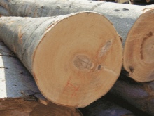
Beech is a valuable type of wood, its fibers stretch, so the material lends itself well to bending. Beech can be used to create the most original compositions of intricate shapes. This tree has a beautiful pattern on the cut, while the shade and texture under the varnish are preserved. Simplicity of material processing will be a pleasant bonus.
Among the disadvantages of this tree, there is a tendency to slight warpage, therefore, when used in places of high humidity, cracks sometimes appear. Nevertheless, beech looks very organic in the interior; it can be a harmonious addition to any design style.
Beech shades are suitable for creating cabinet furniture, open shelves, shelves, doors and some decor items.

Basic shades
Beech colors are striking in their abundance of shades and halftones. Depending on the method of processing wood material, you can always get an option that will organically fit into any color scheme of the interior. The whole palette is presented in several colors.
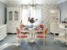
- White - usually it is used when furnishing country and country houses. Looks most harmoniously in Provence and rustic country styles.
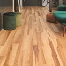
- Sand - one of the most popular and demanded colors. Optimal for the production of children's sets, office and kitchen furniture. These colors fit well with any interiors - from classic to ultra-modern.
- Bleached - this color is obtained after processing wood with steam, subsequent painting and drying. The shade turns out to be non-standard and original, it has become widespread when decorating rooms in the Scandinavian style.
- Silver and gold - such colors are obtained when using translucent or dense coloring. Ideal for decorating spaces in techno, baroque and modern styles.

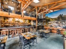
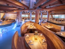
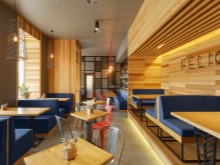
- Bayern Munich - a rare color, it is usually chosen for the design solutions of cafes, clubs and restaurants.
Where is it used?
Due to its increased hardness, beech can easily replace oak wood, and at the same time it will cost much less. The shade range of beech from yellow and pinkish to brown becomes an excellent addition to any design.
For furniture
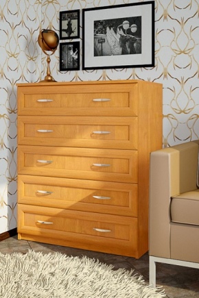
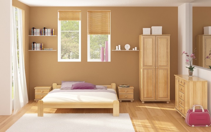
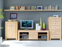
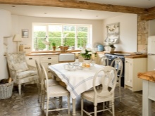
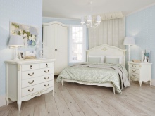
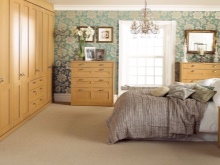
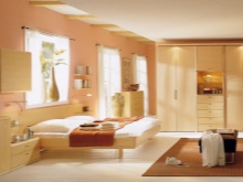
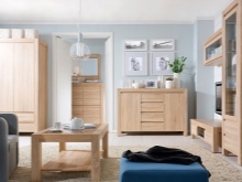
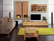
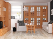
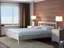
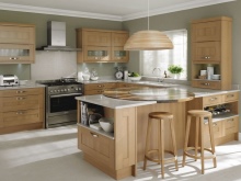
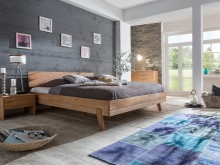
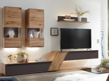
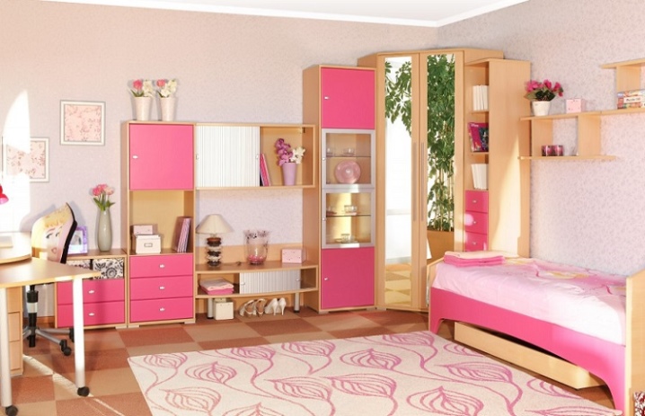
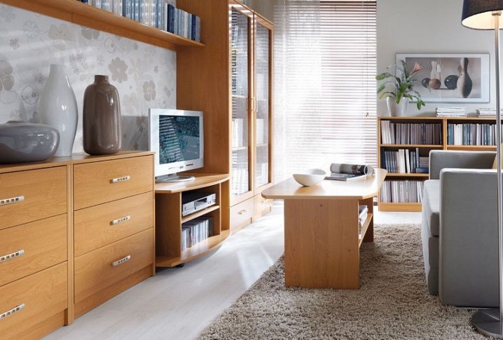
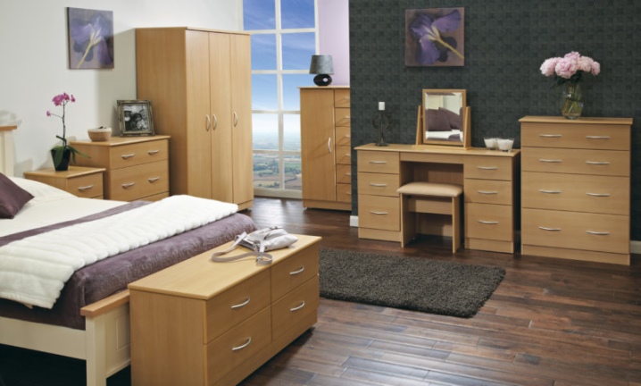
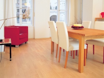
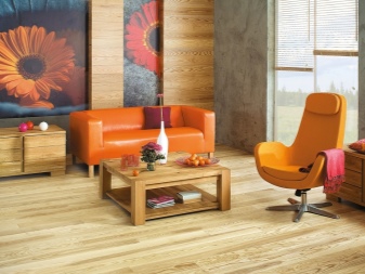
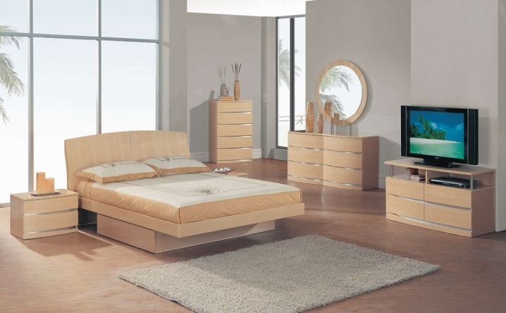
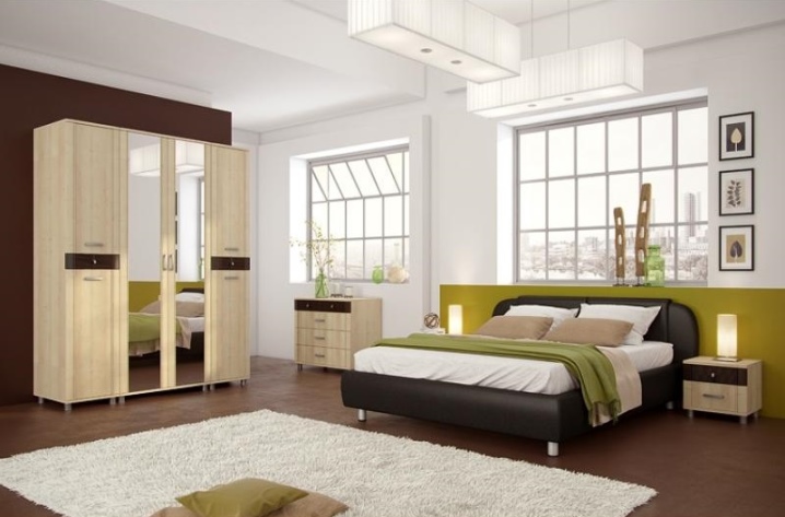
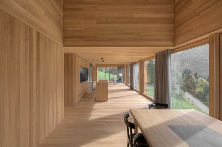
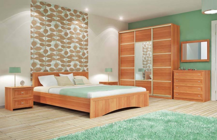
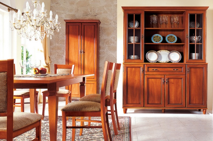
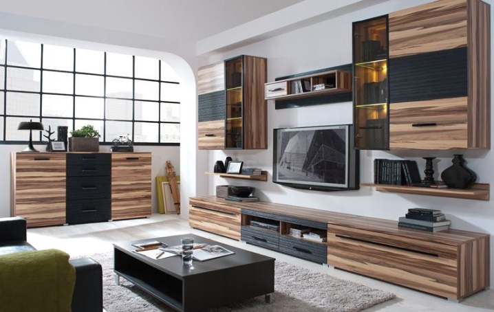
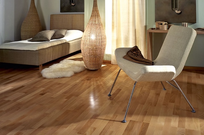
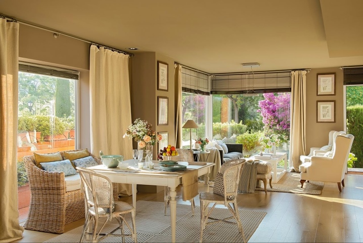
The furniture industry has become one of the most sought-after uses for beech shades.... Kohler is used to create kitchen furniture, dressers, sofas, beds, as well as tables, Viennese chairs, shelves and some other furnishing elements. This is a universal color scheme. Items in this shade are relevant in children's rooms, bedrooms, as well as in kitchens, hallways and even shower rooms. Tables in beech paints have a decorative look and look really expensive. The texture of natural wood gives shine to wardrobe modules and wardrobes of all types.
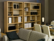
It is very important to use beech colors when creating open shelves and racks - they look airy, light and do not overload the space.
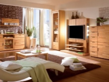
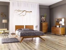
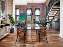
Furniture in beech colors brings to the house an atmosphere of comfort, warmth and tranquility. Due to their natural appearance, such tones have the most beneficial effect on people's mood - they have a sense of security and closeness to nature. That is why such headsets are often chosen for furnishing premises in eco-style. However, in classical designs this tree looks harmonious and self-sufficient. Color is often used when creating interiors in loft and modern styles. In this case, the furniture is decorated with carvings and all kinds of contrasting color combinations.
This color scheme fits especially effectively into the design of summer cottages and country houses. Designers often use it in combination with light walls.
This solution is optimal for shabby chic and Provence styles.
In other areas
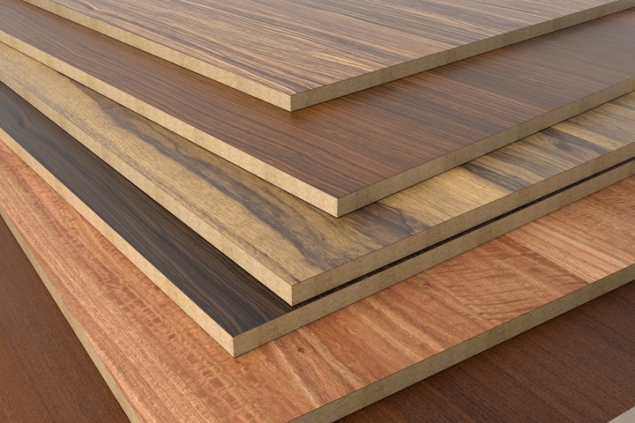
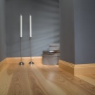
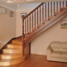
Beech shades are often used for the production of chipboard and MDF sheets - they give furniture made of cheap material a more aristocratic and aesthetic look. Kohler is in demand when creating parquet and stair treads. High quality siding and plywood are made in this color.
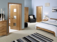
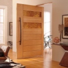
Beech shades are widely used in interior doors, skirting boards and siding.
The color is recognized as one of the most popular in the production of wood stains and varnishes.
What colors are combined in the interior?
A distinctive feature of the beech color is its ability to blend harmoniously with other shades. Combinations of beech with other tones allow you to achieve the most interesting solutions - to make the decor more expensive or add a little tenderness and playfulness to it.
- Pink - in combination with wood, this color loses its vanilla sweetness and sounds in a new way, bringing freshness and light to the room.
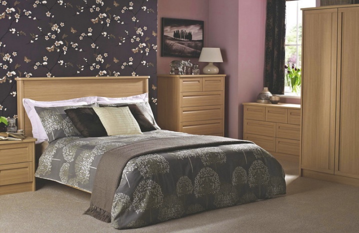
- Gray - this color itself in the interior seems inexpressive and boring. But in tandem with wood, it fits well into the arrangement of sleeping areas, decorated in a classic design.
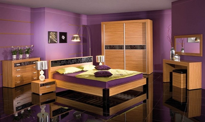
- Purple - lilac tones in combination with beech tones bring their zest to the premises. This solution is relevant when decorating bedrooms and children's rooms.
- Nut - paired with beech it looks very advantageous, especially if you dilute the tandem with contrasting shades.
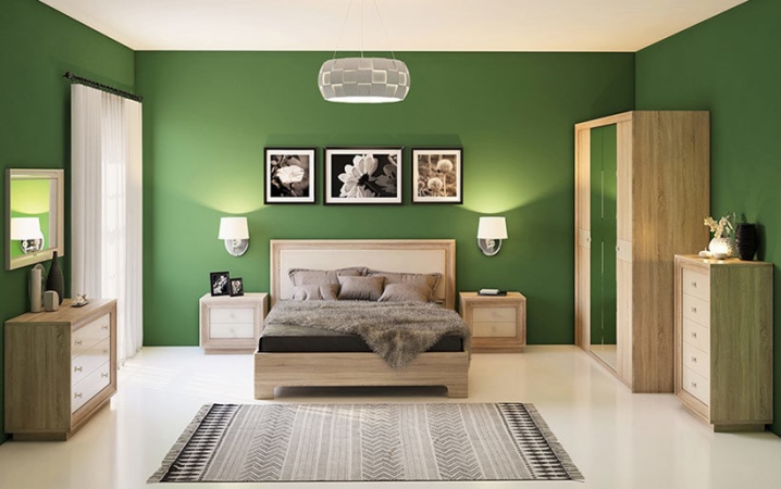
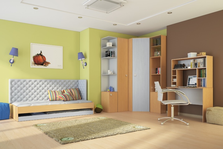
- Green - has always been considered the color of peace and harmony. If you add notes of beech to it, then the combination comes out pleasing to the eye.
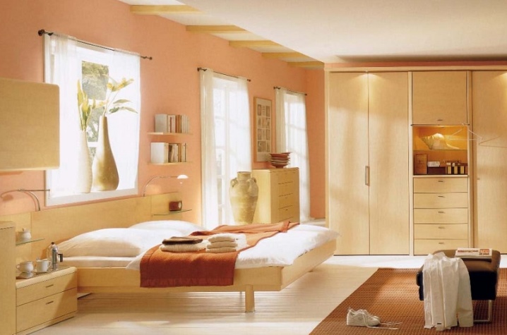
- Peach - the tandem of peach and beech makes the interior austere, but with a light, casual touch.
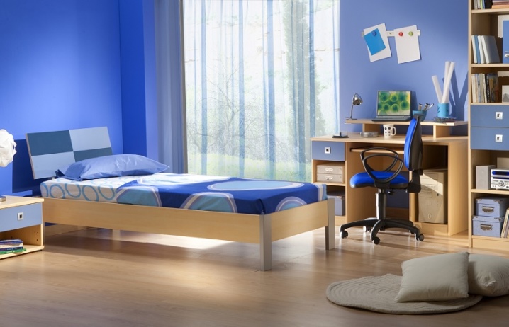
- Blue Is the color of strength and energy. Light beech looks especially good in combination with it, together these shades fill the space with an atmosphere of coziness and comfort.
- Red and orange - these colors are traditionally associated with the sun, they give the room a bright look. And beech paints add solemnity. However, it is very important not to overdo it here, saturated colors should be accentuated, otherwise they will simply absorb the beech.
- Maple - this color is colder than beech and a little lighter; this combination is relevant for interiors with a contrasting temperature design. Light wallpapers go well with beech and maple, textiles in gray-blue and light yellow colors become an effective addition. You can add some purple to create accents.
- Acacia - the combination of yellowish beech with grayish saturated acacia looks very impressive. This tandem assumes the presence of contrasts in the interior. So, a good solution would be to use white wallpaper with a print in shades of acacia and beech, furniture in cold gray and bright accents in turquoise and blue tones.
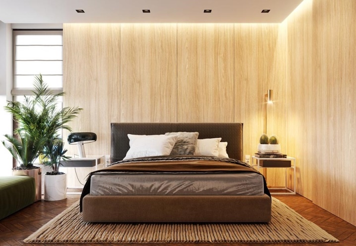
Warm beech colors are laconic and moderately warm. They do not oblige at all to maintain any particular style, therefore they harmoniously fit into any interiors. If necessary, beech can be replaced with some similar woody tones.
- Mountain larch - has a light shade, slightly softer than beech. It gives the room a soft and cozy feeling.
- Alder - gives a honey delicate color scheme.It is successfully used in any design solution.
- Light apple locarno - a yellowish brown shade, warm and pleasant, but slightly darker than beech.
- Baltimore oak - discreet and calm, enveloping, intense and very sophisticated. Ideal for living room and bedroom.
It is easy to choose textiles and other accessories for beech furniture. Designers recommend following some tips.
- The beech palette is versatile, it looks especially good in combination with light canvases on the walls, ceiling and floor. In such interiors, you can add several bright accents in the form of paintings on the walls - this will make the atmosphere more cheerful and positive.
- However, and dark canvases with bleached beech will look catchy and laconic. This design looks great in large bedrooms and living rooms.
- Beech in children's rooms better to combine with light green, pink and beige wallpaper.
- It is better to choose curtains, rugs and carpets in burgundy, green and blue colors. For a complete decor, use textiles of the same shade on the floor, walls and sofas.
- The tandem of furniture from "Bavaria" with milk walls and curtains looks very interesting. So, white curtains are harmoniously combined with beige wallpaper and beech cabinets.


The comment was sent successfully.