What is a color wheel and how do I use it?
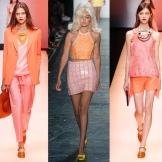
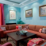
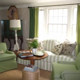
When buying any thing: be it clothes, dishes, furniture, wallpaper, painting, we try to imagine it on ourselves or in the interior of our home. If these are things for the home, then we evaluate not only the dimensions, texture, but also the color. If these are clothes, then we remember whether there are things in the wardrobe with which we could make an ensemble; Will your favorite jeans fit this tunic to match; how it will look with your current hair color. That is, color plays an important role in any issue. And here you can find yourself in an awkward situation and look funny due to ignorance of the simplest rules of color combination.
To prevent this from happening, we propose to find out what a color wheel is and how to choose the right shades in different life situations.
What it is?
Many people know that a person perceives color through the retina of the eye. Different surfaces absorb some rays and reflect others. Absorbed, it is not visible to the eye and is felt by us as black. The more rays are reflected, the whiter the object (such as snow) appears. This means that white is a combination of all visible shades.
The human eye distinguishes a rather narrow range of wavelengths corresponding to different colors: the longest visible wave (about 750 nm) is red, and the shortest (380 - 400 nm) is violet. The human eye is unable to see infrared light and ultraviolet light.


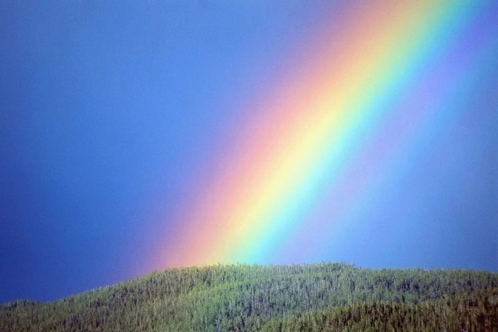
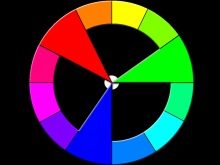
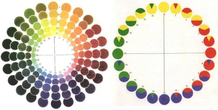
The human retina perceives these same 7 rainbow petals, about which the count "every hunter wants to know where the pheasant sits" is folded: behind the red - orange, and then - yellow, which is attached to the green, a little lower - blue, blue, and keeps it all purple. But there are much more of them - brown and light green, pink and mustard - you can't count all of them. How to determine their place in the color scheme, where they came from and how they are combined with other colors - these questions have long agitated not only artists, decorators, but also scientists.
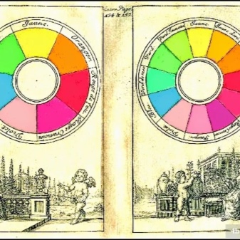
The result of the search for a solution to the problem was Isaac Newton's attempt to combine the first color of the visible spectrum (red) with the last (violet): a color that was not in the rainbow, and that is not visible in the spectrum - magenta turned out. But after all, color combinations can be between other colors. To better see their relationship, he arranged the spectrum not in the form of a ruler, but in the form of a circle. He liked this idea, as it was easy to see in the circle what the mixing of certain colors would lead to.
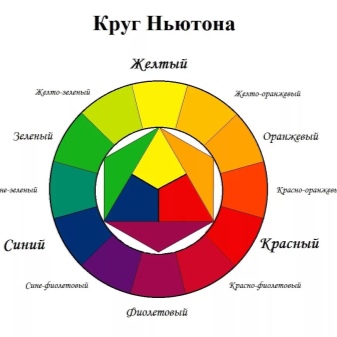
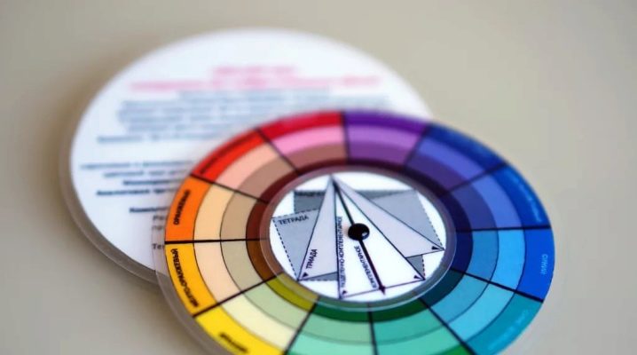
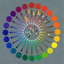
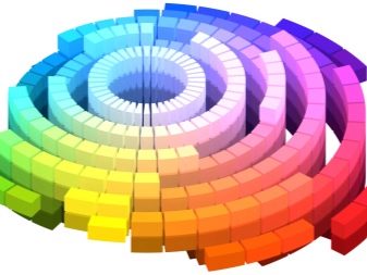
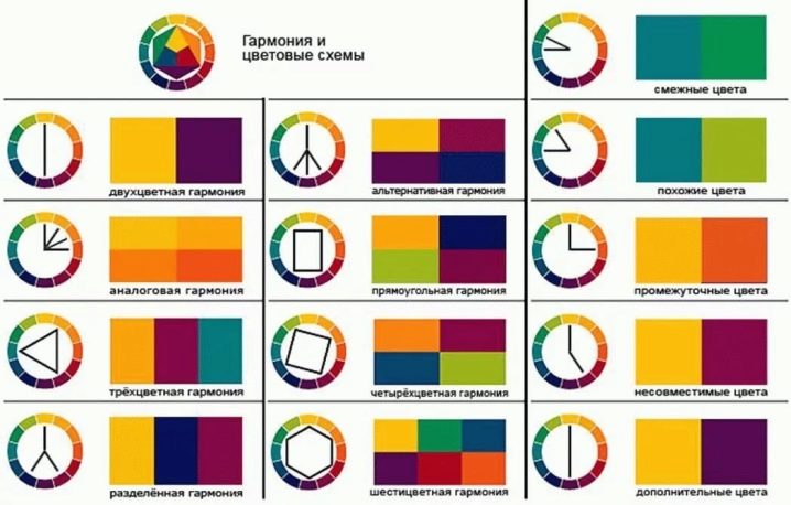
Over time, the theory of the color wheel has developed, changed, but it is still used now, from kindergarten teachers when conducting psychological tests with children and ending with physicists, designers, engineers and stylists. The color spectrum, presented in the form of different shapes, gives us an idea of the primary and secondary colors, cold and warm shades. The full circle pattern allows you to determine which colors are opposite and which are related, as this is a continuous color transition from tone to tone. It can also be used to define hue, saturation, brightness - HSB.
To get a deeper understanding of the interaction of different shades, you need to get acquainted with the different types of color wheels.
Views
Speaking about Isaac Newton, we note that his theory was not flawless, but he made a lot of discoveries related to the color gamut and the spectrum itself.For example, it was he who came up with the idea that if you mix two colors in different proportions, then the new shade will be closer to the one that is used more.
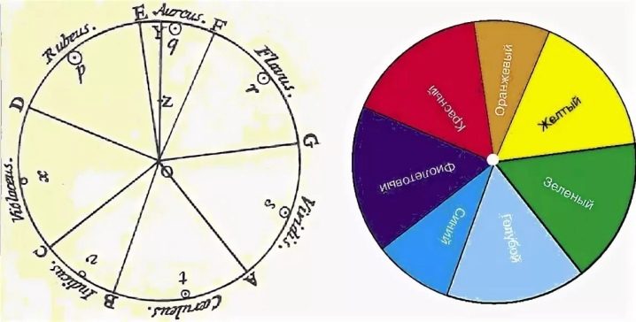
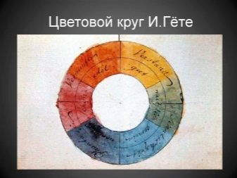
Johann Wolfgang von Goethe disagreed with Newton in many ways. According to his theory, color is the result of the struggle between light and darkness. The first (primary) winners were Red with Yellow and Blue - RYB. These three tones alternate with three complementary ones - orange, green and purple, which are obtained by mixing two primary (main) adjacent colors.
Goethe's circle covers fewer tones, so not all experts speak positively about his theory. But on the other hand, he is considered the founder of the section of psychology on the influence of flowers on a person.
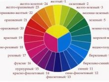
Despite the fact that the authorship of the creation of purple is attributed to Newton, it is still not clear who is the author of the 8-sector circle: Goethe or Newton, because the dispute is precisely because of the eighth, purple color.
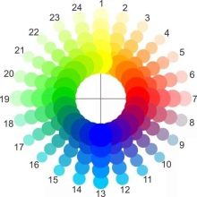
And if they had chosen the circle model modeled on Wilhelm Ostwald (who, however, lived later), then there could be no dispute, because this smooth flow from one color scheme to another in a circle of 24 sectors. He is the author of a book on the basics of color, in which he wrote that in the process of gaining experience, we understand that not all color combinations are pleasant to us. Answering the question why this happens, he says that harmonious combinations that are found according to the laws of a certain order are pleasant. These include the degree of brightness or darkness, equivalent tonality.
But here is the opinion of modern colorists on the Ostwald theory ambiguous. According to the currently accepted rules, opposite colors must be complementary (this is what they are called in physical RGB systems). These colors should only give a gray color when mixed. But since Ostwald took not blue - red - green, but blue - red - green - yellow for the main tones, his circle does not give the necessary gray when mixed.
The result is the impossibility of using it in painting and applied arts (according to the author of another color wheel, Johannes Itten, which will be discussed further).
But women of fashion are happy to use the developments of Ostwald, because with their help, you can harmoniously combine 2-4 tones. Like the arrows of a compass, there are three arrows in the circle, which, at any turn, will tell you which three tones are combined with each other.
And since there are as many as 24 sectors in the circle, it would be much more difficult to pick up the combination manually. Ostwald noted that the background, on which the colors are superimposed, greatly affects the overall perception. On black, white, gray, other colors play differently. But don't put white elements on a light background.
Three tones, equidistant from each other, are called "triad" - an equilateral triangle at any turn to the left or right. Spectral analysis of the scientist Wilhelm Ostwald and his followers, as well as opponents, developed over time into a system that is still used today.
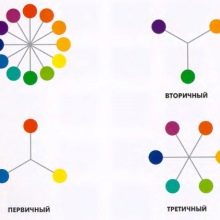
- 3 - 4 colors, located sequentially in a circle, are close, contiguous. If they belong to the same color family (for example, cyan-blue-violet), then they are called analogous or analogous, related triad. We used to call them shades, although this is not an accurate definition.
- Shades are called variants of one tone when white or black paint is added to it. To a greater extent, the development of the gradient scale was carried out by the followers of the scientist.
- Diametrically opposite colors have been called the chemical concept of mutual correspondence - "complementary". But, as we explained above, although they were opposite in Ostwald, they were not complementary.
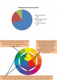
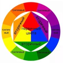
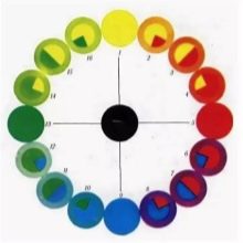
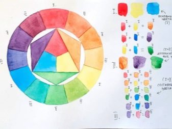
It was on this issue that the artist Johannes Itten subsequently disagreed with the scientist Wilhelm Ostwald. The design theorist, the teacher was helped by his own artistic practice.He designed a 12-sector color wheel. It would seem that he simply reduced the number of colors in the Ostwald circle by half, but the principle is different: Itten again took for the main ones, like Newton, red - yellow - blue. And therefore, in his circle, green is opposite red.
The vertices of the large equilateral triangle within the Itten circle indicate the primary colors of RYB. When the triangle is shifted two sectors to the right, we see secondary tones, which are obtained from mixing two primary ones (it is extremely important that the proportions of the colors are equal and well mixed):
- yellow and red give orange;
- a mixture of yellow and blue is green;
- if you mix red with blue, you get purple.
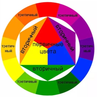
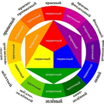
Move the triangle back one sector to the left, and you will see the tones of the third order, obtained from the previous two (1 primary + 1 secondary): yellow-orange, red-orange, red-violet, blue-violet, blue-green and yellow-green.
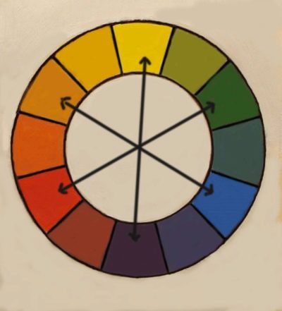
Thus, Johannes Itten's circle is 3 primary, 3 secondary and 6 tertiary colors. But it can also identify cold and warm tones. In the circle on Itten's diagram, yellow is above all, and purple is below all. They are the borderline ones. Draw a vertical line through the whole circle in the middle of these paints: half of the circle on the right is the warm zone, on the left is the cold zone.
Using this circle, schemes have been developed, according to which it is very convenient to select a color scheme for any situation. But more on that later. Now we will continue to get acquainted with other types of color wheels and not only.
You can find a huge number of references about Shugaev's circle, but (paradox!) There is no information about his biographical data. Even the name and patronymic are unknown. And his theory is interesting in that he took for the primary not three, but four colors: yellow, red, green, blue.
And then he says that harmonization is possible only if they combine:
- related colors;
- related-contrasting;
- contrasting;
- neutral in relationship and contrast.
To determine related and contrasting colors, he divided his circle into quarters. Related paints are found in each quarter between the two primary colors: yellow and red, red and blue, blue and green, yellow and green. When used with a one-quarter palette, the combinations are harmonious and calm.
Contrast-related colors are found in nearby quarters. As the name suggests, not every combination will be harmonious, but Shugaev has developed several schemes to help users.
Contrasting colors are located in diametrically opposite quarters. The author called the colors that are as distant as possible from each other as contrast-complementary. The choice of such a combination speaks of high emotionality and expressiveness.
But harmony can also be monochromatic. It is also recognized by other authors, calling it monochromatic combinations.
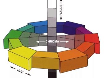
The next kind of color wheel is very interesting because it stops being flat. Albert Munsell's colorimetric system is a careful experiment by a scientist who studied human color perception.
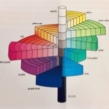
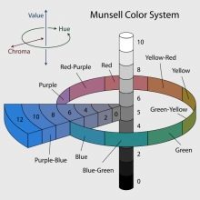
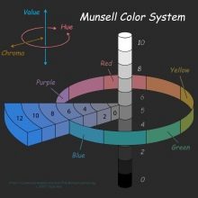
For Munsell, the color appeared in the form of 3 numbers:
- tone (hue, hue),
- value (lightness, brightness, value, brightness),
- chromium (chroma, saturation, chroma, saturation).
These three coordinates in space allow us to determine the shade of a person's skin or hair, compare the color of the soil, are used in forensic medicine, and even determine the tone of beer in brewers.
And most importantly, it is the HSB (hue, saturation, brightness) model that designers and computer artists use.
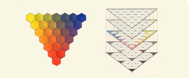
But Tobias Meyer decided to abandon the idea of a circle. He saw the color spectrum as triangles. Vertices are base colors (red, yellow, and blue). All other cells are the result of mixing from color to color. Having created many triangles with different brightness, he arranged them from the brightest to the lightest, faded, one above the other.The illusion of three-dimensional space was created, which is still used today.
Trying to facilitate attempts to harmoniously combine colors, artists, colorists, psychologists have developed compatibility tables. It is in this connection that the name of Max Luscher is so popular.... Even ordinary schoolchildren are familiar with this name thanks to the method of color psychodiagnostics. But this does not belittle, but, on the contrary, elevates the result of the work of the Swedish psychologist: the ease of use of the table makes it unique.
By downloading it to your smartphone and using it when shopping, you can buy things that are very harmoniously suitable for each other.
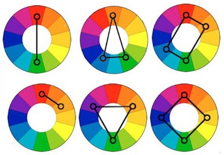
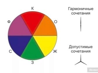
There are other types of color wheels, theories, and techniques. There will certainly be differences in them, but the general rules of color combination will still remain. Let's briefly summarize them. So, in the color wheel, colors can be combined as follows.
- Monochrome - a kind of stretching of light from light to dark, shades of the same color.
- Contrast (complementary, optional)... Colors located opposite each other will certainly be contrasting, but not always complementary.
- Adjacent: 2-3 colors in close proximity to each other.
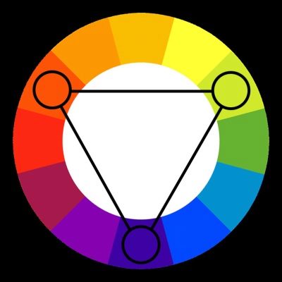
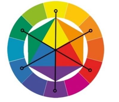
- According to the principle of the classical triad - a triangle equally widened from the center point on all three sides.
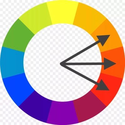
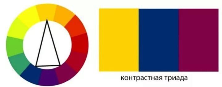
- Contrasting triad - a triangle with an elongated acute angle due to the fact that 2 colors out of 3 are close to each other.
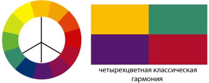
- According to the principle of the four-color classics: an equilateral triangle is complemented by an intermediate color that is contrasting with one of the vertices.
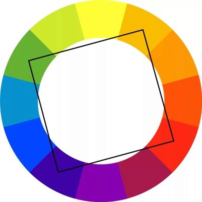
- By the principle of a squarethat fits into a circle. In this case, experts advise using one color as the main one, the rest as accents.
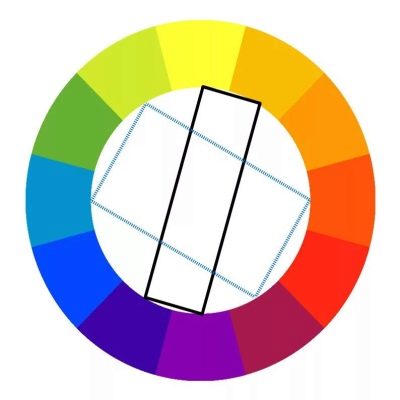
- In a rectangular pattern, in which it is very important to maintain a balance between primary and accent colors.
- Equilateral hexagon - complex harmony, which is not even accessible to every specialist. To recreate it, you need to be very sensitive to color nuances.
Black and white colors are aids for adding tone, brightness, saturation.
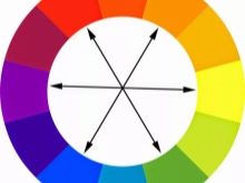
Complementary colors
When mixing any two opposite complementary colors in the same proportions, a neutral gray tone will not be obtained if the color wheel is created according to the principle of primary colors in the RYB system (red - yellow - blue). When the RGB (red - green - blue) model is used, then we can talk about complementary colors. They have two conflicting effects:
- mutual weakening, destruction;
- increasing the brightness of the antipode.
By the way, gray, like white and black, is called achromic. They are not included in any of the color wheels. According to Itten's model, the opposite are:
- Red Green,
- red-orange - blue-green,
- orange - blue,
- yellow-orange - blue-violet,
- yellow - purple,
- yellow-green - red-violet.
If you analyze these pairs, you will find that they are always ternary. For example, the pair "orange - blue" is "blue + yellow + red". And if you mix these three tones in equal proportions, you get gray. Same as mixing blue and orange. Such a mixture is not only the contrast of the indicated shades, but also the contrast of light and dark, cold and warm.
Any color, tone, shade has the opposite. And this greatly expands the capabilities of an artist, fashion designer, designer, make-up artist, decorator. For example, to remove the protest purple color scheme from the scalp, the hairdresser needs to choose a yellow, wheat shade. With the right fit, the hair will turn gray-brown. This method is called the neutralization effect.
But if the notorious green and red are placed side by side (for example, in the same picture), then they will become brighter, will emphasize each other.
Additional tones are not suitable for everyone: this is a sign of dynamism, some kind of aggression, energy.They are designed to emphasize the relief of the figure, so rounded and low persons should not resort to such a color. You also need to be careful when decorating a small apartment with contrasts. It may be worth choosing a dominant and accent color.
But each color has shades with different levels of saturation. Therefore, contrasting colors, depending on the tone, will be perceived differently:
- bright colors, pastel and muted shades of one color scheme are called sharply contrasting;
- weakly contrasting are combinations between pastel, muted tones, monochromatic shades that are similar to each other in saturation.
How to use a circle?
Having become acquainted with a large number of methods, techniques, theories and methods, a natural question arises: how to use the color wheel in life? After all, it is not enough to choose a thing in a trend, you need it to be combined with other wardrobe items. But here a catch can be expected: either you have to carry out the selection of the ensemble immediately in order to guess with a touch, or take with you an already existing thing. And even looking at her, you can be wrong.
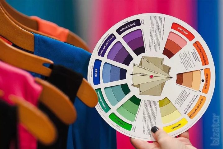
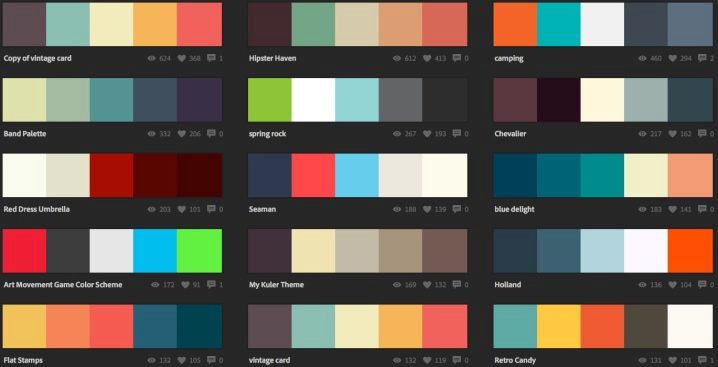
To prevent this from happening, we recommend using ready-made programs for the selection of shades for different schemes (monochrome, contrast, triad, tetrad, analogy, accent analogy). For example, Colorsheme copes with this perfectly.
If you have the Internet on your smartphone, you can pick up wardrobe items, furniture, accessories, decor items directly at the place of purchase.
If there is no Internet, then you need to photograph the desired combination of shades in advance and use it in the store.
Another option is to use professional examples of how this will work. For example, professional photographer Alex Romanuke manually creates palettes that he captures in photographs. Considering the plots they created, the color palette and description. This way you understand much better what should be the result of combining the intended tones and shades.
The next way is to decompose the photo you like into a color scheme using various applications, for example, Adobe Color CC... The application is very good at suggesting color nuances of the choice.
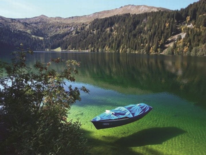
But many professionals advise: take color combinations from nature. If they are there, then they are natural. Works by photographers, artists and designers are also suitable. But here you should not forget that they work in different directions, and what is beautiful for them does not necessarily have to please you.
In addition, there are key color codes, which associatively pop up in a person's memory at the mention of an event. For example, remember the Stop warning signal - yes, it's red and white. New Year is a green tree and a red Santa Claus costume. The sea is an ivory gull and a blue wave. There are many examples, and most importantly, they are understandable. And they are understandable because they are stable. But for each season, new codes appear, which can really turn out to be interesting and go to the masses or just defile on the podium.
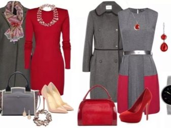
For example, here are a number of persistent codes with red that professionals know by heart:
- combination with black in various versions: the code of sexuality, seduction, mourning;
- red with gray: elegant casual for the city, sporty, modern with low contrast;
- combination with beige: sophisticated everyday life, femininity;
- red with blue: the typical sporty combination, casual wardrobe.
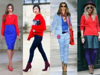


And here is the same red in the new trending codes:
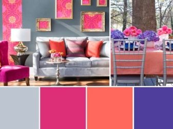
- in combination with pink (two bright colors that were not previously considered compatible): depending on the shades, they can be protest-contrasting or related;
- red with pastel shades (pearl white, silver, pale blue, pale pink, soft coral, lavender) is a bright accent in a calm range or equality of colors, which is used not only in clothes, but also in the interior, as well as when decorating any objects.


Another way is to balance the silhouette by using a neutral color with a warm and cold shade at the same time. To do this, use Itten's circle with a scheme of warm and cold tones. And if it is more or less clear with warm and cold ones from the scheme, then what colors are called neutral - it's worth understanding.
For each color type of a person, their own neutral shades are defined, but they have two subgroups:
- dark: black, khaki, gray, blue, burgundy;
- neutral: beige, nude, milky white, terracotta, brown, white.
Dark neutral and neutral colors are used to create uniforms (doctors, military, workers of various industries), everyday outfits, and fashionable looks.
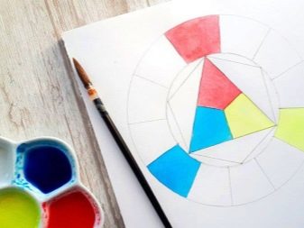
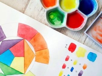
And another way to understand how to use the color wheel. It is suggested by the artist Tatyana Viktorova: take and draw Itten's circle. Then, from our own experience, it will become completely clear where each color comes from and what place it occupies in the circle.
To implement the idea you will need: watercolor paper, a brush, three colors of watercolor paint (yellow, blue and red), water, a base for a palette, a pair of compasses, a pencil with a ruler.
A true artist needs only three primary colors to create any shade. Let's try to prove this using Itten's model.
- On a watercolor sheet in A4 format, you need to redraw this circle using a pencil, compasses, ruler.
- We place the primary tones along the vertices of an equilateral triangle.
- The inner triangle tells you how to get the secondary ones: mix equal amounts of red and yellow and paint over the triangle, which is adjacent to these colors, with watercolors, orange. Then mix yellow and blue to get green, and blue + red to get purple.
- Paint over with orange, green and purple sectors of the circle, against which the sharp corners of equilateral triangles of the same colors abut. The secondary colors are now complete.
- Between the primary and secondary colors, there is a cell for the composite (tertiary) color scheme. It is obtained by mixing red + orange in the first case, yellow + orange in the second, yellow + green in the third. And so on all over the circle.
The circle is filled and you now have an understanding of how colors and tints are obtained. But since the quality of watercolors differs from manufacturers, they can be very different from the original circle. This shouldn't come as a surprise.
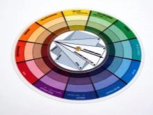
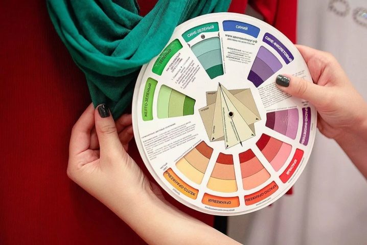
And if even such artistic exercises are difficult for you, then you can use the purchased color wheel to always know how to combine colors correctly.

See below for how to use the color wheel.


The comment was sent successfully.