The subtleties of using blue in the interior
The blue palette is considered dynamic, despite all its relaxing properties. It allows you to bring a light note of coolness and freshness to the interior of the house.
Description
The meaning of blue shades comes down to purity, trust, spirituality. Experts believe that the relaxing properties of this range of colors have a beneficial effect on the human psyche in moderation. It allows you to avoid stressful experiences, conflict situations. In addition, blue is an aristocratic, royal, noble color.
Designers recommend using cool tones of blue in rooms that face south, and in dimly lit rooms to give preference to warmer combinations.
Variety of shades
The sky blue palette is loved by designers. The color scheme allows you to create spacious compositions in which there is a lot of air, freshness, and non-triviality. With the help of blue-blue tones, you can visually adjust the room, make it larger. There are quite a few shades in the palette and the following options are considered the most popular in interior design:
- dirty blue - muted and status;
- cornflower blue - warmer and brighter;
- turquoise - rich, with hints of sea waves;
- icy - barely perceptible, cold;
- aquamarine - warm, with a green tint;
- azure - deep, bright, warm;
- heavenly - restrained, saturated;
- frosty sky - catchy and bright;
- the city sky is inexpressive, neutral;
- Twitter - darker than a frosty sky and calmer.

In addition, it should be borne in mind that all tones have variations in light and dark. Also popular are shades mixed with other similar colors, such as gray. The determining role in the choice of shade is played by the tasks that a person sets for the future composition:
- if it is necessary to increase the degree of serenity, then a choice should be made in favor of light colors;
- the mood is given by bright shades;
- tones of the appropriate temperature will help to cool the interior.
What colors can you combine with?
It is necessary to combine shades correctly. If it was decided to create a monochrome ensemble, then it combines all the shades within one palette, so the task is somewhat simplified. But here it is important to take into account the stylistic direction of the choice of tones. This solution works well for small apartments or studios.
A variety of shades of the same range will create a feeling of a complex and interesting design, optical illusions. The combination of tones of the same palette makes it possible to play with textures, shapes, matte and glossy surfaces, ornaments.
It is worth focusing on the emotional meaning of these duets:
- blue and white - freshness, spaciousness, cleanliness;
- with gold - aristocratic, noble luxury;
- with a gamut of beige - lightness, refined simplicity of Provence;
- with brown - vintage, noble retro;
- with greens - refined tenderness;
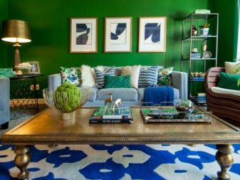
- with red - activity, sharp conceptuality;
- yellow-blue - happiness, cheerful laughter, sincerity;
- with gray - tact, endurance, status.
Blue is in harmony with many other shades, contrasting and close to it in the palette: orange, indigo, black, burgundy. Below are the most popular combinations in creating interior compositions.
With white
Snow-white shades always bring freshness, air and space to the ensemble.White blends perfectly with heavenly tones. Moreover, many style directions, for example, Mediterranean, Provence, marine, are based on just such a combination.
The bluish-white combination is appropriate for both living rooms and bedrooms, bathrooms, kitchens and hallways. This combination is perfect for a child's room. You can safely add bright details to the duet, but you should not overload the interior with them - a few paintings or pillows on the sofa are enough.
It is worth remembering that such a combination visually expands the space, therefore it is recommended when decorating small-sized rooms.
With sand
Turquoise, aquamarine and other juicy tones are ideally combined with beige and sandy tones. If you add milk, bronze or gold, then you can safely create an Empire design. You can also include mirrors, frames, luxurious chandeliers and sconces in the interior. Beige and sky colors are a classic combination that is great for any style. Stylists recommend taking sand, ivory or beige as a basis, and blue as an additional one - then almost anyone can act as an accent tone.
In these colors, you can safely decorate the living room, nursery, bedroom. Warm sand gamut will add warmth to the interior, balance the coolness of blue, make the room brighter, visually larger.
With gray
This is a very noble tandem, there is something aristocratic, restrained and elegant in it. The combination will definitely brighten a large room, create a relaxed atmosphere in it. In addition, this combination is excellently used in the creation of nautical interiors, Mediterranean. You can combine gray with both rich blue tones and muted ones. This duo is good in nurseries, living rooms and bedrooms, it is quite pacifying and creates a relaxed atmosphere.
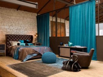
With brown
This is a very expressive combination, juicy, sophisticated and effective. The tones of chocolate and coffee coexist perfectly with the cold blue, allowing you to create a bright composition. In such shades, you can decorate the living room, kitchen, bedroom. They are ideal for decorating country houses.
If the tandem seems too contrasting, then you can try to muffle it with neutral shades.
With green
This duo will brighten up your living room, nursery or kitchen. Both shades are natural in nature and complement each other perfectly. If you give preference to restrained compositions, then you should combine blue with tones of pistachios, as they are more muted and elegant.
It is imperative to combine shades that are close in depth, for example, pale with pale, saturated with saturated.
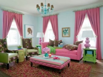
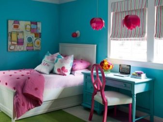
With pink
This solution is ideal for a nursery, it is also suitable for a bedroom, while the rose can be either cool or muted or bright. This combination will definitely not be boring and dull. Both of these shades are very expressive in pastel variations.
With orange
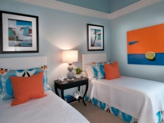
This solution is best used in a children's room or when decorating a kitchen. The calmness of the blue will perfectly balance the catchy orange details, and the orange, in turn, will add cheerfulness to the first.
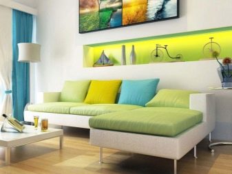
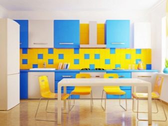
With yellow
These naturally contrasting tones coexist beautifully and complement each other. Blue softens the sunny brightness of yellow, the latter fills the blue with juiciness and light. This duo is very often used in the design of kitchens and living rooms. Designers recommend them for small spaces.
Application in decoration
When choosing a blue range as dominant or complementary, it is important to take into account the nuances of finishing the floor, ceiling and walls.
Floor
A blue floor in any design - tiles, porcelain stoneware, laminate, paint - is a very unusual solution. In addition, there are modern technologies, such as self-leveling floors, that allow you to create a luxurious effect. On a floor of this shade, a blue or gray carpet in the living room looks great.
There is another rather successful solution that can be performed in a blue tone - to cover the floor with carpet. This solution will look good in the interior of the bedroom, giving it coziness and comfort.
It is important when choosing a colored floor to find a matching skirting board on sale.
Walls
The walls, as a rule, are decorated in the dominant color, which decides everything in the composition. It should be borne in mind that it will expand the room, bring freshness into the space, but also lower the degree, making it colder. For this reason do not use this color in the decoration of the walls of rooms where there is little natural light.
Supermarkets offer a huge selection of materials for wall decoration. If you need to create a luxurious interior, then you need to choose heavy, textured wallpaper, fabric, decorative plaster. More restrained styles, for example, Provence or minimalism, perfectly emphasize modest paper wallpapers. Modern interiors look good against the backdrop of painted walls.
Ceiling
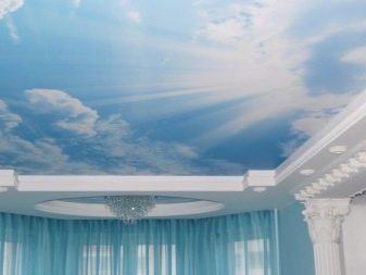
Decorating ceilings in color is a controversial solution, but quite relevant. Stretch colored ceilings are most often used. Light shades of blue are more practical in terms of durability. Brighter hues can go out of style too quickly.
A ceiling in this shade will create the illusion of a bright sky overhead. Expressive compositions of clouds, stars, birds, branches on a bluish background are often created. You can leave the ceiling plain if the room is small and not very bright. You should definitely choose a ceiling plinth to match the ceiling.
We use it as an accent
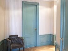
You should also think about furniture in these colors. The bluish sofa will be a great decoration for the living room, the bed in this color will add sophistication to the bedroom, curtains and tulle will complete the composition, adding light to the room. In addition, you can safely use a bluish palette when choosing a shade for doors - they will look very unusual and non-trivial in comparison with the tones of wood and just white doors.
You can safely include in the ensemble:
- blue armchairs - they will add aristocracy to the entire interior;
- poufs in the bedroom and living room;
- cabinet furniture, such as a kitchen set or furniture for a children's room.
In the kitchen, in addition to the headset, which can be made both in monochrome and in a combined version, an apron in the same palette or a dining group is also appropriate.
The living room will be decorated with curtains, curtains or tulle in bluish tones. Such window decoration looks fresh and unbroken, bright, but not defiant. In addition to window decoration, you can choose the following types of textiles in this range:
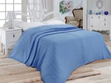
- bedspreads;
- capes, blankets;
- sofa cushions;
- tablecloths;
- chair covers;
- napkins.
These items can be made not only in a single-color version of the blue palette, but also contain a variety of patterns, prints, ornaments. The main thing is the selection of a pattern that best suits the chosen style: small flowers for Provence, tapestries and silk for classic and retro styles, pop art and geometry for modern trends. The decor allows you to dilute the overall composition, add lively notes to it, add dynamism and activity. If the entire room is in pastel shades, the risk of overloading it with details is minimal.
Bluish details will make the hallway brighter, the bathroom and toilet larger, cleaner and visually fresher. In the bedroom, you can create the effect of a boudoir, in the living room - luxury and nobility.
Suitable styles
Bluish shades are appropriate for both classic and modern interiors. Below are the main style directions in which such a range can be used in significant quantities.
- Classic. Here, dark shades of blue, as well as aged turquoise, can be considered most suitable. Ideally, these tones are combined with dark natural shades of wood.
- Retro style. Here it is best to turn to pale, faded tones in combination with pastels.
- Minimalistic. It is worth choosing cool shades, combining them with gray and whiteness.
- Loft. Blue tones are quite acceptable, especially if they are used to decorate an accent wall or ceiling.
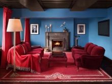
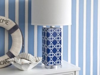
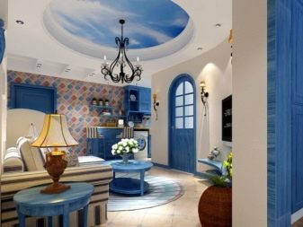
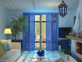
- Nautical. Here, all shades of blue and blue play a central role in tandem with red and white.
- Mediterranean style. More expressive colors are appropriate here, therefore, blue, red, yellow should be included in the composition. The presence of structured surfaces, prints, ornaments is important.
- Modern. There should be a lot of gloss, mirrors, metallic variations of blue will do.
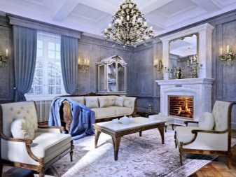
- Neoclassicism. The abundance of intricate furniture, solemn notes, spaciousness and rich ornaments go well with blue tones and dark furniture.
- Provence. Delicate and soft, combining all shades of pastels with bleached wood and floral motifs. Choose blue as an accent or complementary color.
- Shabby chic. Bluish tones will perfectly fit into the interior of a nursery, kitchen or bedroom. You can add a little pink, milk, or beige pastels.
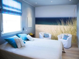
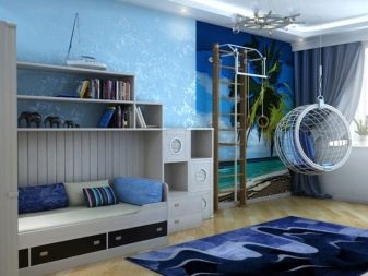
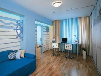
Interesting examples
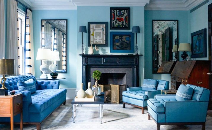
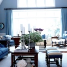
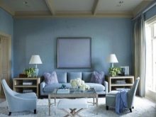
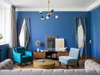
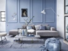
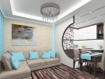
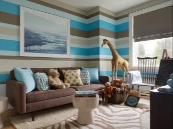
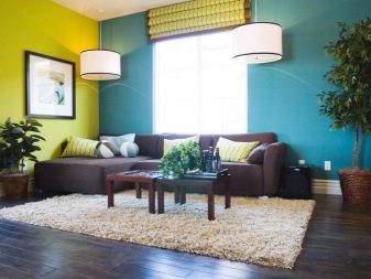
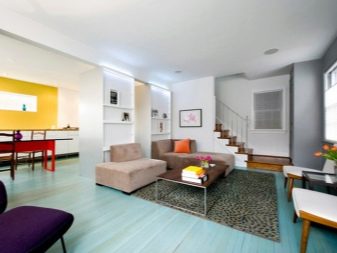
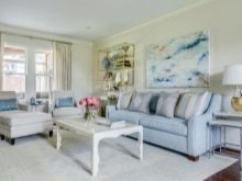
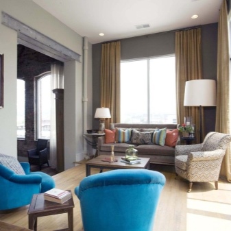
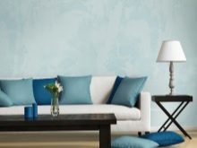
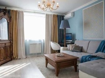
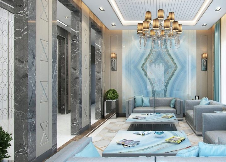
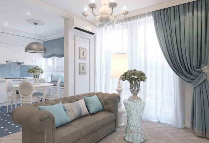
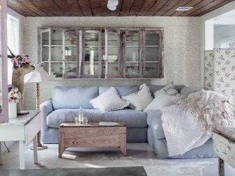
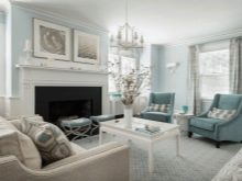
The living room is made in light blue colors, which gives the room sophistication and airiness.
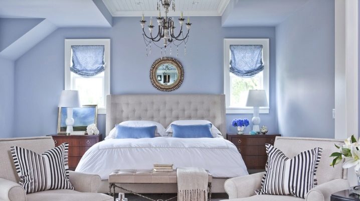
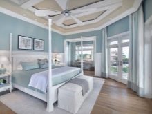
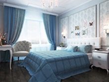
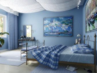
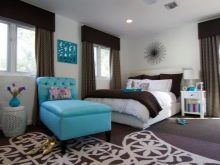
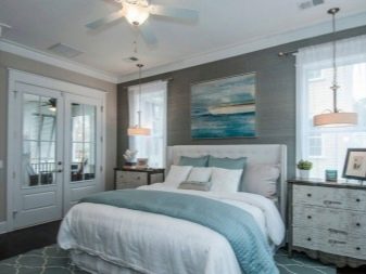
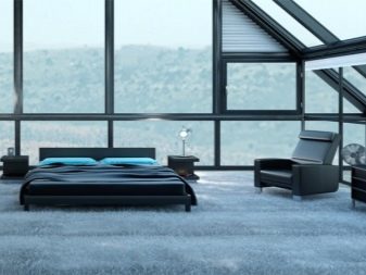
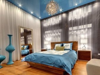
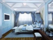
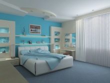
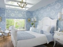
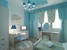
The bedroom emphasizes the tenderness of nature.
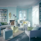
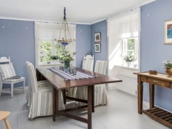
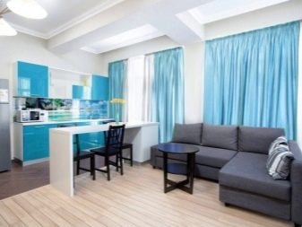
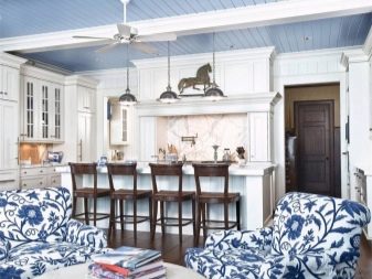
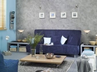
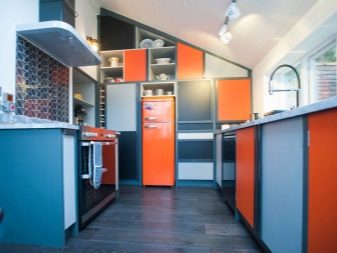
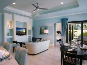
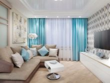
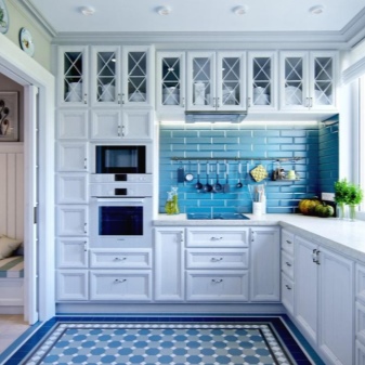
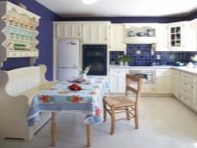
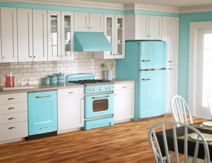
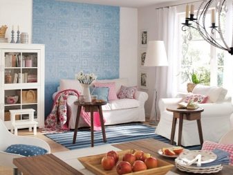
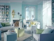
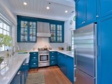
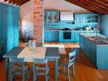
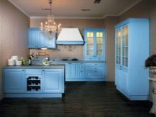
The kitchen is made in tandem of blue and gray colors. Such an ensemble looks beautiful and impressive.
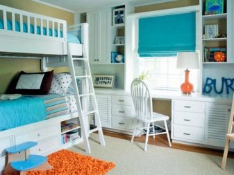
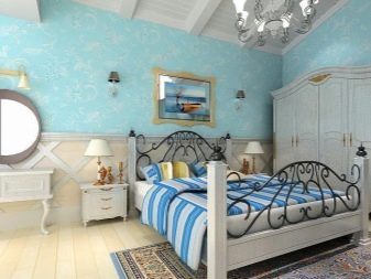
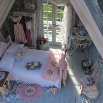
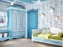
The nursery, made in the shabby chic style, ideally combines all the charm of the blue sky.
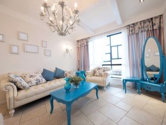
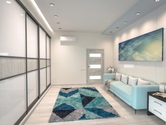
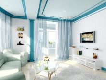
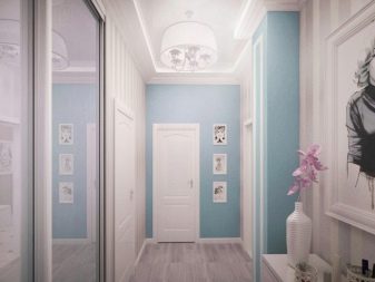
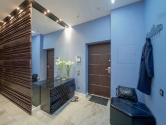
The hallway looks quite modern, while adding a little luxury and a state of tranquility.
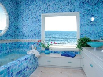
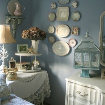
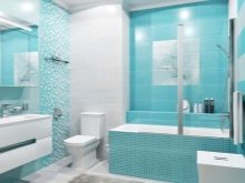
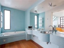
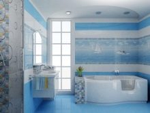
The bathroom is made in shades of gray and blue. She will give a state of calmness and tenderness.


The comment was sent successfully.