How can you use green in your interior?
When decorating an interior, the choice of colors is important. It is known that colors have the property of influencing the level of human comfort. There are soothing colors that give a feeling of comfort, and, conversely, shades that excite the nervous system or are associated with danger. Green is advised by many interior designers, because it's no secret that its shades add tranquility and are associated with nature. Also, green, due to the variety of shades, goes well with a huge number of other colors.
Influence on a person
Each color has its own meaning and has its own effect on a person. Green stands for nature and prosperity. Most striking of all, different shades of the same color have different effects on a person. Let's consider the main tones of green to choose the right option for your interior. They can be conditionally divided into 3 groups.
- Juicy green. The color of the leaves and fresh grass is associated with spring. It has a positive effect on the human psyche, is associated with calmness, helps to relax, cope with stress, gives a person a feeling of cheerfulness. Often this color is used in sanatoriums, hospitals and other medical institutions.
There is even a special color therapy that helps to get out of prolonged depression.
- Warm and light shades of green. They give a more relaxing effect than juicy green. These colors are recommended for decorating bedroom accessories such as lamps, pillows, bedding, etc.
- Dark green, closer to marsh. Scientists argue that swampy and dark shades of green are associated with decay, bring melancholy, lead to despondency. But this moment can be easily corrected by combining with other colors. You can also use more light (lamps or floor lamps) to make the darker shades of green warmer and more soothing.
Green symbolizes wealth and prosperity, it is also associated with happiness, willpower. Green is able to normalize blood pressure and positively affect the human nervous system. Such interior solutions are recommended for strong personalities, confidently going towards their goal.
Do not hope that the appearance of green in the interior will completely turn your life around. This color may have a small positive effect on your well-being and mood, but it is definitely suitable for creating a comfortable home.
Shades
If you start to disassemble all possible shades of the green palette, then you can go crazy - there are several hundred of them. Let's analyze only the basic tones and their features.
- Gray green. It tends to soothe, it is chosen for the decoration of living rooms and bedrooms.
- Blue-green. This shade is considered rather difficult and is often avoided, but with its help you can get a bold and contrasting interior solution. This color, in the right concentration, can give a unique flavor to your room.
- Yellow-green. The most common shade used in interiors. Life-affirming yellow-green is able to invigorate, in addition, it goes well with other tones.
- Light green or light green. The second most popular shade, it is most often used in the design of kitchens or bathrooms.
- Grass color. Juicy and invigorating green, it is not advised to use it in abundance in bedrooms. Able to give any interior a fresh and life-affirming look.
- Olive color. A warm shade that exudes calm and tranquility.
It is important to remember that cool tones are better suited for well-lit rooms on the sunny side, while warm ones, on the contrary. Many designers advise using at least two shades of the main color to give the interior freshness and originality.

What colors can you combine with?
The table of shades combined with this color is very diverse. You can always choose a shade of green that suits anyone, even the most eccentric color. Consider the classic combinations.
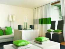
- White... This color tends to visually expand the space, but it needs to be diluted so that there is no association with the hospital ward. If you decide to use bright green colors in the interior, then white will ideally dilute the decor.
Thanks to him, bright green accents will stand out more, but at the same time they will look balanced and harmonious and not irritate the eyes.
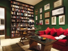
- Black... For many people, interiors in black and green may seem gloomy, however, despite the fact that these tones contradict each other in meaning, they are perfectly combined. To get rid of the severity of dark shades, you can dilute them with white or brighten the room with wall lamps, floor lamps, sconces, etc. Using dark gray or light gray shades, which also work well with green, can also help.
This combination is best suited for bedrooms or living rooms.

- Beige... This combination looks best with the dominant beige and light interior accents of green. This design promotes relaxation and helps to cope with stress.

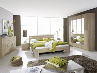
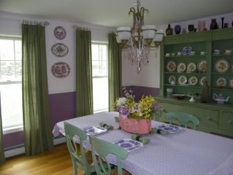
- Brown... This combination is associated with trees. Also, green can be combined with real wood (in private wooden houses or with wooden furniture in apartments). This combination can be described in one word - comfort.
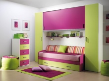
- Yellow... These colors match each other like no others. This color scheme is perfect for children's rooms or kitchens.
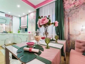
- Pink... An interesting interior solution in which the balance of colors is very important. It is better to choose more delicate shades of pink.
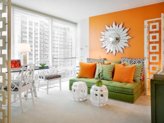
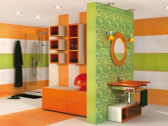
- Orange... This combination is usually chosen by young and eccentric people.
- Blue... When using blue, it is also best to use details of beige, gray or white to dilute and balance the interior. Instead of blue, blue (as an accent, not the main solution) or lilac can also go.
With the right use of such accents, you can give the room originality and style.
- Red... Designers often avoid this combination and are considered aggressive. But, for example, interiors decorated in some modern styles can afford such contrasting transitions. For other styles, it is better to minimize the presence of one of these tones, which will give the interior a dynamism without oppression.
For example, in an interior with a dominant light green, you can use burgundy curtains or pillows.
- Purple... Purple accents are suitable for Provence style, they add a special romance to the interior.
Finishing options for different rooms
Green can be used as the main decoration (wallpaper, ceiling or floor covering) or in the form of accents (curtains, accessories, pillows and a bedspread on a sofa, chair or bed).
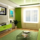
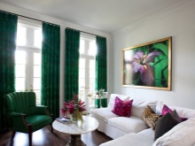
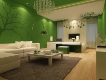
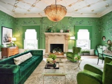
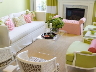
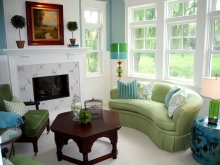
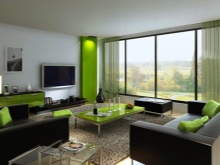
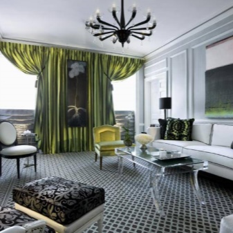
- Living room... An area dedicated to rest, socializing or work. Green is able to fit into any interior, the main thing is to remember the basic rule: the smaller the room, the lighter shades you need to choose.
Combining with white will help to visually expand a small living room.Bright color accents and green dominance are best used in spacious living rooms.
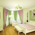
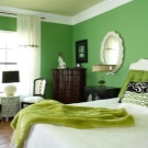
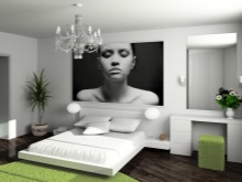
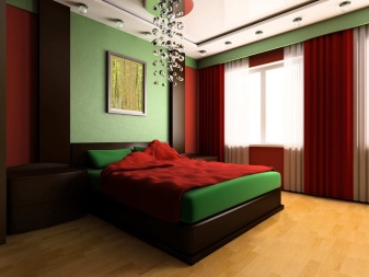
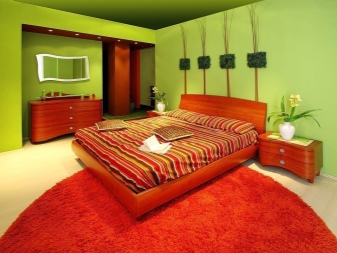
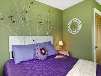
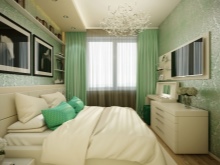
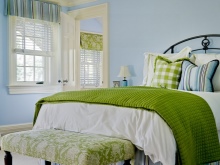
- Bedroom... To decorate the bedroom, you need to choose only mixed and light shades, if it concerns walls or wallpaper. Wallpaper can be taken with a pattern or one of the walls can be painted mint or olive. If your bedroom is decorated in light shades, then you can use more luscious elements as accents, for example, a vase, bedding, etc. A bright dominant color can interfere with relaxation.
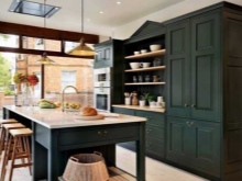
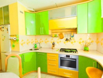
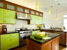
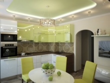
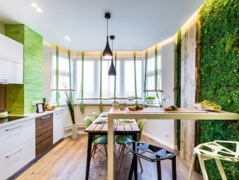
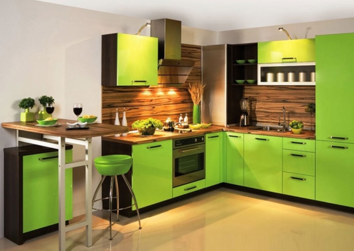
- Kitchen... Green is the most popular color in kitchens, you can use any bright shades here. Lighter olive tones are suitable for Provence style and will fill the kitchen with home comfort. You can use wooden furniture and combine the base color with white and brown shades.
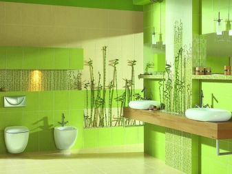
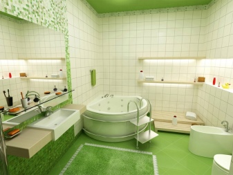
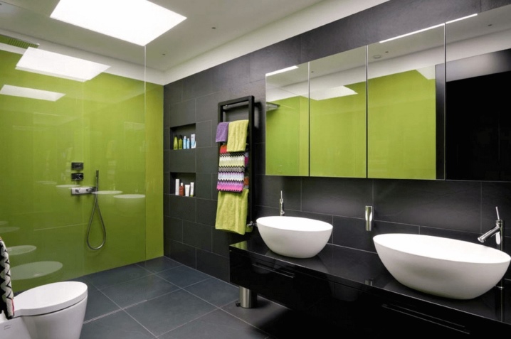
- Bathroom... Bathrooms are usually not large in size, so only light and delicate shades should be chosen for interior decoration.
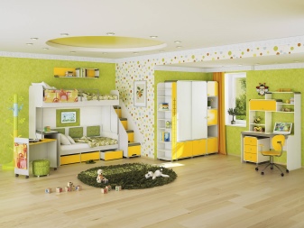
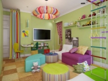
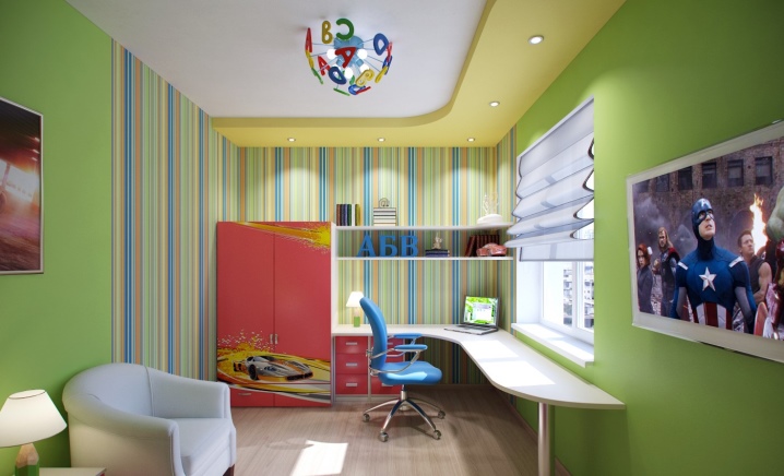
- Children... Green is perfect for children's rooms. It is said to encourage children to be active and explore the world. As shades for the combination, you can choose a light yellow, orange or even red tone.
Suitable styles
Designers recommend using green in many stylistic directions. Let's consider the most popular ones.
- Art Deco... Style implies richness and richness of colors. The name of the trend translates literally as "decorative art" and implies bold mixes of different cultures (Egyptian, Indian, etc.) with modern or classical solutions.
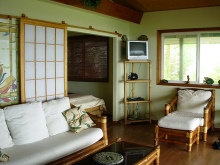
- Tropical and eco-style. They simply imply the use of luscious green hues. Wall murals with bright patterns are perfect for such styles.
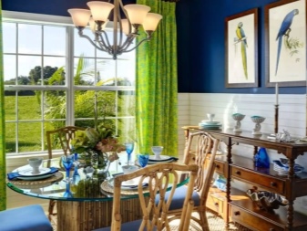
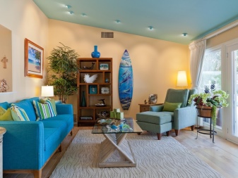
- Marine design. Implies the use of a combination of shades of green-blue, turquoise and aqua.
- Classic... In a classic style, it is worth using deep and dark shades, but it is important not to overdo it with the presence of one color. The dominant colors in the classics are white and beige.
- Modern... This trend is characterized by modern solutions in the style of minimalism, bright contrasts, but not too flashy, dark and light color tones.
There are a lot of interior styles today. You can strictly adhere to the chosen direction or combine them with each other to get the interior design that is closest to you.
Interesting examples in the interior
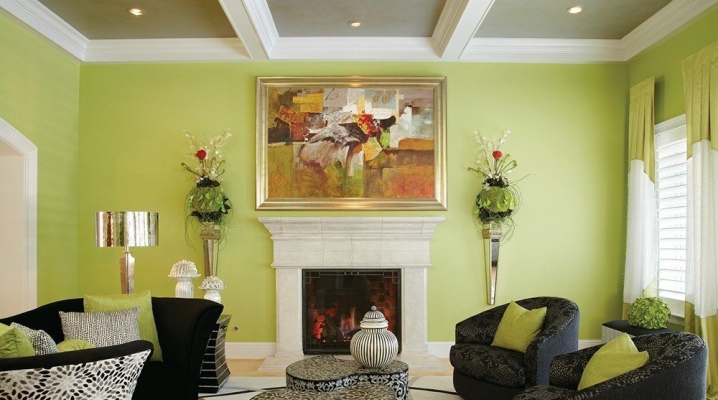
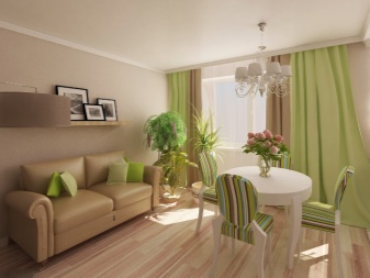
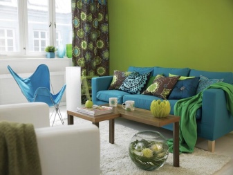
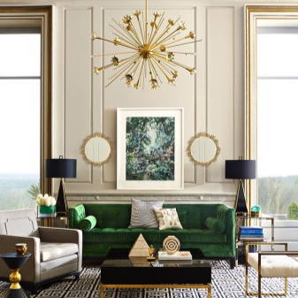
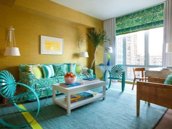
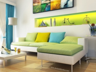
A variant of the living room interior in bright, juicy green colors combined with brown furniture and white elements.
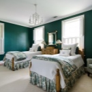
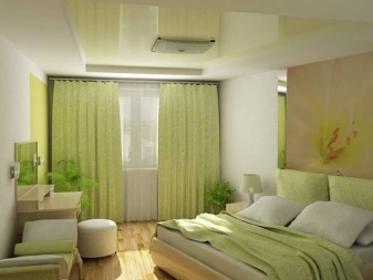
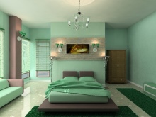
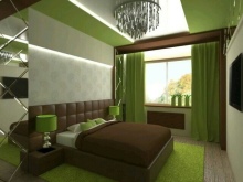
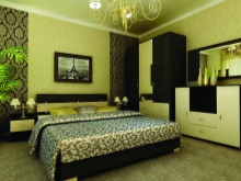
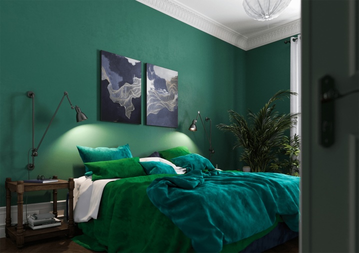
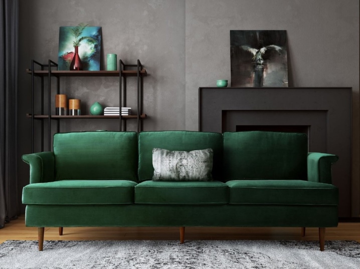
An example of a very sophisticated bedroom done in dark greens with a navy shade.
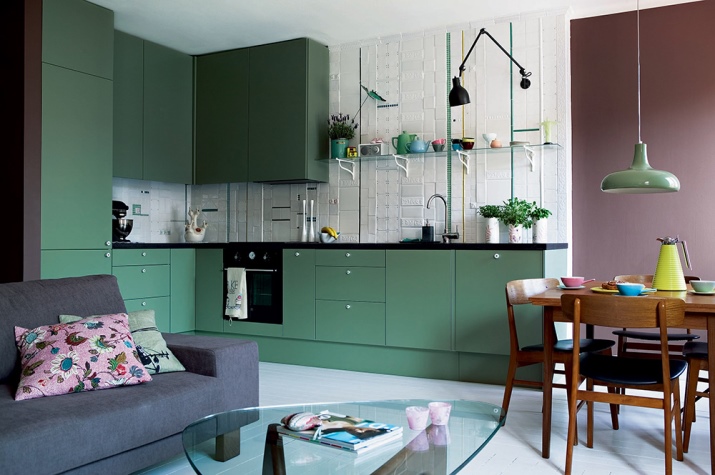
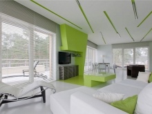
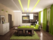
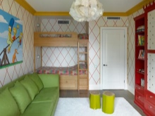
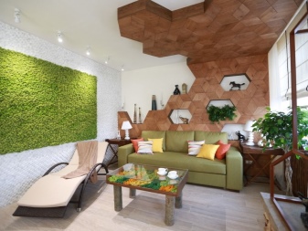
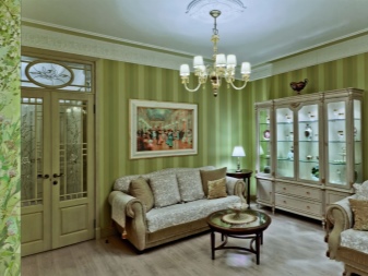
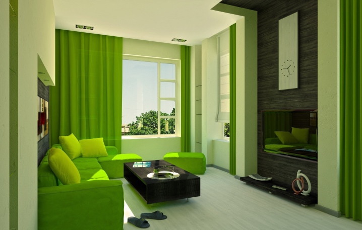
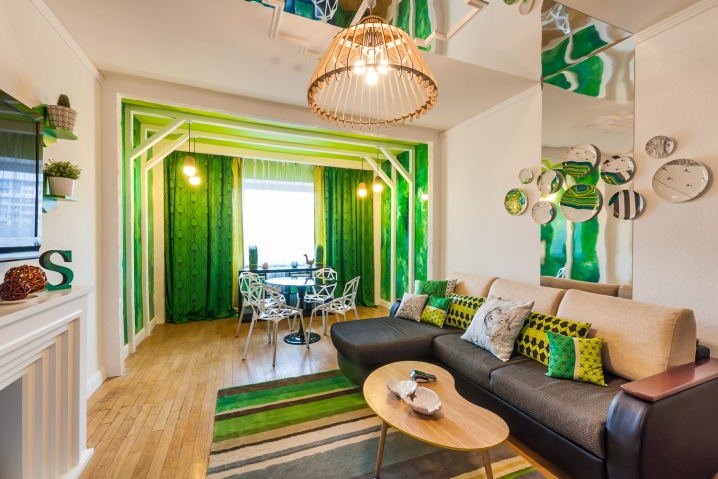
A variant of the interior of a studio apartment, where different shades of green are harmoniously combined.
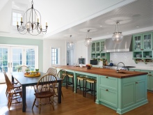
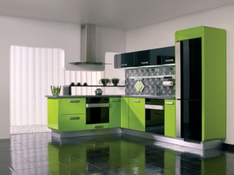
Bright kitchen design with a combination of white and brown tones.
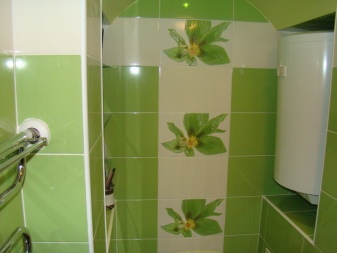
An example of a combination of black and green in the interior of a shower room.
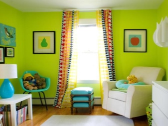
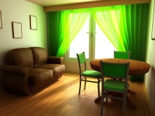
Children's room with bright accents and a combination of red, blue and orange with green.
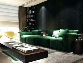
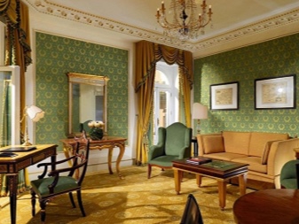
A great example of a living room decorated in dark colors using grays, blacks and dark greens.


The comment was sent successfully.