Gray color in the interior: pros and cons, combination with other tones
Gray is perceived by most people without any enthusiasm - few can say that its shades are among their favorites. However, modern interior design presupposes the most unexpected solutions and combinations, therefore, a relatively untwisted gray, which for a long time was considered a sign of hopelessness or tastelessness, today can help to stand out for the better.
Moreover, having mastered all the subtleties of color, a good designer is able to squeeze the maximum out of nondescript tones and turn an apartment into a dream.

Peculiarities
Although for many people the gray scale is not associated with anything good, in fact, in many situations it is the most correct solution. We usually choose our favorite color, focusing on a good mood (and sometimes on a desire to be sad), but the unobtrusive gray tones of the light part of the scale often do not evoke any emotions at all, allowing you to focus on the essence.
Those who will appreciate such an interior at its true worth are people for whom it is important to think soberly.
It is not for nothing that many office premises prefer a gray finish - there is nothing to distract from work and there are no details pushing for harsh decisions. Contrary to popular belief, gray colors do not necessarily evoke melancholy - if a shade close to white is chosen, or a reasonable combination with more catchy tones is sustained, they, on the contrary, can be associated with friendliness and soothe.


Gray is always conservative, it may not seem festive, but it is never perceived as frivolous., therefore, in the overwhelming majority of cases, its use is appropriate. At the same time, being exactly in the middle between the universal black and white, it is also universal, that is, it goes well with almost any shades of the visible spectrum.
The modern world stands out with flashy colors, but against the background of such brightness, which is not always appropriate, some styles have even appeared that fundamentally abandon bright colors in favor of a gray palette. These include, for example, loft, diligently playing up to the asceticism of the premises, converted from production to residential.
Another in-demand direction is high tech, which puts the maximum emphasis on the practicality of the content, and not on its shell, and it is in the absence of unnecessary details that the charm of this design lies. Something in between the previous two is urban style.

An abundance of gray or an incorrectly chosen shade is still capable of evoking melancholy, especially if the same grayness outside the window is still due to the not very pleasant local climate. With this combination, the feeling of fatigue can be aggravated, therefore, sometimes you should carefully think over the amount of gray in the design of a particular room.
In addition, a sufficient amount of natural light is an almost indispensable detail, since the gray design is good for the smallest overflows of its shades, but it is impossible to see this with a lack of lighting.
Shades
The average gray tone is located exactly in the middle between black and white, but this proportion can be varied, due to which the resulting shade can become darker or lighter.
This range is called achromatic gray tones and usually does not cause much positive. Another thing is that there are also chromatic gray colors. The latter include the same gray color, only slightly diluted with more cheerful tones of the entire available palette. By this logic, almost any strongly muted color can be called gray, which can be said to be a gray tone with a certain sheen.
It is impossible to count the exact number of gray tones, but it is safe to say that there are much more than fifty of them - the name of this famous work is misleading to many. Even the classic electronic palette counts as many as 256 gray tones, and even then these are only achromatic... There are much more chromatic colors - with modern computers that can detect the slightest color difference, today's designers are constantly coming up with new shades.

Some shades of gray have been tested for several centuries of use, are widely used in the same tailoring of business suits, and even have very noble names, for example, "London fog". In general, the choice of a name for each tone usually depends on what it is associated with to the greatest extent, therefore such gray colors as graphite, silver, mouse, lead and many others have become widely known.

What colors does it match?
Belonging to a cohort of neutral and universal colors makes gray a great service - its combination with any other colors in the interior is always appropriate, this does not even require any special compatibility tables. In this case, of course, it should be understood that this is not quite the tone that should be too much, which means that there are certain rules for its use in interior design.
You can experiment as you please, but it probably doesn't hurt to be guided by general principles.
Dark tones
Gray and brown in many respects are close, therefore it is not surprising that with the right shades of both, the combination should turn out to be successful. Brown does not disturb the calmness of the gray setting, but makes it a little warmer, recalling traditional wood shades - it is in the form of wooden furniture that it is often present in the interior.
If the owner of the room considers himself to be a supporter of strict styles, then he may like such a solution, but in general, for most people, this combination causes a little boredom. The difficulty of diluting such a palette is that both of these colors are neutral, and it is impossible to add a third color to them in the form of a bright accent - it will clearly fall out of the general picture.
For this reason, the accent is usually chosen in subtle, muted shades of bright colors.


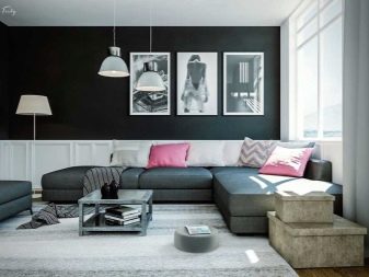
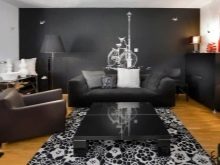
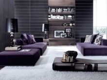
It should be considered a great rarity combination of gray and black, since both of these colors are associated with not the best mood and can drive you into depression. But even in this case, everything depends only on how well the designer knows how to select shades - if they are in harmony correctly, a holistic interior is obtained, which symbolizes order and concentration.
Of course, you need to experiment with it very carefully. At the very least, it is inappropriate in a cramped room, where there is still not enough lighting, because under such conditions longing for those present will reach sooner or later. But in such a palette, any bright accents that are combined with black look very holistic, and against the general background they seem especially attractive and fresh.
Light shades
Among all the combinations of gray with light tones, perhaps the most popular was duet with beige - in the English language even appeared the term "gray", which already indicates the prevalence of such a phenomenon. This is one of the most comfortable combinations with the participation of gray, therefore this option is in great demand not only in living rooms, but even in bedrooms.
There are no color restrictions for beige elements - they can be either pastel or as deeply saturated as possible. At the same time, the eye has nothing to catch on to in the absence of bright spots, therefore this problem is often leveled due to texture or textile finishing.
As an antidote to boredom, one of the following colors (as the third) can be used: brown, yellow, green, black.


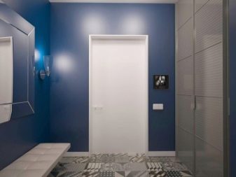
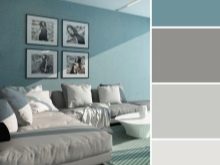
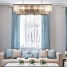
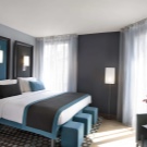
The combination of gray with blue or turquoise harmonizes very well, it resembles a marine palette, and is also steadily associated with a masculine character - there is no longer a boyish pure blue, the tone becomes more severe. A definite drawback is precisely this severity - sometimes it seems excessive, but it can be softened by small ornaments or lighter shades of turquoise.
In general, such an interior gives the impression of a certain vintage and is a version of the classics. To make the perception of the room more "warm", accessories of emphasized bright colors are often used.
For some reason, it is generally accepted that combination of gray and white - this is extremely boring, but in fact it is, of course, not true. You need to understand that white, like gray, can have a certain chromaticity, say, be slightly lilac or barely perceptible purple. Even without such notes of "extraneous" colors, the emphasized milky white color looks good against the background of soft and natural gray - it dispels the overall gloom and "calms" the atmosphere.
In such an environment, it is very comfortable to relax, which has long been appreciated by interior designers - no wonder this design is included in the top ranges for the bedroom. In addition, a gray-and-white kitchen or bathroom is also quite common.
When choosing in favor of a gray-white combination, it is with the help of shades of gray that they determine how the surrounding space will be perceived. If the room seems too large, it is wise to choose darker gray options to emphasize the limited space, but if the situation is slightly cramped, on the contrary, it is better not to interfere with the light reflecting endlessly.
Bright colours
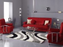
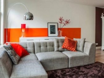
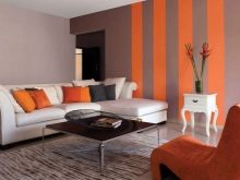
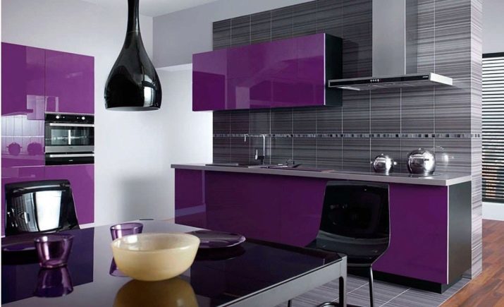
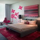
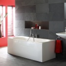
One of the most popular and catchy solutions is combination of gray with red - they are perfect because one is a good background, and the other is extremely good as an accent.
It is important to note here that a certain coldness of gray usually outweighs the warmth of red, therefore this combination is relatively rare in rooms such as a nursery, study, bedroom or kitchen - the lack of comfort usually cannot be compensated for by high aesthetics.
Most often, this duet can be seen in living rooms, it is also used in bathrooms.
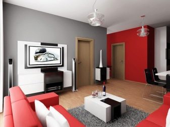


It is generally accepted that these two do not do very well without the third tone - the cool range needs to be slightly diluted. If there is no shortage in the light, you can pay attention to brown or yellow accessories, dark green also looks curious.
To improve coziness, good options seem to be cream, beige and ivory, especially if the furnishings are complemented by wooden furniture and parquet in light natural shades. As bright accents for a gray-red background, you can use strokes of turquoise or blue, only they should not be present in a single copy.
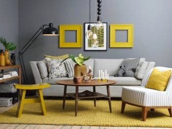


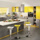
The combination of gray with yellow is surprising in its contradiction - it differs neither in the calmness of the first, nor in the sunshine of the second. Even a dull yellow against an expressionless gray background will rivet attention, therefore, in this case, experts advise to dilute the range with matte black or green.
In general, the gray-yellow duo looks good not only in living rooms, but also in dining rooms, bedrooms and offices, provided that there is no shortage of free space or lighting.

Bright blue in combination with gray looks curious - the two colors are generally quite close, therefore they harmonize well, at the same time the gray background perfectly sets off the depth of the blue. Moreover, such a solution in itself is very cold, it is appropriate to use it only in those rooms where there is never a shortage of natural lighting.
To dispel the emphatically cold atmosphere, it would also be wise to pay more attention to bright accessories in warm colors, whose role should not seem so secondary.
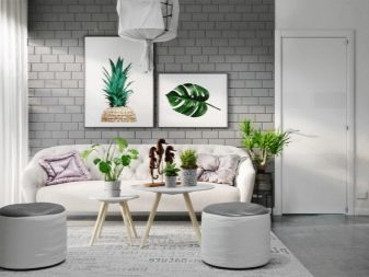
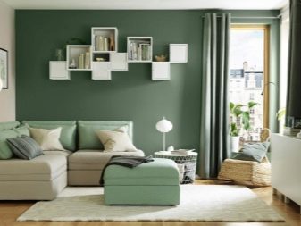
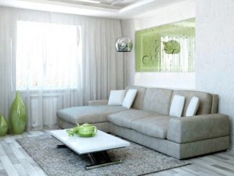
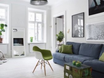
In small rooms, the combination looks very worthy gray with green. The main space here will probably be occupied by light gray, since it has the same properties as white - to visually increase the space, fill it with light.
Green is usually given relatively little attention, but in the form of well-placed accents, it will turn out to be a chic option, since it also contributes to the visual increase in the room, and most importantly, it introduces a much-needed element of cheerfulness.
A big plus of green is that its share in the interior is not necessarily limited to decoration or furniture. - so, it may well be represented by indoor plants. The maximum brightness, by the way, is also not important - if there is already a lot of space, and there is definitely no need to increase it, you can focus on slightly muted tones like pearl.
If there are not enough two tones in the room palette, you should add bright black elements or emphasized yellow accents.
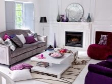
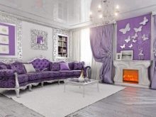
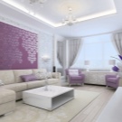
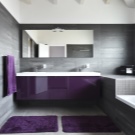
The combination of gray with pink or purple (or it is possible with both at once) is so far rare, but this is just its trump card - this is another chance to stand out from the boring tastes of the majority. Contrary to possible skepticism, the solution looks decent - even deep purple, which is not liked for some depression, loses its gloom and is perceived as more positive.
With a combination of gray and pink, a certain girlish naivety is lost, as a result, the room remains sensual, but without obvious excesses towards childhood. Moreover, in both cases, it makes sense to add texture design. From additional accents, catchy green and relatively calm white details seem to be good solutions.
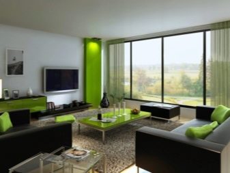
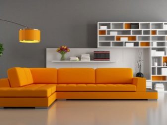
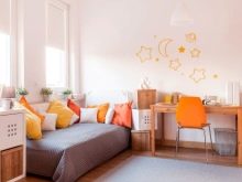
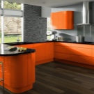
In combination with gray, bright orange takes on new life. Separately, it is usually not used in interior design - despite all its cheerfulness, in large quantities it somehow gets boring too quickly. But, being shaded with a gray background, it suddenly becomes that life-affirming ray of warmth and sun, which is so necessary for the room and from boring turns it into a holistic and tastefully decorated.
Most often, an orange accent is made on furniture, for example, a sofa, which can be of any, even the most flashy tone - from carrot to orange. For obvious reasons, this combination seems most appropriate either in the living room or in the nursery.

Subtleties of room decoration
With all the advantages of gray, it still has its own specifics - few other tones are as dependent on the correctness of the chosen shade and combination with the rest of the palette. Despite the fact that grays are considered universal and can be used literally anywhere, nevertheless, you should think over the design and clearly imagine its finished form even before implementation.
For example, for the kitchen, this seems to be a good solution, after all, home appliances are usually produced in a gray version, but we must not forget that the created atmosphere puts pressure on the psyche and it will be very sad if a piece does not go down the throat simply because the room is tastelessly decorated.
Therefore, in the kitchen, the presence of bright, cheerful colors, such as olive, orange or yellow, as well as more modest, but positive white and beige, is essential.
By the way, accents can be marked without finishing - furniture, tablecloth or even dishes can stand out.
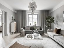
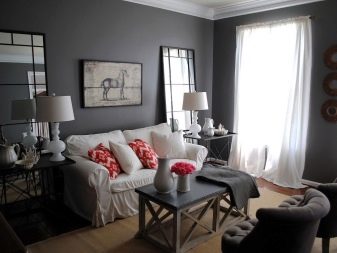
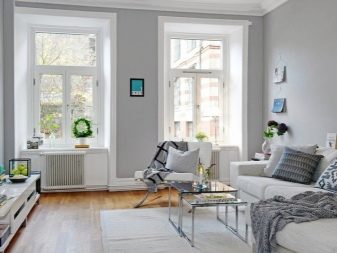
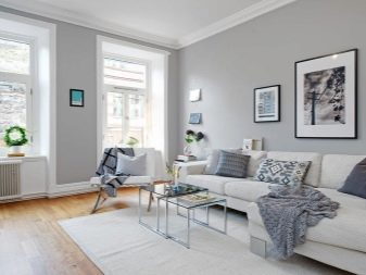
In the living room, the gray color is in demand, since the neutrality of this shade allows you to provide the proper charm, emphasized the aesthetics of this part of the apartment. At the same time, in pursuit of fashionable styles that actively exploit the gray color scheme, one must not forget that it is here, in the living room, that it is customary to relax cheerfully and enthusiastically, and dullness depressing on the subconscious and not very conducive to this.
This is not a reason to abandon gray tones in the design of the living room at all, because such a solution may be optimal as a background, but do not get carried away with this tone in everything.
Combined with orange, blue, green, lilac, or light blue, a gray wall finish will look better. You can use literally anything as a bright accent - for example, a sofa or curtains.
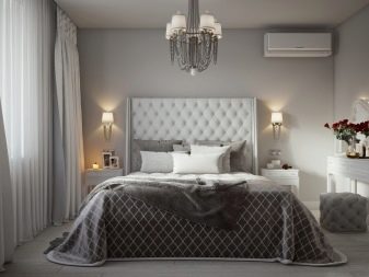
For the bedroom, gray tones that represent the lighter part of the palette and do not create an oppressive impression - definitely one of the best solutions, because this universal color is very neutral and calm, it should not interfere with rest.
However, we are still not in prison with its asceticism, therefore, you can and even need to add third-party notes: so, adding pink and white accessories will make the room more delicate, but for a feeling of warmth and coziness, it will be useful to leave space in the design for beige or brown inserts.
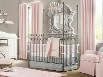
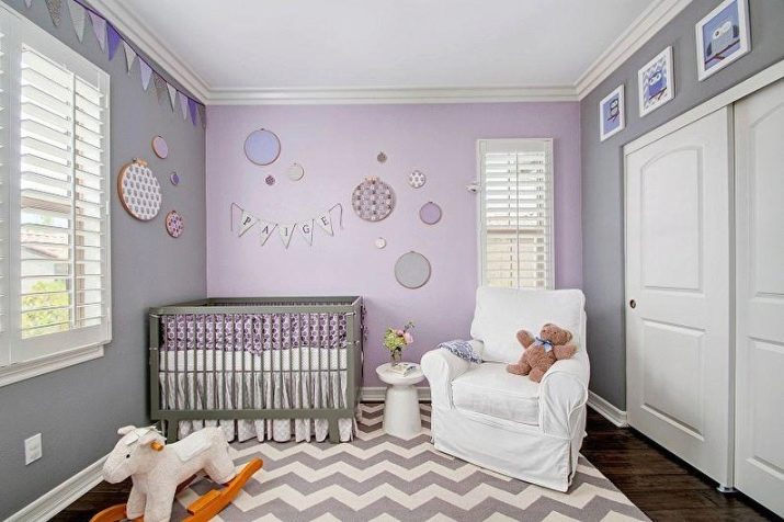
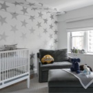
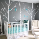
For many it might come as a surprise but even in a nursery, gray design is often the best of all possible options. The advantage of this solution lies precisely in the fact that this color is not only universal, but also even less striking than white or black. As he grows and matures, the child repeatedly changes his tastes - in the first years of life he does not need too much brightness, otherwise he will not fall asleep, then a mad fascination with the brightest tones sets in, and in adolescence he again does not accept too bright things.
Parents who consider themselves to be supporters of high-quality and durable repairs "for centuries" act simply in such situations: they decorate the walls and ceiling with neutral, "invisible" gray, and over the years they only change the "stuffing" of the nursery. Accessories, of course, at a certain stage should take on the maximum load in terms of ensuring the color scheme, but then it will be easier to replace them than to make a full renovation of the premises.
The only criterion for choosing the color of the details is that they should be light.
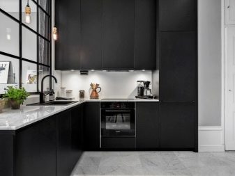
As for the bathroom, its color scheme usually does not highlight any special requirements. - purely theoretically, you can arrange a bathroom exclusively in gray (or silver) shades. Another thing is that here you have to be naked, and in the "cold" atmosphere of grayness, sometimes it is subconsciously scary to go into the water, even if you know that it is hot.
In this context, there is a reason to add cheerful light tones to the palette - for example, the same red or orange. In general, blue is still a very popular solution for bathrooms, but in combination with gray it can have the opposite effect, further "cooling" the room.
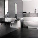
At the same time, it is important not only to reasonably think over the color combinations, but also not to forget about the selection of worthy accessories. For example, wood looks equally good with all tones, and gray is by no means an exception; from other relevant materials, neutral chrome iron, plastic and glass should be highlighted.
Silver also fits perfectly into the gray scale, which discreetly emphasizes the possible aristocracy of the interior in question. In addition, unless your goal is to comply with one of the modern styles, it is important to provide a large amount of textiles - he, even being in gray tones, still somewhat dilutes the possible oppressive impression from the interior.

Also don't forget that dark shades reduce space, and light shades increase. Having made a choice in favor of gray, it does not always make sense to look for a certain better shade - experienced decorators can play with several at once within the same room, achieving amazing results. At the same time, it is highly undesirable to use gray in rooms of any purpose, where there is a lack of light of any type, be it natural or artificial.
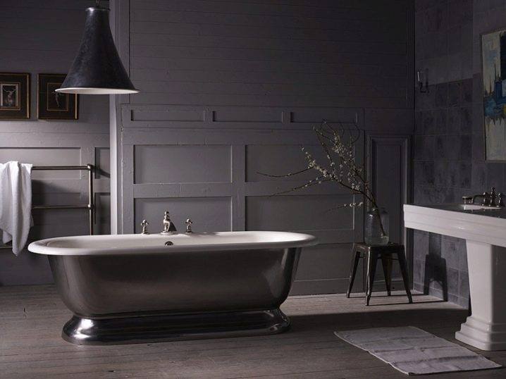
Beautiful examples
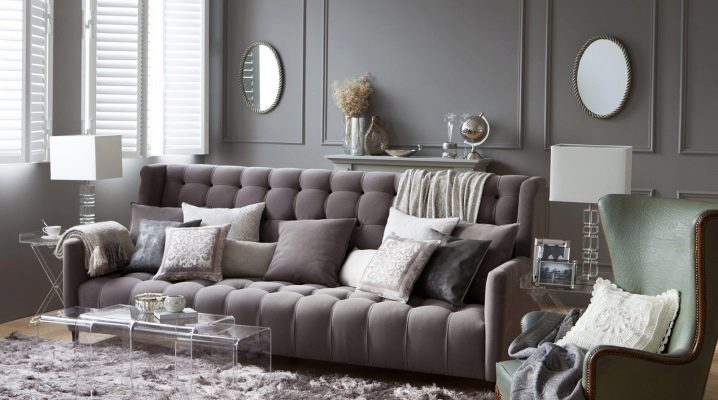
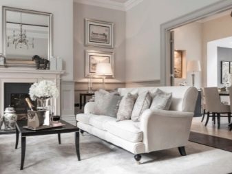
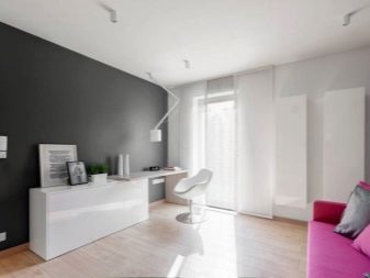
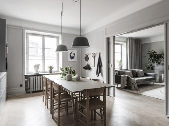
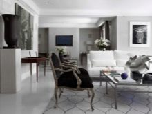
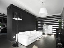
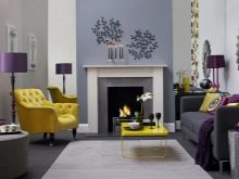
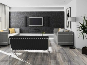
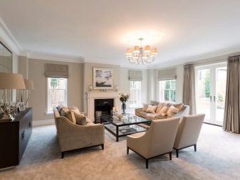
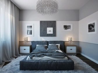
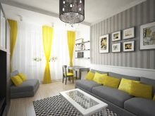
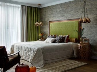
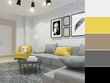
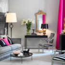
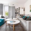
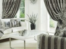
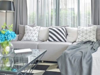
The first photo clearly shows how even minor blotches of bright colors can dilute the grayness and make the gray tone just a good background for a stylish living room. It does not seem ideal for unbridled fun, but there is no despondency in its design either - this is a comfortable place for a family vacation.
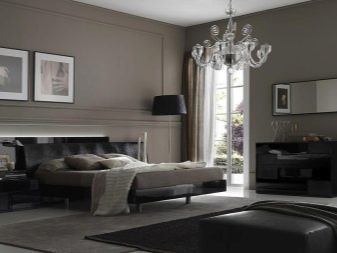
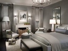
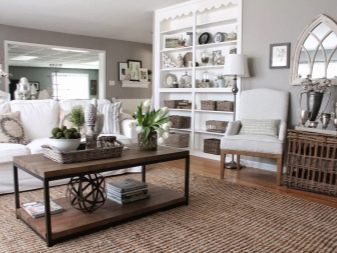
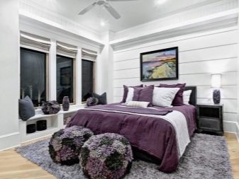
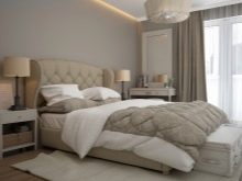
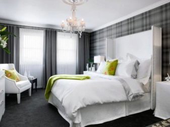
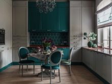
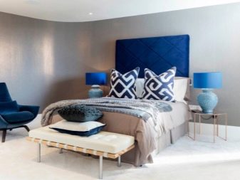
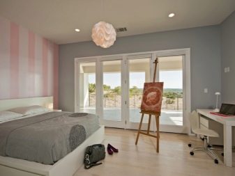
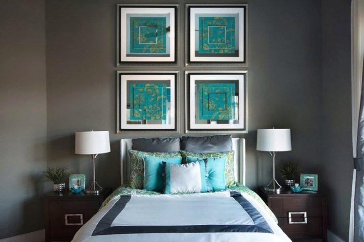
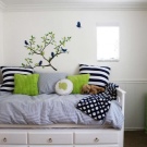
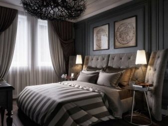
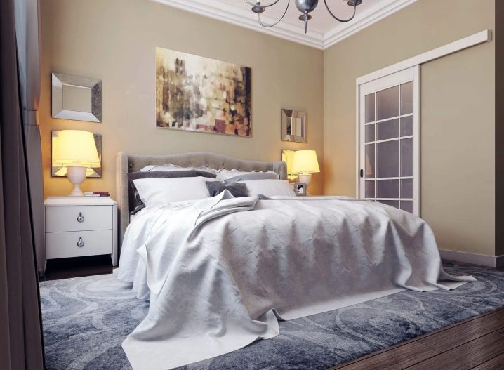
In the bedroom, gray could create an overly sleepy atmosphere if a mediocre designer was involved in the interior, and so we see how you can think things through competently. Against the background of dark beige wall decoration and visually very warm nightlights, the gray bed and the same floor even give off a certain aristocracy, reminiscent of rustic simplicity, but with taste.
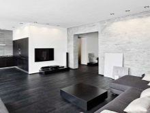
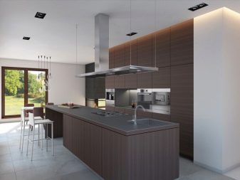
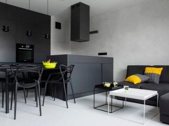
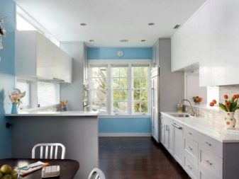
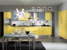
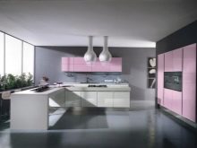
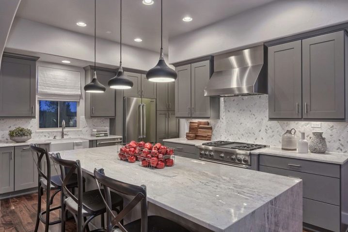
The third example shows an almost no-nonsense kitchen. Honestly, this sample could be called unsuccessful, it looks too bland, if not one significant "but": pay attention to how light changes the perception of the room. Another thing is that in cloudy weather it is no longer so comfortable here.
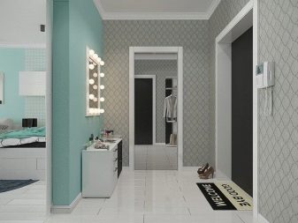
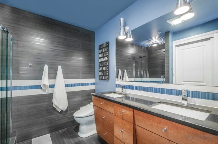
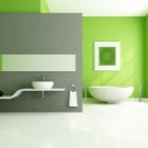
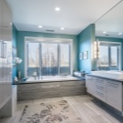
If you like light Gothic and are generally a supporter of unadorned classics, perhaps you will like such a bathroom as in the photo. If you do not scare you with asceticism, this can turn out to be a real find from an aesthetic point of view.


The comment was sent successfully.