Brown color in the interior
The brown palette is one of the most in demand when decorating residential and public spaces. Designers develop and implement in practice new and non-standard finishing options, which involve pieces of furniture and accessories. Both saturated and neutral shades of this color are not able to bore or ruin the overall impression.
Advantages and disadvantages
Brown and all its shades are considered classics, without them it is difficult to imagine a stylish and fashionable interior. Together with white, black and gray, laconic and versatile shades often form the entire color palette in home decoration, harmoniously complemented by bright accents.
Along with designers, psychologists also advise using this color for home decoration, as it is life-affirming, supports a sense of confidence, pacifies and calms. According to research, brown attracts almost no attention, envelops and contains a secret, but not striking.
For many people, natural tones remind of a comfortable life in a country house.
If a conservative style is chosen, the colors of the wood in the decor can be safely called manifestations of expensive restraint. People who have achieved financial independence, who value their family and their position in society, tend to choose a rich beige-brown color scale.
Like any other color, brown in the interior has certain advantages and disadvantages. Combinatoriality, that is, stable compatibility with almost all other colors, refers to its significant advantages, as well as the variety of halftones.
As for the disadvantages, they are small compared to the advantages. Sometimes an overly saturated and darkened range can visually reduce the size of the room, so in small rooms these tones should be used with caution. This rule is used when painting walls, laying large areas with tiles. Drawing in light colors helps to smooth out this impression. At the same time, vertical beige and light brown lines and stripes visually make the ceiling taller.
The brown palette never goes out of style and is extremely practical.
Shades
There are over 180 shades of brown. The color palette ranges from delicate milk chocolate and walnut to dark wood and chocolate tones, with cold and warm varieties. The tables give the names of these shades. The most famous of them:
- chocolate;
- nut;
- reddish;
- reddish brown;
- coffee;
- cognac;
- caramel;
- wenge;
- terracotta;
- coffee with milk.
Cool bitter chocolate can be complemented by cheerful reddish and orange-golden hues, very light terracotta. The basic rule when choosing colors is that there should not be more than 3 or 4 tones close in gamut at the same time.... The textures and textures of fabrics, lacquer and tiles and stone, metal, natural and artificial leather, weaving and embroidery, ceramic vases and glass surfaces with a bluish or yellowish tint work perfectly in the future when creating a designer interior.
It is important to choose lighting from several levels, which helps the color to come to the fore.
Combination with other colors
Color theory is based on the concept of a color wheel. It depicts all tone streamers emanating from the base colors. Brown is not primary or secondary, it is formed by mixing red with green and orange with ultramarine, forms a contrast with the tones lying opposite it. Looking closely at the wheel, it is easy to create a chain of harmonious combinations.
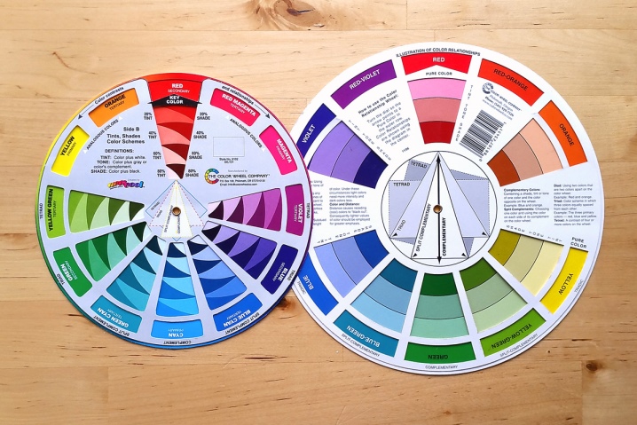
The main shades in the design should be determined immediately for a specific interior. Then intermediate tones and more saturated shades are added to them. Therefore, it is worth considering with what colors brown and its derivatives will be combined in the decor in the future.
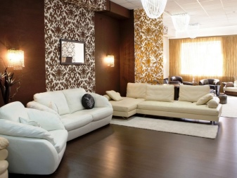
- White... Ideal for creating a clean line in design, expanding dimensions and expanding space. The duet of dark brown and white belongs to the elite and the most contrasting. Reaching up to black in saturation, each shade of the dark range appears in its own way next to pure white. Milk-white skirting boards and platbands on the ceiling look beautiful, emphasizing the shape of the room, in combination with dark furniture and floors. In order not to create the feeling of a hospital interior, the amount of whiteness on the walls must be diluted correctly.
It is preferable to choose warmer pale cream or white-yellowish tones, especially for the living room or dining room.
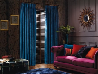
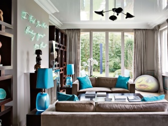
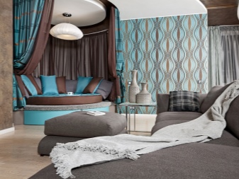
- Blue... Cobalt, ultramarine and azure are most often used as contrasting elements that highlight chocolate and coffee elements. A noble blue and a restrained reddish brown equal to it in saturation show each other. There should be no excess blue, curtains, carpet, objects, sofa and chair upholstery. Accessories have the ideal environment to be displayed, especially against a matte background. A couple of friendly flowers literally heals the nervous system, just like staying by the sea in summer.
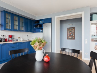
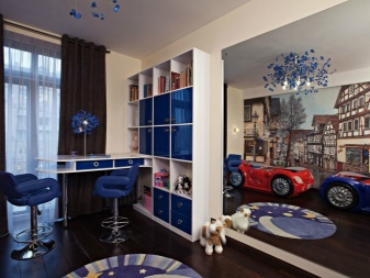
- Blue... A universal shade that has been successfully used for decoration for a long time. Turquoise and blue-gray visually increase, therefore, in small rooms, walls are often trimmed in light blue tones. Patterns in sky blue will advantageously emphasize and highlight individual details, decorate wall panels. More neutral than blue, the color goes well with shades of beige and sandy line. Like people with creative inclinations, impressionable and romantic.
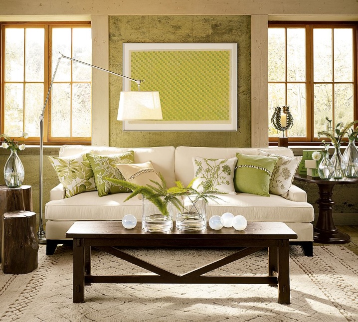
- Green... Perceived as herbal and medicinal, absolutely natural, like nature itself. Therefore, the green range is organically combined with brown, like the trunk and leaves of a plant. This combination is appropriate when decorating a hall and a dining room, a living room and an office. Usually the palette of greens dominates, and cognac or wenge complements and dilutes. This combination symbolizes discreet harmony; it is pleasant to be in the rooms for a long time.
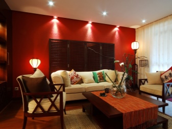
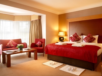
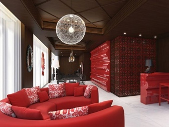
- Red... A symbol of activity and vitality, in the East it is revered as aristocratic. Deep color is successfully used in decoration, combined with gold and wood. For a long time, elite red was present in the apartments of the royal people.
Looks rich and impressive together with brown, especially coral and lilac, cherry and burgundy tones.
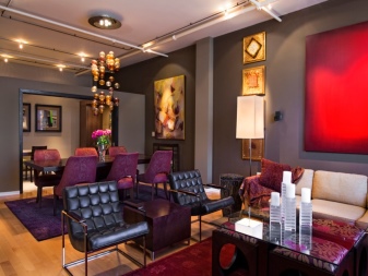
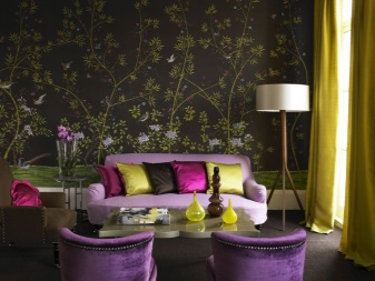
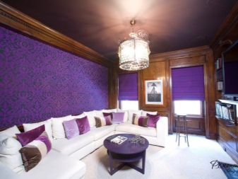
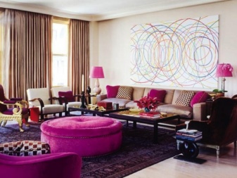
- Purple... A bit melancholic, evoking a sense of comfort and luxury. In a duet with mocha and burgundy brown, it can be a godsend for creating a new and non-standard style. It is better to use this ensemble in a living room or hall. Especially if white or yellow brings a joyful note.
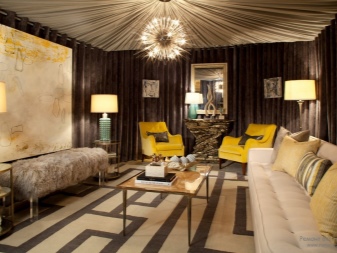
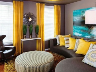
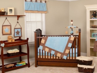
- Yellow... In modern homes, it is indispensable for decorating bedrooms, children's rooms and kitchens. Has a stimulating effect on the nervous system, promotes the assimilation of information. The classic option is gold and other bright shades of yellow metal. The subdued shade of a sunny palette is combined with blues and browns to create a harmonious trio of colors.
- Pastel colors. Warm and soft, all tones from this group are successfully combined with a more saturated brown. For the bedroom and living room, experts recommend noble combinations as the main ones.On their basis, you can create a spectacular design using a variety of bright colors. It is worth paying attention to the complex textures of fabrics and artsy accessories.
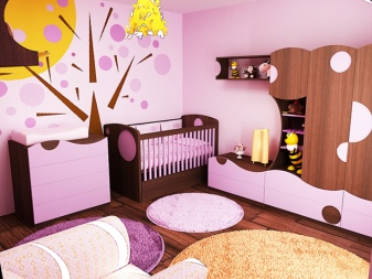
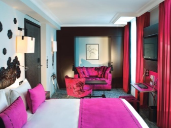
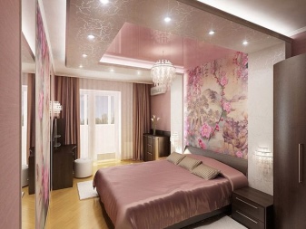
- Pink... The softened red color looks elegant and delicate, joyful and does not overload the viewer visually. Designers quite often combine light brown, coffee and cocoa with pink and pink-orange, conveying the maximum of positive emotions with this combination.
Ash rose and bright fuchsia are in fashion.
Subtleties of room decoration
Wood tones dominate public spaces such as restaurants and bars, clubs and offices, ship cabins and train stations.
In a residential building, all rooms are suitable for using this color, the main thing is to choose the right shade correctly. A wide range of shades, including chocolate and coffee, will help to decorate the living room and bedroom, study and hallway, as well as kitchen and bathroom. Experts offer home owners ready-made interesting solutions.
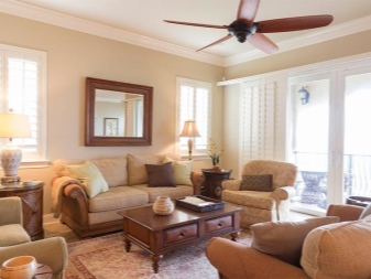
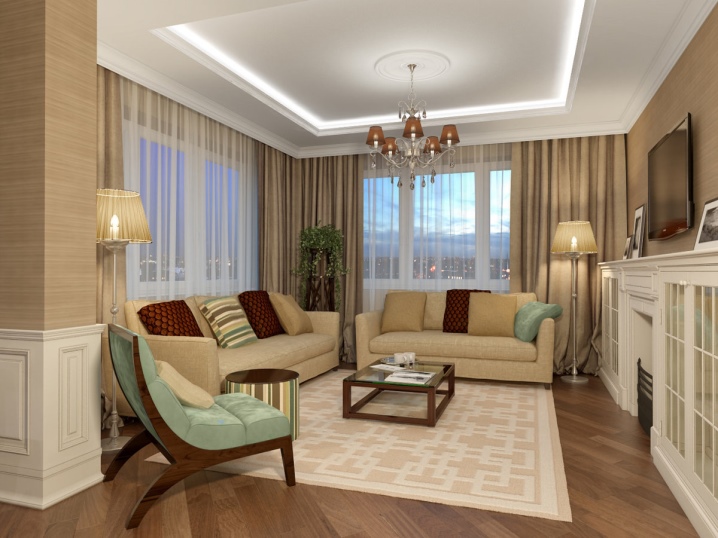
- Living room... Most often, in beige and brown colors, they choose wallpaper and curtains for the living room, acquire classic furniture, select expensive parquet or laminate flooring. This room will be decorated with a soft sofa and armchairs a tone darker or lighter. Curtains made of soft coffee tulle or heavy curtains that are in harmony with the carpet - it depends on the size of the hall.
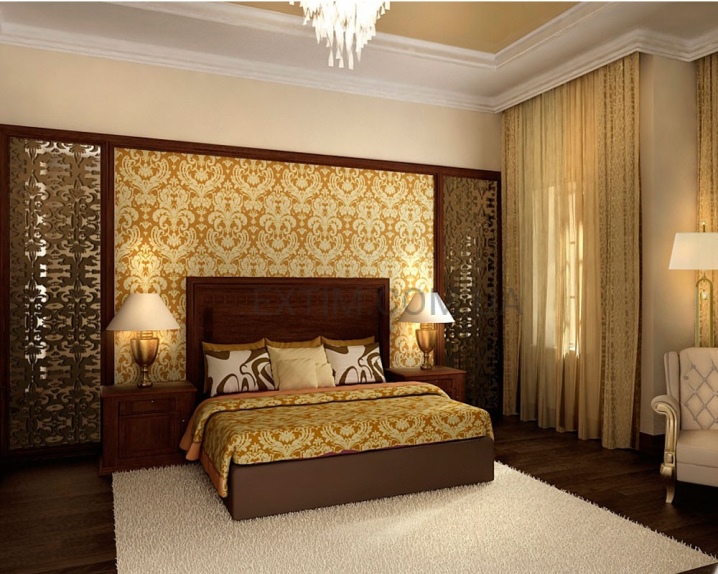
- Bedroom... With a dark coating or overly flashy walls and ceilings are inappropriate in a cozy bedroom, it is better to leave them as light as possible. If you want to add contrast, furniture such as a beautiful wood bed with light coffee upholstery and an elegant table are enough.
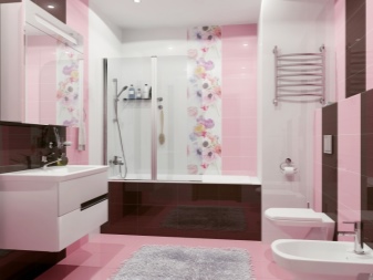
- Bathroom... The room is always humid, so the most demanded material here is tile or porcelain stoneware. It can repeat the pattern of natural wood, shelves and coasters made of chip materials or plastic are also designed to match. In a small bathroom, only stripes of brown on the walls are possible, otherwise the room will seem even smaller. However, pastels and pink-beige, as well as golden-sand tones in abundance will only enhance the look. Dark brown ornaments and images look advantageous on light tiles.
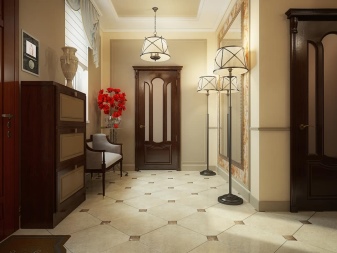
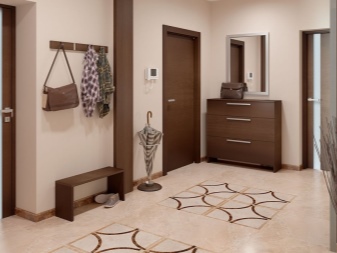
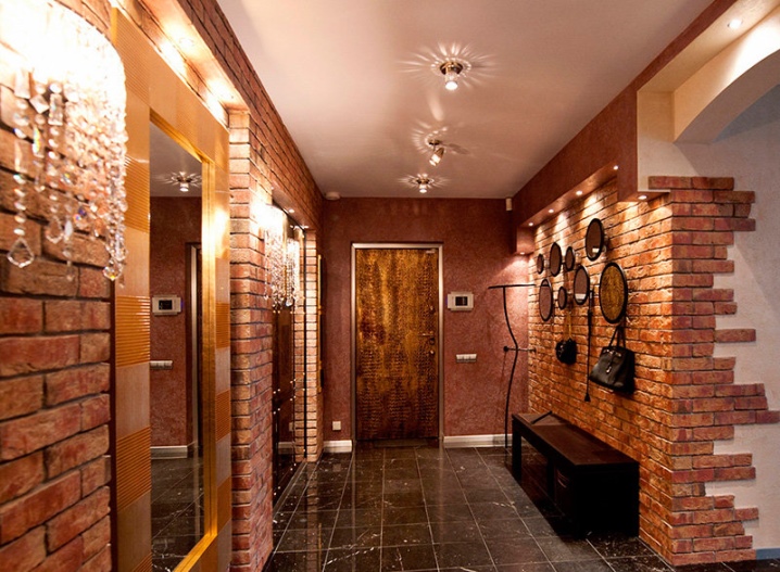
- Hallway... The same rules apply to decorating a hallway. Many people like the modern brick-like finish in traditional red-brown tones. Alternatively, a lighter tone solution with a convex and non-standard texture is also possible. The choice depends on personal preference. Do not forget that dark brown flooring or laminate in the hallway gets dirty less. The frames for the mirrors and the golden tinted glass will help to add zest.
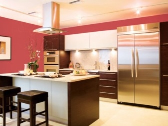
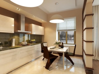
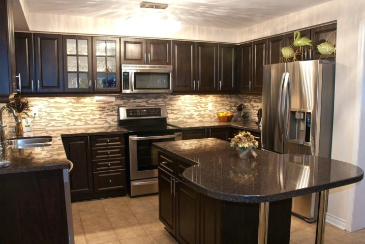
- Kitchen... A room that can be both large and very small. There is no need to exhaust the space of imagination with a furniture set or a countertop, rustic and urban styles suggest using brown colors everywhere - if there are bright and rich colors, dark brick or light mocha plus traditional ceramics and wood, as well as cute rugs with ornaments, are quite appropriate next to them. smoky glass cabinets, fridge and metal hob.
When creating a style using brown, you can move in any direction: country and eco, classic and baroque, minimalism, Japanese and Scandinavian, loft and Victorian. The gloss of the baroque and classic is replaced by matte naturalness for country and eco-styles.
Handcrafted, weaved surfaces, striped and checked fabric prints, and a couple of shades of brown make for a country style hallmark.
Eco-interiors are formed with the addition of olive and green, joyful ornaments and lots of warm hues and wood surfaces. The rooms contain flowers and leaves, pictures with images of animals.
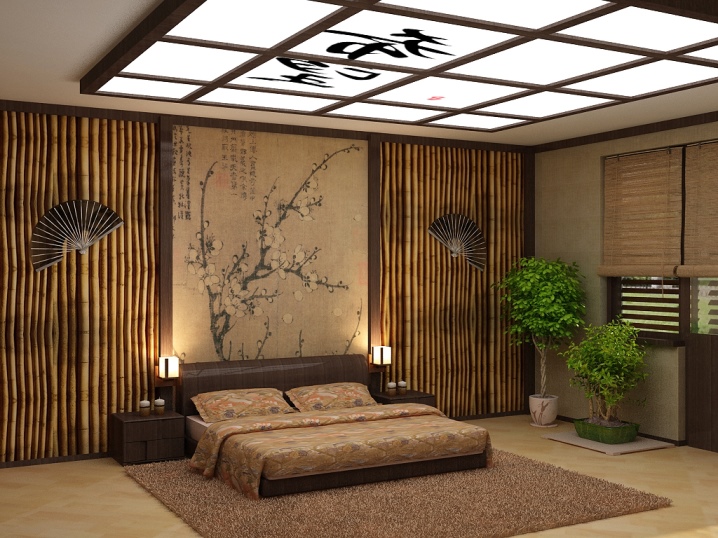
Japanese minimalism implies a visual increase in space and lighting, absolute naturalness and natural materials, bamboo, ceramics and glass tables, straw mats, blinds on the windows. It is characterized by cold tones, contrasts, and discreet jewelry and accessories are preferred.
The Scandinavian interior is based on light gray and sandy beige tones. Dark elements such as brown are given the role of accents, bringing together a harmonious ensemble of colors.
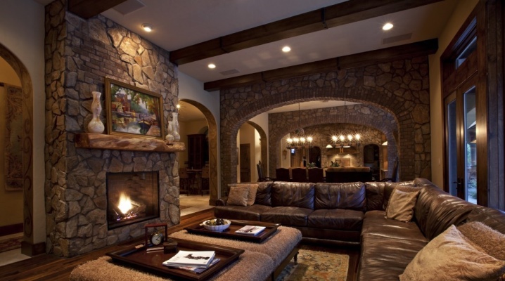
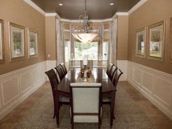
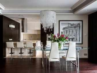
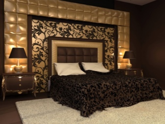
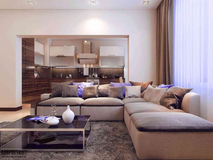
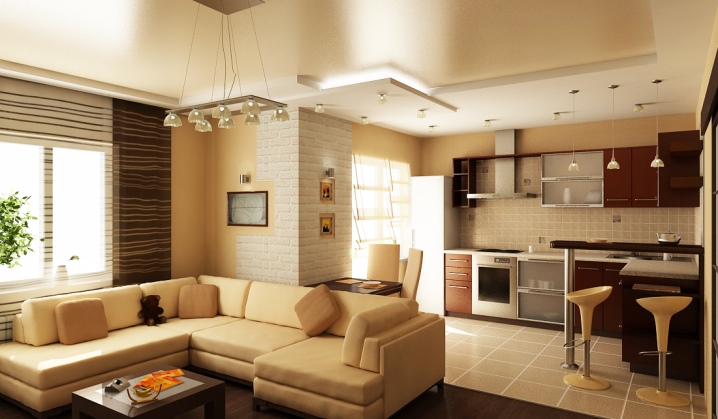
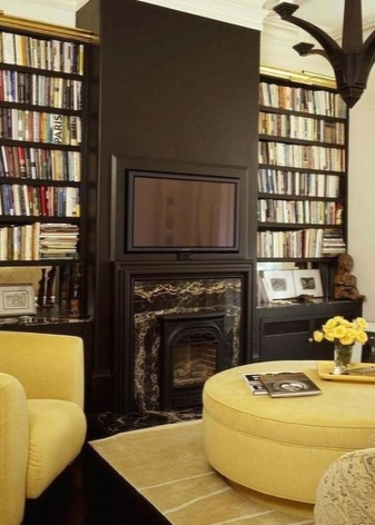
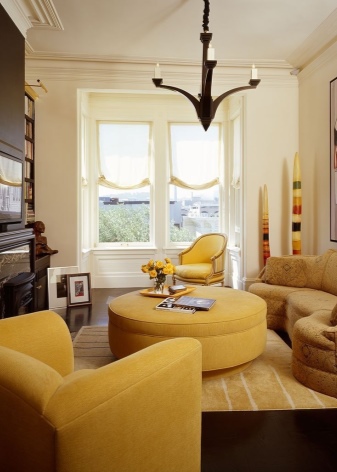
Beautiful examples
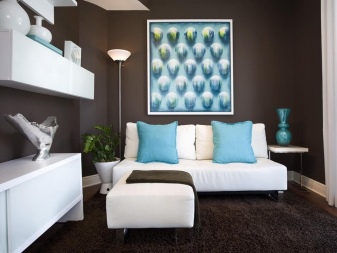
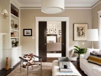
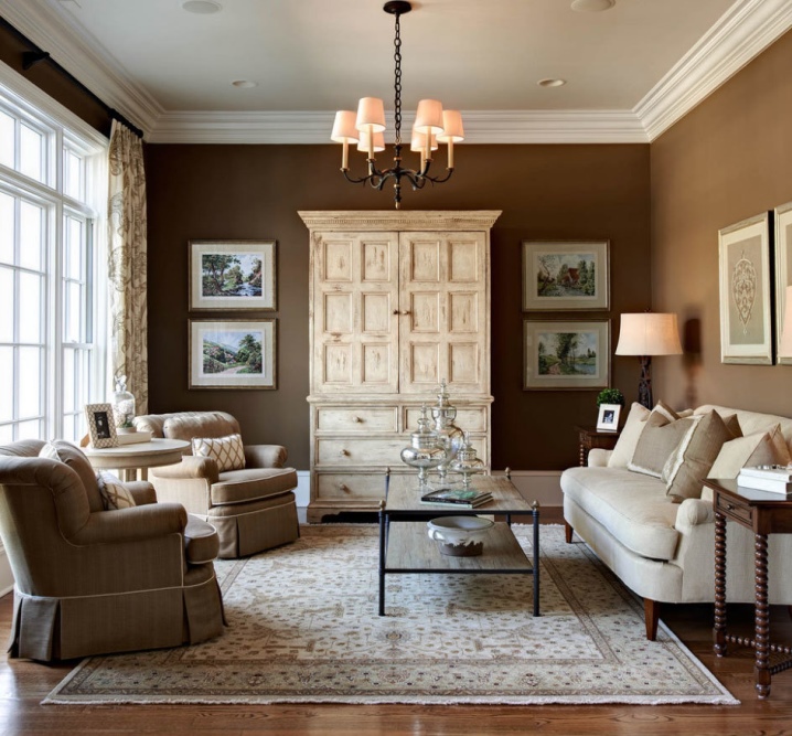
- Classic living room in white and coffee colors. Wall covering in light chocolate tones, armchairs upholstered in dark sand. White sofa and soft beige patterned carpet. Floor lamp and lampshades with orange tint. Paintings in thin frames under glass and glass objects on the table.
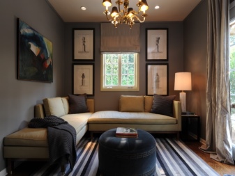
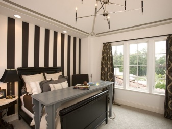
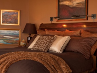
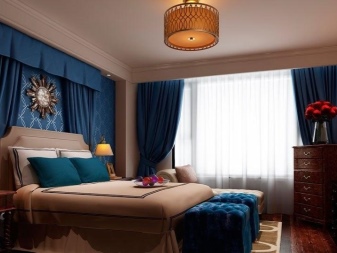
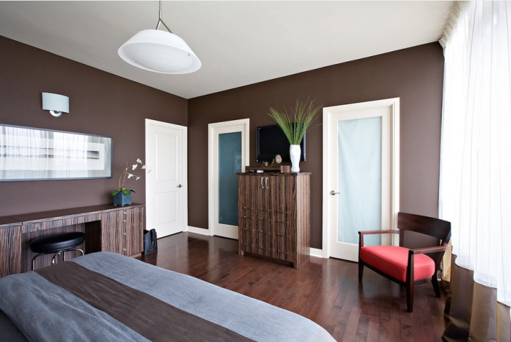
- A bedroom decorated using several contrasting combinations - between gray, beige-coffee and red. The ceiling, doors and curtains are white with a bluish tint. The curtains are edged in brown. The rich texture of lacquered wood parquet and wood-like finish on the cabinet doors were used.
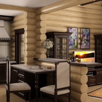
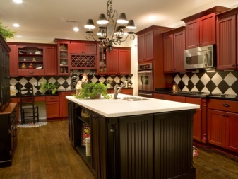
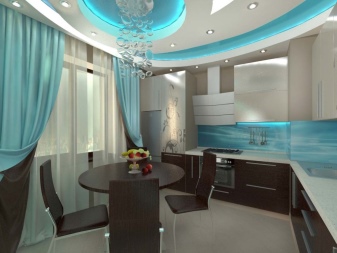
- An exquisite kitchen-dining room in pinkish coffee and cocoa tones, the kitchen corner is decorated with a worktop and a walnut wall. Deep white and ink on the curtains and cushions of the sofa complements the harmony. A bit of metal and ceramics support the minimalist style of the room.
- Canteen. Kitchen area with gray-white furniture with brownish-beige. The floor covering turns into a yellowish-sand tone, against the background of which there is a spectacular yellow and beige sofa, which acts as a bright dominant.
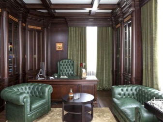
- Cabinet with modern furniture upholstered in light yellow fabric. Dark chocolate wood wardrobe and chandelier. In addition, the ensemble is supported by such details as a reddish floor, multi-colored bindings of books on the shelves of the cabinet, the whiteness of the ceiling and walls.
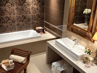
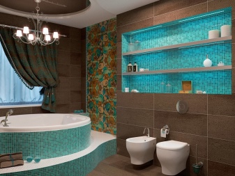
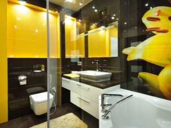
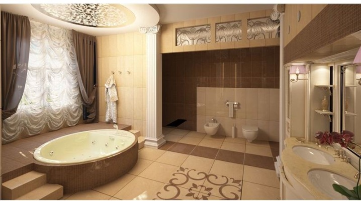
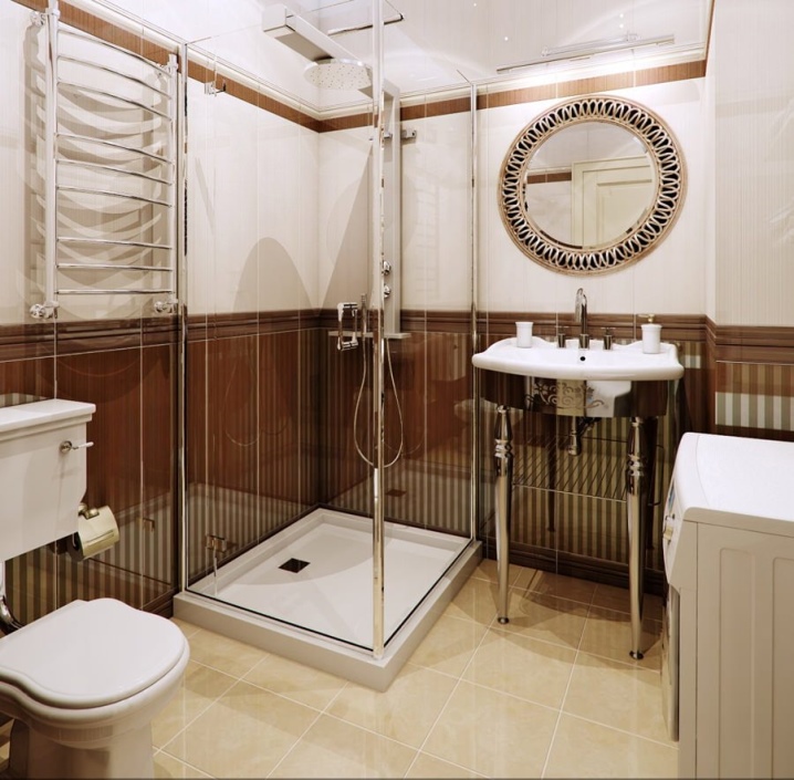
- Bathroom combined with a toilet. The principle of tiers is applied, where the lower part of the walls is the color of coffee with milk, the rest is porcelain stoneware on the floor, a shower cabin, a washing machine and the upper part of the wall are soft beige.
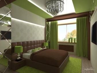
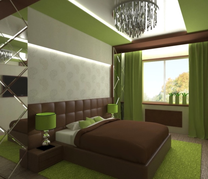
- Joyful gentle bedroom with vegetal green carpet and curtains. Light chocolate is present in the frame of the bed and window. Neutral tones are represented by metal and glass of a massive stylish chandelier, gray-beige floor.
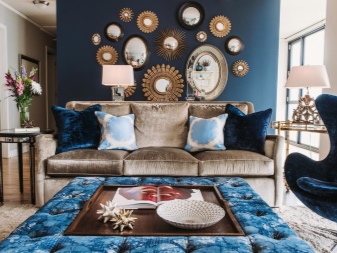
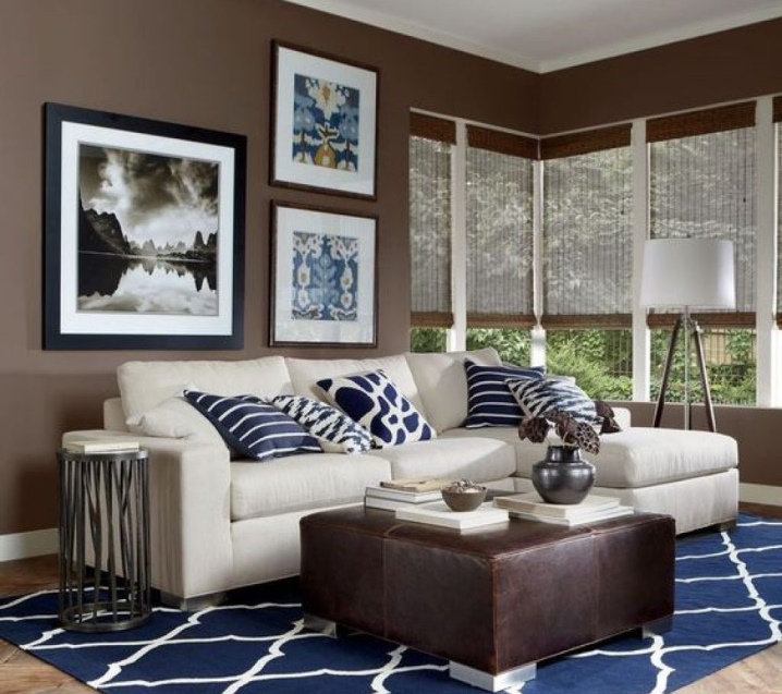
- Blue and brown bedroom in minimalism. Carpet and pillows with a white pattern on a dark blue background, a light sofa. When decorating, two brown ones were used - walnut and light chocolate.
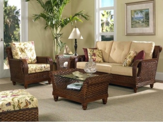
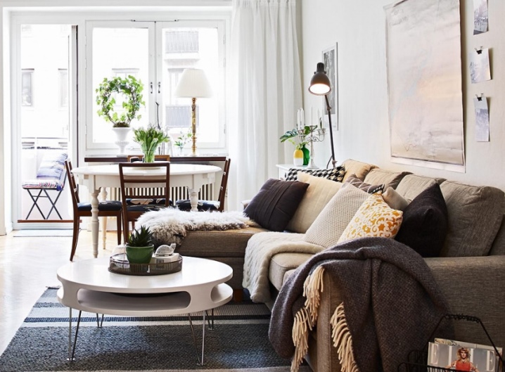
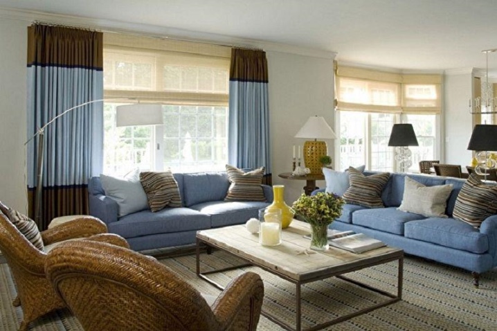
- Spacious and comfortable living room designed in eco-style. Wicker chairs and a light sand carpet, cushions on the couch. For contrast, gray-lilac upholstery and two-tone curtains on the panoramic window were chosen.
You will learn about the combination of colors in the interior from the following video.


The comment was sent successfully.