Variants of using red in the interior
Red is one of the most common colors both in nature and in products created by human hands. In the interior, until recently, it was a comparative rarity, but given the current fashion for everything unusual, such a solution may turn out to be ideal.
Human exposure
The reason for the long-term neglect of red tones in the design of premises lies on the surface: although it is beautiful, it puts pressure on the psyche in large quantities. For a bedroom, this tone is not suitable, in general, in any way: it promotes the activity of the person living here, therefore, it interferes with normal rest. It is for this reason that the red color began to gradually penetrate into apartments - for too calm children, such a design acquired a new meaning, since it stimulated their activity.
At the same time, we must not forget that this is also the most aggressive color, which in large quantities is sometimes associated with vulgarity.
Red and its shades are warm tones, therefore they are especially appropriate for use in rooms where natural light and warmth are lacking. In such conditions, such a design makes the room seem a little more comfortable, but it should be remembered that it also visually reduces the room, therefore it is not used in cramped apartments.

Shades
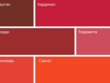
Red is understood as a whole range of colors, each of which leaves its own impression and is perceived by people differently. In general, at least four main categories can be distinguished, among which are bright natural shades a la berry or poppy and relatively muted, imitating fallen leaves, deep tones like wine or ruby, as well as typical representatives of acid futurism, which are practically not found in nature. ...

In a design using red tones, it is not customary to separate it from the texture - Ideally, a painted object should be similar in texture to what it resembles in color. At the same time, anything can be red - from enamel to plastic and even leather, such glossy surfaces will be especially bright. If we talk about combinations with other, non-red interior details, you should pay attention to wood, glass and gold.
Most often, you will find brick and terracotta tones in the design of premises - either brick is really used here, or its imitation is used in the form of the same textured wallpaper. Coral and berry shades are in great demand for unobtrusive accessories.
How to combine correctly with other colors?
Red is not one of the colors that are highly legible when combined with other tones - you just need to figure out how to fit the color scheme into the design. Naturally, this shade looks most organically with universal colors - either in black-white-red scheme, or separately with black or white... Red and white looks fresh and quite cheerful, depending on the way the tones are combined, it can come from different styles.
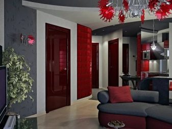
So, checkered surfaces are appropriate for country and English design, lines - for decoration a la Japan, patchwork is good for a rustic style, and abstraction is indispensable for modern. The red and black combination is perceived as gothic, it is quite bright, but not for an amateur, but it will definitely not be forgotten.
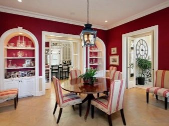
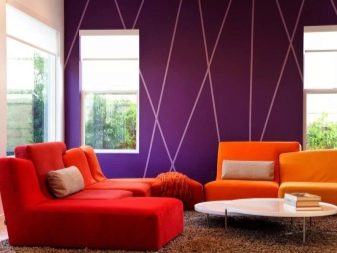
Let's consider some other combinations. So, a pair with beige gives a similar effect to a combination with white, but in this case there is more harmony and less contrast. The red and yellow range is a true example of life-affirming design. In combination with brown (for example, wood), red looks noble and aristocratic. Sometimes a combination is also allowed with blue, green, pink and even gray.

Use in different rooms
If you are still not ready to glue the red wallpaper, and also disagree with the provocative red laminate and the same stretch ceiling, but you still want to bring such warm shades into the design, then you need to pay attention to the accessories. Unlike wall decoration, they are special for each room, therefore they should be considered separately.
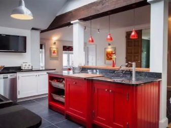
Kitchen
This room is better suited for using red than others: this color stimulates both culinary activity and appetite, and is also associated with fire. For this reason, a place for such a shade can be found in anything: a built-in wardrobe, chairs, and even doors can be painted into it, not to mention an apron that can imitate natural brick.
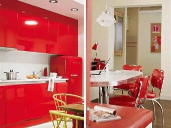
If we talk about color combinations, then the most popular suggests itself, because most kitchen appliances today are produced in white and gray tones, which together creates a very positive impression. However, no one takes the opportunity for an experiment from you, so long as it does not create a feeling of gloom.

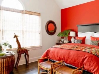
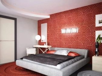
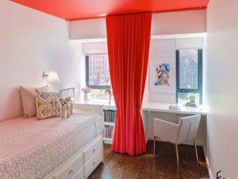
Bedroom
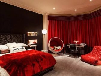
For a vacation spot, the abundance of red is a risk, but this is not a reason to give it up altogether. Such a shade can paint an entire wall if it is located at the head of the bed - then it will not fall into the field of view before resting.
As a small accent, this solution can also be used as the main color of a piece of bedding. If the tones are selected relatively soft, and the texture is like velor, then any accessories, for example, pillows, will also seem appropriate.
Wood inserts will help to partially neutralize the aggression of red, for example, the same carved bed railings. As a result, you can make at least a glamorous, at least a modern urban bedchamber.

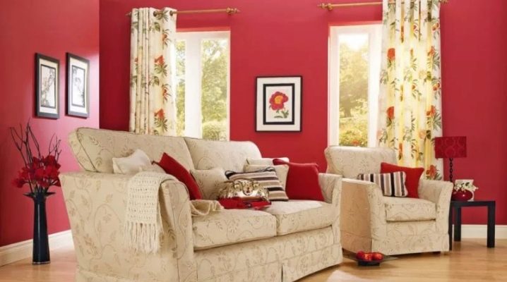
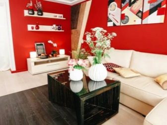
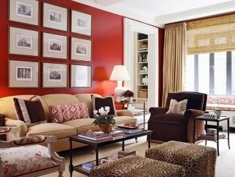
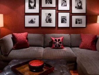
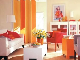
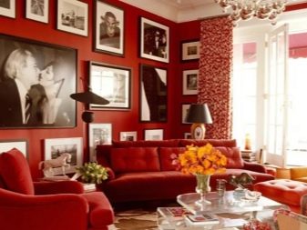
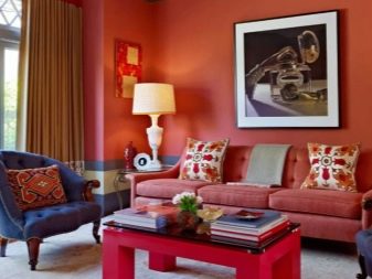
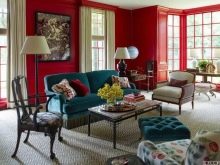
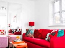
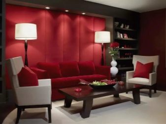
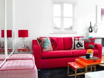
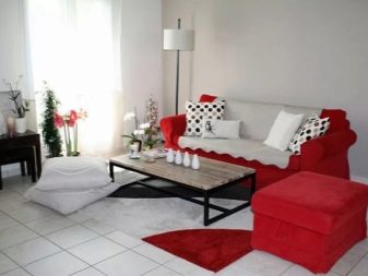
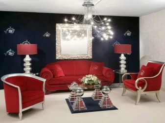
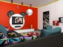
Living room
This is exactly the room where the red spot should almost certainly be found, because for a quiet rest you need a bedroom, and here you need some kind of accent that allows you to actively communicate with the received guests. The red color here symbolizes the chic atmosphere, that is, it shows the owner from the best side.
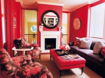
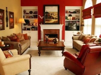
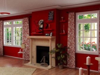
If you are lucky enough to have a fireplace in the living room, you can decorate it in red colors - in combination with the tongues of flame, this design will truly warm even in the most severe winter, creating an indescribable "lamp" comfort. A roughly similar association of red with warmth is played up by those who paint batteries in this color or buy grilles for them in appropriate tones.
This is where it makes sense to widely use red tones both on walls and in furniture. However, keep in mind that such a color in large quantities can be depressing, therefore dilute the same red wall with paintings.


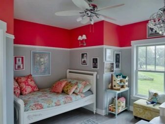
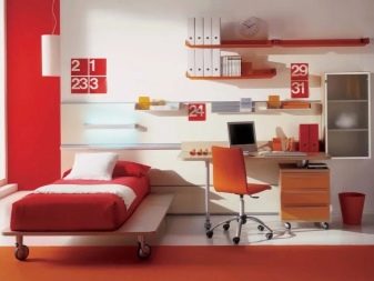
Children's room
From about the age of 3-4 years and up to ten years, children usually love everything bright, which can be traced in all their hobbies. Psychologists believe that colorful design will only benefit babies - it stimulates activity and curiosity, which has a positive effect on both physical and mental development. In other words, for a cheerful and healthy child, cheerful shades in the design of his room are very important, especially if he is even too calm by nature.
Another thing is that for already overly mobile children, such a pathogen may turn out to be an obvious overkill. Do not forget that, in addition to studying and playing, the child should also rest someday, because there should be relatively little red and preferably only in the play area.
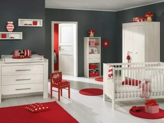
At the same time, from the very beginning of adolescence, children cease to perceive the typical "childish" attributes, and too bright decoration of the room no longer seems appropriate to them. Here it will be wiser to choose calmer colors, in consultation with the child himself, however, red accessories can breathe a little life into a dramatically serious design.
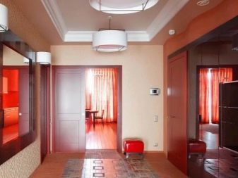
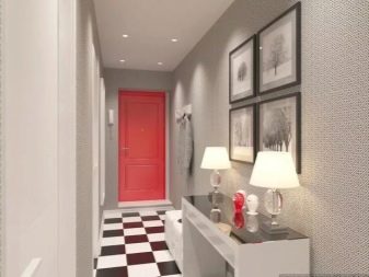
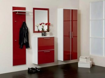
Hallway
The design of this room is rarely given much attention - usually it is made neutral, without much pretense, which is not always correct if the owners of the apartment really have a delicate aesthetic taste. Do not think that the entrance hall does not have any special meaning - when you leave, it sets you up in a cheerful mood and prepares you for new achievements, and when you return, it greets you first and reminds you that you are finally at home.
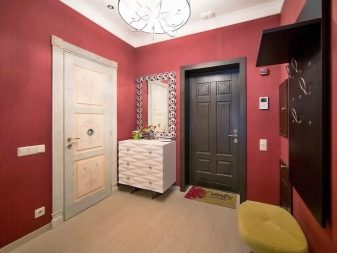
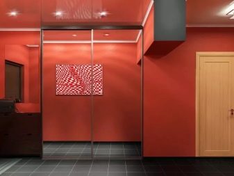
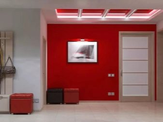
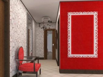
For this room, the abundance of red, indeed, will seem inappropriate, but here are some details in such tones will help turn dullness into delicacy. Even a completely practical accessory can act as an accent, for example, a red umbrella hanging on a hanger or the same shoes of the hostess. The front door itself can be made in muted saturated tones of the red spectrum.
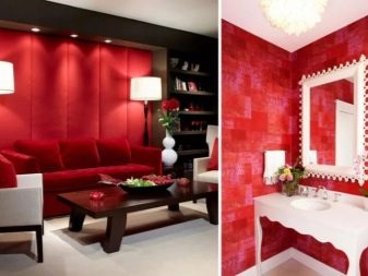
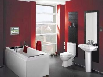
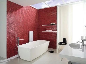
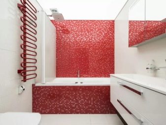
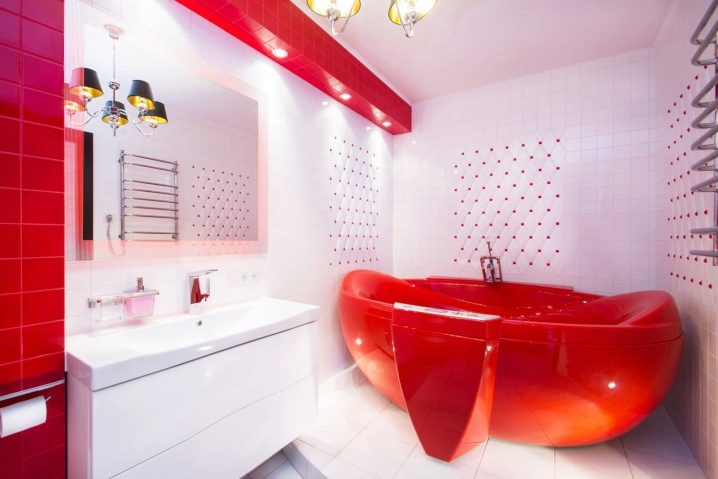
Bathroom
In the bathroom, red is still very rare - if it is present in the range of your bathroom, then you can already be called a supporter of non-standard outlooks on life. Since red helps to increase activity, it is definitely not the best solution for those who like to relax in the bath and stay longer. At the same time, this option will be good for active people who often use the shower as the main way to wake up urgently.
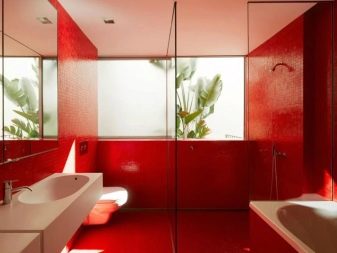
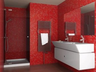
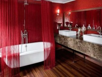
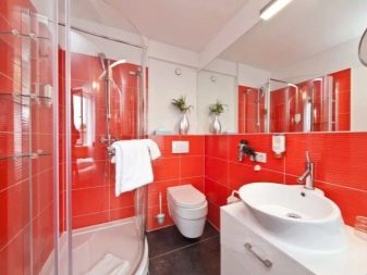
Even if there is a place for shades of red in the bathroom, they are almost always accompanied by white and black, or at least one of them. In most cases, the wall remains red, less often the floor or ceiling, but the actual bathtubs of this shade come across quite rarely, although even such plumbing can be found. Wherein muted tones are rarely chosen for the bathroom - usually the brightest and most saturated solutions appear here.
Style selection
In our tradition, it is not customary to widely use red as too rebellious, but for some styles it is vital. For example, empire, fusion, avant-garde, pop art, art deco and eclecticism - all these are styles that do not accept boring solutions and require interesting color schemes. You don't even have to invent anything too complicated, but just do a red accent in the form of a still life - at the same time, you will get a stylish decor.


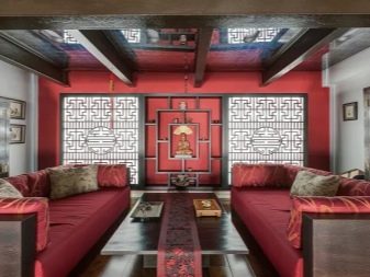
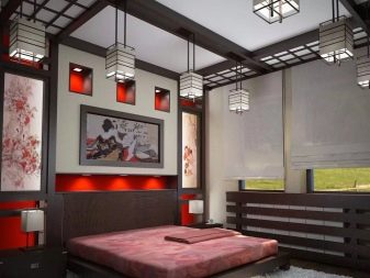
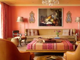
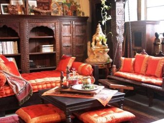
If for most of our compatriots a completely red room is too much, then in some folk styles this is the absolute norm - for example, in Chinese, Japanese, Moroccan or Indian. There, the tradition itself makes you constantly turn to specific shades: here the most unexpected interior details, even a chandelier or blinds, can be red.
If you want to add a moderate amount of red detail to your design, think about what exactly that color should be. All walls are usually not painted in such bright shades - two as a maximum are enough.
In fact, the room can be completely red, but then on the walls you need to use many accessories of a different color.
In practice, much more often they do it in a different way: in a room of too calm gamut they put one furniture accent in a red shade, for example, a corner sofa, an armchair and other similar furniture.
Original examples
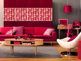
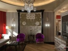
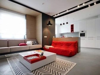
As an example, we see a chic version of a red-white-gray living room in the Art Deco style. As you can see, there is little red here, and it is unobtrusive - it gets into the field of vision just enough so as not to fall out of attention. It looks very stylish and modern.

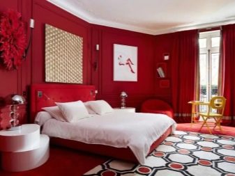
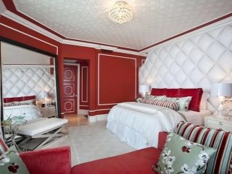
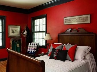
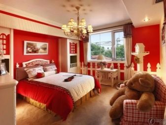
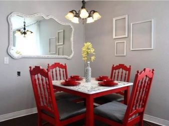
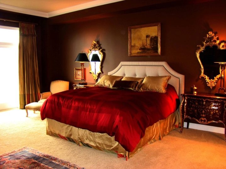
But for a bedroom, even such an amount of red would be significant, because in the photo the designer shows how not to overdo it with this color.In red tones, there is only a bedspread, undoubtedly the main accent. In combination with a muted, woody brown, as well as a painting and carved mirrors, an indescribable feeling of a forgotten aristocracy is created.
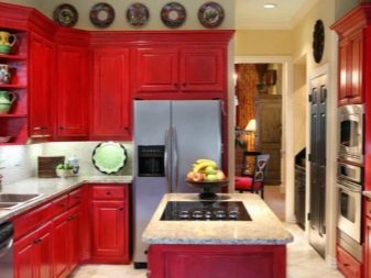
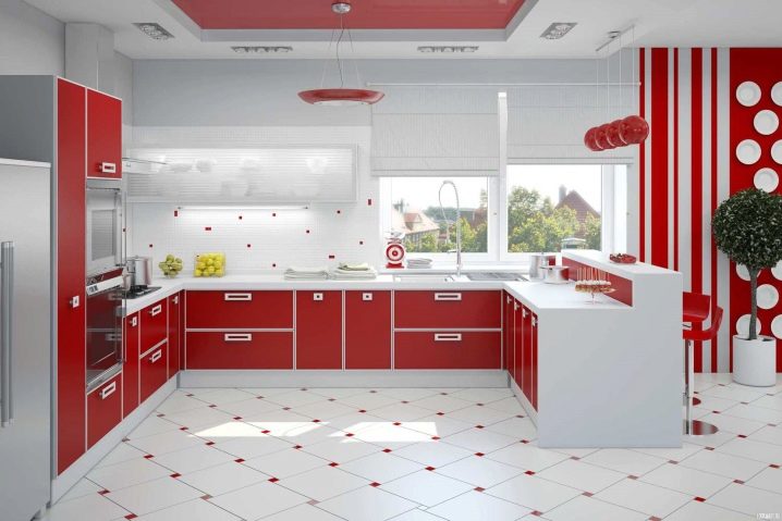
The photo shows how a white and red kitchen can awaken the appetite and the desire to cook. There are quite a few red details here, you can't dodge them, because even at the joints of the tiles it is present, and at the same time, the main tone of the entire room should still be called white. It turns out very invigorating and not too intrusive.
In this bathroom, the main emphasis in the decoration of the walls, floor and ceiling is made precisely on the white shade, but everything is compensated by a completely unearthly bath with yellow tints - it seems that cold water simply cannot be inside.
See below for the use of red in interior design.


The comment was sent successfully.