Interior in light colors
Interior design in light shades is what you need for a stylish home or modern apartment. Delicate colors are ideal for any interior style direction, creating a feeling of large space even in a small room.
Peculiarities
Interior in light colors is a classic version of apartment design. Small "Khrushchevs" and small studios are ideal for using a neutral palette. Bright decorative elements will look good on white, beige and cream bases.
Advantages and disadvantages
Consider advantages of using light shades in design apartments.
- The space of a small room visually expands. The main thing is not to forget about bright accents.
- The sun's rays are reflected off the light finish, so rooms with windows facing the sun will not get too hot. And the whole atmosphere becomes airy.
- The neutral range can be easily combined with bright textiles, panels, carpets.
- It is easy to refresh the light environment with curtains, pillows, rugs.
- Light colors will always be relevant.
- Dust and other imperfections are invisible in white.
But light colors also have disadvantages:
- uncomfortable (you may feel like you are in the hospital);
- impracticality;
- facelessness;
- emotional people experience feelings of apathy, depression and psychological pressure.
Variety of shades and their combination
Light tones include a whole palette of shades that can be used in tandem with brighter, darker colors. Designers highlight the most harmonious combinations.
Pearl shades
Pearls are a symbol of luxury, purity and beauty. Pearl shades, including light gray, pale pink, beige and pastel blue, will add elegance and sophistication to the interior. Pearl (another name is mother-of-pearl) color goes well with blue, pink, peach, raspberry, lilac, gray, silver. Brown does not match the pearlescent color, as it creates a feeling of gloom and heaviness. When using a pearl scale, pay attention to the lighting arrangement.
Dimmed lighting is the best option.
White color
This color is loved by designers because it is a refreshing tone. With its help, you can add light, increase space, and the most valuable thing is that it combines wonderfully with almost all colors. White has cool and warm (eggshell) shades. Together with other warm colors, white adds warmth to the interior, and when combined with cold colors, it gives freshness. Pure white is rarely used in design. White combined with gray, blue and turquoise elements is a modern use of this color. Beige, gray, bright blue, bright green look great against a white background.
Cream (or creamy) color
Interestingly, a pure cream color is hard to imagine. In reality, this is a very light, yellowish tint of white. The cream color easily complements all shades of the color scheme. Its use in the interior gives lightness, tenderness, warmth and ease. The perfect combination is cream and chocolate.
The cream color is optimally combined with gray, purple, hot pink, fuchsia, blue, yellow, sand, pistachio shades.
Beige color
This tone creates a relaxed and relaxed home environment.It is versatile, can be easily combined with both warm and cold shades, can visually expand the space, can be both the main color and a neutral background for bright elements, does not dominate, but enhances or mutes another shade. Companions of beige are often quite saturated colors (wine, purple, indigo, hot pink, black) and natural tones (pink, earthy, white, grassy). Champagne, or champagne, is a trendy version of beige.
Sand color
This is the natural natural color of the sand. It brings warmth and coziness to the room, creates a warm, relaxing and soothing home aura. It is a versatile color. Golden and grayish are the main shades of sandy color. White, cream, cherry, beige, red, blue, brown will ideally complement the sand. The main thing is to combine the right shades.
Inspiration can be found in nature.
Coffee with milk
Milk coffee is not beige. It is much richer. This color has a beneficial effect on the nervous system, gives a feeling of relaxation, warmth and comfort, gives the room solidity. It is considered a classic in interior design. It is loved by conservatives and people who do not plan to often change the look of their house. By itself, the color of coffee with milk is not interesting, therefore it needs correctly selected decorative elements (curtains, figurines, lamps). Due to its neutrality, it can be combined with other colors. If you want to highlight a certain area or any decorative element, then the coffee-milk color will help with this.
Such fashionable shades of mocha with cream are optimal in the hallway and office.
Grey colour
In reality, gray does not have 50 shades, but much more. It provides a neutral backdrop to which you can add vibrant detail. Grayish shades provide a sense of comfort and security (which is why introverts love it). But if you overdo it with gray (do not use elements or furniture of a different color), then such an interior can cause depression.
Decor
Accent decorative elements (furniture sets, small accessories, textiles) are a prerequisite for decorating an apartment in light colors.
Otherwise, the room will seem boring.
There are certain rules for choosing accents.
- The main thing is to keep a balance: 60 percent - the main background, 30 percent - additional colors and only 10 percent - accent.
- Don't use a lot of small parts.
- Use prominent bright accents for the main palette. With light walls, you can use multi-colored accents, objects that should be in harmony with each other.
- Increase the number of accents if there is no complementary color.
Light shades are suitable for interior design in styles:
- modern;
- classic;
- minimalism;
- neoclassicism;
- eco;
- Scandinavian;
- provence;
- loft.
Room decoration options
The design of the rooms in light colors differs depending on the purpose of the room.
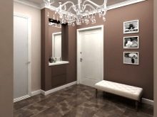
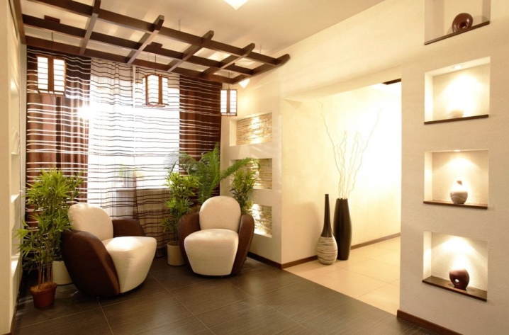
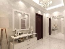
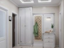
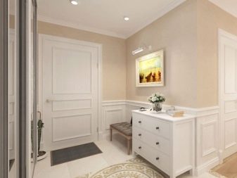
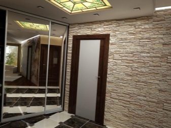
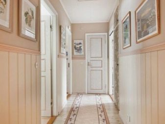
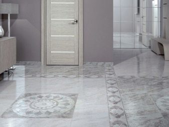
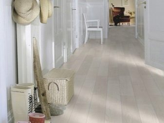
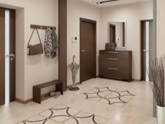
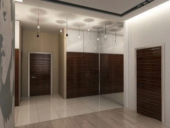
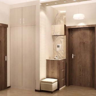
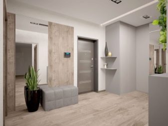
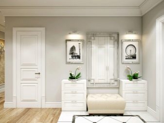
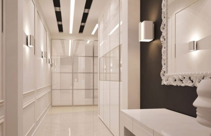
Hallway
The entrance hall is the real face of the house, this is the room that welcomes guests and gives a general idea of the apartment, so it should be cozy and beautiful. The peculiarity of the hallway is most often a small space and lack of natural light. Light shades in the design of the entrance area have their own advantages:
- cosiness;
- the ability to expand space;
- can make the room brighter.
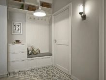
It is believed that light shades are not suitable for the hallway due to the soiling. However, if you choose washable vinyl wallpaper or photo wallpaper, the problem will be solved. You can also choose for the walls:
- painting;
- decorative plaster;
- decorative rock;
- wall wood panels (for classic interiors).
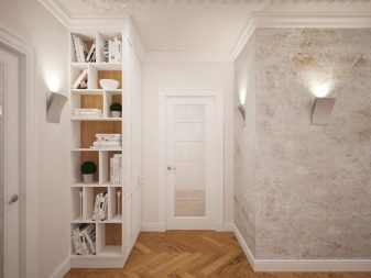
Ceramic tiles, linoleum, porcelain stoneware are used for the floor. Sometimes they combine ceramics and laminate.
As for lighting:
- small entrance hall - one lamp directly next to the front door;
- a large entrance hall or a long and narrow corridor - several sconce lamps located around the perimeter; chandeliers and several sconces; several built-in lamps.
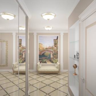
For the hallway, you can use the following styles:
- baroque;
- provence;
- modern;
- loft;
- eco;
- minimalism;
- classic.
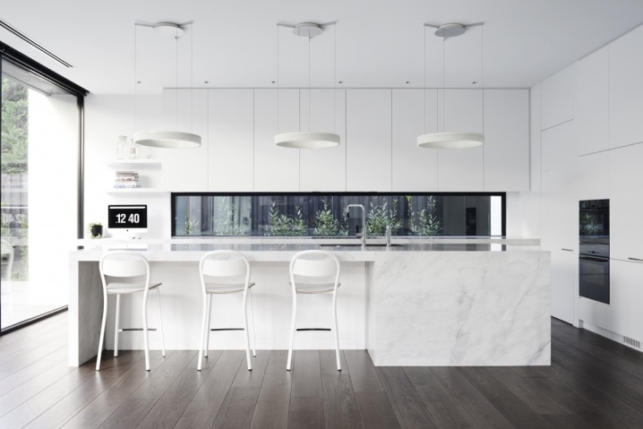
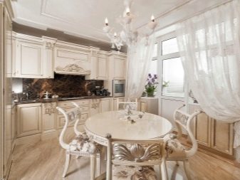
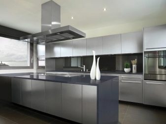
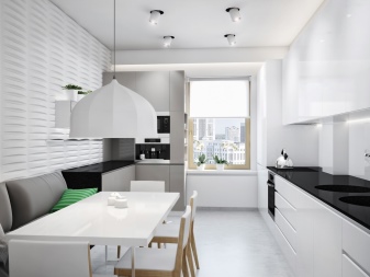
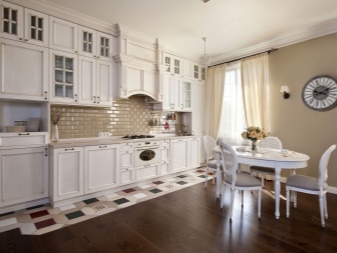
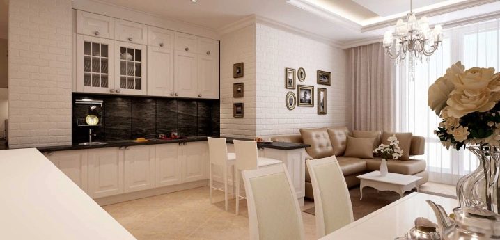
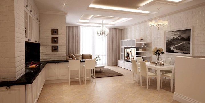
Kitchen
The bright kitchen is an all-time classic. She always looks elegant and expensive, this is the place where the whole family loves to gather.
For kitchen design, choose beige, white, light gray, light yellow, light pink or light green.
Let's analyze what you need to equip a kitchen in light colors.
- Light kitchen set. The colors can be as follows: beige, sky blue, light brown, light gray, pale green. The kitchen set made of solid wood looks luxurious. Only the walls should be lighter by one or two tones.
- Light apron, made of ceramic tiles, tempered glass or mosaics. It will visually expand a small room. For light or dark countertops, this apron is ideal.
- Light-colored table top.
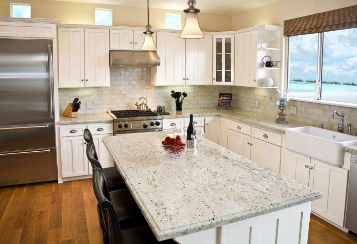
- Light walls... To maintain cleanliness, it is better to use a moisture-resistant wallpaper that can be washed, or a special paint.
- Floor... When using the "light bottom" use dark walls and ceilings (this option is only for rooms with high ceilings). Laminate, porcelain stoneware, tiles are well suited for this. If the "light top" option is used, a dark floor is used.
Various styles can be used for kitchen design in light shades.
- Classical.
- High tech. Modern and stylish. Colors: white, pale blue, lime green, yellow, light gray, as well as silver and metallic shades.
- Minimalism.
- Mixed.
- Provence.
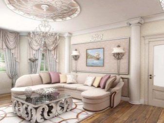
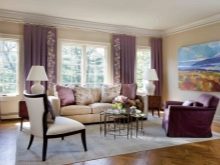
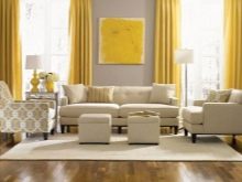
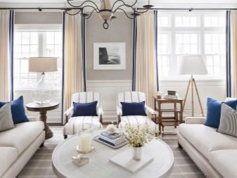
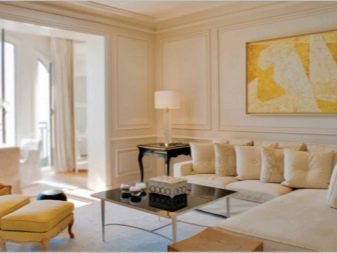
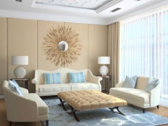
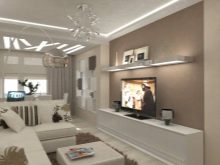
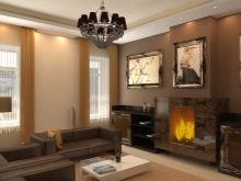
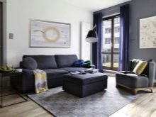
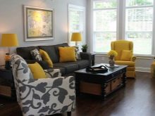
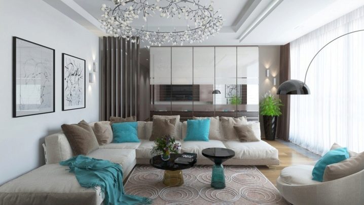
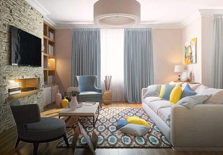
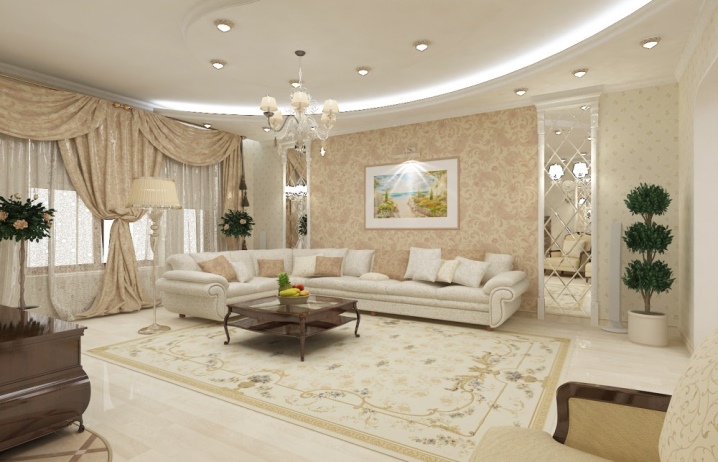
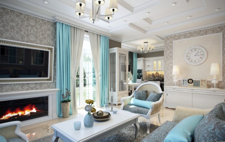
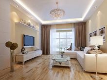
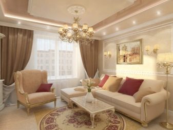
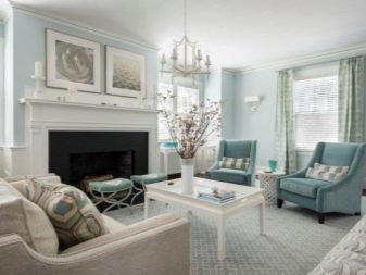
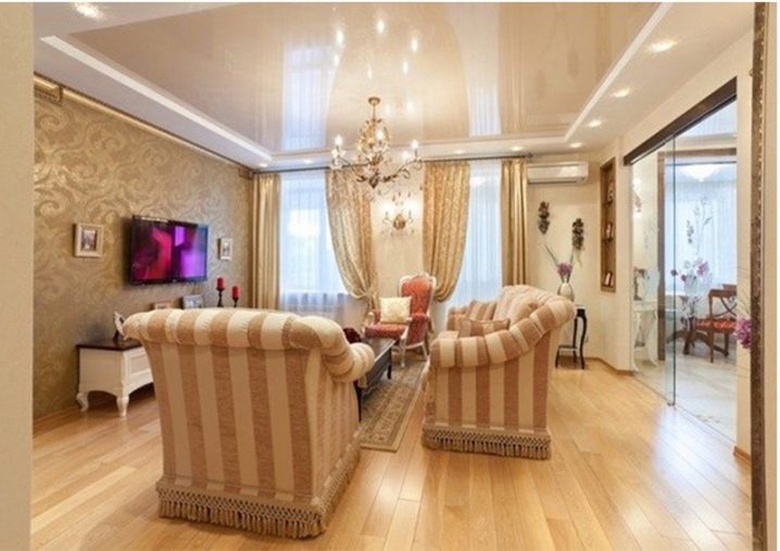
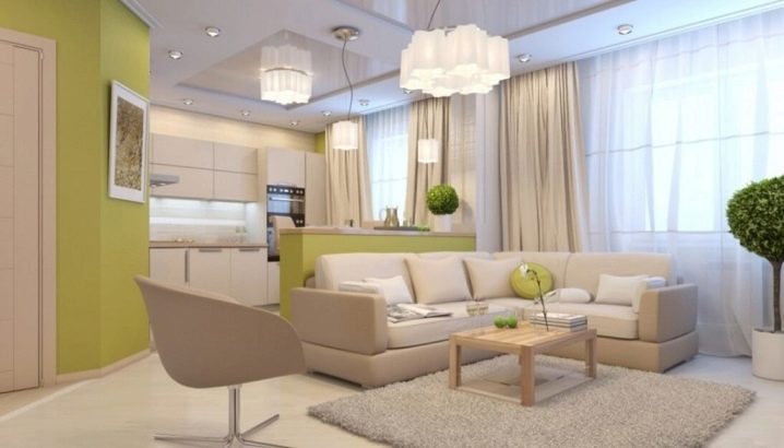
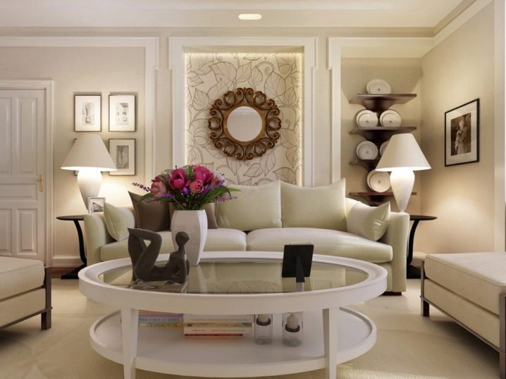
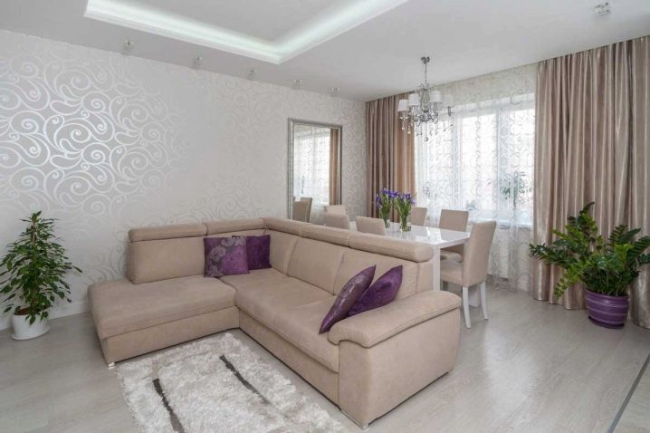
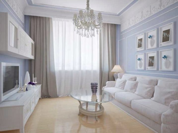
Living room
Thanks to light shades, the room seems larger and lighter, it is pleasant to relax here after a hard day's work. There are three living room design options:
- neutral base color and bright decorative elements;
- combination of contrasting colors (50/50);
- one color of different brightness.
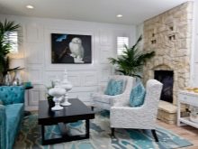
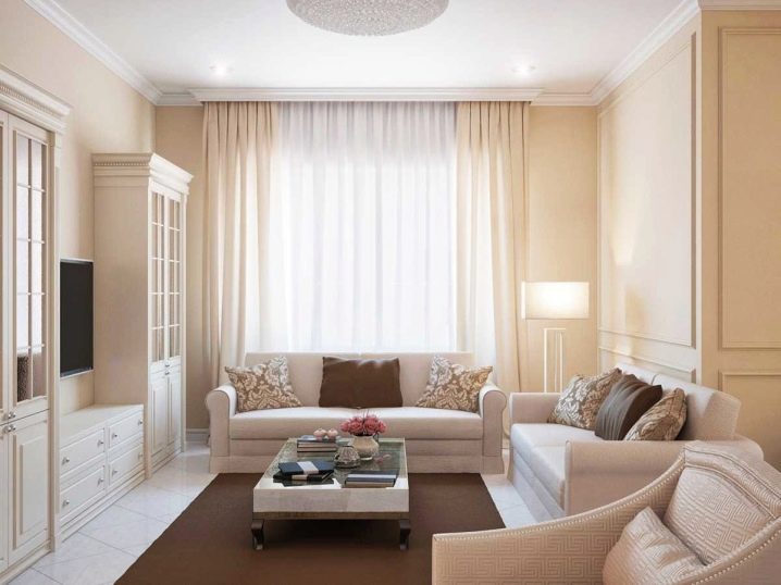
Beautiful tones for the living room - sand, milky, golden, light pink, coffee with milk, light blue, light green.
For apartments facing south, cold tones are suitable, for northern ones - warm ones.
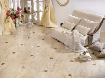
The floor is the background. For it, they use parquet board, linoleum, porcelain stoneware or self-leveling floors. The color of the skirting board can be accentuated, matched to the floor or combined with any decorative element.
A glossy stretch ceiling (milky, pearl, light gray or cream) is suitable for a bright living room.
For walls, a good choice would be one tone wallpaper of vanilla, beige, cream, champagne, pearl color.
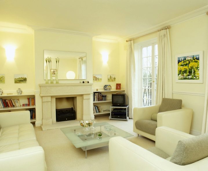
Both light and dark furniture fit equally perfectly into the design of the living room, decorated in light colors. A leather corner sofa and armchairs are suitable for the interior of the hall. Be sure to add a bright bedspread or decorative pillows on a sofa with plain upholstery.
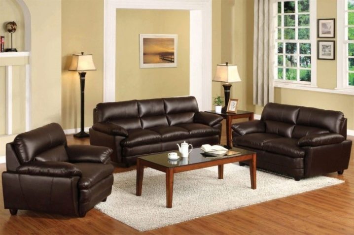
Candlesticks, paintings, vases, photographs, ceramics are used as decoration.
Living room design styles - modern, classic, country, eco, provence, minimalism.
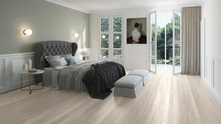
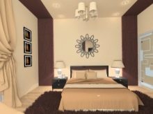
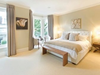
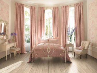
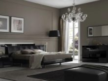
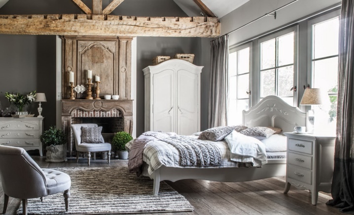
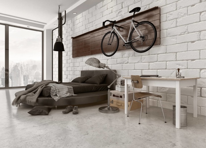
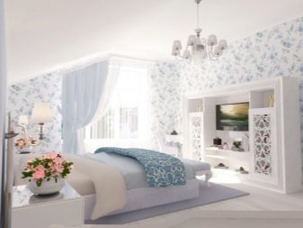
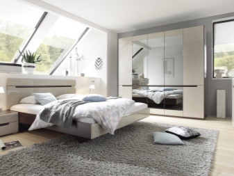
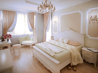
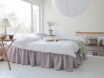
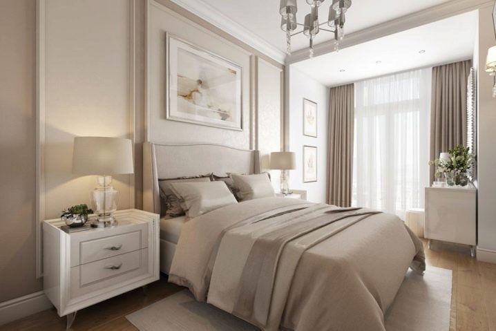
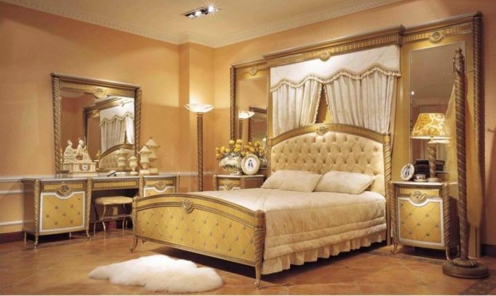
Bedroom
Both small and spacious bedrooms can be furnished in pastel colors. Curtains, bedspreads, accent wall will be a spectacular decoration. To make it cozy, you need to use different light sources.
Furniture can be selected in any color.
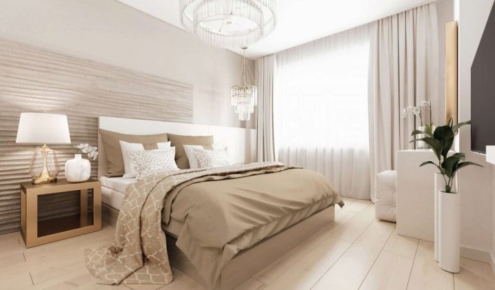
White, cream, gray, beige, pink, blue paper or non-woven wallpaper is used for the walls. The best flooring in the bedroom is laminate, cork, parquet (black, white, dark brown, cream).
The color of the ceiling must be combined with the floor and walls. It can be stretched, painted, plastered or plasterboard.
Styles suitable for the bedroom - Provence, Country, Modern, Classic, Scandinavian.
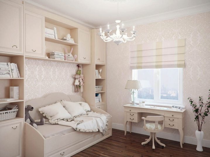
Children
The bright environment is ideal for children up to three years old.Older children need to add bright details to a neutral nursery. For this, it is better to use multi-colored toys. It is advisable to arrange the area where the baby's bed is in a neutral color so that it does not interfere with falling asleep.
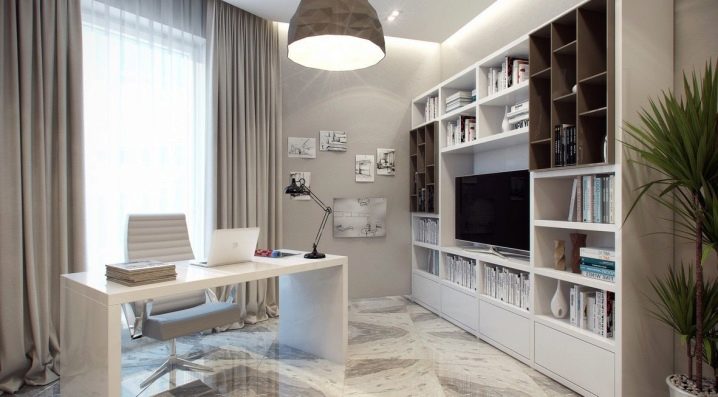
Cabinet
Classics are used to equip the office at home. Bookcases and shelves will not look bulky against a light background. And also a light atmosphere sets you up for a working mood.
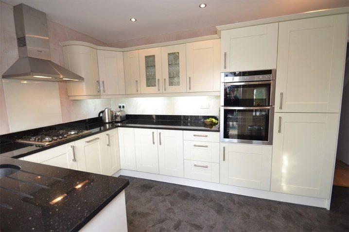
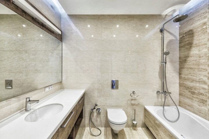
Bathroom
The combination of beige and white tiles is a classic bathroom design. Such a tandem will expand the space and add light. If you have a low ceiling, use a dark floor color. The different color of the tiles on the wall will help to beat the absence of a wall in the combined bathroom. Warm shades create a relaxing atmosphere, while cold shades give a feeling of freshness.
Any color scheme is suitable for a toilet located separately from the bathroom.
Beautiful examples
We offer a variety of options for any room and an inspiring selection of photos.
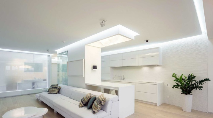
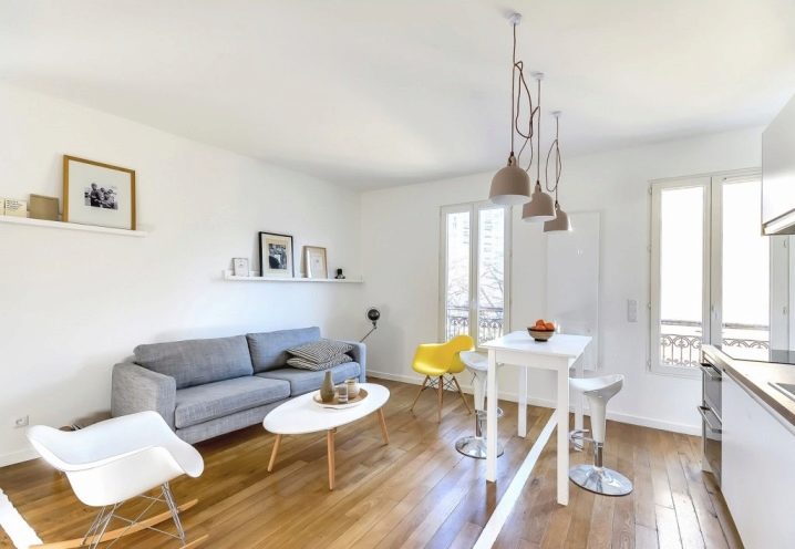
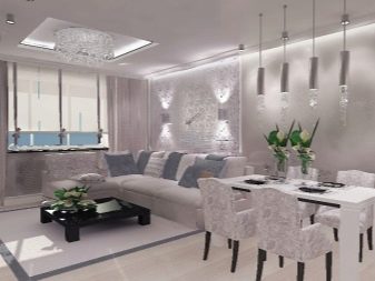
- The living room combined with the kitchen in shades of white does not at all look like a hospital sterile. Rather gentle and airy.
- The kitchen-dining room in light shades looks invariably attractive, fresh and clean. Be careful those who follow the figure - in the kitchen in light shades, any food seems useful and healthy.
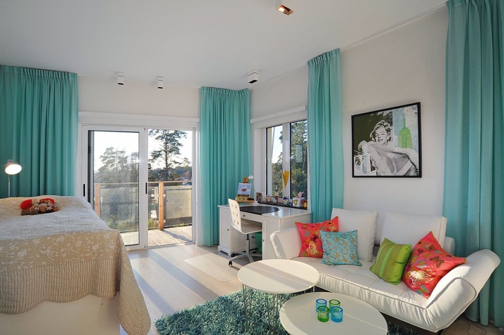
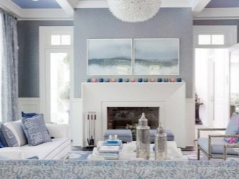
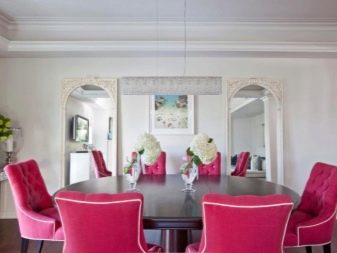
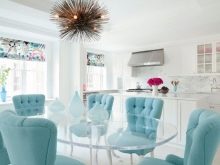
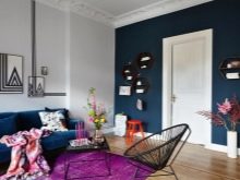
- In a light interior, separate bright color spots are quite appropriate. It can be accents in the form of flowers (as in the photo), pillow covers, figurines.
- White has a multitude of powdery shades, the combination of which gives an excellent visual volume. Unusual textures in decoration also help to dilute the uniformity of the design.
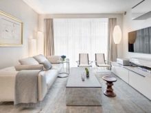
- White with light gray and ivory tints make a successful and consistently harmonious combination.
- Bright accents give the neutral design of the room in light colors a special zest and freshness.
- Light colors help to visually expand the space of a small room in the best way possible.
- Choose calm and noble shades of gold, beige and white for a truly luxurious room design.
- The entrance hall, like no other room with the absence of natural light sources, needs a light design solution.


The comment was sent successfully.