Cream color in the interior
Choosing a color palette for the interior, many rely on personal preference. But besides this, there are a number of other factors that can affect the choice of color. How to create a cozy interior that will be practical and will appeal to all the inhabitants of the house, and what is so good about the design in this color, let's try to figure it out in this article. By giving preference to creamy shades, you will solve several problems at once.
Advantages of a creamy interior
The cream color in the interior scares many. It is believed that it is light shades that are more easily soiled. But in fairness, I must say that other tones get dirty no less. But the advantages of this color are enough.
- Combines well with most colors. It is thanks to this feature that beige very often becomes the basic shade for the entire interior. Against its background, it is easy to create color accents and highlight the desired areas. If you make the walls in this shade, then you can easily change the mood of the entire interior simply by changing the color accents. For example, both furniture in a classic shade of chocolate and an extravagant red sofa will look great against its background.


- Comfort. Creamy is very pleasing to the eye. It does not annoy with its brightness and will not bother you even after a considerable amount of time. If you want to create a calm and cozy interior, then the ivory shade is what you need. This is one of the reasons why it is chosen for bedroom decoration.


- Aesthetics. The noble shade of ivory (or cream) always looks very dignified. No one will reproach the owner of the house for the lack of taste, who chose this one from the whole variety of colors and shades.
- Non-marking. Despite being a light color, it won't smudge as much as pure white. Do not be afraid of cream shades and families in which little naughty ones grow up. In any case, if little artists decide to decorate the walls with their paintings, it will be noticeable even on black wallpaper.
The only thing we advise you to refrain from is buying an expensive carpet in beige shades. But the walls or floor may well be made in this pleasant color.
- No restrictions on use. There can be as much cream in the interior as you see fit. It is impossible to oversaturate the room with this shade. It can be completely creamy or with the addition of other accents in the classic 60/30/10 scheme. That is, 60% of the main color, 30% of the thinning and 10% of the accent color. Whichever option you choose, it will be appropriate and stylish.


- Filling the room with light. If cream prevails in the interior, then the rooms will inevitably seem more spacious and freer. He does not overload the space, does not draw all attention to himself. This noble shade will fill the room with light and air. Even the ceiling in an unusual cream shade will not "put pressure" on you. It will only emphasize the creativity and taste of its owner.
Among the shortcomings can be called, perhaps, only the complete filling of the interior with a monochromatic cream color - in this case, the room will seem blurry and lifeless. But this is hardly possible, since accent colors and dividing lines will be present anyway.


What is it combined with?
A versatile and unpretentious cream, it feels cozy with most flowers.This allows your imagination to unfold to its fullest. But all variations can be conditionally divided into two large groups, which we will talk about.
Monochrome interiors
Such interiors are distinguished by calmness and nobility, in whatever style they are made. The following colors can act as a companion to the vanilla shade.
- Gold. It is always associated with luxury and wealth. But do not think that this shiny color is completely unacceptable in restrained interiors. For example, beige furniture with gold fittings will not look pretentious. This option is more likely to claim the title of noble. The main rule is to know when to stop.

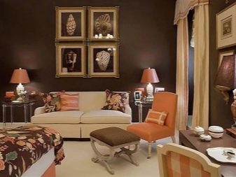
- Chocolate. The very combination of the names of these colors - cream and chocolate - already sounds very sweet. Interiors in these shades are no less "tasty". Although brown is much darker and could be categorized as contrasting combinations, belonging to the same color palette makes this combination monochrome. In addition, both chocolate and cream can be of different saturation.


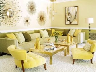
- Muted shades of light gray, mustard and yellow. Not everyone decides on a bright yellow in their own apartment. But it is worth lowering the saturation and making it slightly blurry, as it acquires completely different properties. The same rule applies to other bright colors. Together with a neutral cream, they will create a good union, pleasing to the eyes and interesting in terms of their content and perception.

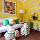
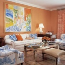
Contrasting combinations
The shade of baked milk goes well with bright colors. The best option would be to use it as a background. In this case, all accents will be clearly visible and create the desired picture.


It is difficult to list all the possible combinations of milk with other colors. Here you should be guided by your own preferences. For example, bright blue or pink furniture against a background of cream wallpaper will look great in a nursery. And in the hall, a bright carpet will become an excellent color accent and will not "argue" with a vanilla-colored floor.


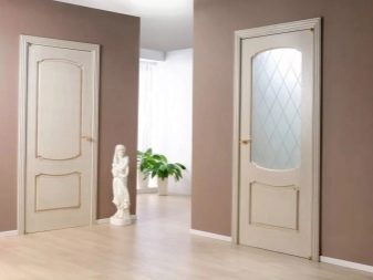
Light beige doors will also look very elegant. You just need to understand that all interior elements must be combined with each other.


Therefore, if you decide to give preference to a cream color in the design of an apartment, think over all the details in advance. Don't go to extremes.
If you want to add bright colors to beige, then let it be one color. Even such a neutral backdrop will not be able to save the day if you decide to use all the colors of the rainbow in the design of one room.
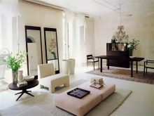
Cream for different rooms
Delicate cream color is great for decorating any room. It can be easily adapted to the design of the entire apartment or one of the zones, regardless of the semantic and functional load of the room.
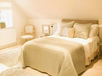
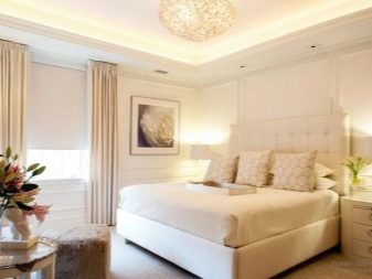
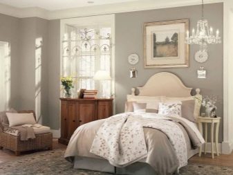
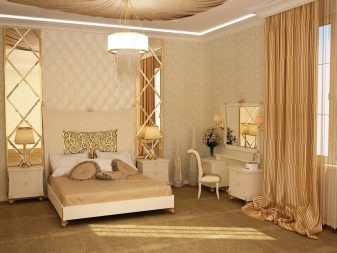
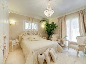
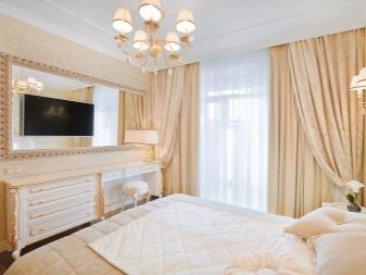
Bedroom
In this situation, vanilla will relax and calm down. This will have the best effect on the emotional state of the inhabitants. Both wallpaper and furniture can be made in cream color.
After a hard day at work, you need to recuperate. It is important here that bright colors do not tire or irritate the eyes. It will also not be very comfortable if the design is made in rich dark and gloomy colors. That is why cream is one of the best options for decorating bedrooms for both adults and children..


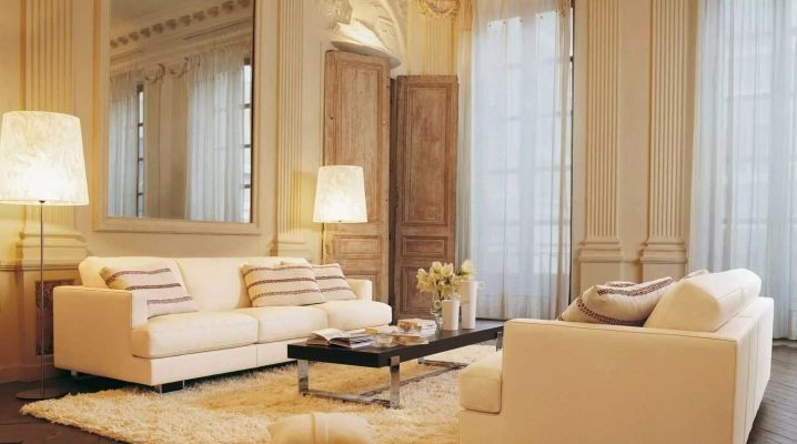
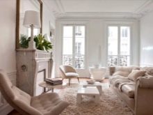
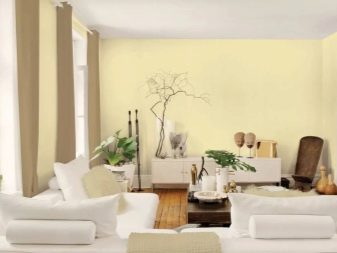
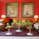
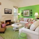
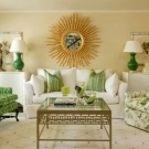
Living room
The place where the whole family and guests gather most often should be cozy and pleasant. Bright living rooms are always associated with respectability and good taste.
If you give preference to this color, then it will solve another important problem. The room will visually appear larger and more spacious. Even if you are not the happy owner of a huge apartment with a hall of 40 sq. m, light walls will visually change the geometry of even the most modest room.


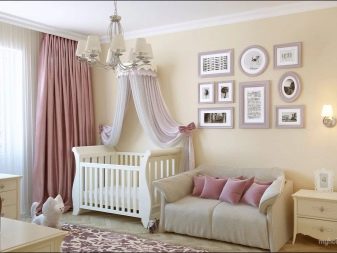
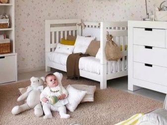
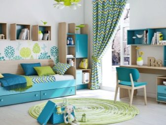
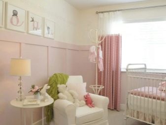
Children
Many people strive to make the children's room bright and colorful.However, in fact, it turns out that after a couple of months the riot of colors begins to "crush". Psychologists claim that for very active children, you need to choose a more relaxed room design. Otherwise, bright colors only excite the child even more, and it becomes very difficult to come to emotional balance.
The ideal solution would be to decorate the walls in a cream color. This will create the necessary calm background. V In such a situation, color accents in the form of bright furniture or toys will not hurt the eye. Plus, if they get bored, they can be easily replaced.


Kitchen
Experienced housewives know that the kitchen is a place that gets dirty pretty quickly due to its functional load. Drops of grease, water and other contaminants come from cooking and eating food. That is why many people prefer to abandon light colors in favor of more unpretentious ones. And in vain.
If the floor and backsplash in the kitchen are made of cream-colored tiles, then there will be no difficulty in cleaning them. And they will get dirty in the same way as any other shades. The same applies to the kitchen set itself - on dark wenge-colored furniture, dust and dirt will be even more noticeable than on a light surface.


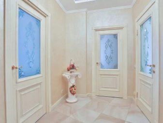
The corridor
This room is rarely equipped with windows. Therefore, the primary task is to make it light. In addition, it will be useful to visually increase its area.
A creamy shade in the decoration of walls and floors will perfectly cope with this task. If one good solution is placement of mirrors. This is a favorite design trick. The geometry and sense of space will be completely different, if you just change the dark wall decoration to cream.


Bathroom
For this damp room, the most popular finishing material is tile. The classic cream shade is presented in many collections of ceramic tiles, so choosing the best option is not difficult.
The bathroom in typical high-rise buildings is not equipped with a window, therefore it has to be illuminated only with the help of lamps. But even the abundance of artificial light cannot create the illusion of free space if the walls are dark. Cream and its shades are a classic solution for the design of this room.


Cream color is a real find for bringing to life the most daring design decisions. It can be a great backdrop for bright accents if you decorate walls and floors with it. And you can make a completely monochrome design of the room in these shades.
The milky shade is considered universal and, despite the existing stereotypes, it is not as difficult to care for it as many people think.
See below for the combination of cream color in the interior.


The comment was sent successfully.