Psychology of color in the interior
Most of humanity has a unique gift - the ability to perceive colors and shades. Thanks to this property, we can navigate the life events of the people around us. Why does color have such an effect on a person? Because this is the work of the subconscious, which has developed into a whole science. And today we will talk about the interior, where the psychology of color also plays an important role.
Peculiarities
There are general rules for the influence of different colors and shades on the human psyche. But when decorating the interior, you need to take into account that the same color will affect different family members and guests in different ways, depending on the psychotype. To determine what color and how it affects people, practice, theoretical calculations, various tables offered by colorists very often help. Different peoples use color harmony in different ways: visualize the Scandinavian style and the Moroccan style, where the restrained Nordic character is expressed in white, and oriental expressiveness in bright colors with almost no pastel shades. Another feature is the relationship between age and the colors used: you must admit that it is not easy to imagine a grandmother permanently living in a pink fairy's room.

The next aspect is gender. It is believed that women are inherent in more delicate, light shades, while men are connoisseurs of cold and monochrome tones.
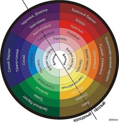
Recall that monochrome includes white, black and all shades of gray. But what colors are warm and cold is very convenient to look at on the color wheel, which is used by all colorists.
Professional affiliation will also play a role in color choice. It's hard to imagine a boss in an office in an orange suit, and a plumber in the same pink. And one more feature is the purpose of the room: the psychology of color is such that for the living room and office, the bedroom for children and adults, tones and shades are selected in which it is comfortable to work, relax, receive guests or sleep. In some cases, the design of the room should help to concentrate, in others - to relax.
Characteristics of colors
To choose the most pleasing color combinations for the eyes, you need to understand their characteristics. Comfortable perception is a matter of a specific moment, and repairs are done for several years, which means that the color scheme must be selected for the future. First, let's take a look at monochrome colors that can be used everywhere without fear of being overwhelmed. But you should always remember about the balance between all the shades used in the interior.
White
This is the color of calmness and spirituality, justice and sincerity. It fills with energy and pushes forward, improves the functioning of the endocrine and excretory systems, as well as the organs of vision. But a monochromatic white room is perceived by the subconscious as loneliness, surrounded by emptiness.
To prevent this from happening, it is recommended to dilute it with any colors.
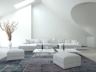
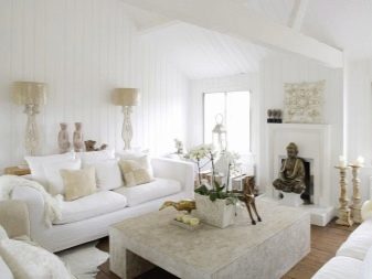
It goes well with pastel shades, as well as bright orange, blue, turquoise. It is these colors that can be bright accents in Nordic minimalism. Blue and white are the main colors of the Gzhel style. Do not forget that any bright color becomes even brighter against the background of white. To prevent such paints from cutting the eyes, they often use not crystal white, but white pastel, which on the color wheel is closest to our tone.
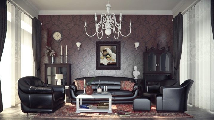
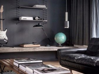
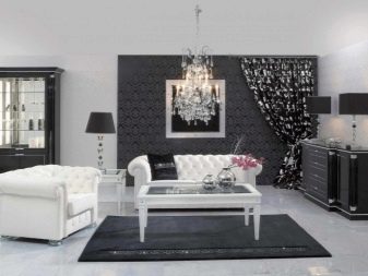
Black
Depending on our psychological state, we treat black in different ways. Its perception largely depends on the surroundings: glossy black, marble with silver veins or black, framed with turquoise. Despite the fact that black is depressing for some, most people see intrigue in it.
An attempt to create a black interior is a desire to hide your own inner world from others.
It will perfectly hide flaws, replace space. For the people of Japan, black is a symbol of experience and wealth. But making a purely black interior is perhaps the greatest stupidity. He will crush everyone in a short time. If the desire for a black interior is caused by psychological problems, then in such a room they can only get worse.
It is imperative to create harmony using other colors.
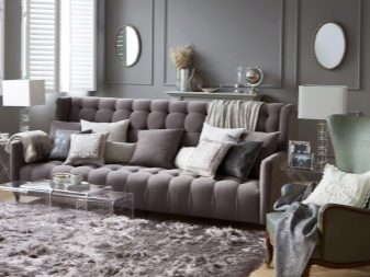
Gray
It is believed that the preference for gray in the interior is a desire for stability, emotionless calmness. This color is the personification of loneliness hidden behind self-sufficiency. Now gray is a frequent visitor of interiors. Ash walls, decorated with various bright elements, are held in high esteem. Gray with pink - a combination of a cold cocoon with a delicate butterfly inside. Against the backdrop of brown and peach, the smoky shade has turned into a soft and fluffy kitten. It is difficult to imagine a shade for which gray would be a poor companion.
Now let's turn to the colors of the rainbow.
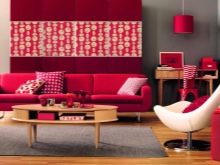
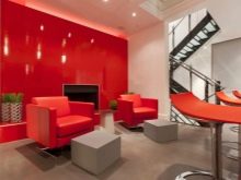
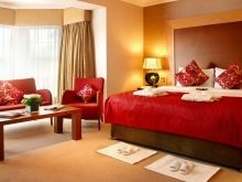
Red
This color stimulates the nervous and circulatory systems, increases sex drive. Psychologically, he identifies a leader promotes friendliness and confidence. But blood red is the color of aggression, conflict. A large number of red spots in any room will be difficult and will ultimately lead to lethargy.
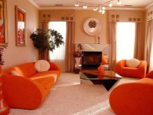
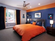
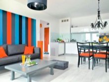
Orange
The color of a ripe orange definitely raises the mood, makes the world around you more colorful. It is energy and cheerfulness, activation of brain activity and concentration of attention, an excellent antidepressant. It makes people friendlier, kinder, increases self-esteem, and has a beneficial effect on the work of the endocrine and digestive systems. But, thinking about the future, it's hard to be only in orange every day.
Better to think about combining with other colors.
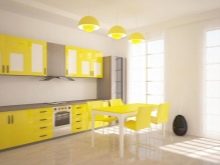
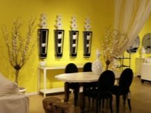
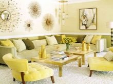
Yellow
This sunny tone is called the most intellectual: it is responsible for creative development, talents, memory, improves logical thinking and increases the level of concentration. With its help, food, vitamins and some trace elements are better absorbed. Therefore, it will be useful in the interior of the kitchen. But it can aggravate insomnia, since falling asleep in such an active color is problematic. The flip side of optimism is emotional incontinence. Yellow goes well with other warm tones.
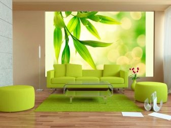
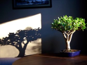
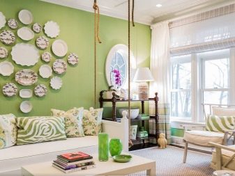
Green
It is the color of peace and freshness, calmness and tenderness. It has a calming effect and symbolizes life and harmony. It helps to find peace in difficult situations, improves the functioning of the cardiovascular and respiratory systems. Psychologically, with a lack of green color, a person feels disharmony.
But you should not use it in rooms where you often have to make decisions - the color is relaxing.
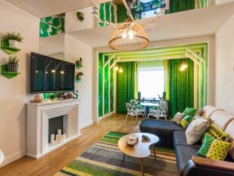

That is why nature wallpapers in green tones are often used in apartments. But do not place in bedrooms at eye level, otherwise relaxation can turn into apathy. And also you need to correctly select shades. And green is also credited with attracting money. So the money tree on the windowsill, the money frog on the table - and life will sparkle with new colors.
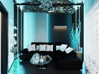
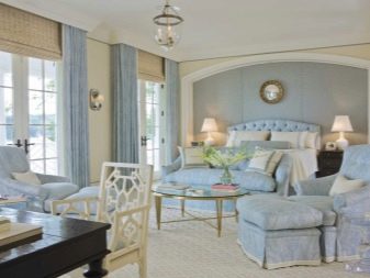
Blue
This shade of blue is loved by creative people. It soothes well, helps to cope with migraines and insomnia.But the constant presence in this color will lead to drowsiness and chronic fatigue. Since blue itself is a subtone, it is better to combine it with the shades of its circle or with blue of different saturation. It is recommended for classrooms because it is considered creative. It helps to liberate yourself with shyness, fear of the public.
This color is loved by psychologists, it gives confidence and optimism.

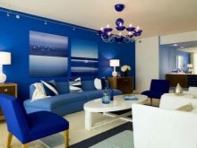
Blue
This color is recognized as the most popular, it relaxes and soothes physically and mentally, has a positive effect on vision and the endocrine system, treats insomnia and rheumatism, hypertension and lowers body temperature. Psychologically, it evokes alertness, but clears thinking and activates intuition, relieves fears and anxieties. The color of cold space is not recommended for use in rooms where depressed people are. Logic, analytics, control over emotions, poise, equanimity - for the development of these qualities, you need to surround yourself with moderately blue interior of various shades. And in the bathrooms, under the sound of water, it will relax and soothe.

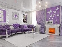
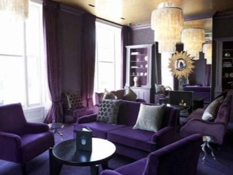
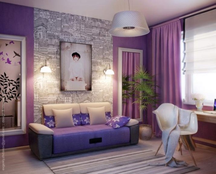
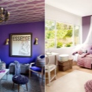
Purple
This color, obtained from a mixture of warm red and cold blue, is the same in life: it can become a delicate lilac or deep blueberry. But pure purple is the color of mystery. They need to decorate the premises very carefully: with an excess of purple, depression and nervousness, apathy and fatigue can settle with you. In reasonable amounts, it provides energy and neutralizes tension.
It is the color of the balance between yin and yang.
How to choose shades?
In the color wheel, the place of the tone is of great importance: divide the circle in half by drawing a line through the center - the colors that are most distant from each other along this line will be contrasting and suitable for combination with each other. Shades of the same color of different saturation are perfectly combined. Another way not to be mistaken in the choice of tones is to use shades of different colors equidistant from the center of the circle.
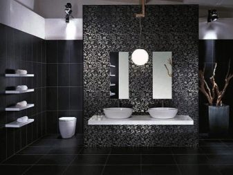
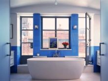
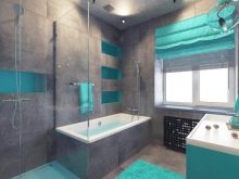
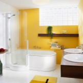
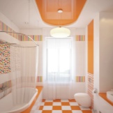
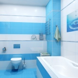
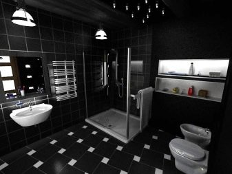
Bathroom
Since the bathroom rarely has windows, it can be lightened with whitewashed tones. A more accurate selection of shades will depend on the size of the room.
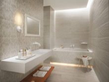
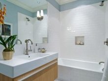
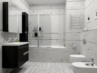
- White is used to visually enlarge the room, but to get rid of sterility, it is better to combine it with a refreshing blue or warm yellow, orange. The smaller the bathroom, the lighter the shades should be.
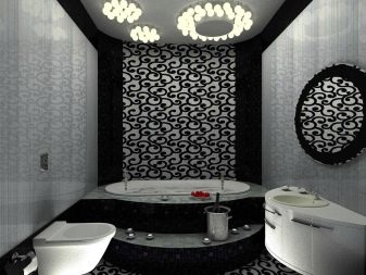
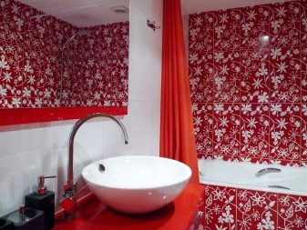
- In a large room, black and white or black classics will look gorgeous. You can try to make the room red, but this color is unlikely to be suitable for a family with children. But silver, gray, you can try to compile with any colors.
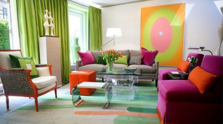
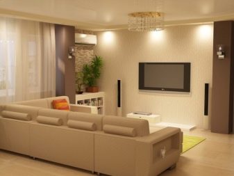
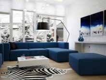
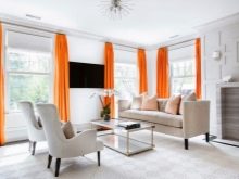
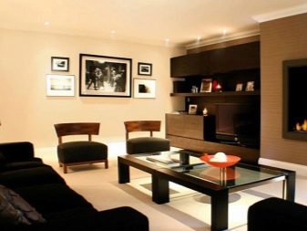
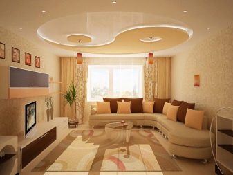
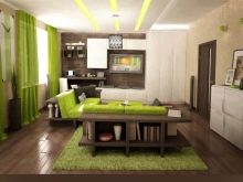
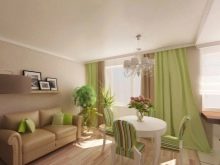
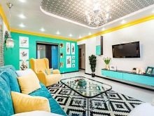
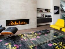
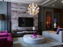
Living room
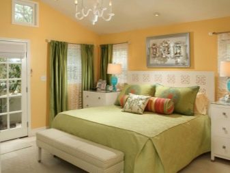
If in your home the living room or hall is a place for the family's daily gatherings, then the colors should be chosen warmer, more friendly. Otherwise, it may turn out to be a room of constant quarrels and conflicts.... Since furniture is often chosen brown, the living room can be decorated in shades of this color. There are many halftones, and if you also use the shades of the neighboring yellow, you can get a very warm room.
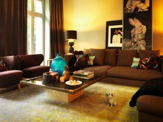
Green should use softer shades.... It is not at all necessary to use green wallpaper - let it be flowers, wall plates, curtains, tulle, that is, something that can be removed from the room at any time. Although a very sunny living room will be perfectly shaded by deep green velvet curtains.
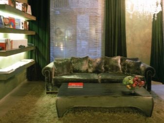
And the same sofa will relieve headaches, lower blood pressure and produce an overall calming effect.
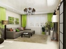
I want bright colors - why not, but neutralize them with gray, pastel shades of green, yellow, orange. Red, blue, purple - deep colors. So that they do not turn out to be psychologically difficult, it is better to use them as decorative elements: a picture of a blue sea, a purple carpet and a sofa, red poppies in a vase or on the wall.
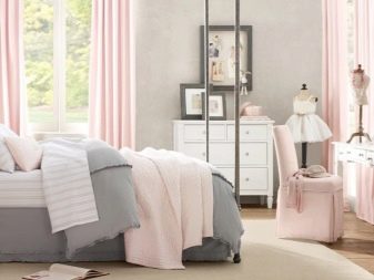
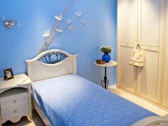
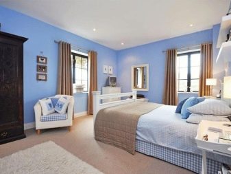
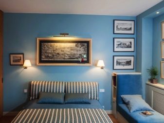
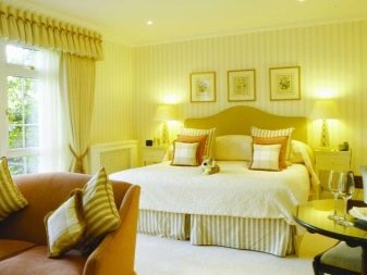
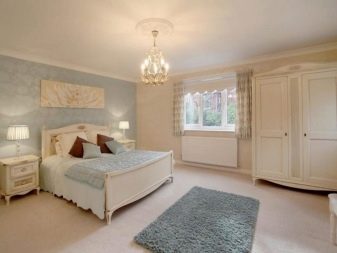
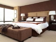
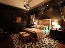
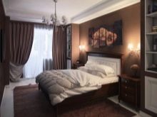
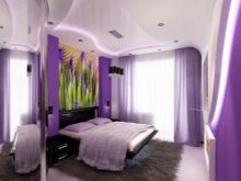
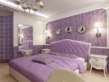
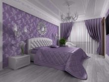
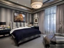
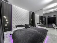
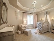
Bedroom
In an era of chronic sleep deprivation, the psychological atmosphere of the bedroom is one of the most important aspects of health. Let's take a closer look at the color scheme for this room.
- Cool blue walls "cool down" thoughts, relax the nervous system, and give vigor in the morning. It is worth picking up beige and yellow companions.
- Bleached shades of green with light yellow, peach are the colors of harmony and tranquility. Don't use rich greens.

- Deep chocolate with a beige accent is the interior of confident people. But it is very important to try to avoid the tint pattern in textiles.
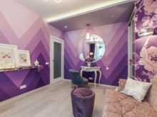
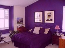
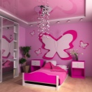
- A real lady can afford a lilac bedroom. Only very carefully you need to combine with darker shades.
- For men, in addition to chocolate, black and gray are perfect, possibly in combination with white. These monochrome colors will stabilize each other and your nervous system.

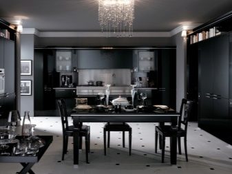
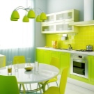
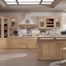
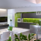
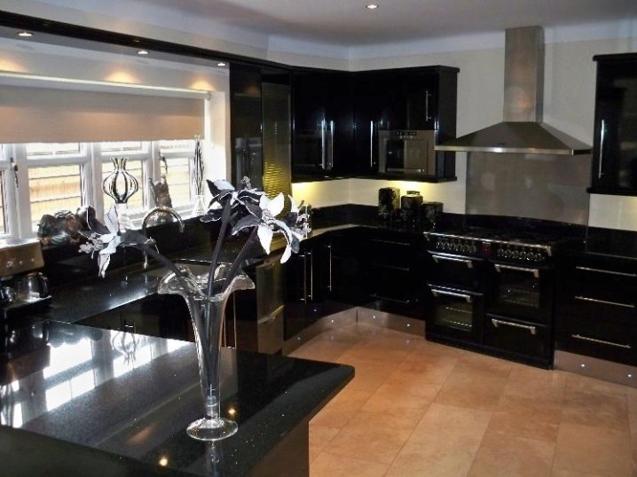
Kitchen
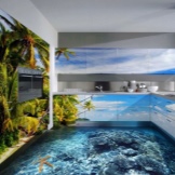
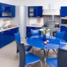
If you want to see a good appetite from your family members, choose juicy green shades for the kitchen, as well as bright orange, yellow, red - the colors of vegetables and fruits. They can be reflected on walls and headsets, apron and dishes. But blue and blue will help control appetite, which is why the idea of 3D floors, walls, facades in a marine theme is so interesting. Natural wood color will relax. It is often combined with beige, cream, blue and green.
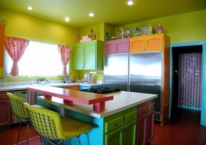
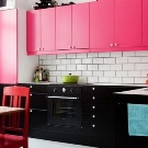
Many are interested in whether the kitchen can be made in black. Why not. If the kitchen is sunny, it will not depress. But white should not be used in large quantities by people inclined to be overweight - it develops appetite.
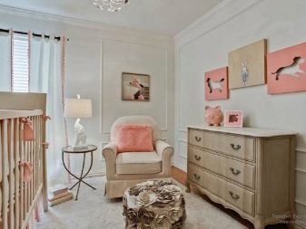
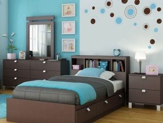
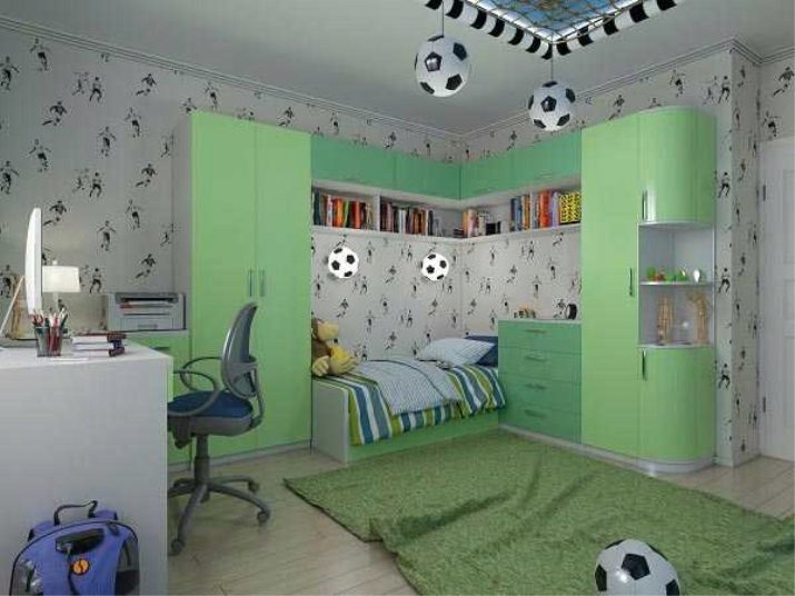
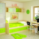
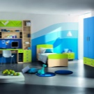
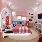
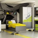
Children
Children are excitable creatures with poor concentration. They quickly switch from one activity to another. This is what needs to be taken into account when designing a nursery for different ages of a child.
- Children under three years old it is important to be among calm shades, so use pastel colors without large drawings.
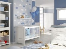
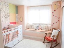
- From the age of three the child increasingly needs his own workplace, so the room will be divided into a work area, rest and sleep areas. Each can have its own color, but together it must be harmony. In addition, at this age, it is extremely important to take into account the psychotype of the baby: blue, light green will help the hyperactive to relax before going to bed. Bright red will play a positive role in concentration of attention, but in small quantities - a table lamp, a pen, a poster. Pink, blue, brown, green and yellow are suitable for the play area.
- In adolescents with a change in the hormonal background, color preferences also change: girls like lilac, purple, light green, olive, blue and, of course, pink; guys prefer blue, brown, black. You do not need to interfere with their choice of color, but if you are alarmed by the combination of the selected colors, push for a more competent ensemble.

Helpful hints
For each person, on a subconscious level, it is important to be in a comfortable environment. From the point of view of color psychology, for a feeling of comfort, we recommend listening to the following tips:
- Before creating the interior, carefully consider and draw the configurations and dimensions of the room, including the height of the ceiling and the dimensions of the window and door openings;
- draw a picture in color the way you would like to see it: walls, floor, ceiling, furniture, textiles, doors and windows, lamps;
- remember which side the windows face: in a dark room, the finish should be lighter;
- specify the material of the upholstery, curtains: satin will make the room brighter, velvet - richer;
- if the life mode of the owner of the room involves daytime sleep, it is necessary to provide for dimming for the windows;
- in places of rest and sleep, bright colors are appropriate in the form of accents, but not as wallpaper;
- light walls and ceiling will make the room visually larger;
- it is recommended to use no more than three colors in design, but with a competent combination of shades it can do more.

The psychology of color in the interior is described in the next video.


The comment was sent successfully.