We select the shade of wallpaper for the kitchen set
When decorating the kitchen, it is important to choose the right wallpaper that blends harmoniously with the rest of the interior elements and creates the right mood. It is more convenient to do this based on the color of the selected headset, which is the central "spot" of the entire room.
Basic rules for combining
In order to choose the right wallpaper for a kitchen set, it is important to understand what rules are usually used to combine shades, as well as what color creates the required visual effect and its psychological impact.
Paints of the same color palette are well combined, differing by tone or half tone... Combinations of several shades that correspond to a single range are also suitable. For example, gray wallpaper is suitable as a harmonious background for lilac kitchen items. It would also be good to choose one dominant color and complement it with inserts of a darker or lighter paint.
For a black and white, yellow and blue or other bright contrasting kitchen, it is important not to overdo it with a variety of palettes and use something neutral as a background. In addition, regardless of the color of the furniture itself, it is important to remember that cold colors, for example, blue or silver, will visually expand the room, and a small pattern or pattern on the wallpaper will also work. The most pleasing to the eye are beige and orange, as well as yellow tones.
How to match with furniture?
When choosing wallpaper for a kitchen set, you should remember the importance of balance. This means that bright furniture must be balanced by calm walls, and vice versa.
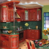
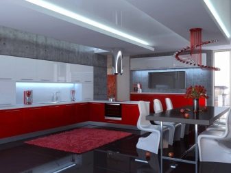
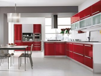
Red tones
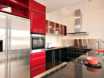
A bright headset in red tones looks good only in a spacious room. It is good if the layout provides this, but when the number of square meters is limited, you will have to visually expand the space with the help of wallpaper. The abundance of red tones can be tiring and, in some cases, provoke aggression.
It is better to take the headset itself not in bright scarlet, but rather in dark variations of red, for example, burgundy or pomegranate. Wallpaper in this situation is chosen calm, even neutral.
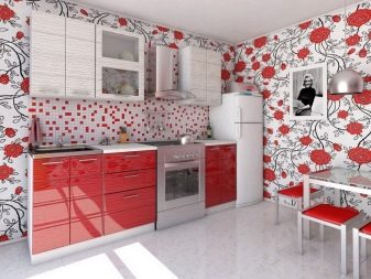
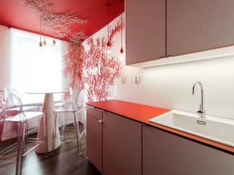
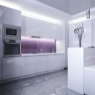
White, gray and pastel shades such as cream or ivory are considered ideal. In principle, a combination of red and black is also possible, but this is not suitable for all owners, since the mood of such a room may seem aggressive to someone. A white tint can balance this situation.
For example, the snow-white painting of the walls with geometric inconspicuous patterns will be an excellent "base" for a high-tech style headset.
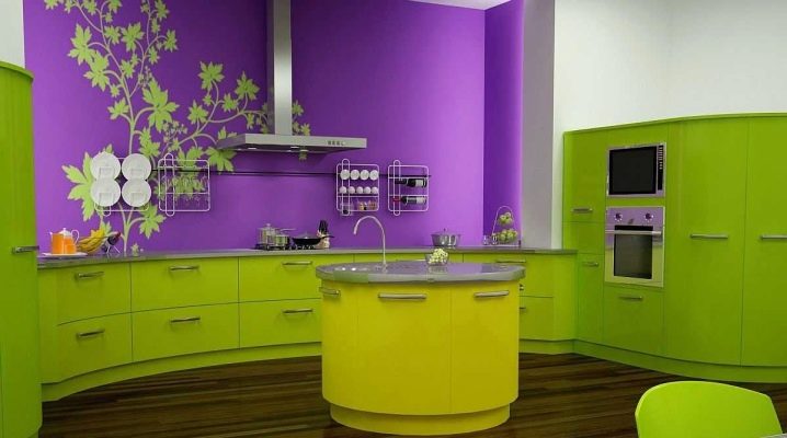
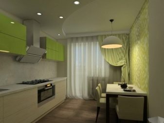
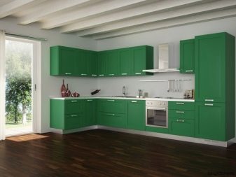
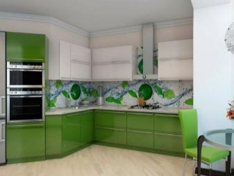
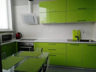
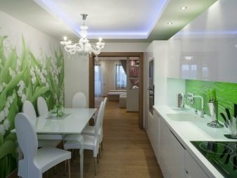
With green
The green shade in the cooking area is considered one of the most successful, since this color not only creates an atmosphere of coziness, but also soothes, and also combines with many colors. Light green, pistachio and olive furniture will look great against the background of orange, beige or yellow wallpaper. Some experts even advise you to experiment and paint the walls in burgundy tones.
Objects of any shades of wood will look good as a decor in such a kitchen. By the way, if the color of the headset is bright, and its surfaces are decorated with gloss, then you should give preference to quieter wall paints without any patterns, for example, milk or cream.
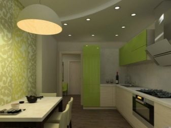
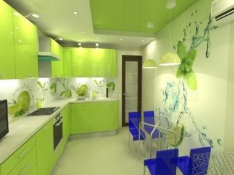
Shades of green go well with each other.Alternatively, light green facades will organically manifest themselves against an olive or marsh background.
In order not to overdo it with green, you will have to dilute it with white inserts.
In addition, light green itself is well combined with blue, pink and sandy shades, but in no case should it be supplemented with shades of lilac. "Cold" cuisine, for example, turquoise, emerald or mint color, is recommended to complement the same cold colors - steel, blue or pure snow-white.
With light
The beige kitchen is chosen for many reasons. It expands the space and fits into any style, can be combined with any colors, and also has various "tasty" shades: coffee, cream and others. The beige set will fit perfectly into the white kitchen - it will turn out to be very light and calm. A combination of beige and brown will look good if light tones still remain dominant. Alternatively, you can purchase white wallpaper with brown patterns or designs.
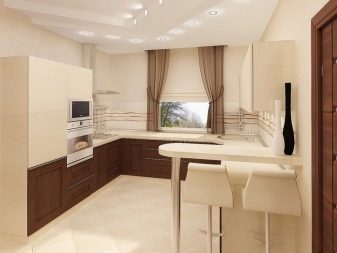
With a minimal decor and plain surfaces without a pattern, you can combine a beige set with purple, burgundy or terracotta. For maximum comfort, you should choose gray or green wallpapers. A gray shade is rather appropriate for a minimalist interior, and green is a country, boho or eco-style.
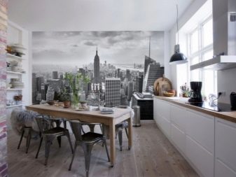
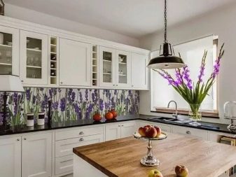
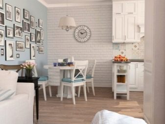
A white set will look with any other shade, so the selection of the latter should mainly depend on the style of the interior. It will be appropriate to choose an unusual background, for example, a photo wallpaper with a three-dimensional panorama, graffiti, flashy patterns or bright drawings. The combination of snow-white furniture and wallpaper imitating a brick surface, wood or tile will also be interesting.
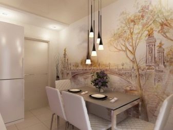
The more interesting and impressive the furniture, the calmer the background should be.
If the kitchen is decorated in a country style, then the walls can be decorated with a floral pattern, natural images, or even a landscape. The Provence style goes well with wallpaper with images of lilies or irises. It is recommended to place a Scandinavian-style kitchen against a background of light gray, light blue or even blue walls.
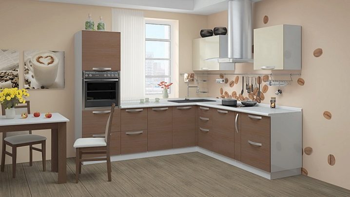
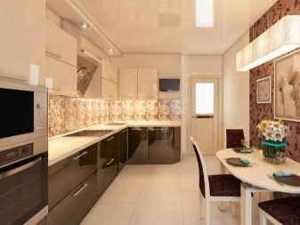
With brown
A brown headset or wenge color looks impressive and self-sufficient, which means that it requires a background that can not "drown" it. Furniture looks most organic with wall covering in pastel shades, from beige to cream. If the cabinets have a "warm" color, for example, with chocolate or burgundy notes, then the wallpaper can approach either a yellow-orange palette - be vanilla or soft orange, or to green tones, for example, pistachio. "Cold" wenge with green and purple tints looks good against a background of green or lilac.
In order not to make the interior overly saturated, you should give preference to the minimum amount of details and the absence of patterns.
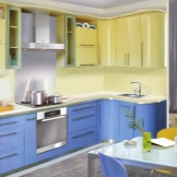
With blue
The choice of wallpaper for blue or blue furniture largely depends on the desired mood of the interior. For example, a headset in bright blue with white or light green wallpaper will form a cool, calm interior. To add temperature to it, the walls will have to be repainted in a delicate shade of peach. Blue furniture and yellow or green wallpaper will give the room a positive mood, but in this case it will be extremely important to choose the right accessories.
If you buy striped wallpaper, which is a combination of white and red, then a retro atmosphere will immediately appear in the kitchen. Approximately the same effect will be obtained when combining cornflower-blue cabinets and bright yellow wall surfaces - by the way, this combination is also typical for country style.
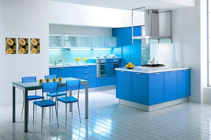
Most often, in recent years, a blue set is located in a kitchen painted in a calm gray color, and "cold" should be combined with "cold". This combination is appropriate for the Scandinavian style, and for the minimalism style, and for any other modern one.
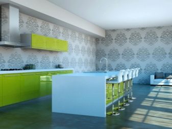
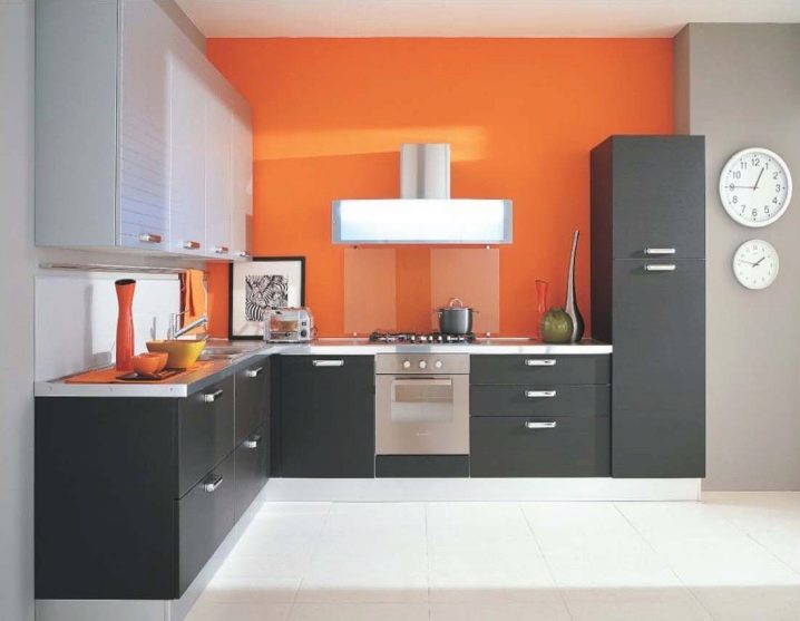
With bright
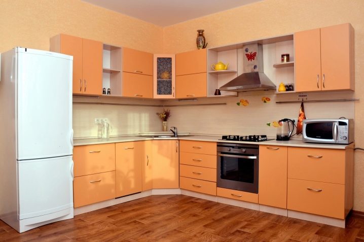
A calm wallpaper that plays the role of a background is suitable for orange furniture. This, by the way, does not depend at all on which shade of orange you plan to use. The most harmonious is the combination of gray walls and an orange set, complemented by steel appliances. Monochromatic green coatings that can add positive emotions to the space will also show themselves well.
The combination of orange and white is quite classic, which should be supplemented with wooden objects for softening.
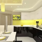
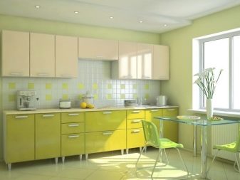
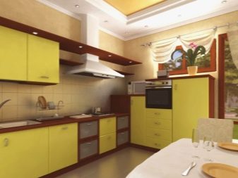
The yellow kitchen is quite controversial: on the one hand, it seems filled with sunlight, and on the other, an excess of this color can even cause irritation. That's why it is better to take not the color of the yolk, but something quieter - for example, golden, sandy or mustard.
If there is sympathy for several shades of yellow, then it would be wiser to take the one that is lighter. Pastel, green, blue or pink walls are suitable for any of them.
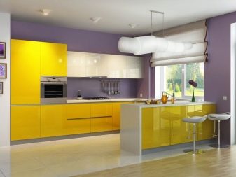
The combination of gold and red looks very impressive, but it is only suitable for decorating an oriental-style kitchen and is not psychologically suitable for everyone. Combinations of yellow with blue or yellow with brown look good.
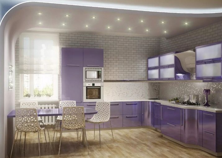
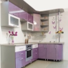
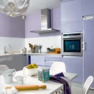
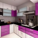
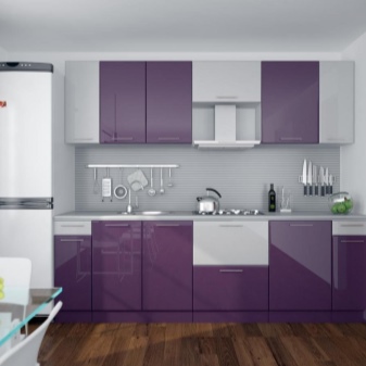
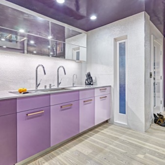
The purple kitchen is not particularly loved by design specialists, since this color is very complex, and also significantly changes its shade depending on the background. For example, calm purple cabinets, being next to red wallpaper, will play aggressively with purple. In any case, purple should always be diluted with white inserts.
A purple headset will look good with green, blue or pale yellow colors. The lavender shade looks beautiful against the background of pastel-colored wallpapers, from cream to beige.
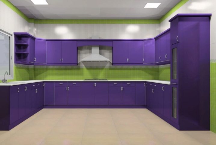
The best solution would still be to place a purple headset in a snow-white or light gray room. This color scheme looks calm and harmonious, but at the same time quite impressive. Black items will ideally fit into such a kitchen. By the way, an interesting solution would be to highlight striped inserts with a lilac shade corresponding to the color of the headset on the snow-white wallpaper.
It is advised to combine burgundy cuisine with calm shades, for example, beige or green, as well as cold shades of blue. A combination of burgundy and white is always considered a win-win.
Non-standard solutions
In the case when there is a great desire to use some unusual design, for example, a lime-colored headset or wallpaper with oranges, it is easiest to balance it with a pure white shade. Wall decoration with white brick fits perfectly into a classic or Scandinavian interior, and therefore requires the use of light furniture, ideally, not painted additionally, but retaining a natural wooden shade.
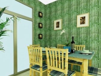
Wicker coverings or photomurals with bamboo groves look good with cabinets covered with soft yellow paint.
It is worth saying that experts advise fans of experiments to purchase wallpaper for further painting, which has an unusual texture. Thus, by the usual repainting and adding new details, it will be possible to completely transform the interior.
Beautiful examples in the interior
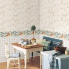
A serene set in beige and brown tones will look great on cream-colored wallpaper decorated with the image of several coffee beans. Such a calm interior creates a very pacifying atmosphere, which, if necessary, can be "invigorated" by adding only a few bright details.
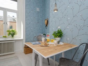
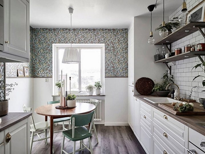
If in a small kitchen you still want to use patterned wallpaper in a dark shade that "steals" space, then you should not do this on all surfaces. For example, plant motifs can be "settled" only on the upper half of the walls, and the rest of the space can be filled with white.The set in such a kitchen should be calm white with wooden details.
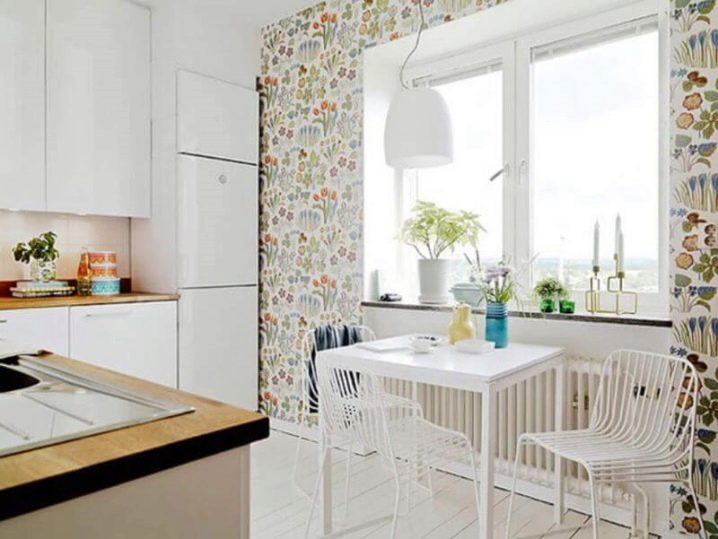
Scandinavian design, subject to the choice of light furniture, allows you to choose wallpaper with unusual patterns in a measure of bright, but not flashy shades. It is important to mention that such a coating should only be on one of the walls, and it is better to leave the rest white.
You will learn how to choose wallpaper for a kitchen set in the next video.


The comment was sent successfully.