Combined wallpaper design in the kitchen
To decorate your home, you can start with wallpaper. Among them, one of the most fashionable trends is the combination of types of different designs. This combined approach is used not only to add variety to the interior, but also to visually change the room itself.
Peculiarities
Since we are talking about wallpaper for the kitchen, there are several nuances to keep in mind.
- The kitchen environment is characterized by high humidity and frequent temperature changes, so you need to pay attention to the material of the wallpaper.
- There is a high risk of staining all surfaces, including walls. To prevent this from happening, you need to choose smooth models - they are easier to wash. In addition, the embossed pattern can be easily damaged.
- The lifespan of wall coverings can be quite long. But due to unforeseen situations, it is sometimes necessary to replace them in small areas. Therefore, you should have a stock of all types of wallpaper used.
After evaluating the practicality, you can pay attention to the aesthetic component of the wallpaper. Since most apartments do not have dining rooms, and this function is taken over by the kitchen, its appearance must satisfy the tastes of all family members. If there is no general solution to this issue, it is better to choose the neutral option.
And so that the design is not boring, they use two, less often three types of wallpaper. This approach has its positive and negative sides. Let's consider the pros first.
- Visual change in the parameters of the kitchen area: expansion, increase in the height of the ceiling.
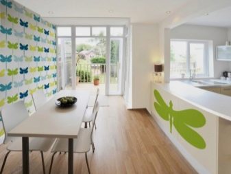
- Allocation of any part of the room: central, working, dining. Using different wallpapers is one of the zoning techniques.
- Hiding various kinds of small and large defects. Small ones - cracks, potholes and other irregularities. From large - niches, ledges, boxes.
But, despite all the advantages, be prepared for the fact that the wallpaper should be combined not only with each other, but also with other furnishings. Therefore, the issue of choice must be approached with all responsibility.
Materials (edit)
The choice of material affects not only the durability and practicality of the wallpaper, but also their appearance, since each material has its own decor options. Paper wallpapers are impractical for the kitchen. Suitable wallpapers include the following varieties.
Non-woven
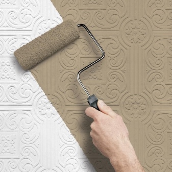
This stuff is done from cellulose fibers, textiles, acrylic and others. The density of the wallpaper depends on their ratio. On the roll you can see icons indicating the density and other characteristics, including their harvest. Some of them can only be washed with water, others with detergents. Preferred for wallpaper in the kitchen brush and waves icon - this means that they can not only be washed, but also apply a little effort.
In appearance, wallpaper made of one non-woven fabric can be smooth or textured... And they are intended for the subsequent application of paint. When choosing a paint, you also need to evaluate its practicality.
But you can often update the interior by creating your own graphic decor. For example, you can make stripes: stick masking tape on the wallpaper, and after applying the second layer and completely dry, carefully remove it and apply paint of a different shade to the convex parts.
Vinyl
This kind of wallpaper is multi-layered. Paper is used as the main layer, which is undesirable in the kitchen area or non-woven.Vinyl is applied in a special way and the result is four types of wallpaper.
- With a foamed face layer. Such wallpapers usually have a relief of different depths. This coating is more porous.
- Dense (pressed)... The last layer is applied under a press. As a result, we get more durable wallpapers - smooth or with relief (imitation of stone, floral or abstract motives).
- Hot embossed coating. It can imitate any natural or textile material, be plain or patterned. There are options with a pearl effect or sparkles.
- Silkscreenedimitating a fabric covering. This type is considered the most sophisticated. Its beauty lies in the drawing with unusual tints.
How to place?
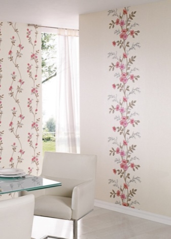
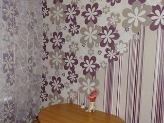
Companion wallpapers occupy a special place among the wallpapers. You don't need to select them yourself, you just need to take a couple of the ones already chosen by the designer. As a rule, they are placed side by side in the showcase.
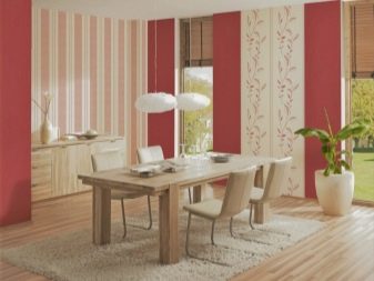
One of the options will be calmer, and the second will seem especially bright against the background of the first. It is they who can be glued through the strip. So even the brightest drawing will seem less provocative. Moreover, the width of the stripes can be the same or different.
Much depends on the picture - it is better if it forms a kind of vertical row.
The following rules can be applied to the rest of the wallpaper combinations.
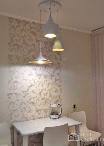
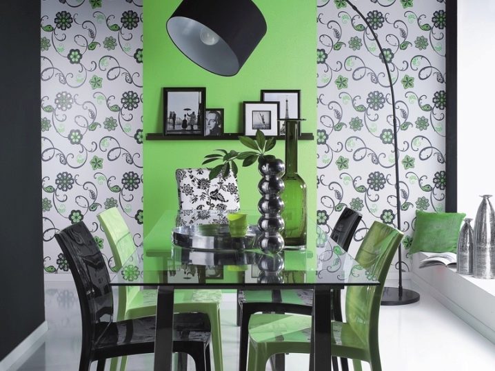
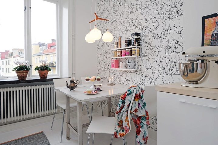
- We paste over one or two opposite walls with brighter wallpaper, fill the rest of the space with background. In this case, you can not observe the clear boundaries of the walls, they may slightly shift.
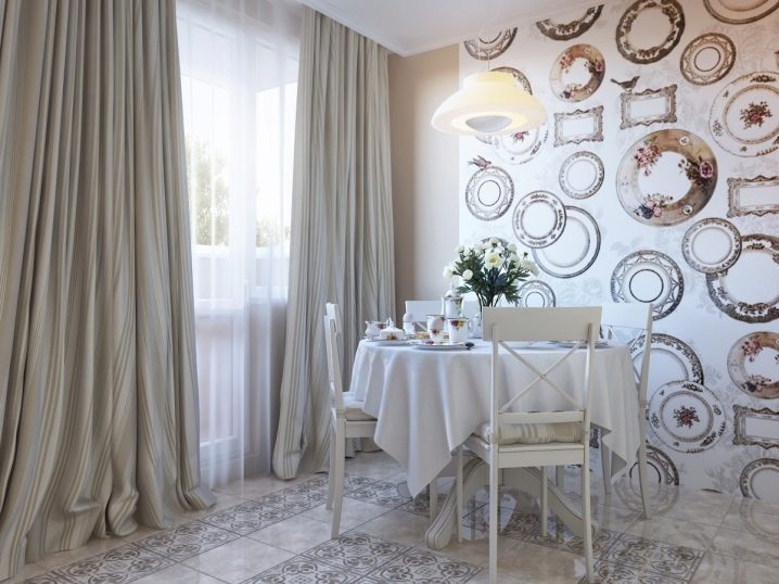
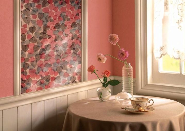
- You can make a kind inserts on the walls in the form of large paintings or medallions. You can also arrange piers between windows or niches this way. In this case, the design of the inserts should carry some meaning.
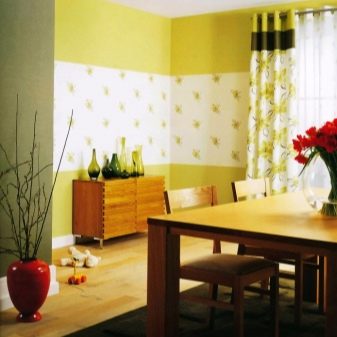
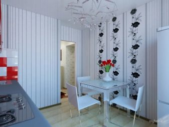
- With bright stripes some part can be distinguished - for example, a dining table. Or designate the center in the kitchen if symmetry is at the heart of the interior.
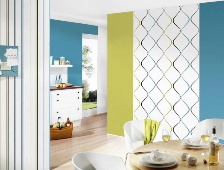
Any vertical arrangement of wallpaper can create the illusion of increasing the height of the room. If you divide the wall horizontally, you can get a different effect - the ceilings will become lower, but the space will expand slightly. In this case, it is important to beat the border between the top and bottom. It can be a strip of wallpaper or a raised cornice. A strip of contrasting wallpaper can also be placed in the middle, parallel to the floor.
There is also a more intricate arrangement of a combination of two or more wallpapers. For example, diagonally or according to a special design. The border between the canvases can be wavy, semicircular or stepped - as you can only imagine.
This arrangement emphasizes the originality of the interior, repeats its basic geometric lines.
If you decide to choose the wallpaper yourself, then remember some of the features.
- Both options should be combined in color and texture.
- The drawing, if it is on one of the canvases, must be appropriate.
- Be careful when joining wallpapers of different widths.
- Pay attention to the material and thickness of the blade. Wallpaper made of the same material, but of a different type, may also differ in thickness - the joints between them will be uneven.
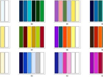
How to match colors?
You should be especially careful about the color combination. In general, it is believed that in the interior of the kitchen there should not be more than 3-4 of them... Matching the chosen color scheme will emphasize unity and harmony.
The more extraneous colors there are in the covering of walls, floors and ceilings, furniture, textiles and dishes, the less coordinated the kitchen furnishings look.
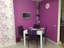
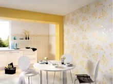
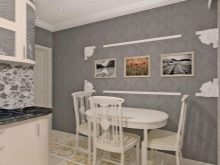
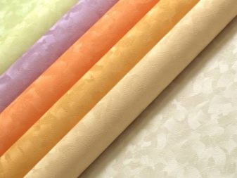
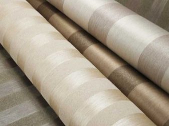
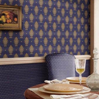
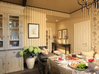
The easiest option is combination of black and white. Moreover, in order for the kitchen to seem light and not make an overwhelming impression, there should be much more white - it should be the background. Neutral can be called combination of brown, beige and gray... Such an interior is a win-win if you need to take into account the tastes of all household members or you cannot make a choice.
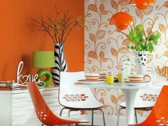
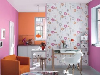
Neutral colors can be diluted with brighter, but restrained: burgundy, dark blue, purple, dark green... Or use bold combinations of pink and orange, green and yellow.
To choose, you can use a special color combination table or rely on your own taste. Another good option is to use darker or lighter shades of the same color. With two-color wallpaper, the situation is more complicated - in this case, it is better to choose a single-color version for them.
When choosing wallpaper, be sure to look at the batch number on each roll, as there may be discrepancies in the shade - they may not be visible in the rolls, but will be noticeable on the wall.
Examples in the interior
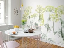
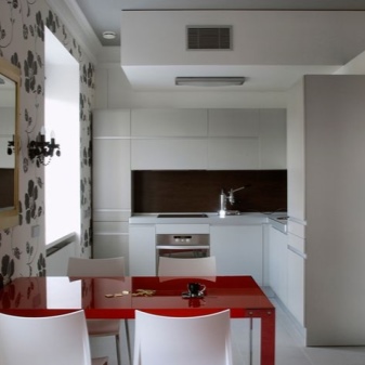
If the above combination ideas seem too complicated for you, use one of the suggested options. If the kitchen area is small or its windows face the shady side, any combination of light and warm colors... They will fill the room with light and comfort. Such a kitchen will seem more spacious.
For a spacious and light kitchen, there are many more combinations of wallpaper. You can even say that any that match the general style of the interior will do. It is important that none of the colors are dominant and that balance is maintained.
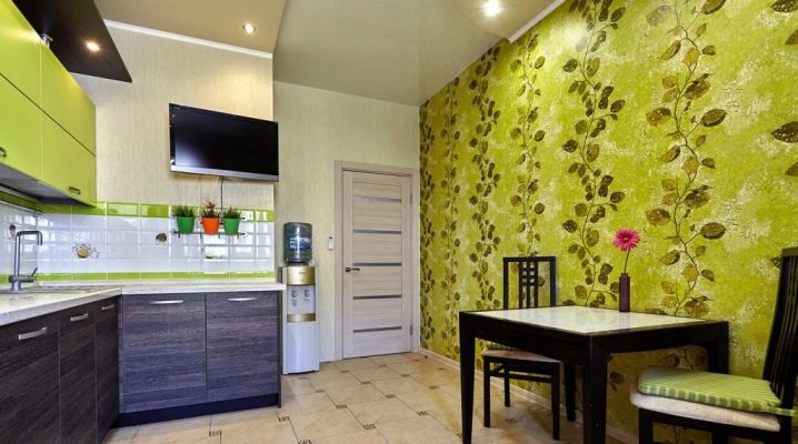
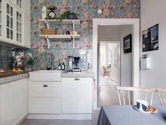
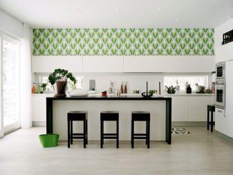
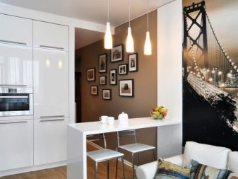
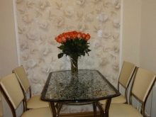
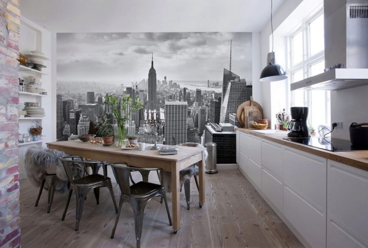
They look especially beautiful in the kitchen wallpaperif you combine them correctly with the background ones. It can be city and natural landscapes or images of fruits, vegetables, desserts that are more close to culinary.
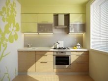
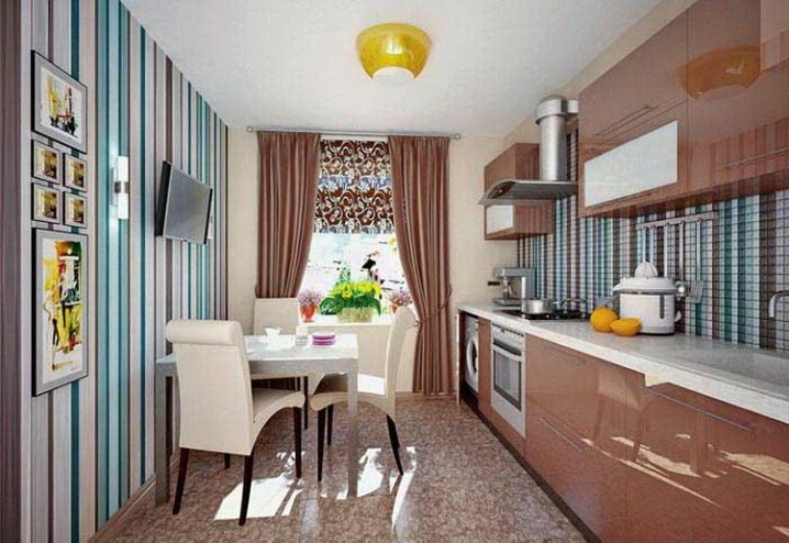
A wide range of modern finishing materials provide a choice for original combinations. For striped wallpaper on the wall, you can choose a tile of the appropriate color and arrange it with a working wall opposite.
For such a dynamic combination of colors, it is better to choose neutral companion wallpaper as background wallpaper.
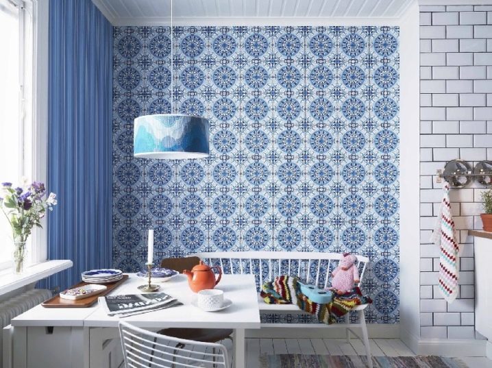
Do not rely on a ready-made combination idea. You can choose the wallpaper yourself. Moreover, the drawing can be on both canvases.... The main thing is that it should be unobtrusive and made in the same color scheme. In this case, it is better to place the wallpaper on different parts of the walls.
For information on how to choose wallpaper for the kitchen, see the next video.


The comment was sent successfully.