We glue two types of wallpaper in the hall

Facing the walls of the hall with the same wallpaper is a thing of the past, giving way to stylish design solutions for decorating the space. Today, the focus is on combination - a design technique that allows you to beat any features of a room, advantageously accentuating the desired area.
Which ones are suitable?
The combination technique allows the use of different types of finishes. Each material has advantages, although not without disadvantages.
The most popular of these are:
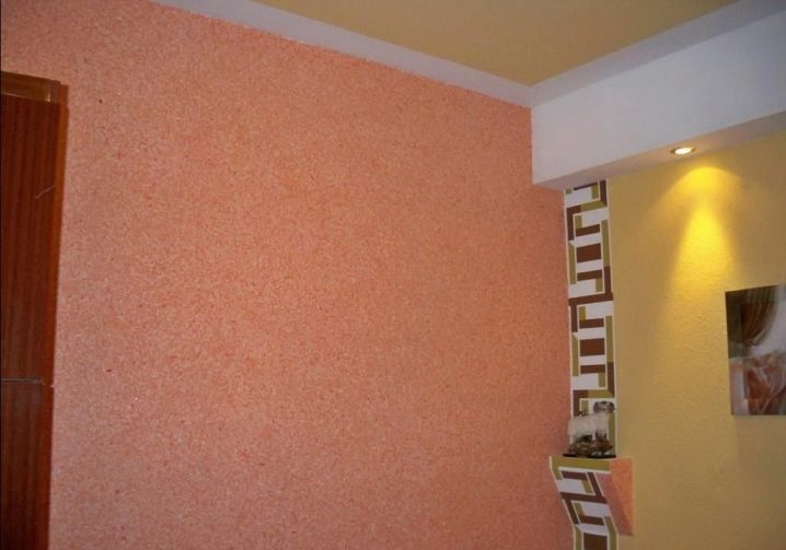
- paper - predominantly two-layer, capable of holding out on the walls for up to 5 years (the budget alternative, unstable to steam and moisture, looks simple);
- vinyl - an elite roll finish, capable of correcting the unevenness of the walls, including canvases with a hard, smooth, porous structure and embossing, designed for up to 15 years of operation (harmful, as it emits formaldehyde vapors into the air);
- non-woven - elastic canvases of a meter width, distinguished by their practicality, color fastness, resistance to accidental mechanical touches, durability, attractive texture, but attracting dust;
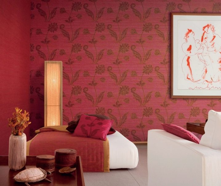
- textile - wallpaper with a premium face, which is an excellent choice for a hall as an accent, made in the form of interwoven threads glued to a paper base and closely spaced textile fibers (capricious finish in pasting, which is not resistant to moisture);
- the liquid wallpaper - coatings in the form of a powder or a ready-made mixture, which, after facing, must be covered with a layer of acrylic varnish to increase practicality (eco-friendly finish as an accent, demanding in choosing a companion, since it has a special volumetric texture);
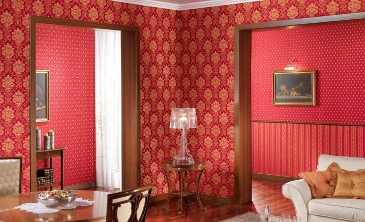
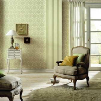
- wallpaper - a classic combination technique, which is a paper-based wallpaper in the form of a solid accent drawing or a canvas with an image fit (their weak side is the fear of ultraviolet radiation);
- glass wallpaper - cloths made of fiberglass mass with shaping by means of special impregnations. This is a wallpaper with an original texture and good performance characteristics.
Advantages and disadvantages
It is no secret that each room has its own characteristics. The combination of two different materials of the same line is a non-standard solution to the interior composition, through which you can perform a number of tasks. This technique involves a combination of plain wallpaper and patterned canvas in facing. The uniqueness of the idea lies in the fact that the print can be made with paints, photo printing, embossing, it can also be presented in the form of an invoice.
The raw materials used for this decor are diverse: the materials on the market are full of beauty in shades, versatility of themes, and an extraordinary texture. Each type of cladding has its own pros and cons, provides for combination, is distinguished by the richest colors and different operational characteristics.
By taking the combination, you can mask the unevenness of the walls, paste the most practical companions in the right place, playing with the different features of the wallpaper (for example, using washing in places with an increased likelihood of contamination).
The design approach has many advantages.
Combining two types of wallpaper allows you to:
- to beat the design features of the room, deliberately emphasizing the protrusions, niches, panels, turning the imperfections of the area into bright accents of style;
- muffle an unnecessarily bright and patterned companion through a calm contrast, saving the interior from an abundance of variegation and oppressive atmosphere;
- accentuate an advantageous place in the room, thereby distracting from unsightly corners, emphasizing the uniqueness of the design;
- zoning the room into certain functional areas, thereby introducing an unobtrusive organization into the space;
- reduce the consumption of material for fitting the picture, if necessary, using the remains of canvases from neighboring rooms;
- to give the room individuality, using beautiful examples of experienced interior designers, adjusting them to the characteristics of the hall and your taste preferences;
- change the aesthetic perception of the room by infusing the desired shade, pattern, adding illumination and the desired temperature to the atmosphere;
- combine together disparate pieces of existing furniture and other interior elements (curtains, poufs, decorative pillows, table lamps, floor lamps, wall lamps, paintings, etc.);
- to choose your "color type", thanks to which you create the right mood and increase your potential, make the atmosphere of the room cozy at home;
- to give the space the desired status by combining expensive and fashionable textures that match the pieces of furniture;
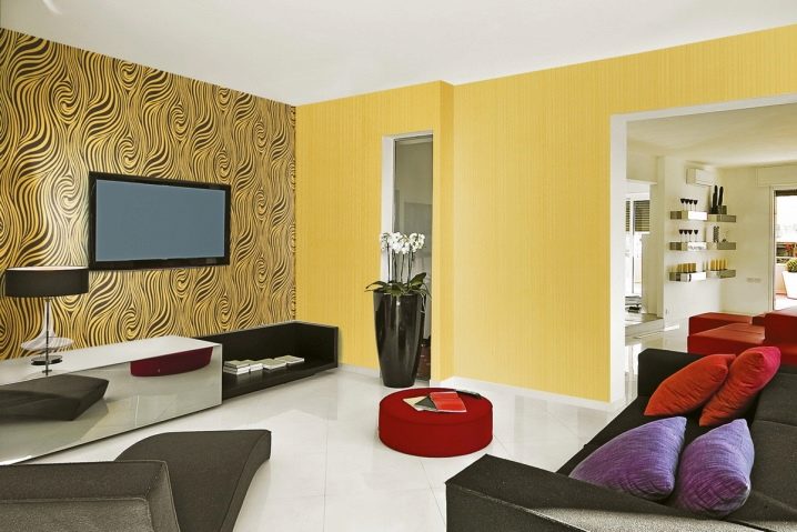
- depending on the shades used, their saturation and the size of the pattern, create a stylish interior in a classic, ethnic or modern design, indicating its idea;
- rid the space of boredom and everyday life, filling it with fresh colors.
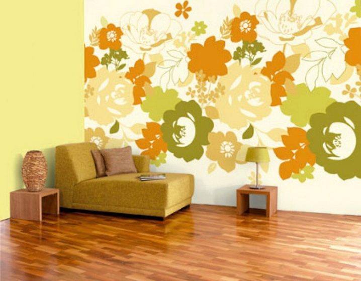
Combining wallpaper has a lot of design possibilities: modern manufacturers, knowing this technique, offer paired canvases for sale that are not limited in subject matter. In addition, there are always wallpapers in any style on store shelves, be it classic flowers or creative abstraction.
If you wish, you can always choose a combination, taking into account your own preferences and the budget planned for the purchase.
disadvantages
The combination of two types of wallpaper is not always harmonious. This can be due to several reasons.
One of them is the rule of texture compatibility: not all canvases, different in composition and appearance, can be mixed. For example, smooth paper wallpapers simplify the look of embossed vinyl or textile options.
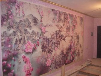
They will not fit non-woven fabrics either: the finish should be selected taking into account the status of each type. For the reception to be successful, it is worth beating it with the use of photowall-paper.
Different widths and reliefs matter. Porous thick wallpapers, combined with thin paper or smooth non-woven ones, do not create a sense of solidity, therefore they look scattered and resemble a hastily glued cladding with remnants. Some canvases are difficult to select due to the lack of identical shades.
The method of combining two wallpapers has disadvantages:
- it does not always give the desired effect and expressiveness;
- inappropriate in small rooms, since when using large drawings it creates a feeling of congestion and limited space;
- does not look beautiful and stylish if done unprofessionally, thoughtlessly, without a pre-prepared sketch;
- requires a clear place for each piece of furniture, otherwise it loses its expressiveness;
- compares each element of the furnishings with itself, therefore, implies stylish furnishings and does not accept unnecessary details that overload the overall look;
- far from always stretching the correction of trapezoid rooms with a broken perspective, giving it an even more awkward look, visually distorting the walls;
- often has an unsuccessful print in the form of small stripes, polka dots, cells that create ripples in the eyes, irritate within a few days after pasting.
How can you glue it?
The two types of wallpaper gluing methods are multifaceted. There are several original design tricks that are worth considering.
The size of the picture, the color of the canvases and the texture depend on the height of the ceiling. If it is low (2.5 m), the shades should be light, the pattern should be small, the texture should be soft. If the ceilings are low, it is preferable to combine using stripes or canvas without a pronounced pattern with a monochromatic coating.
With a high ceiling, a large print, stretched in width or horizontal stripes, is harmonious.
The rules of pasting dictate the size of the hall: the larger it is, the brighter the shade can be, the more expressive the pattern. If the room is narrow, you can combine it with the entry of the canvas onto a long wall. This will allow you to beat the flaws in the layout.
In cases where the entrance to the room falls on the narrow side, it is necessary to highlight the opposite wall with a contrasting color, beating the corners with wallpaper for short walls. Additionally, you can use special vinyl-based stickers: they perfectly correct layout flaws.
Use the techniques of a combination of experienced designers:
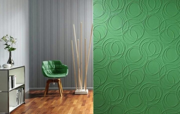
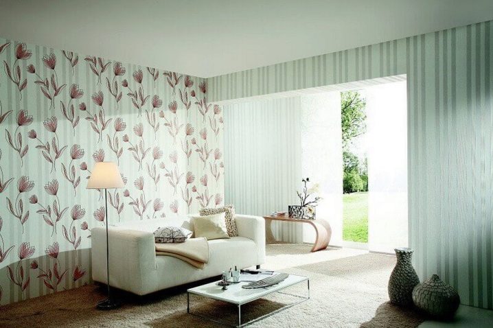
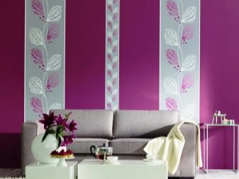
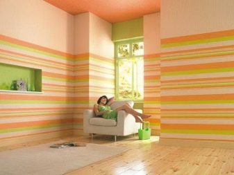
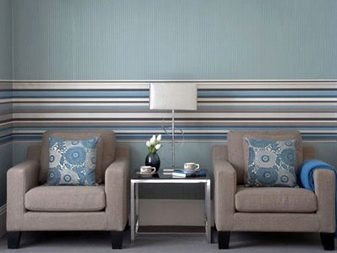
- horizontal - a stylish solution in which the wallpaper is glued parallel to the floor by using canvases with an original texture or by alternating exclusively paired wallpaper with a smooth transition of the print;
- vertical - a classic technique that allows you to divide the walls vertically: highlighting contrast in the form of two or three strips of wallpaper with a pattern (maximum of one wall) and smoothing the rest of the planes with plain canvases;
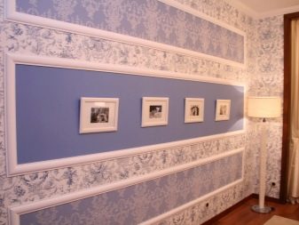
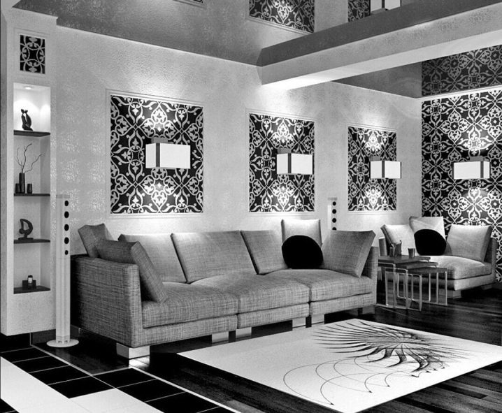
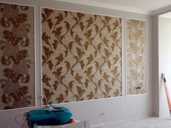
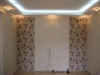
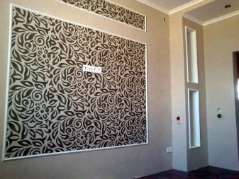
- wall decoration with panel inserts - gluing basic plain wallpaper with the addition of small fragments of accent sheets to the wall surface, framed in moldings or ceiling plinth;
- accentuation of protrusions and niches - highlighting design features by gluing contrasts or smoothing them with monochromatic companions.
How to avoid mistakes?
To avoid common mistakes, it is worth considering a few simple rules:
- if the space of the hall is small, exclude wallpaper with a large print that does not correspond to reality from the list of preferences (large decorative elements have a crushing effect);
- exclude a combination of different styles: ethnic and modern, antiquity and technology, conservatism and abstraction (they cannot be combined into a duet);
- buy canvases at the same time, if possible, in natural light: this way you can check them for color compatibility;
- if you do not have the skills to combine, it is better to buy a contrast with a pattern of several shades: it will be easier to choose a calm companion for it (it is better to buy a photo wallpaper);
- do not make the combination by alternating stripes of the same width: this is devoid of taste, splits the room into parts, gives the room the feeling of being in a gypsy tent;
- exclude reception diagonally: in most cases this leads to a visual distortion of the wall;
- bright and hot colors irritate the psyche and provoke pain in the eyes, it is more expedient to dilute the bright contrast with a companion of the pastel group;
- the combination of a floral pattern with textured ornaments should be dosed: the abundance of contrast overloads the room and quickly gets boring;
- do not confuse brightness and tone: shades can be combined in tone, but the brightness of two companions is unacceptable, only one can dominate.
The point of using combined wallpaper is to make the room individual, beautiful and cozy. You don't need a lot of contrast and variegation: this is how the print loses its significance. The unity of style is achieved by moderation. A contrasting color is necessary to highlight the details of a pattern or a specific area of the hall. It is applied only on one wall or in one place of the plane.
It is extremely important that the room is designed in the same style, otherwise the acquisition of uniqueness is impossible, the combination is meaningless and will not have the desired effect.
From different materials
It is quite possible to create a spectacular wall cladding with different materials without feeling an imbalance. It's extremely simple. If you have a sense of taste, you can combine different finishes, while it will look appropriate, cozy and fashionable.
To correctly and harmoniously combine two types of wallpaper, it is worth:
- select canvases of the same thickness (this will reduce the accentuation of the joints and make the vertical transitions of the canvases invisible);
- pay attention to the texture: a glossy surface simplifies any canvas, so it is better to replace it with embossing, and matte often needs similar support from a companion;
- pay attention to color: at least one of the contrast shades of two canvases should be common;
- understand the purpose of the room: it is inappropriate to glue wallpaper with funny children's drawings or the theme of the bathroom on the walls of the hall;
- determine the dominant: the accent with the print should not be large;
- choose contrasts deliberately: animal print is not combined with polka dots, stripes, zigzags, flowers.
Different sizes
In order for the combination to be harmonious, the sizes of the canvases must be different. The chosen technique is appropriate in one room, so the renovation will look unique and stylish. The combination of patterns of different sizes should be careful: this is permissible only in a spacious room. The print can be different, but large size is unacceptable on two canvases.
The modern approach allows the use of a repetition of colors by means of texture when pasting. It can be an animal print and wallpaper with a plush or velor texture, canvases with monograms and a companion with imitation of plaster streaks, a mix of floral motifs and relief streaks in the form of curls. The main thing to understand is that two drawings more often overload a room than fill it with the desired effect.
Color combinations
The main criteria for choosing a shade are psychology and color combination. To do this, you can turn to the color wheel, which will demonstrate the correct arrangement of contrasts.
It is important to remember: warm shades (beige, cream, peach) give coziness and an inviting atmosphere, fresh tones (mint, blue, blue-green) can bring cold and lethargy into the space.
Eliminate the abundance of blue and purple: they have a negative effect on the psyche, causing depression in older people. If you want freshness, you should take a closer look at the contrast of beige and turquoise tones. The abundance of orange, red is unacceptable.
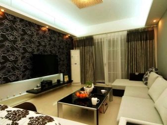
Monochrome gamma can cause a negative: you need to combine black and white shades in moderation. It is more expedient to play up the contrast, using a gray pattern with a silver coating or embossing on a white background, supporting the situation with furniture with black decor.
The technique of embossing makes the room luxurious: made in coffee, lilac shades, it will look stylish if it is shaded with a monochromatic companion without shine. To tie two canvases together, you can stick stickers on calm wallpapers or hang pictures whose color of the pattern matches the bright print.
The best combinations are:
- green and beige;
- lilac and silver;
- olive and orange;
- lilac and fuchsia;
- sandy and diluted turquoise;
- white, gray and silver;
- cocoa with milk and pink;
- coffee, beige and gold.
Design ideas
The combination of two types of wallpaper will look fashionable, beautiful and stylish if:
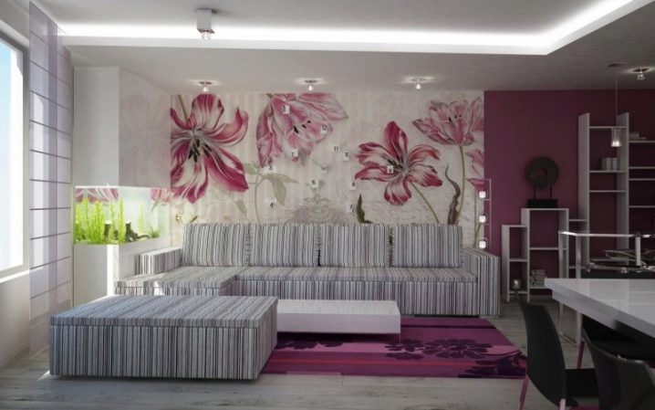
- glue a bright contrast to one wall, smoothing it with a plain canvas with a transition to the accent side;
- decorate three walls and the center of the fourth with light monochromatic wallpaper, placing one accent strip on the sides;
- choose two canvases with the same texture, but in a different shade, gluing an accent in the middle of the wall, framing along the edges with light panels with curved lines;
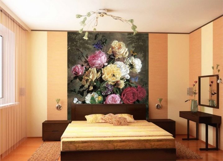
- highlight the area at the head of the bed, closing the joints of the canvases with a curb or molding;
- glue plain wallpaper on all walls, accentuating one of them with a large rectangular insert framed in the ceiling plinth;
- repeat the print of the wallpaper in the drawing of the curtains, provided that they are located on the walls with plain canvases;
- glue plain wallpaper on all walls and the top of the fourth, marking the bottom in the form of contrasting panels;
- making three walls calm, decorating the top of the fourth with a bright accent, the bottom with plastic panels.
Interesting examples and options
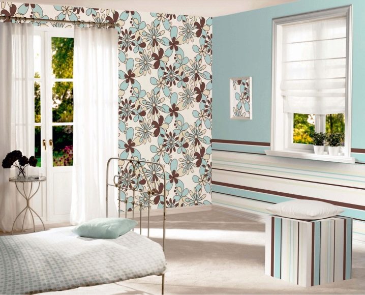
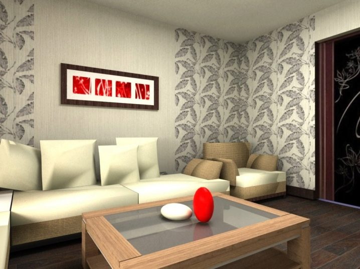
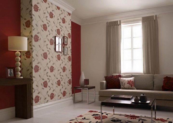
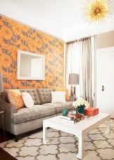
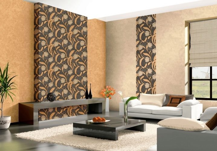
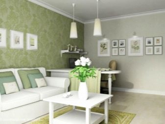
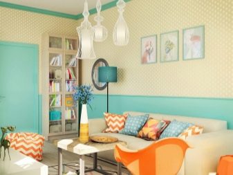
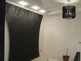
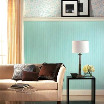
To visually understand what the technique of combining two types of wallpaper in the interior is, it is worth referring to interesting design examples. A textured strip and delicate wallpaper with leaves in mint tones look great with molding, support in the form of beige curtains and light-colored furniture.
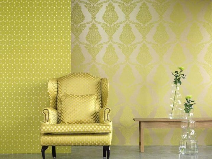
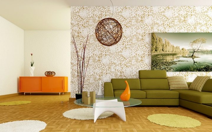
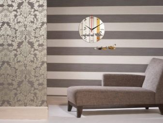
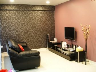
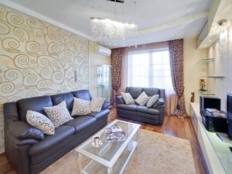
Medium-sized wallpaper with monograms and a strip accentuating the living room protrusions, made in a diluted gray-green shade, are harmonious with the support of the white color of the window and ceiling, a similar floor plinth, bleached floor color, dark furniture and accessories.
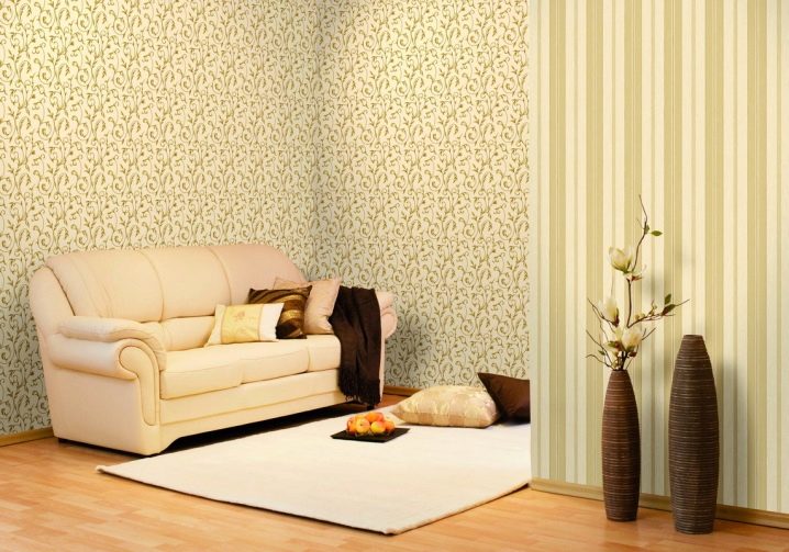
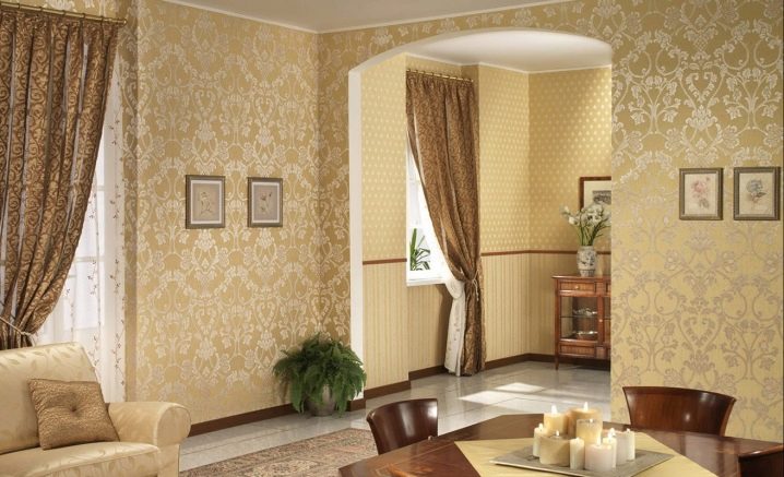
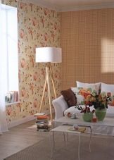
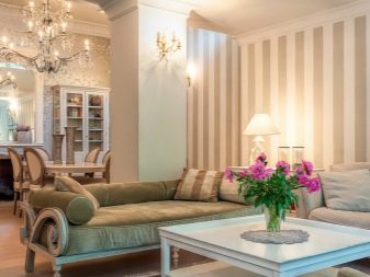
The interior of the living room in beige tones will be decorated with an unobtrusive accent in the form of lace wallpaper: to make it harmonious, it is worth complementing it with curtains of a similar pattern in a coffee shade.
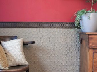
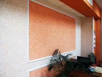
It is better to combine liquid wallpaper with each other through panels or individual geometric shapes: peach canvases decorated with a white plinth against a cream wall look harmoniously, a bright contrast can be supported by the design of the room's ledges.
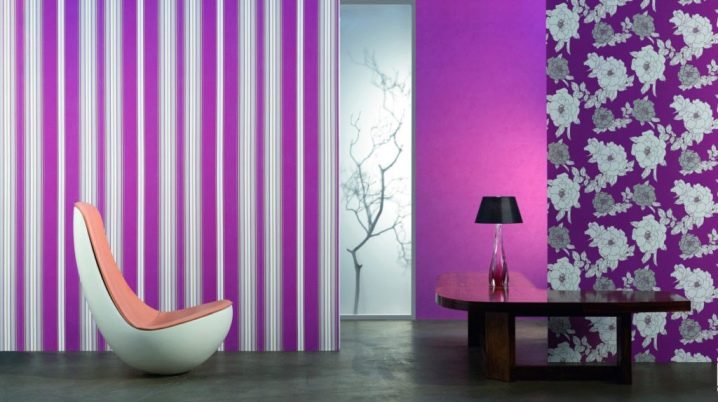
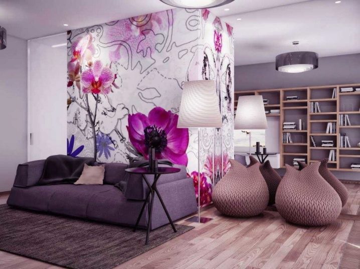
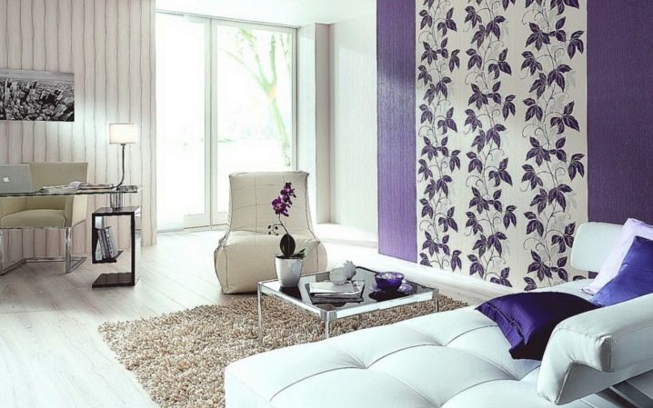
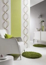
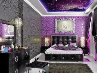
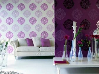
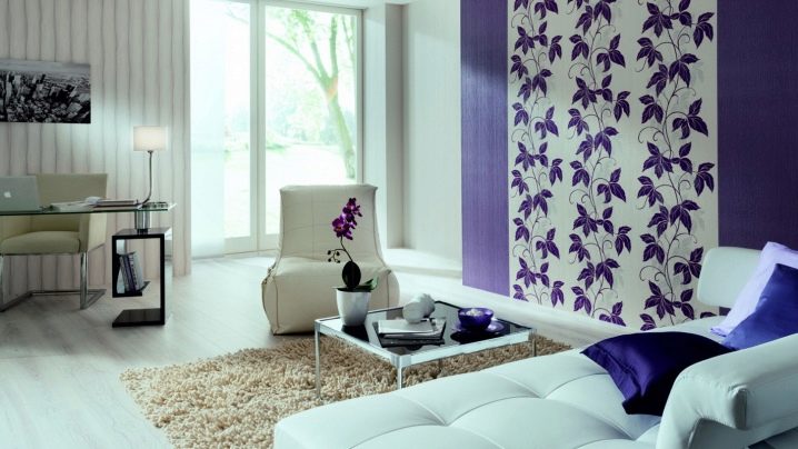
So that there is a lot of light in the living room, gluing in violet and white tones with a light gray monochromatic companion is suitable, delimiting the space of the room into functional zones.
For information on how to combine wallpaper of two colors in the hall, see the next video.


The comment was sent successfully.