Turquoise wallpaper in the interior
With the development of the building materials industry and the influence of fashion on interior design, people are no longer afraid of radical color solutions, bold combinations. In all the variety of shades, you should pay attention to the turquoise color in the interior. Is it as difficult as it seems and how much new can it bring into your life?
Influence of color
Turquoise color with all its brightness and originality was given to us by nature. The turquoise stone gave it its name. It sits between blue and green and has been of interest to people since ancient times. Turquoise shades thousands of years ago, people endowed with mystical power. They brought good luck, were a symbol of faith and healing, love and compassion. Turquoise turned people's thoughts to the sky and oceans.
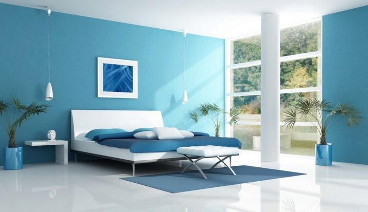
Now in the interior turquoise color brings lightness, joy, concentration of thoughts and tranquility... Although its brightness and ambiguity frighten many people who do not know how to correctly apply it in the decor of their homes.
Such a choice will give a feeling of space, clean air, light, cool in the heat, so the color is very suitable for arranging an apartment or a country house.
Views
To begin with, you should figure out what kind of wallpaper are in order to choose the option most suitable for a particular room:
- In terms of density, there are wallpapers with a low indicator (up to 110 g per sq. M), medium (110-140 g per sq. M) and dense materials (more than 140 g per sq. M).
- In texture, there are smooth, textured (with embossed patterns), matte, glossy (from a modest overflow to varnish or satin sheen) coatings.
- In terms of resistance to moisture: unstable (they do not tolerate moisture, cannot be cleaned and cleaned with water), moisture resistant (with a special protective coating - they can be wiped off with a damp cloth) and washable (assume the effect of cleaning compounds and brushes).
- By the number of layers: single-layer and multi-layer.
- It is also possible to distinguish the classification according to the format produced: roll, powder (available in boxes or bags) or photo wallpaper (they are sold as a separate solid canvas).
Texture and materials
If past generations of people in our country were content with thin paper wallpaper of inexpressive and strange colors, now there is an opportunity to choose materials with unique properties, which can solve any problems arising during the repair:
- Paper wallpapers have not ceased to attract the attention of buyers. They remain the most budgetary of all the offered goods. There are two main groups of them - simplex and duplex:
- Simplex - one-layer wallpaper, thin, fragile, with a smooth surface and uncomplicated patterns. They do not tolerate water and are suitable as the most budget finishes.
- Duplex is a multi-layer material. This technology allows you to give the surface a relief. Embossed wallpaper is obtained by embossing the pattern. Texture is also obtained by applying a layer of acrylic or by sanding shavings between layers of paper.
- Non-woven coverings are more durable and resilient, but also more expensive in price. Their texture is very diverse. They imitate wood, metallic luster, satin shine and do not lose their environmental friendliness. Such a coating is durable and easy to paste.
- Vinyl does not allow walls to breathe, but it cleans well and also has a wide variety of patterns and reliefs.
- Liquid materials are similar to putty, but very convenient to use even for novice repairmen. They are gaining popularity all over the world. In a turquoise shade, they are the ones that best convey the theme of the sea, water, glass or ice.
- Made from natural materials - wood, veneer, cork, fabrics. Eco-friendly and textured coatings are expensive and difficult to maintain, but the interior takes on a special charm and warmth.
Shades
There are quite a few varieties of turquoise color. And all of them can be used in your interior:
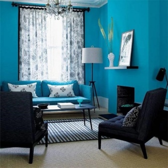
- Bright turquoise walls will be smoothed by furniture in calm or white colors. This combination is suitable for courageous and avant-garde people.
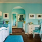
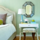
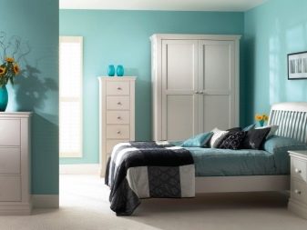
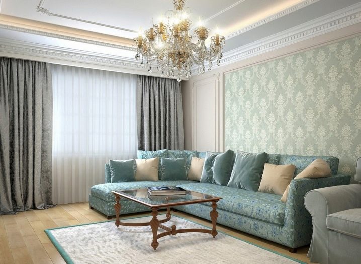
- The pale turquoise color is widely used in the interior, like other pastel shades. It is suitable for various premises and will be appropriate in a wide variety of stylistic solutions.
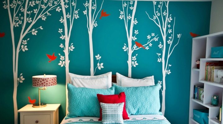
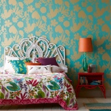
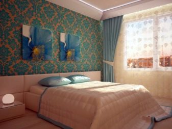
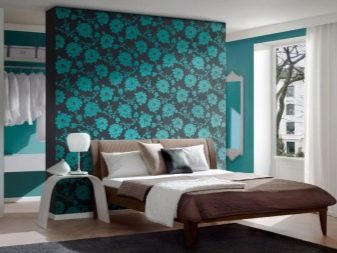
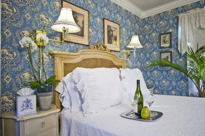
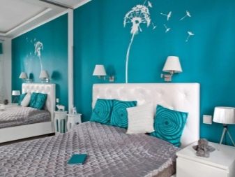
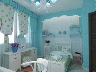
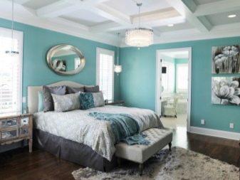
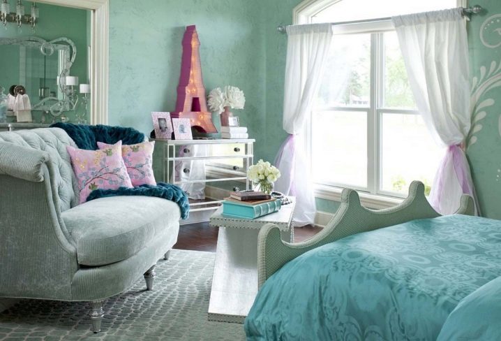
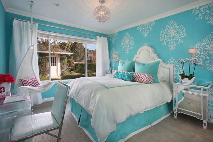
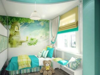
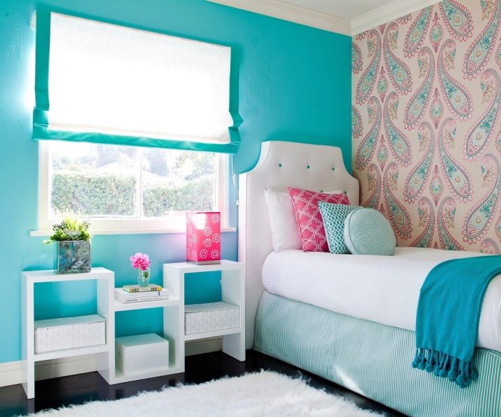
- Delicate turquoise shades will perfectly fit into the decor of a romantic girl's bedroom. They will also decorate the baby's room.
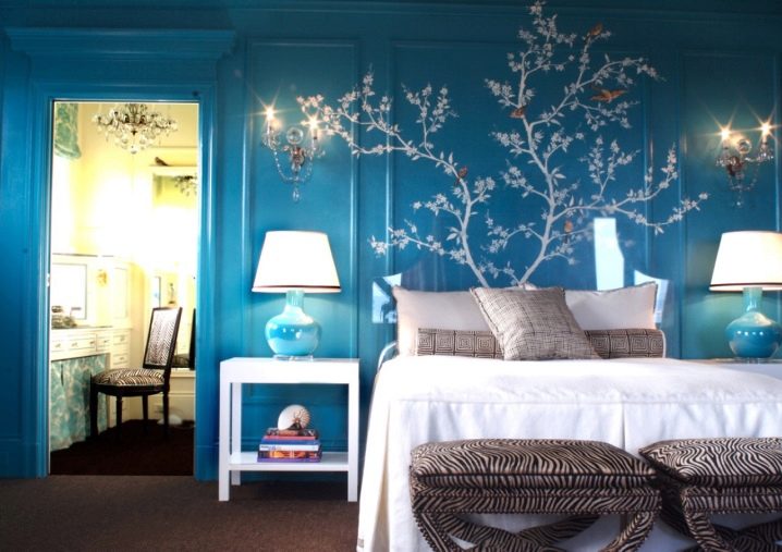
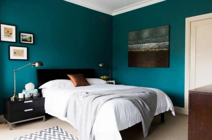
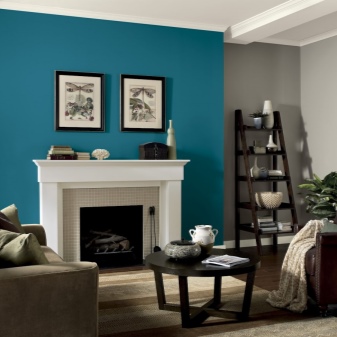
- It is better not to use dark turquoise wallpaper in large quantities on the walls. It is better to highlight one wall with them, and arrange the rest in light basic shades. Light turquoise tones can also be combined with them. But in this case, it should be the only accent color in the room due to the activity of turquoise. It is better to choose furniture and interior details as simple as possible.
Colors
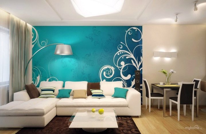
Manufacturers have long understood all the attractiveness and freshness of turquoise and are trying to produce all kinds of wallpaper colors with its participation. Plain wallpaper refreshes the interior, breathes coolness into it, gives it airiness and lightness. But in tandem with other shades turquoise can give a radically opposite mood to your room:
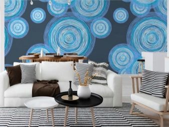
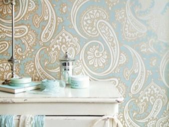
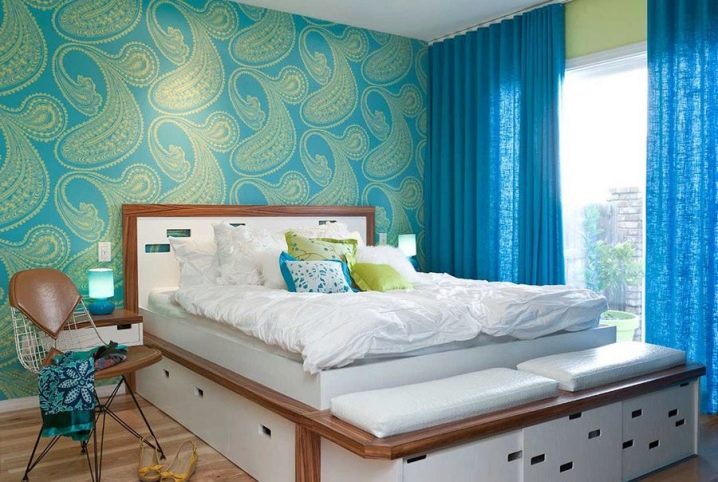
- Wallpaper of this shade with an oriental pattern (Turkish cucumbers, monograms) will enhance the Asian theme in the interior. Coverings with a geometric pattern (rhombuses, circles, herringbone) will give the design an avant-garde and at the same time rigor.
Such decor will fit well into the concept of finishing an office or work space in a children's room. It will help you focus and calm down.
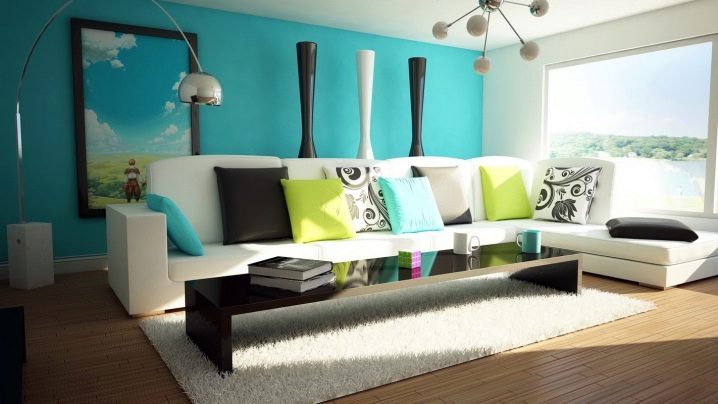
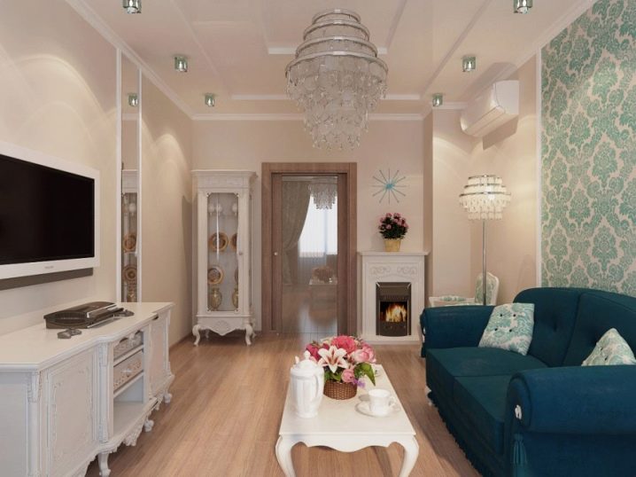
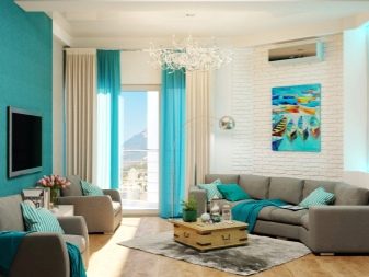
- White-turquoise combinations are the most win-win and, one might say, classic. They are suitable for various styles and will find application in any room.
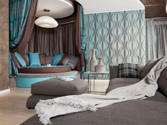
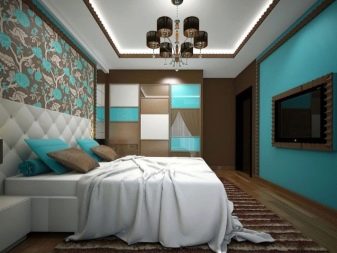
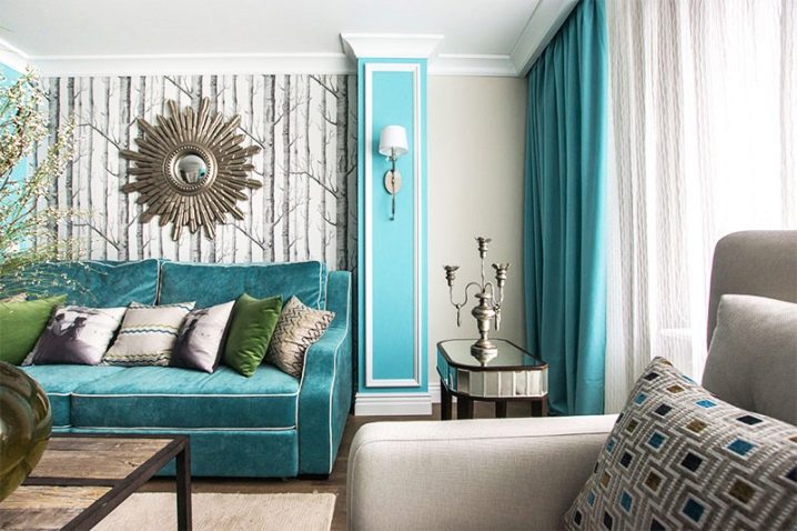
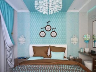
- Turquoise brown shades have already become design classics. They will add elegance and style to your room. If you focus on any one wall, then you can choose a chocolate-turquoise striped wallpaper. Such decoration will suit even people who do not dare to be avant-garde and radical in the decoration of the apartment.
- Yellow, together with a blue-green tint, gives an unusually positive and invigorating tandem. Such a finish is easy to imagine in a nursery. It will add sun and light to a closed panoramic loggia or balcony. The living room of a country house will also sparkle with new colors thanks to such wallpapers.
- Turquoise and green will create a feeling of naturalness and closeness to nature. It is better to use pale and matte textures of these colors.
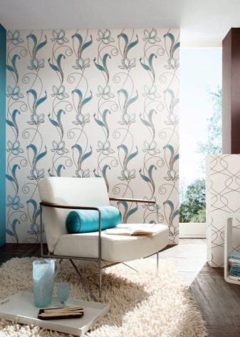
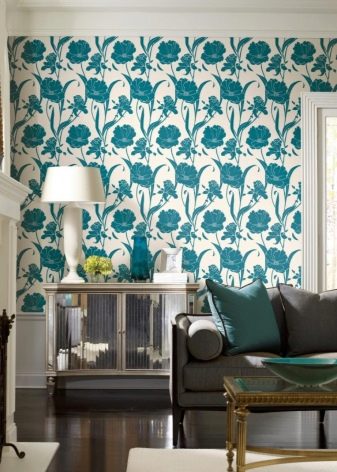
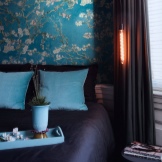
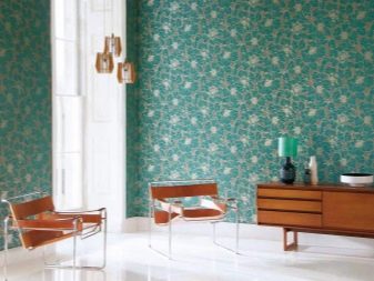
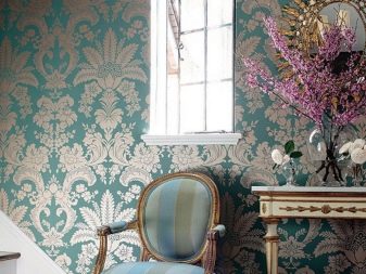
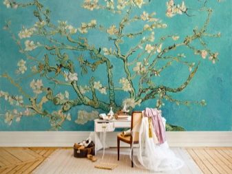
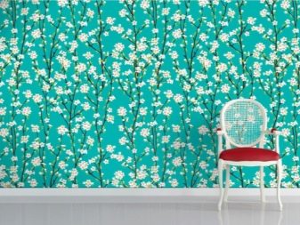
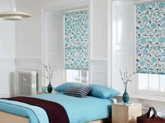
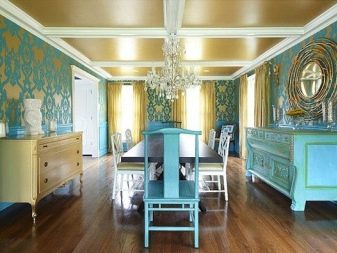
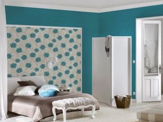
- The floral theme of the pattern (wallpaper with chrysanthemums, cornflowers and orchids, sakura, leaves) is perfect for a delicate spring bedroom or highlighting a relaxation area in the living room. The combination of turquoise with gold has long been used to decorate palace interiors. So if space permits, you can use this pair to create rich and gorgeous décor.
- Aged turquoise is good for wallpaper decorated with a natural wood look. This color will look very impressive in a nautical theme or a loft-style studio apartment.
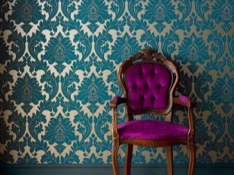
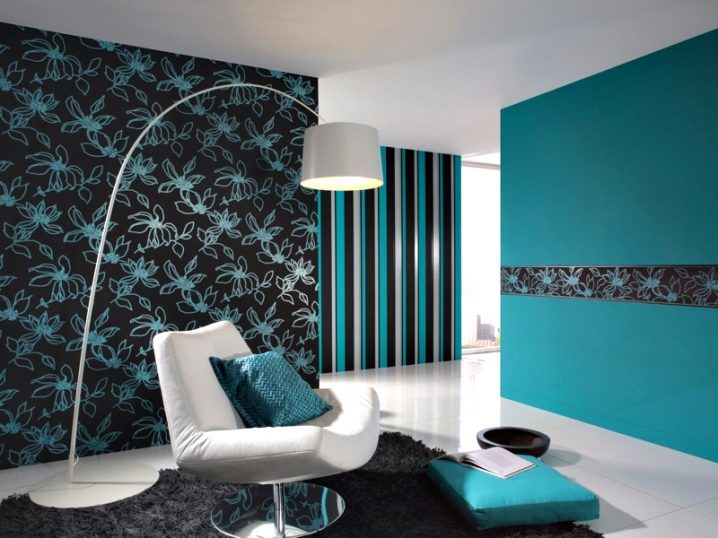
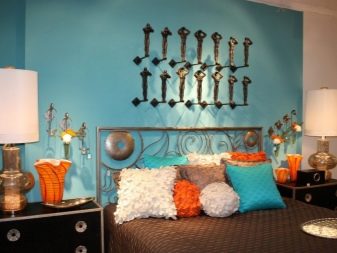
- Black color will play especially effectively in combination with turquoise. It will emphasize the depth of the turquoise color, while blue-green, on the contrary, will soften the burden of black. The interior will acquire austerity, laconicism and unique chic.
What are they combined with?
We have already found out that turquoise is active and vibrant.Now we need to decide what kind of furniture turquoise wallpaper is suitable for:
- It is necessary to choose interior items of the correct shapes, not cumbersome, and it is better not to give preference to dark lacquered furniture. It can add extra brightness and burden the overall picture.
- Tables and chairs with simple outlines with subtle details, light-colored soft furnishings and classic metal fixtures are the perfect complement to rich turquoise.
- If you want to fit dark furniture into the interior, it is better to stay on one black coffee table, black legs of bar stools or a dark matte bed base.
- The wardrobe takes up a lot of space on the wall and, with its too unusual design and color, draws attention to itself: the design will turn out to be too intrusive for the eyes. The best solution would be a white or light natural wood wardrobe.
- You can also pick up a matte chocolate chest of drawers and complement it with some other small piece of furniture of the same shade (vase, floor lamp or trim on chairs).
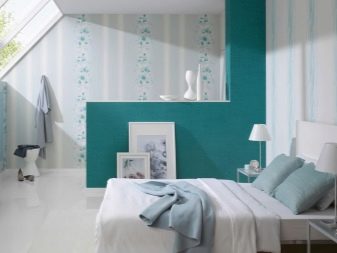
Floors look better in pale textures with natural wood motifs. In this case, they do not draw attention to themselves. If you settled on a pale color of the walls, then you can afford a pronounced pattern on the floor. But with a bright design, it is better to calm the room with unobtrusive textures.
Styles
The color of the sea and sky is applicable to any style. Delicate bluish wallpaper will fit well into a Provence-style room. Palace interiors with tints of gold and turquoise - classic selection of baroque decor.
Light shades will add some variety. in scandinavian style. And the coldness of the shade will add the feeling of a northern mysterious country. Greenish overflows will give a special similarity to the color of sea water, so a room decorated in such tones will be unusually close to the Mediterranean design.
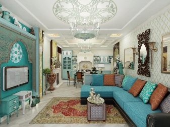
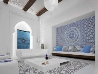
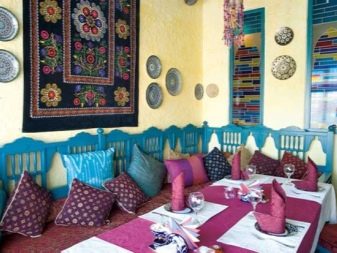
Favorable natural color will look in ethnic oriental styles, for example, in Moorish. Persian carpets and iridescent stained-glass windows will be perfectly set off by bright turquoise. Extraordinary personalities should pay attention to avant-garde design. Here you can combine several bright and rich shades: yellow, scarlet, deep dark turquoise.
The color of turquoise in the modern world evokes associations with the flow of information. They are rendered in this particular shade. It is logical to use the design of the walls in this color option in the style high tech.
Laconic and functional furniture, glass, metal and cold turquoise will create the impression of an airy and technological space in your apartment.
Pale pink fabrics, vintage furniture designs and numerous style décor items shabby chic perfectly complement the wallpaper in a light turquoise color, reminiscent of a mint shade.
How to choose?
A few tips:
- We select the right material. Paper is the cheapest option. If you are afraid of turquoise, then this solution is for you. You can always re-glue such wallpapers at no special cost. Eco-friendly cellulose wallpaper is also perfect for a nursery. Vinyl washes well, but does not breathe at all.
It can be chosen for the corridor or hallway. Non-woven fabric is stronger than paper, has interesting textures and looks rich in the interior. Glass fiber is a good way out for those who are not afraid to try new things.
- Pay attention to the size of the rolls. Width and length can be completely different. This is especially true for European manufacturers.
- Do not forget to read the markings in order to choose the right glue.
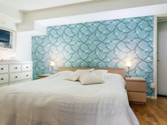
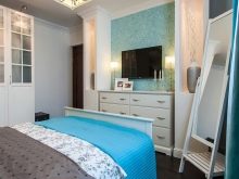
- We choose the shade based on the style and purpose of the room. In large rooms, you can choose wallpaper in bright and dark shades for accents. In small rooms, it is better to take light and pale tones of turquoise. Drawings with floral and oriental themes will perfectly decorate one of the walls in the living room and add coziness.For the bedroom, it is better to choose calm variations of turquoise, plain wallpaper, and place bright colors in the headboard area of the bed.
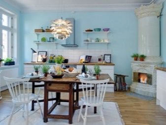
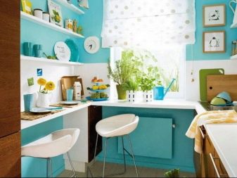
In the kitchen, it is preferable to use a combination of turquoise with warm colors to maintain a homey and warm atmosphere. In the nursery, choose a light turquoise wallpaper color. It will need to be diluted with juicy and cheerful details. In the bathroom, thanks to modern developments, you can place turquoise wallpaper, resistant to moisture and mold. They will support the marine theme.
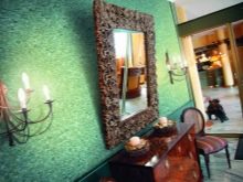
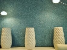
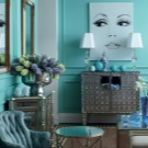
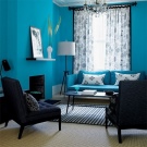
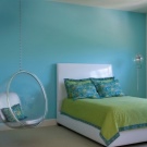
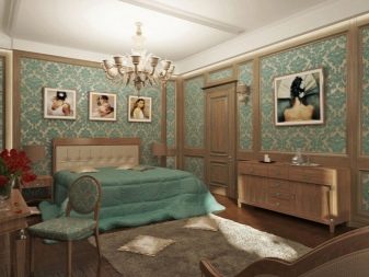
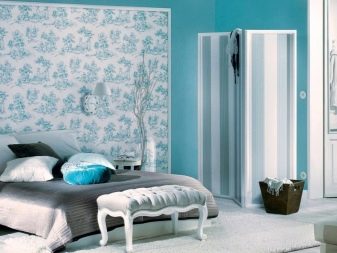
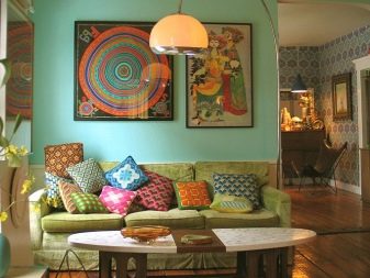
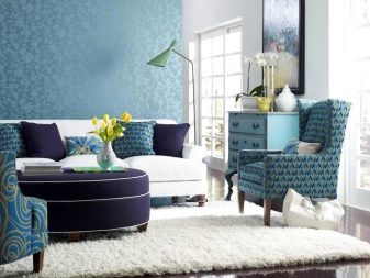
Beautiful ideas in the interior
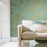
Turquoise in the room can perfectly emphasize unusual color schemes in details. Fans of classics and minimalism will like the dilution of a few solid furniture and natural textures with a bright monogram ornament.
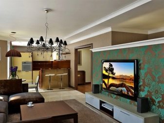
Floral patterns on a bright turquoise background will complement the living room design with airiness and lightness. The cold color of the kitchen will dilute the natural furniture and add the missing warmth and comfort. The room for the little princess is decorated with turquoise and pink shades. Candy colors are pleasing to the eye, but do not overplay, but create a sense of space and freedom.
For information on how to decorate a living room in gray-turquoise colors, see the next video.


The comment was sent successfully.