How to choose the color of your kitchen countertop?
When you choose the color of the countertop for your kitchen, you are probably guided by the style and general color scheme of the room, or you are guided by the practicality and versatility of colors. In our article, we will tell you about the basic principles of such a selection, introduce you to the color scheme of countertops and reveal a few secrets.
General principles of selection
Immediately I want to formulate the main principle of choice, which applies not only to the countertop, but in general to any interior detail - this is the absence of inappropriateness. That is, if you, having chosen something, have no idea how it will fit into the interior, do not take this thing, material, accessories, no matter how much you like this item.
Now let's figure out what principles should be followed when choosing a kitchen countertop.
- Decide on the style of your kitchen. Will it be an ultra-modern space with glossy black and white surfaces? Or maybe you like cozy Provence with its printed chintz and pastel colors? Or an eerie and rude loft? In any case, the countertop should become part of the interior and fit perfectly into it.
- Match the countertop to the kitchen unit. It is unlikely that a steel silver table top will decorate a brown oak set. Exactly, like wood, it will not fit high-tech furniture.
- Decide on the material of manufacture. Today, on the building materials market, you can see countertops made of natural and artificial stone, solid wood, fiberboard, chipboard, plastic, glass, stainless steel.
Study the prices for the selected material, check out its pros and cons, colors.
- Count your money. Take the amount you planned to spend on repairs and divide it by all the necessary purchases. Then take a look at which countertop you have chosen at the moment - its material of manufacture, color, price and answer your own question: does it fit into the budget? Or maybe you should look for a countertop made from a cheaper material? For example, you have chosen natural marble, but after studying the market offers, you realized that at the moment this option is not suitable for you. In this case, consider options from an artificial stone with a suitable color. Thus, you can save money and implement your plan without losing the chosen style.
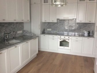
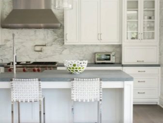
Light shades
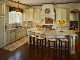
The light kitchen is considered a classic of the genre when decorating the interior in Provence, shabby chic and country styles. In this case, we are talking not only about the color scheme of the kitchen set, but also about the design in general. Since in our article we are talking about countertops, then Let's figure out what colors are suitable for the aforementioned interior styles, and indeed, for any kitchen in light colors.
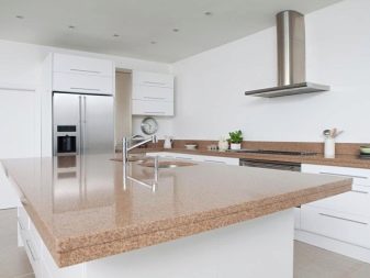
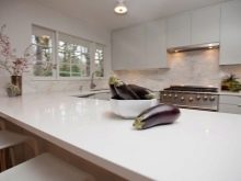
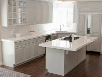
- Let's start with the lightest of all light shades - white. But just do not immediately imagine a sterile cold operating room with a blue, snow-white tile. White, of course, cannot be called warm, but in a certain setting it “softens”. Imagine a shabby chic kitchen with crisp white tulle curtains, ceiling moldings, carved back chairs, and a white wooden kitchen set with a white top. Will you be "cold" in such an interior? Unlikely. Therefore, do not be afraid of white when choosing a countertop.The only obstacle to acquiring a work surface of this color may be the fear that it will stain from bright or dark food: juice, beets, oranges, tea, coffee.
In this case, just choose a material that does not absorb dyes, such as acrylic or impregnated wood.
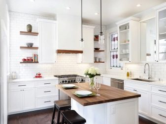
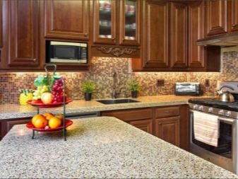
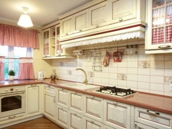
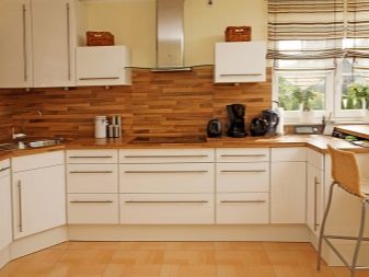
- Next on the list is beige in all its variations: from cream to coffee with milk. This is probably the most commonly chosen color for kitchens. The fact is that the shades of beige are perfectly combined with each other and are in harmony with all other colors. By the way, for the aforementioned Provence, country and shabby, a beige countertop will be an ideal purchase, it will even suit a white kitchen set.
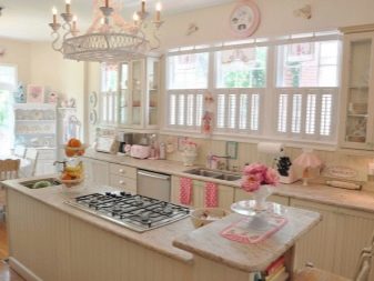
- Pink, turquoise, mint, lavender, light green. Why did we combine these colors into one item? Because this is the basic color scheme of Provence and shabby. Country can afford brighter shades, which we will discuss below. You can safely choose any of these colors for your countertop: they look fresh, unobtrusive and very stylish, and their combination is only welcome.
Summing up all of the above, we can conclude that a light tabletop with a suitable style solution is a godsend. It does not distort the lines of the interior, does not distract attention and does not irritate. By the way, the table top does not have to be monochromatic: surfaces with splashes look very interesting: with a pattern "marbled" or "malachite".

Colors for dark countertops
Now let's take a closer look at the color scheme of dark countertops.
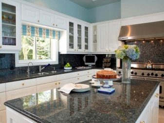
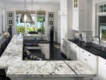
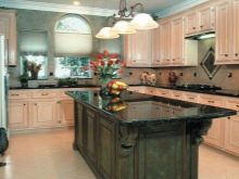
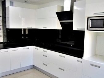
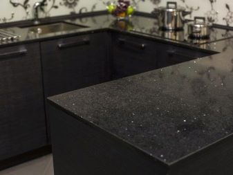
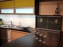
Black
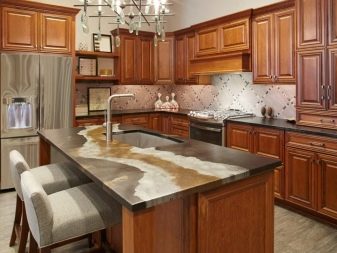
For countertops, this is one of the most controversial colors. On the one hand, stains from food or drinks will definitely not be visible on black, but on the other, any scratch will immediately catch your eye. Therefore, if you prefer a countertop in this color, carefully choose the material of manufacture and texture. A black countertop with small specks or stains will be much more practical than a monochromatic glossy one. One of the most beautiful options is the “royal opal” color (yellow-gold stains on a black background).
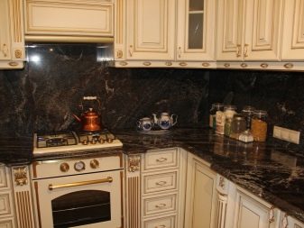
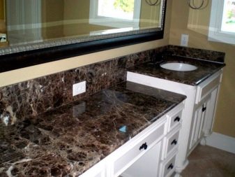
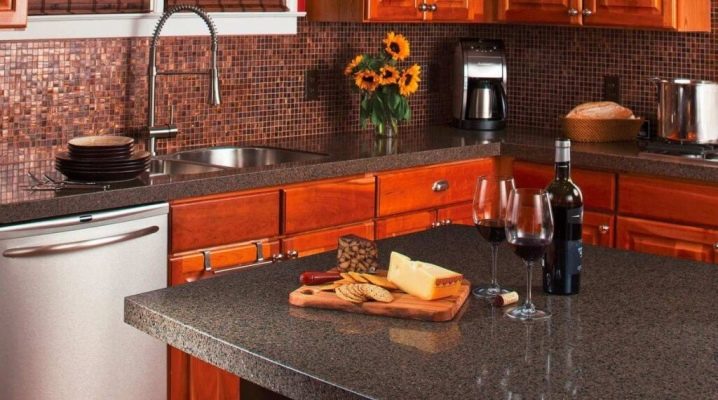
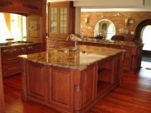
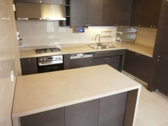
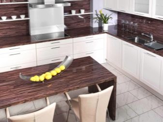
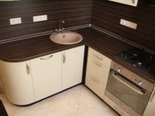
Brown
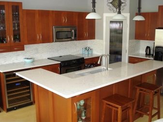
This group includes: wenge, dark brown, chocolate, as well as all "woody" shades (oak, alder, birch, etc.). And this color range has, perhaps, the widest range of applications with regard to various interior styles. So, a wenge-colored countertop can be inscribed in a loft, country and modern. Lighter colors are suitable for Provence and shabby. Brown goes well with any other color, especially with the right accents. In terms of practicality, such a tabletop will also give odds to surfaces of other colors. Well, the texture can be "wood-like", and "wild stone", and any other.
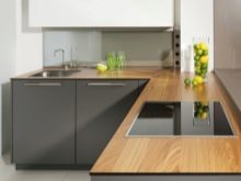
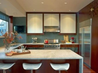
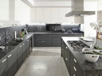
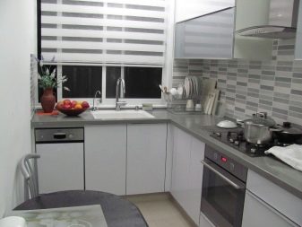
Grey colour
It cannot be unequivocally attributed to either light or dark: it all depends on its shade. Worktops of a gray (steel) color can often be seen in high-tech interiors. It is quite practical, the color is beautiful and unobtrusive, it perfectly sets off color accents.
Fans of "cold" interiors will definitely like gray.
Those wishing to choose a countertop from the "dark" list should take into account one nuance: if your kitchen space is small, choose a lighter option - dark colors "narrow" the space. It is also not recommended to choose dark fittings for kitchen owners of non-standard proportions: any errors, angles, recesses will be immediately visible. If you do not want to focus on them, give up the gloomy color scheme.


Bright colors
On the modern market there are many colored kitchen sets, and, consequently, countertops for them. However, when choosing such an ambiguous environment, one should take into account the influence of each color on the human psyche, because the kitchen is a place where a person spends a lot of time.
So let's start in order.
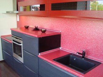
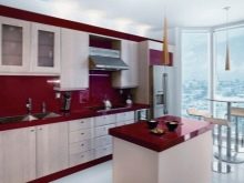
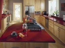
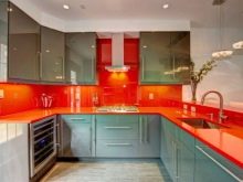
Red
If your choice fell on this color, remember that it helps to stimulate appetite, so it is contraindicated for diet lovers. Also, do not choose red for people with an increased level of anxiety or prone to aggression - it can negatively affect the psyche and a person will become nervous and angry. A more classic, "expensive" color from this spectrum is burgundy.
You can purchase such a tabletop without fear.
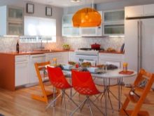
Orange
The red-haired countertop is immediately associated with a fast food cafe. Because this color stimulates appetite, but not in the same way as red: you want to eat a lot, but quickly. If you like this color and want to add it to the kitchen interior, choose not a countertop of this color, but something smaller: a bright sugar bowl, a picture, a clock.

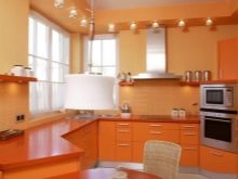
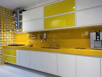
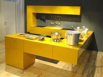
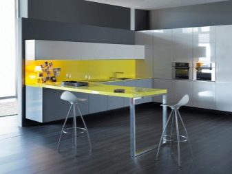
Yellow
Creative personalities, avid chefs who want to cheer up in the morning with a cup of coffee - this item is for you. Because the yellow color of the kitchen countertop will help you not only wake up and get in a great mood - it will also stimulate you to create culinary masterpieces. Therefore, feel free to choose a countertop in one of the shades: from lemon to honey.
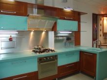
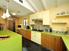
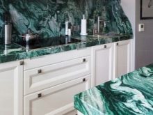
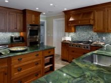
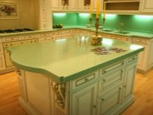
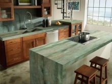
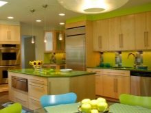
Green
It is considered the most favorable for humans, since it is the color of nature itself. The green countertop will be a great solution in your interior. A rich selection of shades - from light green to malachite - will help you navigate and choose the most suitable color for your kitchen.
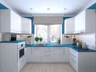
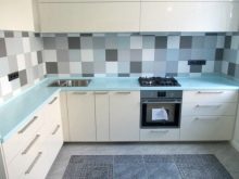
Blue and blue
The blue countertop is often chosen by lovers of shabby chic. This color is gentle, soothing, unobtrusive: it can be bright or faded. Blue is sharper, more contrasting, such a tabletop, of course, has a right to exist, but eyes can get tired of such a "deep" color.
Therefore, it is desirable to use it as an accent.


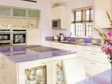
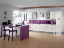
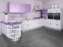
Purple
The color of mysticism, witchcraft, mystery. It also has many shades: from lavender, beloved by Provence, to the deep color of the night sky. Looks very nice in a monochrome kitchen. A gray-black-white interior, in which a purple countertop will act as a color spot, will obviously not go unnoticed and will not look too strict and boring.

When choosing the color of your countertop, do not stop at monochromatic options: consider variations with glitters, stains, interspersed, with a wood-like or stone-like texture.
Your imagination and artistic taste will help you with this.
For tips on choosing a kitchen countertop, see the video below.


The comment was sent successfully.