How to choose the color of the apron for the kitchen?
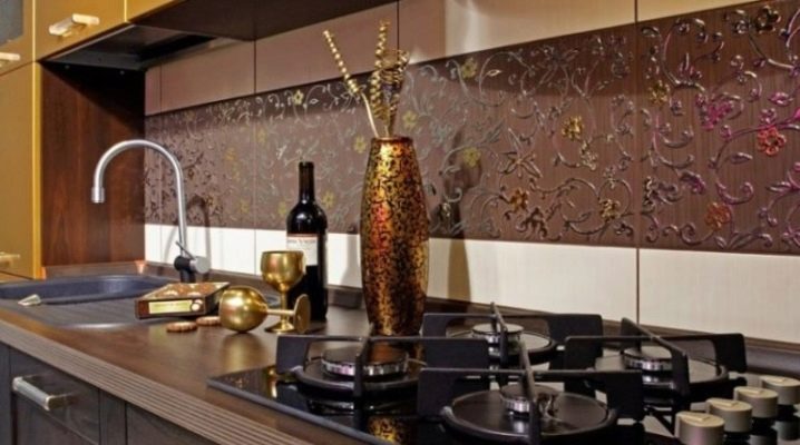
Housewives spend a lot of time in the kitchen, so the convenience of this room should be maximized. In addition to having all the necessary furniture and appliances that are needed for cooking, it is important to create a pleasant environment in which work will be done with pleasure. The presence of a kitchen apron has become an indispensable attribute for good housewives, because it allows you to protect the surface of the walls from pollution, and is easy to clean. To make this element look beautiful, it is important to be able to choose its color correctly.
Color spectrum
The apron for the kitchen has become a familiar and necessary detail, which, in addition to its direct function of protecting the walls from dirt, also began to perform a decorative function. In order for this element to blend harmoniously into the interior, it is necessary to choose the right color scheme. There are 4 main groups of color combinations.
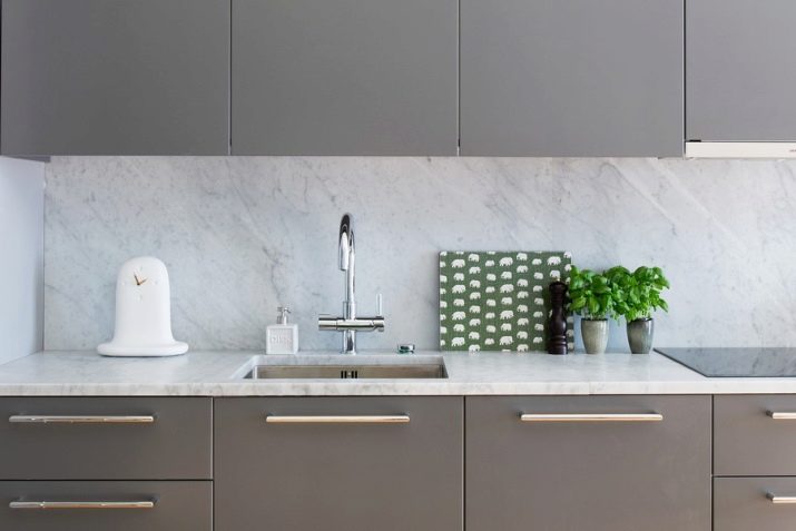
- Neutral tones. It is supposed to use calm tones, which partially or completely coincide with the color of the kitchen headset. If you want to highlight the apron, you need to choose a tone that is lighter or darker than the interior of the kitchen itself.
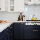
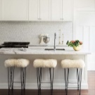
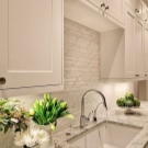
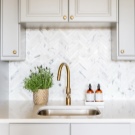
- Contrasting tones. They are used indoors where the design has one common color scheme. Due to the sharp contrast, it is possible to achieve style in a strict and simple design. The most popular are combinations of black and white, but you can use wenge against a background of white or beige walls and vice versa, a light apron against a background of dark walls.
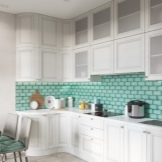
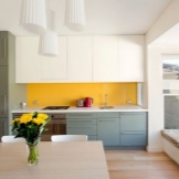
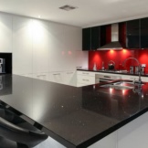
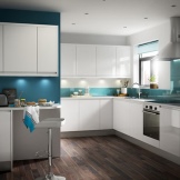
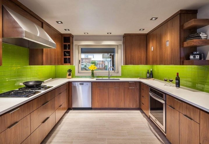
- Bright colors. The use of bright colors for the apron is supported in the general interior with the help of additional details: handles of the same shade, doors, dishes. The general color scheme of the kitchen itself should be calm, made in monochromatic, discreet colors, which makes it possible to highlight the apron zone. Such a room has a very elegant appearance and evokes positive emotions, but requires special attention to cleanliness and order.
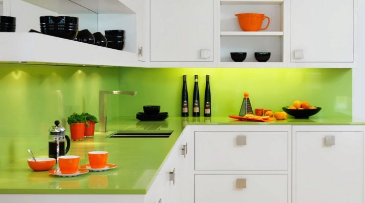
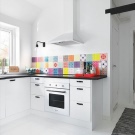
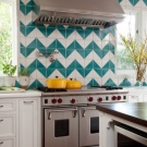
- Use of non-standard materials to create an apron: glass, metal, plastic, wood, stone, while the traditional option requires the use of ceramic tiles of different sizes and textures.
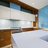
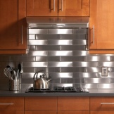
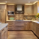
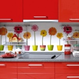
The choice of the color of the apron is dictated by the style of the room and its color scheme. It should be understood that there are shades that combine well with each other, but there are those that should not be combined.
Dark
In a black and white kitchen, one color should play the main role, and the second should play an auxiliary role. The black room will look stylish, and the presence of a white apron in it will relieve the space and decorate it. This color scheme is not to everyone's taste; many adhere to light colors in the interior with a possible contrast in the area of the apron. Purple, blue, brown, yellow, red and orange aprons will look the most juicy and beautiful, as they favorably set off the rest of the room.
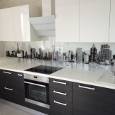
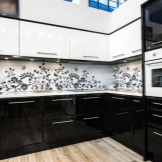
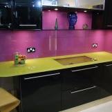
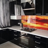
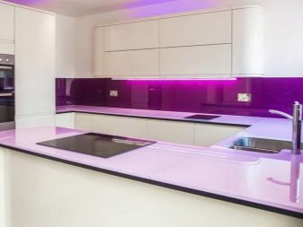
If the kitchen is made in light colors, then it can be shaded with a dark apron made of glass. The advantage of this option is the ability to apply photo printing, which will complement the design of the kitchen and add zest to it. For such objects, you should not choose pictures of nature or a night city, since they will be isolated objects that are not related to the room. The most correct would be a drawing of fruits, abstraction, mosaic, which will add color to the interior without overloading it.For a bright kitchen, you can pick up an apron with a lilac edging, which will favorably emphasize the design of the room. The play of dark and white shades looks good in any room, especially with small dimensions, since it visually allows you to expand it. The color of the apron should be such that it sets off the rest of the room and at the same time looks stylish and appropriate.
Bright hues
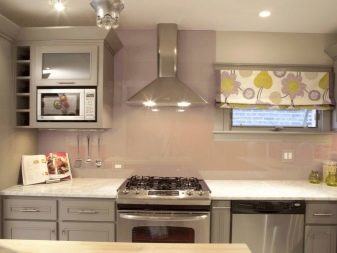
An apron in light shades can be placed both in a white kitchen and in a room where the walls have contrasting shades. A completely white kitchen will look stylish only when interesting accents are present in it. There may be bright stains or flowers on the apron, and in the room itself there may be contrasting dishes, towels, decorative elements, which together will make it possible to obtain the desired result. White interior colors can be diluted with an apron of gray shades:
- wet asphalt;
- metallic;
- chromium.
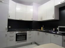
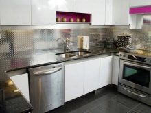

Wall decoration with metal will also look good. An apron made using mosaics can be original and brighter, the colors for which can be from neutral to contrasting in combination with white. Using a plastic backsplash in bright colors will fit perfectly into a bright room, especially in combination with a dark countertop. The most contrasting solution will be black tiles, which will favorably emphasize the beauty of a white kitchen.
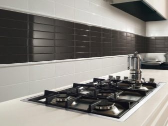
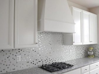
For a gray kitchen, the color scheme of the apron may be slightly different. By itself, this color is quite simple and discreet, but in the right combination with the color of the apron, it will give the room a cozy, spacious and interesting appearance. The most suitable options would be:
- yellow;
- Red;
- pink;
- blue.
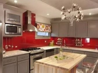
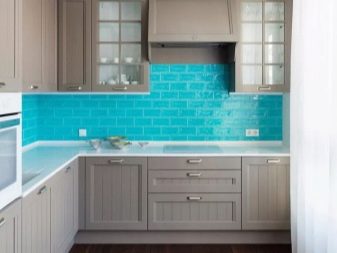
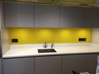
Gray can also have several shades, for which you need to be able to choose the right colors. There is a rule in which a warm color scheme of an apron is matched to a warm main color, and a cold one to a cold one. The presence of bright tiles, dishes, towels, salad bowls, flower pots of the same shade will form a single stylistic concept, into which the apron will also be organically inscribed.
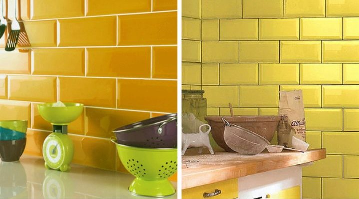
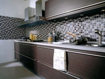
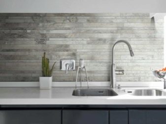
If you want to add bright colors to the room, then the work area is decorated with a plain apronthat stands out against the gray interior. For lovers of calm tones in a gray interior, you can use a white apron or black and white mosaic. So that the room does not seem too boring, it is important to add some interesting decorative items to it. For those who prefer dark colors, you can choose a dark gray apron, but it must have thin bright stripes on it, which will make the object interesting and stylish, logically complementing the gray kitchen.
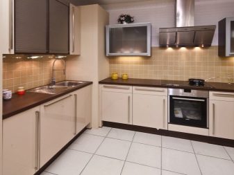
If the kitchen is made in the color of cappuccino, then the most correct color for the apron will be the one closest to it in tone. Typically, the premises are made in a classic and restrained style without an abundance of decorative elements and with maximum simplicity. The use of the cappuccino color scheme is intended for spacious kitchens, as it makes the room more elegant and beautiful. In this case, it is not necessary to include bright colors in the color of the apron, otherwise it will distract attention to itself, making it difficult to perceive the entire interior of the kitchen as a whole.
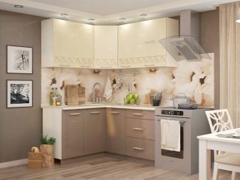
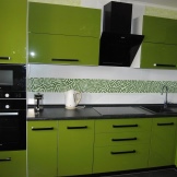
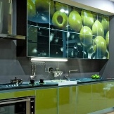
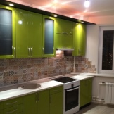
If the kitchen is made in olive color, then there are more opportunities to create an interesting appearance of the room by choosing the color scheme of the working area. When creating an interior in olive color, it is usually diluted with different tones and other colors to make the room more dynamic and interesting. Most often, either walls or furniture are made in this color. The most successful combinations with olive color:
- black;
- White;
- Gray;
- beige;
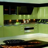
- yellow;
- Red;
- Orange;
- pink;
- purple.
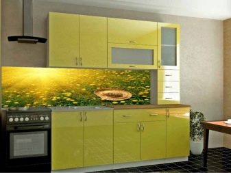
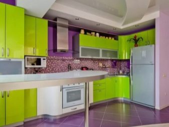
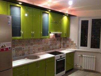
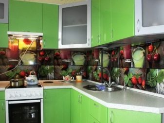
To combine everything in the room, it is important to complement it with olive-colored decorative elements. The apron itself can have the most varied appearance.The choice of texture, material and pattern is selected for a specific room and the tastes of those who live in it.
For a beige kitchen, there is also a range of apron colors that look most advantageous with it. Best combined with a beige kitchen:
- White;
- Orange;
- Red;
- purple.
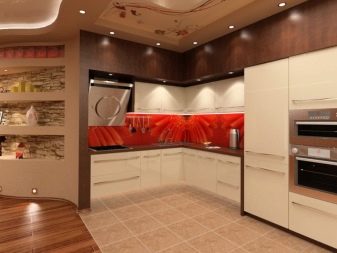
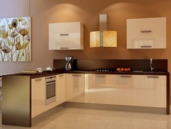
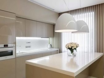
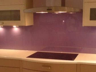
Since these colors are very different from the shade of the entire room, it is imperative to bring decorative details in the same color scheme. The right combination of elements in the kitchen will make it possible to get a comfortable and attractive room in which it will be pleasant to be for a long time.
Bright
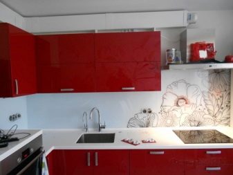
The bright colors of the apron play a very important role, therefore it is necessary to combine them correctly with the interior of the kitchen. For a colored room, in no case should you create a bright work area, this is the basis for decorating that should not be violated. If the furniture and walls have the same rich shade, then the work area will become invisible. The same fate awaits an apron in soothing colors, which is made in the color of the room.
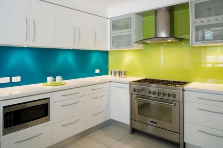
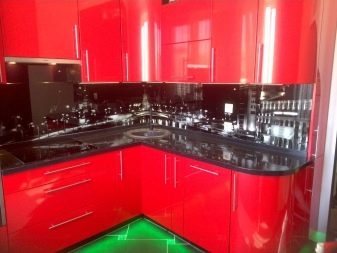
For a red kitchen, you should not use shades close in tonality: pink, coral, burgundy. For such a room, it is necessary to choose the right contrasting color, in the quality of which it looks best: black, white, gray and brown. A room with a blue and blue set or the color of the walls should have a white apron, or made to match the color of the tree. If blue is a good accent color, then blue is best combined with other colors, these can be:
- light green;
- lime;
- lilac;
- White;
- black.
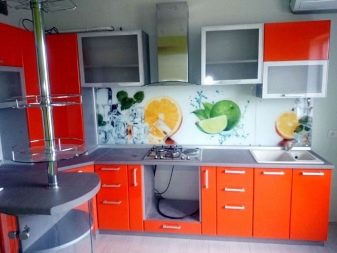
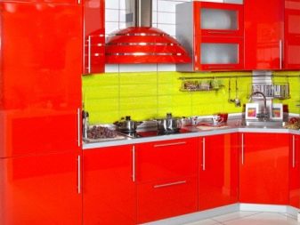
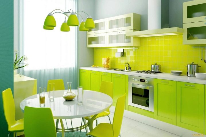
For a green kitchen, it is best to choose a yellow apron. For an orange room, it is worth choosing light green and brown colors as the design of the working area. Any colored aprons should be diluted with a calm headset, and vice versa. So, for a burgundy kitchen, you should choose a white or the lightest and most calm option for finishing the workplace. A turquoise apron will be a decoration for a white or sandy kitchen, where the main background is soft and calm.
We take into account the style
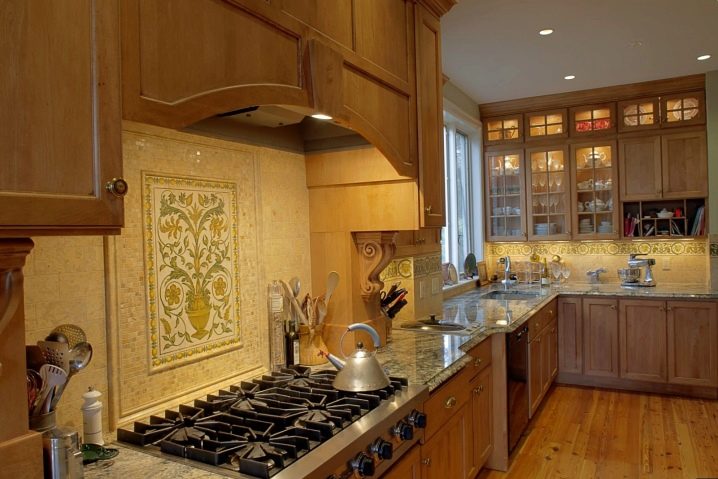
Those who want to make a room for cooking and eating food special, with their own face, should choose a certain style. The presence of a specific direction allows you to choose certain options for an apron that will best combine with the main interior. Each style has its own characteristics that you need to know and follow in order to get a beautifully decorated room. For a classic kitchen, a feature is the use of natural materials and compliance with strict lines. Aprons in this case can be made of MDF, chipboard, ceramic tiles, plastic panels with wood imitation. It is important to pay attention to accessories that should complement the room without overloading it.
Country style has a connection with the village, the farm, and therefore everything should be simple in the room. The apron in this case can be made of wood, MDF or stone. The set and dining area should complement each other to create the desired style. For the Provence style, everything is different: here the furniture has an exquisite shape, light colors and an abundance of small decorative elements. The apron in this case should be made of glass, MDF, tiles or mosaics.
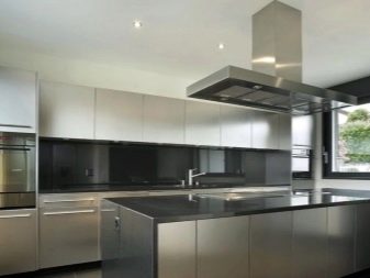
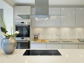
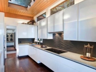
The modern kitchen will be distinguished by interesting stylistic solutions, the shape of the headset, the materials from which it is made. The work area is usually made of metal, polycarbonate or glass. The high-tech style can also boast an abundance of original materials for the work area:
- chromium;
- glass;
- plastic;
- metal.

Selection Tips
So that after the repair the kitchen does not turn into a room where it is uncomfortable to be, there is no desire to cook or have dinner, it is important to choose the right elements from the color of the walls and furniture to the selection of the apron and countertop. If the issue of the colors of the kitchen itself and the headset has been resolved, then it is worth paying special attention to the apron. To choose the right color for the kitchen, it is worth considering:
- the color scheme of the walls and kitchen furniture that are already in the room;
- any kitchen will suit a calm color scheme with small bright accents: bright colors will tire the eyes, causing discomfort;
- it is important to choose the right texture of the material: the glossy texture will make the color richer, and the matte texture will make it calmer;
- combinations of print size and room dimensions are very important: for a small kitchen, you should not choose a large drawing, and for a spacious one, a small one.
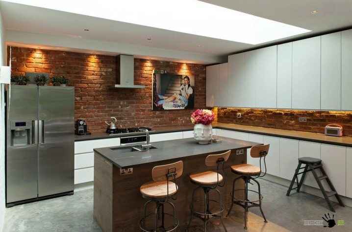
The worktop is also part of the work area, so it is necessary to choose the right material, texture and color for it so that the kitchen is one solid object in which all zones are clearly visible.
Beautiful examples
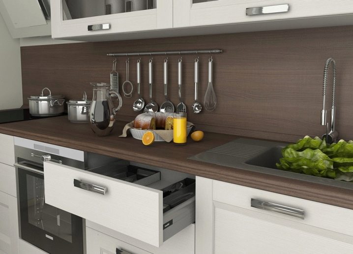
To create a unique interior, it is worth looking at the work of experienced craftsmen. The correct selection of all components becomes the key to success in creating a functional, beautiful and comfortable kitchen.
For information on how to choose the color of the apron for the kitchen, see the next video.


The comment was sent successfully.