White apron for the kitchen: advantages, disadvantages and design options
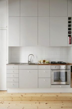
The popularity of the white range in the design of living spaces is due to its democratic nature and openness to any experiments with color and texture in the preparation of interiors of varying complexity, style and functional orientation. Neutral white, along with black and gray, are among the basic, fundamental colors that form the very idea of interior design. A clear proof of this is the white kitchen apron. It can act as an accent, serve as a backdrop for accent decor, or, taking on the main load, support different shades of background finishes and interact with other materials.
Advantages and disadvantages
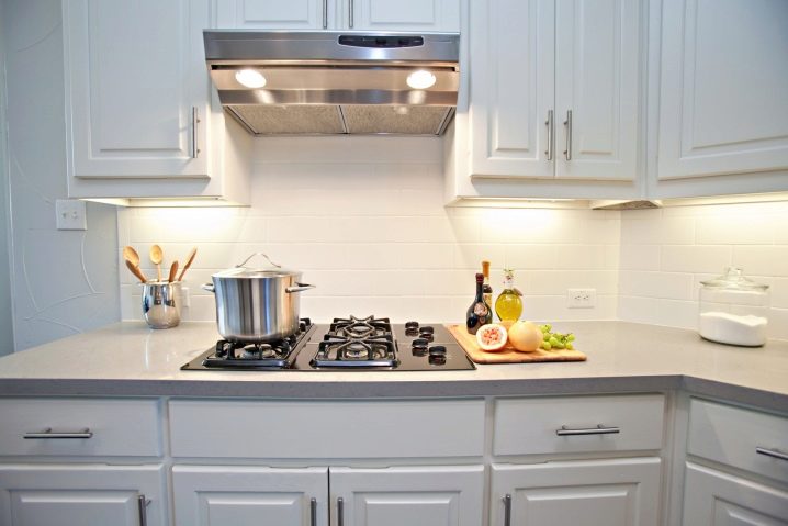
An apron in a snow-white design is a simple, but at the same time elegant solution for the kitchen, stylish, memorable and profitable in many ways. A kitchen apron in white has many advantages.
- Universally and equally successfully integrates into most interior styles from classic to ultra-modern.
- It has the ability to visually increase the space, making it more voluminous, which is especially important for kitchens with a limited area.
- Increases natural light in the room. The sun's rays, reflecting from a light surface, spread throughout the room and multiply in space, making the room seem much brighter than it actually is.
- Demonstrates perfect compatibility with all colors of the spectrum, regardless of their brightness, saturation and chromaticity. This is very convenient when changing the kitchen design. The presence of a white element will definitely not cause color imbalance in a partially or completely renovated interior.
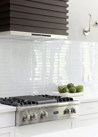
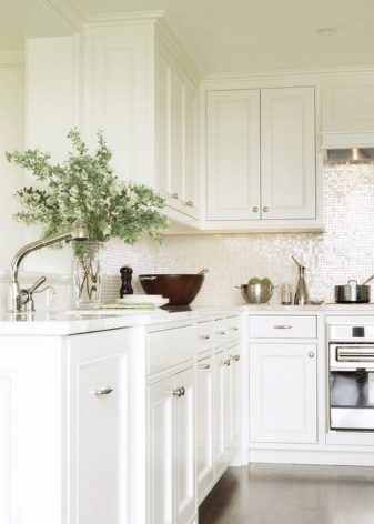
- Has an aesthetic and elegant appearance. Furnishings, decor and white furnishings are good in that they transform the interior, enlivening it and filling it with light.
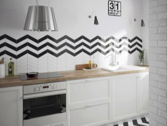
- It is a fashionable element thanks to the current monochrome range. The white apron itself looks very stylish. This element looks doubly stylish in a completely white kitchen. So that the monochrome interior does not tire, it is recommended to dilute it with other shades: contrasting, dark or bright, warm. For example, you can make an apron in black and white.
- Serves as an excellent neutral background for dishes, textile decor and lighting elements, regardless of their color.
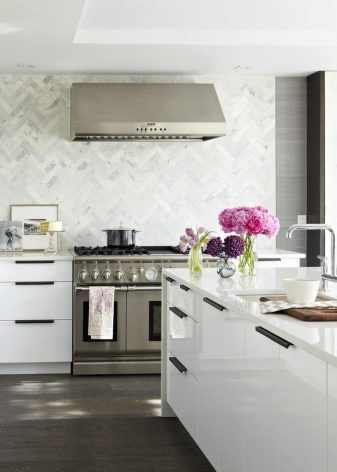
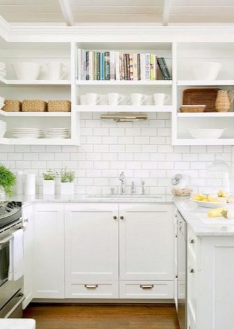
Even recognizing the many advantages of white, not everyone dares to use it in their kitchen. Basically, the refusal of the white finish of the apron is argued that it is too easily soiled. The practicality of a white coating in a kitchen is really doubtful, because on a light background any pollution is very conspicuous, so you have to especially carefully monitor its cleanliness.
But it is the decision to make the apron white that the healthy habit of keeping the kitchen in perfect order is developed, so this disadvantage can be considered relative.
Successful combinations with other colors
The kitchen apron in white is one of the most versatile finishing options for the work segment. Combining white with different colors and shades allows you to solve a variety of interior tasks, for example, to regulate the color temperature in the interior or to emphasize the style features of the design.
- Black. White forms the most effective color duets with contrasting colors.In addition to the classic black and white tandem, which is most often found in art deco or modern kitchens, the non-trivial and fresh white color looks paired with deep blue, gray or brown. The main advantage of contrasting alliances is that the light shade in them looks more saturated, and the contrasting one looks noble, refined and elegant. The addition of a third color to black and white kitchen design: orange, red, pearl, provides a lasting wow effect.
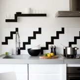
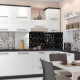
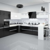
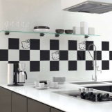
In this case, an additional shade can be present on facades, textiles or in background finishes.
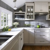
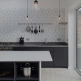
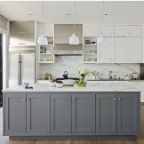
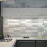
- Gray. A white apron goes well with any shade of gray palette from the lightest to the most intense dark. Most often, designers use gray and white tones to decorate small kitchens in order to visually adjust their proportions and add volume. In a gray-white kitchen design, it is recommended to use matte, not glossy facades, the mirror shine of which will discord with the restraint and calmness of the gray scale. The duet of gray and white can be safely used when creating a kitchen interior in the style of French country, Victorian romance shabby chic, Mediterranean design.
- Red. The duet of red and white is a bold, original and undoubtedly memorable combination of colors that has long become an interior classic. The interiors of kitchens in red and white design are most often found in ecodesign, French country, modern, Japanese, classical styles. In order for the design to be harmonious and balanced in color, it is important to choose the right shade of the red palette and remember the sense of proportion. Going over with red is a sign of bad taste. Therefore, when choosing this color scheme, it is better to use white as the main one, and red as an accent one. The facades of the kitchen set, kitchen utensils, decor, upholstery of chairs can be in red, and in white - the decoration of walls, ceilings, countertops, work surfaces.
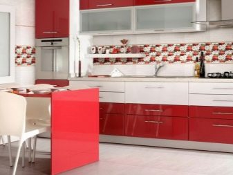
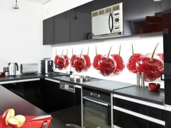
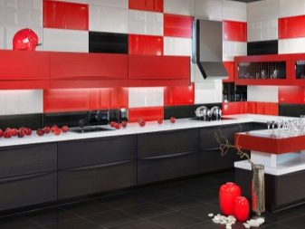
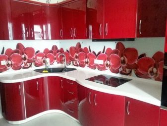
If desired, the apron can be made with a combined red and white, as well as pick up white window textiles with a pattern in red tones.
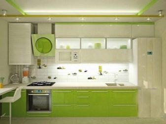
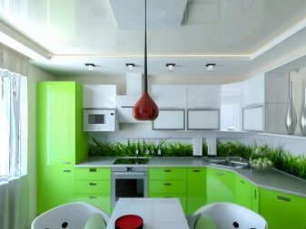
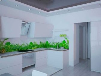
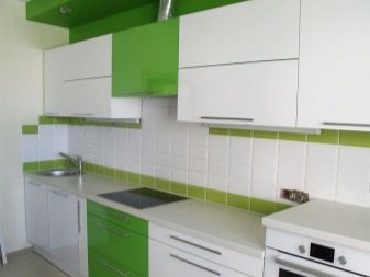
- Green. A white apron will further freshen up the interior of the kitchen in green tones. This color duo will appeal to lovers of rich, rich shades that the green palette is rich in. The most beautiful, expensive and stylish combinations of white with an emerald or pistachio shade are considered. There are tons of variations of white and green kitchen designs. The combination of a white apron with green glossy facades looks interesting. No less impressive is a snow-white apron made of ceramics, stylized as brickwork with a dark green grout, in combination with a matte set of natural green color.
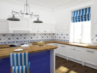
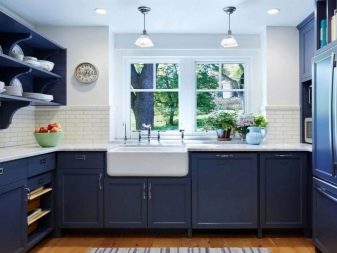
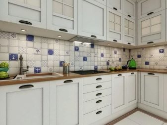
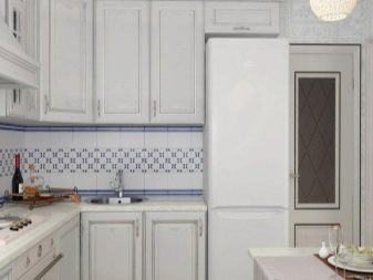
- Blue. The shades of the blue range are calm, coldish, pacifying, and most importantly, very beautiful. Blue and white combinations have a relaxing effect on the psycho-emotional background and harmonize emotions. A white apron looks equally advantageous in combination with cold and warm, airy and light shades of the blue palette of the kitchen facades.
Ideas for design
Consider the possible design options for kitchens with a white apron.
- Contrasting. A white apron can be diluted not only with the traditional black and white, but also with the red-gray or black-red color design of the headset, marking the visual border between the upper and lower tiers of storage systems. In this case, the snow-white cladding of the work surface will serve as a color accent, giving expressiveness to the interior. This technique is most often used in minimalism, hi-tech, modern, "attic" style. In contrasting design, white often dominates in the color scheme of furniture, in the background finish and facing of the apron, and in dark chairs they act as accents.
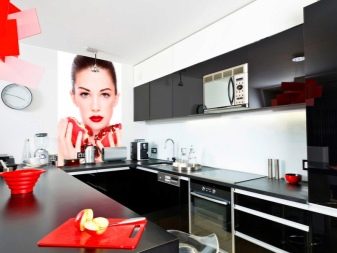
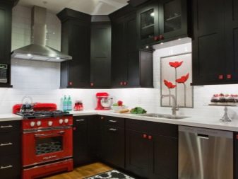
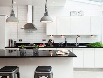
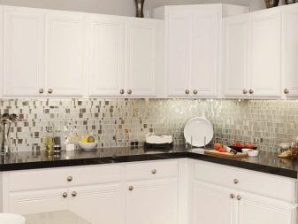
To avoid the undesirable effect of blurring the elements that form the working area of the kitchen space, which, merging with each other, become a single white spot, it is important to draw a visual boundary. This can be done using a dark-colored countertop that visually separates the wall and floor modules.
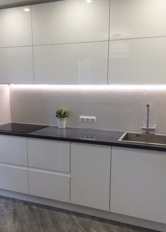
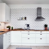
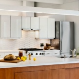
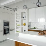
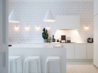
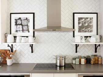
- Monochrome. You can treat a completely snow-white kitchen as you like, but just not indifferent. Here, the white apron is perceived as a logical continuation and integral part of the Total White kitchen. It will fit into any design of a kitchen set, regardless of the type of facade coating (glossy or matte). The most practical option is a white gloss with a delicate pearlescent sheen. In a snow-white monochrome design, it is important to visually separate the apron and the headset. Otherwise, they will merge with each other. The snow-white interior, in which the borders of neighboring objects are erased, visually looks flat, losing volume. It is most convenient to highlight a white apron in a totally white kitchen with the texture of the finishing material, interesting geometry or an original pattern. This task can be solved using textured tiles of a non-standard format, mosaics, relief or volumetric tiles with imitation of the texture of stone or brickwork, grouting in dark shades.
- Color. In a colored kitchen design, 3-5 shades can be present at the same time. Here, the white finish of the work segment is used either as an auxiliary element that unites the rest of the shades, or as a color accent in whimsical vintage interiors or retro kitchen designs. Those who prefer the color scheme of the kitchen have to choose the coloristic solution of the apron much more carefully than in cases of using any other design options. The presence of a colored panel can cause color imbalance and visual overload, and being dark in neutral tones can cause excessive contrast. With a white apron, such problems will definitely not arise.
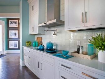
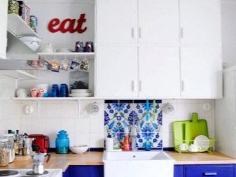
Due to its neutrality, white, which is also used in doses, will not dominate and interfere with the color scheme, disrupting the harmony in the interior. But at the same time, it is necessary to take into account the ability of a white background to emphasize the brightness, depth and saturation of colors.
Care Tips
The complexity of caring for a white apron, as well as for a snow-white kitchen, is just a stereotype. The main secret of preserving the original whiteness of the working surface of a boiled color is the timely removal of contaminants in the process of systematic local and general cleaning of the kitchen. The frequency of their implementation is determined by the intensity of use of the stove and sink. And following the simple rules for caring for a white apron during operation will help maintain its attractive appearance for as long as possible.
- Express cleaning. Any dirt - stains, oily splashes, hard water deposits must be disposed of immediately upon detection. It is better not to postpone cleaning until later, because it will be much more difficult to remove ingrained dirt.
- Avoiding abrasive products and hard sponges. To maintain the cleanliness of a light apron, there are enough universal detergents: all kinds of gels, pastes, liquids. The use of abrasives can cause scratches, dents or discoloration of the coating. Instead of metal sponges, you need to purchase soft sponges, ideally made of microfiber or foam.


- Using a hood. When cooking products, it is necessary to make it a rule to immediately turn on the exhaust device. Due to the timely elimination of soot and particles of all kinds of impurities formed during the cooking process and settling on the surfaces of surrounding objects, the apron will get dirty much less.
- Regular general cleaning. It is necessary to arrange wet cleaning at least once a month.Use warm soapy water or dishwashing detergent to clean your apron.
- Treatment with dirt-repellent compounds. Thanks to the systematic use of such compositions, dirt and dust will not stick to the apron coating, therefore, there will be no need to use aggressive household chemicals.


Interesting examples
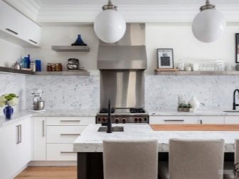
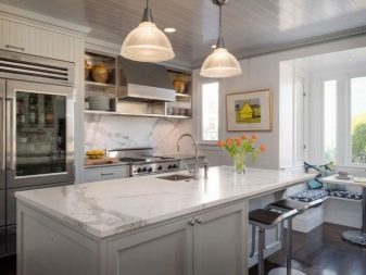
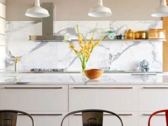
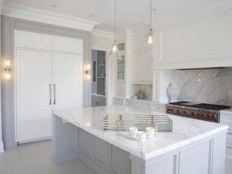
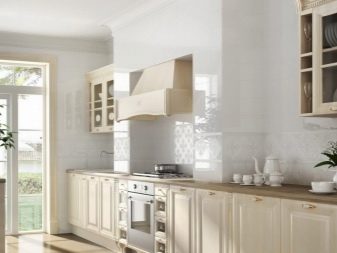
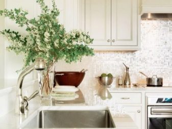
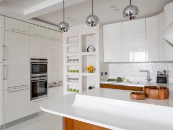
The photo selection presents examples of the use of a white apron made of different materials in classic and modern interiors.
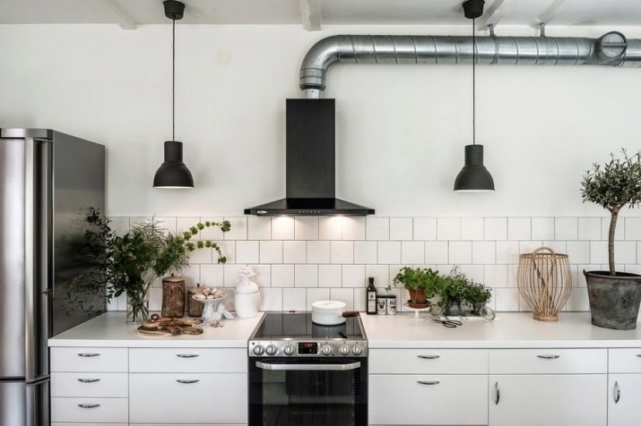
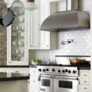
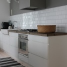
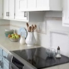
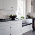
The kitchen with a white mosaic panel impresses with its exquisite and original look. An apron made of small mosaic details that often shimmer in the light is a bright and stylish accent that looks most harmonious in eclectic kitchen design, retro styling, hi-tech and ethnic style.
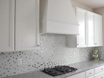
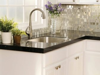
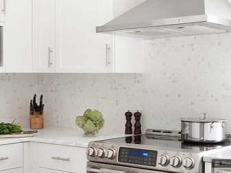
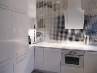
Facing an apron with white marble, perhaps the most luxurious finishing material for decorating a work surface, looks solid and expensive. This option is suitable for chic kitchens in palace styles (Empire, Rococo, Baroque), interiors in the Greek and English style, expensive variations of rustic and modern.
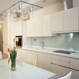
The beauty of skinny (glass aprons) rarely leaves anyone indifferent. It is the ideal solution for kitchens designed in trends of minimalism, futurism, hi-tech and other trends, gravitating towards regular shapes, clear lines combined with streamlined curves, reflective surfaces and transparent textures.
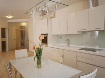
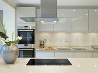
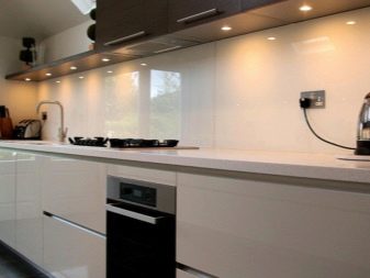
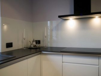
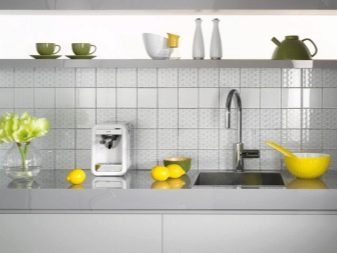
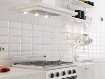
Decorating the apron with ceramic tiles is a traditional solution for the kitchen. Due to the different installation methods, monochrome white cladding, which some consider too boring, looks completely different in each specific kitchen, giving interiors in a variety of styles from classic to minimalism a bright personality.
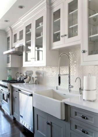
A skinali or a ceramic apron with mother-of-pearl effect is a sophisticated, sophisticated and truly luxurious solution for kitchens decorated in a nautical, antique or Mediterranean style. Delicate mother-of-pearl cladding fits best with light gray, beige, cream, milky, pastel pink, sand color design of the kitchen set.
For information on how to choose the right kitchen design with a white apron, see the next video.


The comment was sent successfully.