Wood colors for furniture
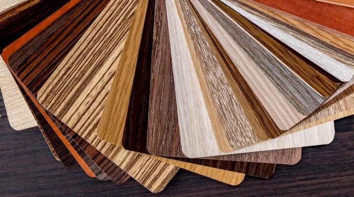
Everyone at least once in their life felt uncomfortable when choosing a shade of wood. There seem to be so many of them, but most are very similar. However, in fact, all natural shades of wood are divided into three types, and it is not so difficult to recognize them if you prepare. The color for the furniture should be chosen taking into account the interior palette, so that the whole design looks harmonious and attractive.
Overview of natural wood colors
So, all shades of natural wood can be divided into three large groups: dark, light and neutral. This makes it easier to choose and understand the topic as a whole.
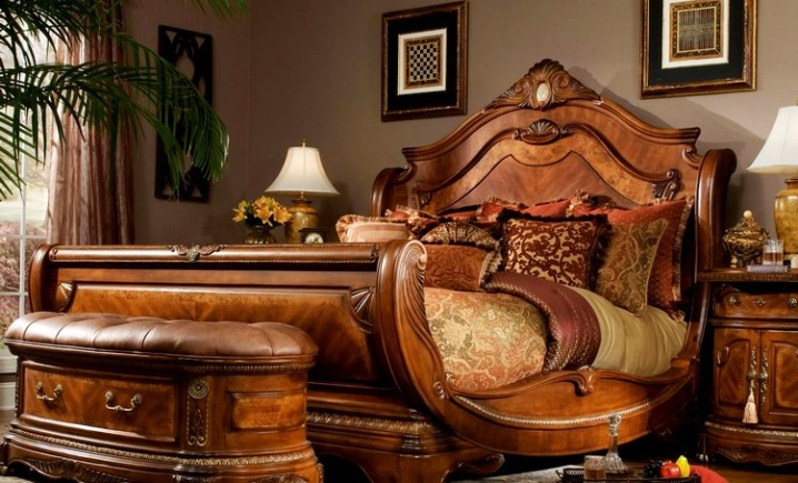
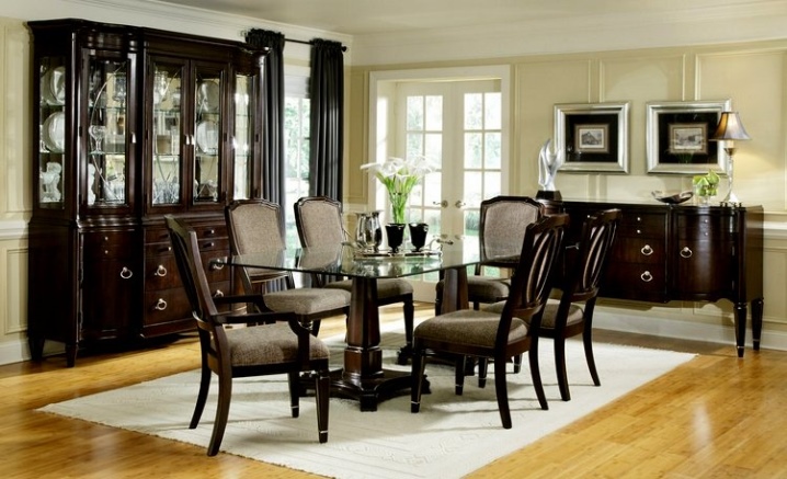
Dark wood is good for classic interiors. This group includes such shades.
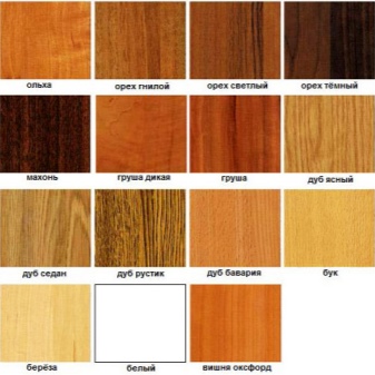
- Nut. Color from gray-green to brown with reddish undertones. It is the latter that is very popular. The color is characterized by saturation and depth.


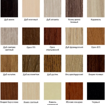
- Wenge. Black with blue stripes or dark brown tint. It looks expensive and laconic, which won its fans.


- Red tree. The name speaks for itself. With high-quality polishing, it feels like lights are jumping over the surface.


- Ebony. African ebony is exactly this color, the texture is veined. The presence of a matte sheen is characteristic.


Light wood colors are used very often for furniture. Usually used for hull structures. Shades allow you to visually enlarge the room. This technique is used by designers.
Light colors of natural wood.
- Birch. There is a slight yellow tint, and the structure itself is reminiscent of marble.

- Light ash. Creamy shade, somewhat reminiscent of coffee with a lot of milk.

- Pine. The color is rich, golden.

- Light beech. A shade of beige, diluted with pink blotches.

Neutral wood is used if the furniture is not the most important figure in the interior. A good solution not to overwhelm the space. Also, such inserts on upholstered furniture allow you not to distract attention from textiles.
Popular neutral shades of natural wood.
- Cherry. It has a rich shade that combines red and brown.


- Alder. The color is reddish or red, the texture is very weak.


- Oak. May have a golden hue in its natural state. However, bleached oak is sometimes used.


Chipboard color palette
The canvases are used for various purposes and are decorated with decorative foils. Therefore, there are no restrictions here, the color and pattern can be absolutely any. Quite often, manufacturers resort to imitation of the surface of natural wood. At the same time, colors can be light and dark, warm and cold.

Such a variety of colors allows you to combine chipboard with natural wood. This is quite convenient if there is a need to save some of the budget. Plates are much cheaper, but high-quality models are difficult to distinguish from natural wood. Usually wenge, oak and light pine are purchased.
Nuances of choice
The lucky owners of spacious and light rooms can use any color from the palette of natural wood or slabs. If the room is less than 17 m², then you should think over the choice more carefully. Here you need to use more light shades to expand the space. In general, small rooms are recommended to be decorated with soft, pastel colors. So, against the background of light walls, an ash cabinet will be almost invisible, regardless of size.


Light colors are easy to work with. The room can be "revived" with bright decorative elements. If you use some other colors as a basis, then you will have to act with the utmost care.
Cold colors are used to create a strict interior. However, warm ones are more relevant if little natural light enters the room.


The entire interior of the room can be conditionally divided into two parts. One will include the floor, ceiling and walls - this is, as it were, the basis. But furniture and decorations are secondary elements. The background and furnishings should match in color and style.
The rules for balancing shades.
- If the main elements are decorated in a neutral way, then the furniture should be as massive as possible, catchy. The same rule works in the opposite direction.
- In order not to overload the interior, you should choose simple textures. Complex patterns are relevant only in large rooms with high ceilings. If you really want to, then you can arrange only one thing in this way.

- Dark wood indoors should be no more than 40%. The rest of the space should be left light. Otherwise, the interior of a small room will become gloomy and too gloomy.
Beech, milk oak and birch are equally good on light and dark backgrounds. A little coffee, blue or red shades in this composition will add coziness. Gray works well when arranging a cold room with a strict design.
Neutral wood tones work well with both bright and pastel backgrounds.
Color matching recommendations:
- White. Combines with everything, universal. Usually oak is bleached - a rather noble wood with a pronounced texture.

- Black. In the classic version, it is combined with contrasting white. You can use a gray, blue, or beige background to create a softer bounce. In some cases, black walls and the same furniture are combined. However, you should definitely refresh the interior with light textiles. Do not combine black wood with variegated patterns on the walls and flooring.

- Wenge. Noble shade. Combines with turquoise, peach, creamy, vanilla and orange backgrounds. If the wood has a purple overflow, then it can be successfully combined with pink. Also, such furniture looks great with olive or green wallpaper.

- Nut. In the classic version, it is combined with a sand and white background. If the furniture has a warm undertone, then you can use brown, red, yellow and blue, dark green and burgundy. Cold wood looks better in combination with blue, light green.

- Red tree. Designers often use such furniture to create warm and cozy interiors. Usually combined with pastel and warm colors. The combination with purple and green looks original and bold. Mahogany looks good on a brown background, but a little beige should be added to refresh the interior.

- Gray. The background should be yellow or green, and it is better to use light shades. Such furniture looks good in combination with red, white, purple and blue.

When choosing a color, it is also worth considering the features of the interior. So, dark wood is relevant for classic styles. In a modern interior, furniture of light colors is more often used.
Neutral shades are relevant when decorating in the style of Provence, country and the like. The main thing is that everything looks harmonious and the space is not overloaded.
For more information on wood colors, see the video below.


The comment was sent successfully.