Wallpaper colors in the interior
When choosing wallpaper, buyers have to face obvious difficulties, especially in light of the modern variety of materials for their production, quality, manufacturing companies, and, of course, color solutions. If you have the financial opportunity, you can instruct a good designer to take part in the decoration of the premises. However, if you want to do it yourself, there is always the opportunity to independently study what the best color solutions of wallpaper in the interior can be.
General selection rules
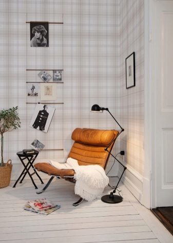
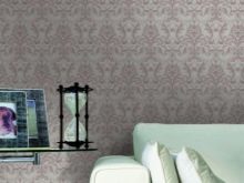
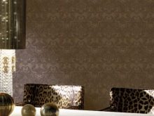
There are a few simple rules that are important to follow. It is they who will help to correctly and tastefully arrange the wallpaper in the interior. It all depends on which element the owner of the premises wants to focus on. If you want to focus on the wallpaper itself, you can safely decorate the walls with products of bright colors with a large and textured pattern. It often happens the other way around: the owner wants the attention of the guests, first of all, to dwell on the furniture. Then it is better to paste over the walls with wallpaper with a small pattern, and it is preferable to choose pale colors or any pastel colors, for example, peach, olive, sand.
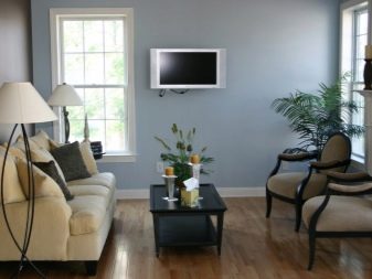
If options are selected for an office or bedroom, calm tones are preferable, and the texture is even, without bright and fanciful patterns that will interfere with concentration while working or falling asleep. For a small room, wallpaper that visually expands the space is best suited - without a pattern, any light shade. Do not paste over a small room with dark canvases - this will create an even greater effect of reducing the area.
Do not forget about which side of the world the windows of the room face. If this is the north side, choose a white background with a discreet repeating pattern or pastel wallpaper colors. An excess portion of sunlight, which will always be present on the south side of the windows, should be compensated for by a cold scale: all blue, blue, purple colors, as well as turquoise, light green and azure green are suitable.
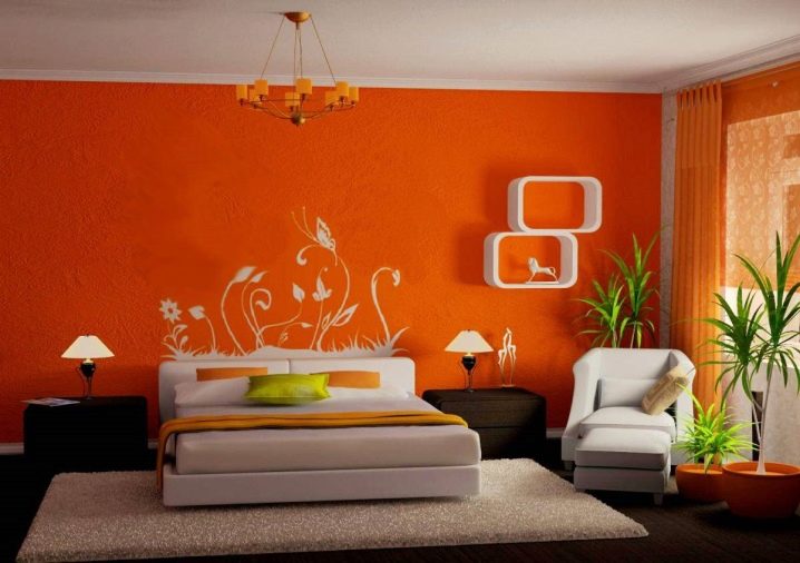
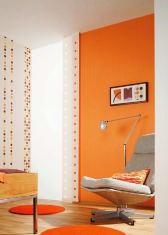
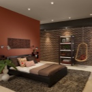
If the room is always cool, it is recommended to make it warmer by choosing the appropriate wallpaper colors: burgundy, orange, any chocolate shade.
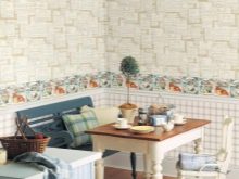
Fashionable prints with imitation of natural colors of stones and trees will best fit into a country or garden ensemble. One of the most non-standard and, perhaps, complex options is wallpaper with complex geometric patterns.
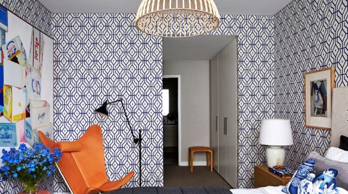
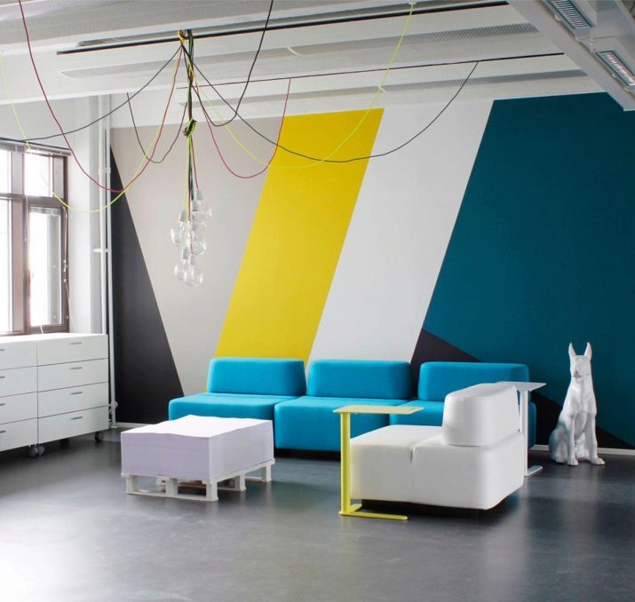
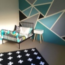
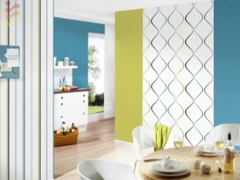
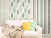
With geometric shapes
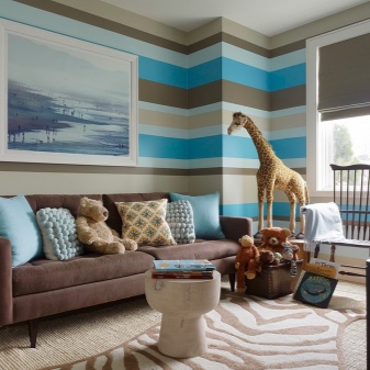
This is a know-how that began to gain popularity due to the fact that more and more consumers began to appear who want to design their space in one of the modern interior styles, for example, high-tech or minimalism. Wallpaper with geometric patterns can include any model that depicts different shapes: rhombuses, squares, rectangles. Among these options you can find wallpapers with circles of different colors and sizes, as well as colored zigzag patterns "missoni", which will organically fit into a certain style of modern furnishings, such as high-tech or eclecticism.
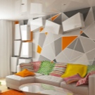
It should be said right away that it is very difficult to choose the right "curly" wallpaper yourself, so if you intend to focus on just such a non-standard solution, it is best to trust the taste of a professional designer, who will help you avoid many mistakes when choosing.
There are several basic rules that are highly recommended when choosing wallpapers with geometric elements:
- You should not abuse excessive originality and acquire an overly complex texture of the drawing: an excessive heap of shapes and colors will make the room uncomfortable and difficult to perceive.
- It is also important to take into account such a factor as a combination of several colors, which is very typical for "geometric" wallpaper models - so that the colors of other interior items do not enter into sharp dissonance with them.
- In the case of the presence in the house of just such a non-standard vestment for the walls, the furniture should be monochromatic, with smooth contours and smooth transitions, without any sharp corners. If you neglect this advice of professionals, the room will look like a tasteless jumble of chaotically intersecting lines, which does not contribute to creating a cozy space.
Plain
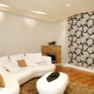
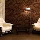
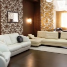
Monochromatic models seem boring and uninteresting to many, but this is far from the case, especially if a person is a beginner in the field of interior solutions, but, nevertheless, wants to decorate his room on his own, without resorting to the services of professional designers. Due to its simplicity and versatility, this type of wallpaper is especially in demand. Most often, these are neutral muted colors that are not striking, which makes it easy to match furniture, curtains and other furnishings. In this case, you need to be guided by a simple principle: if the walls are light, the furniture should be at least one tone darker, so that it does not merge with the walls, but looks the most advantageous. If furniture in light colors is planned in the room, the wallpaper can be pasted in darker ones.
Models differ with both the presence and the absence of a pattern, but neither one nor the other will never look annoying and too bright.
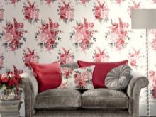
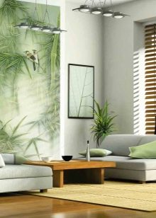
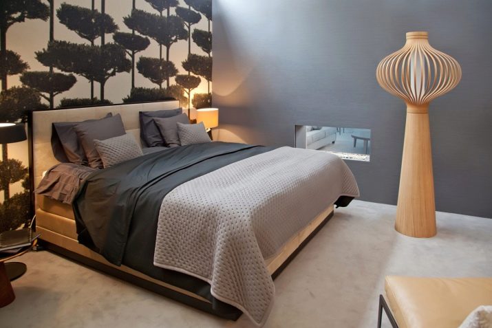
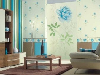
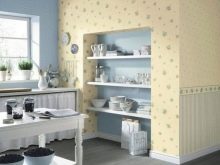
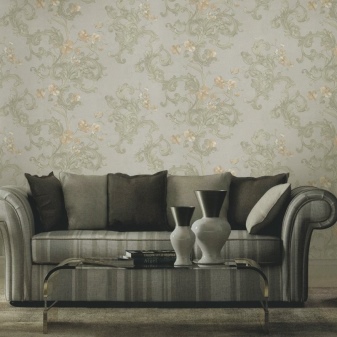
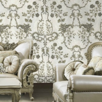
With a plant pattern
Different stems, twigs, leaves are a familiar and beloved version of wallpaper that will never go out of fashion. They are notable for the fact that colors are used in the manufacture of prints, as a rule, pastel and not particularly bright. The only nuance when gluing is the need to "fit" the ornament, its connection. The pastel range of colors will always become a very beneficial background if the room itself is bright and creative, and its owner often likes to rearrange or update his interior.
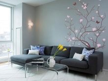
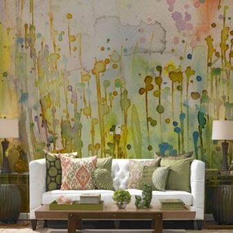
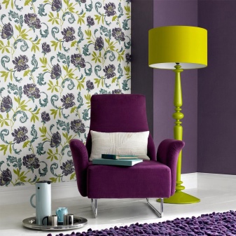
With abstraction
The abstract pattern on the wallpaper is most often made in the form of a chaotic and contrasting ensemble of bright spots or strokes and streaks. They often seem tasteless and tacky, but this is not entirely true. When placed in a modern setting with solid colored furniture in bold colors, they look very beautiful and appropriate. If they are dominated by light spots (yellow, orange, blue), furniture should be selected in any tone available in the palette, sometimes with a darker shade, depending on the overall creative picture. The advantage of abstract models is that they do not need to be joined together, but they will look best in modern interiors.
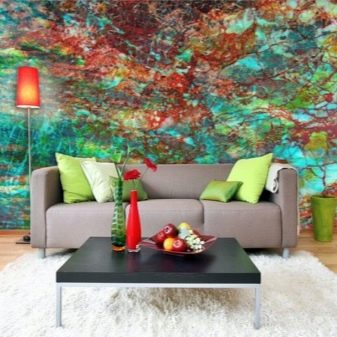
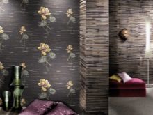
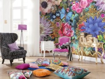
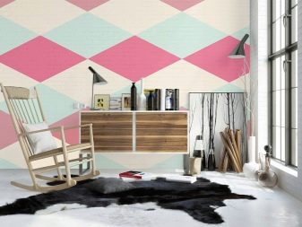
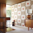
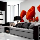
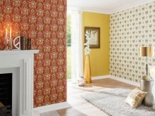
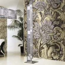
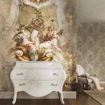
With a large pattern
Contrary to popular belief, it is safe to say that a large drawing will look great in both large and small rooms. It is important to choose the right option so that you do not get unnecessary piling up and variegation. The more contrasts there are shades with a large pattern, the better it will turn out to focus the guests' attention on the wallpaper.This choice is best made for larger rooms that have plenty of natural light. And, on the contrary, if the colors of the background and the pattern on it smoothly merge into each other or even merge, this will be an excellent option for a modest area.
The influence of the tone of the walls on a person
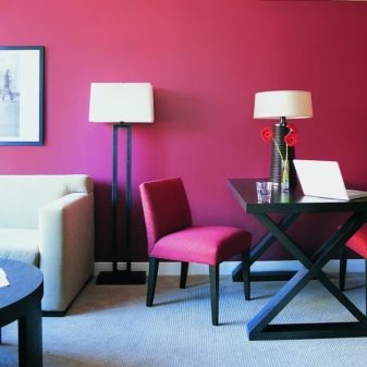
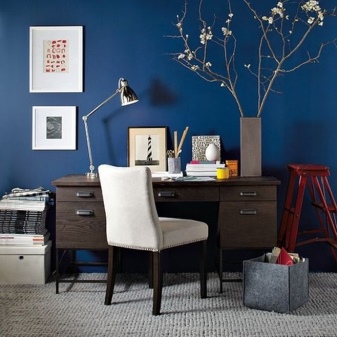
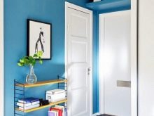
It is known that different colors in a certain way affect the mental organization of a person. It is generally accepted that red has a stimulating effect, therefore it is not recommended to use it in rooms intended for recreation. Red interior wallpaper and all their shades are well suited for the design of a study: this will help to activate the working regime and create an optimal microclimate for productive activities. By the way, blue and cyan colors are also good for covering the workspace with such wallpaper, because they stimulate thought processes and help a person to concentrate well when doing an important assignment.
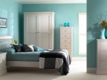
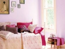
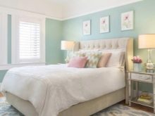
It is best to decorate the bedroom in muted and calm tones: peach, pale blue, light purple, pink. This range promotes relaxation and restful sleep. Similar colors are recommended for use in psychotherapy rooms, yoga centers and other areas designed for quiet relaxation.
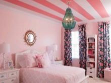
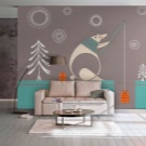
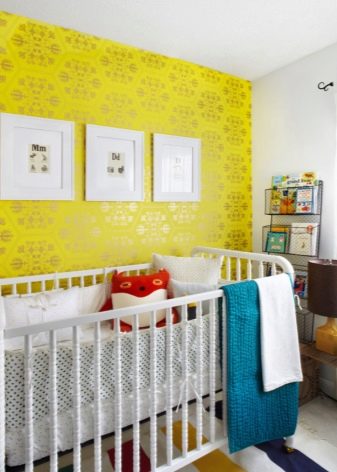
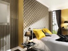
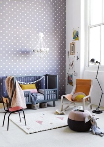
Joyful, bright yellow and orange tones are best suited for decorating a child's room: they are warm, contributing to the most favorable atmosphere in the nursery. In order to make the child more fun, you can even carry out zoning using wallpaper of different colors and patterns: for example, paste over the area above the bed with wallpaper with the design that the child will like the most, and let the rest of the space be decorated with models that harmoniously combine with the specially highlighted zone.
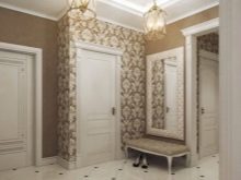
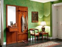
For the hallway, you can use all the options for a dark color scheme of soothing shades: brown, blue, green. These colors create a good microclimate and a cozy atmosphere as soon as a person enters the room.
How to combine different shades and textures?
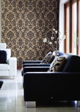
Combining wallpapers of different textures and colors in the interior is a very common and creative technique that allows you to show your creative abilities in decorating a room. So, wallpaper of two types in a room can help to emphasize its merits, while advantageously hiding flaws. For a person who has decided to tackle the combination of different colors, it will be enough to learn a few simple principles of how to combine shades of a particular range.
If you take a closer look at the collections of the same manufacturer, it becomes clear that many decorative options (at least two or three) are ideally suited to one another. This is done specifically so that consumers have the opportunity to combine different models in an original, contrasting and tasteful way.
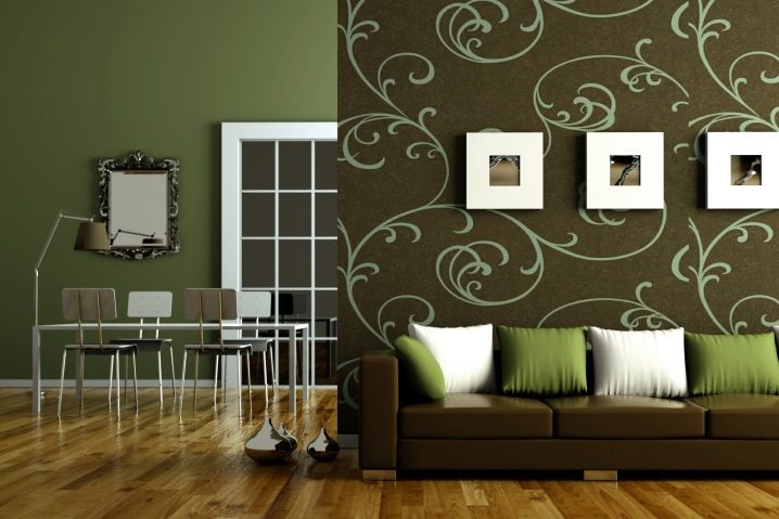
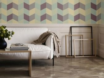
The combination of multi-colored models with each other is different. The simplest is expressed in the harmonious addition of one color to another. A complex combination already implies a combination of different color shades, and an extraordinary one - when three colors can be used in combination, which are radically different from each other.
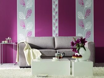
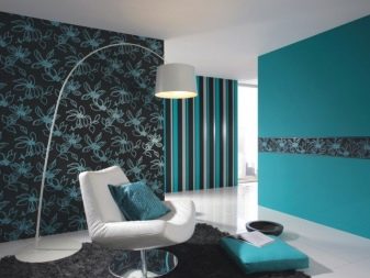
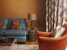
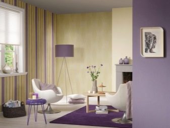
In general, in order for the interior to give the impression of comfort and tranquility, it is enough to combine three shades of the same spectrum, for example, pistachio, mint and light green. This combination works well for a bedroom. In a more lively room (living room or large kitchen), you can safely combine the opposite warm and cold colors: yellow with blue (purple), and blue with orange.
For a more complex combination task, you should be aware that between different types of wallpaper, there should be both contrast and commonality at the same time... For example, models can be similar in color, but with a different shade (brown and chocolate). In this case, it is highly preferable that the pattern on them has one style and structure, for example, in the form of large flowers in one view, and small flowers in another. If there is a desire to combine different patterns, for example, models with floral patterns with polka dots or stripes, it is highly desirable that the main background on which the pictures are located should be of the same color scheme.
In a spacious living room, thick and dark wallpapers (purple, dark silver and even black) will help create an atmosphere of fullness and comfort. You can safely choose options with a large pattern: it can be red poppies on a velvet-black background, maroon models with gold. In this case, it becomes much easier to choose furniture taking into account the color of the wallpaper, especially if the living room is planned to be decorated in a solid classic style. Wallpapers of thick and dark colors and shades are harmoniously combined with velvet curtains and tapestries, and it is better to highlight the places for placing furniture with monochromatic models of calm and suitable colors.
As already mentioned, dark models and too much contrasts when combined are not suitable for small rooms, the space of which requires visual expansion. A good way out of the situation can be to decorate one wall with light wallpaper, while the drawing should not be too conspicuous, but have a clear texture. The rest of the walls can be pasted over with wallpaper of a different type, while the use of large geometric options in a confined space is strongly discouraged in order to avoid the appearance of a disharmonious pile-up effect. However, you can use the image of a small rhombus on a plain soft background - this is the only figure with an elongated shape, which is most appropriate in a room with more than a modest footage.
Uneven walls certainly cause a lot of hassle for tenants, but they can be a reason for a creative approach to the design business. Non-woven wallpaper, which has an excellent leveling ability and is designed specifically for this purpose, will always be the saving anchor here. The surface of the wall must first be leveled as much as possible in order to try to hide defects as much as possible, and only after that proceed with gluing.
Small peas, plaid models and even spotted prints are suitable for hiding irregularities. - the design is selected depending on the level of the wall defect. Of course, a contrasting combination of different colors (yellow and red, blue and orange) will be most preferable due to the fact that they skillfully distract the eye from the defects themselves with their brightness and variegation. The rest of the space can be pasted over with ordinary paper wallpaper, but the main thing is that they are not too thin and cheap, and the main tone and direction of the picture in style correspond to the "main" wall.
If someone is lucky enough to become the owner of a kitchen with a high ceiling and large windows, it is important to make sure that it does not look like a cold and official room. You can create coziness in it by applying two types of wallpaper from the same manufacturer, matching each other in color. The lower half of the wall should be pasted over with a model of a darker color, and the upper half (it should be much smaller) - with light colors. Optimally, divide the boundaries between the combined zones with a border, which will visually make the ceiling a little lower. Pro-recommended color combinations: top is matte pink and bottom is red, top is sandy and bottom is dark gold, and so on.
If the room is very elongated and seems very long and narrow, combining two colors with different patterns will help smooth out the feeling of a tunnel.The short wall is pasted over with a model with a pattern that is located horizontally, and let the long walls be decorated with wallpaper with large images of dark tones (flowers, patterns, simple geometric shapes in blue, burgundy or rich gray).
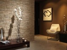
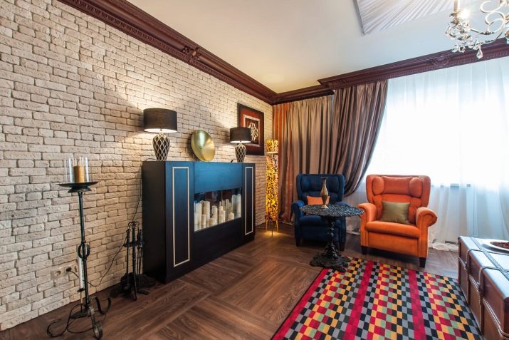
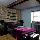
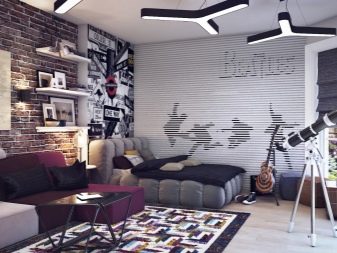
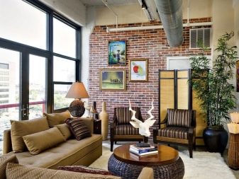
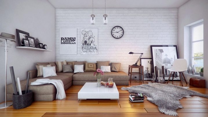
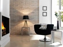
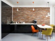
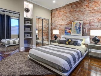
Wallpaper and brick
The presence of brick in the interior space has firmly formed the basis for the arrangement of interiors of a wide variety of premises: from living rooms to numerous art spaces, cafes and small restaurants, where such decoration can be found most often. If there is a desire to equip home comfort in this way, nothing will prevent you from combining brick and wall wallpaper with each other to make the space look more lively.
As a rule, walls with a brick finish or the use of real brick without finishing find their sympathy among young people who prefer the most advanced and modern interior options to the classics, such as grunge and loft. If the living space in this case is not covered with wallpaper at all, it will look cold and uncomfortable, even if the color of the brick itself is orange or red. Usually, partial wall gluing is used to symmetrically mark the main areas of the room, as well as hide construction flaws in those places where the brick may not look entirely "presentable" and neat.
Of course, the issue of color combination takes a special place here too. It would seem that it is very simple to choose wallpaper for a wall in orange or red: you can simply paste over the walls with canvases of similar colors. However, you should warn you in advance against such a mistake. If there is a red or orange brick in the room, then similar shades should not be allowed: they will merge with each other, and the opportunity for a profitable combination of wallpaper and brick will be missed. It is best to select opposite colors, preferably without pronounced patterns, in order to avoid unnecessary clutter of lines and variegation: dark blue, soft green, also dark shades. If the bricks are gray, it is much easier to pick up the color: just here you can give preference to bright colors, "diluting" the twilight gray.
Do not get carried away with creating a shapeless "picture", using "pieces" or parts of different wallpaper for pasting. The fact that a brick wall is versatile and easy when creating a design seems only at first glance. Before setting yourself such a task, it is worth choosing the most suitable and successful example for yourself, which can be followed in the future.
Also, the presence of photowall-paper is not recommended: they will create an unnecessary effect of space congestion. It is important to remember that restrained monochromatic models are most suitable here and will favorably set off the "pristine" and originality of brick walls. If you wish, you can paint the brick walls with white paint - this can become especially relevant if not enough light enters the room.
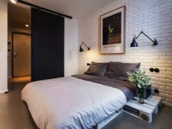
Brick print
It is known that not everyone gets a room with a picturesque wall made of natural bricks. In addition, in order for such walls to look beautiful, sometimes you have to put a lot of effort - from finishing to the selection of wallpaper, which was discussed above. As for the wallpaper with imitation of brickwork, anyone can purchase them and paste over their space as they see fit. At the same time, do not forget about which colors should be used in this or that case.
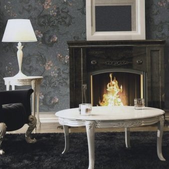
Most often, this option is used to highlight certain areas.: fireplace or work area in the kitchen. Since "brick" wallpaper models also come in different colors, it is better to use light colors to highlight the most popular areas: white, beige, peach or light brown. Of course, in the kitchen it will be preferable to glue a more neutral color so that stains and splashes are not visible on it so much.By the way, thick vinyl wallpaper is easy to remove dirt, like washable counterparts.
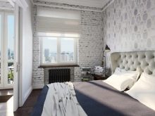
It is believed that it is best to paste over the hallway or kitchen with such wallpaper, but this is not entirely true. With a variety of modern textures and colors, brick wallpaper will look great in the bedroom, if they also tastefully highlight the area above the bed. The tone can be soft brown or light. There are also white wallpapers on sale, which will skillfully create an imitation of painted brick and will look especially attractive in places for quiet rest.
And finally, the main advantage of such models is that, unlike real brickwork, they do not create a feeling of cold and officialdom, but, on the contrary, radiate warmth and comfort.
Contemporary collections of Russian designers
Probably, few people know that the famous Russian designer Valentin Yudashkin not so long ago embodied his ideas in different wallpaper models. The Valentin Yudashkin Fashion House is located in Moscow and apart from clothes, wonderful interior and household items are being developed there. A new collection of wallpapers deserves special attention, which surprisingly combines uniqueness with closeness to the Russian consumer.
The Home Fashion line was developed in cooperation with Italian colleagues, the wallpaper factory Emiliana Parati, and was released to the general public in 2014. Modest colors and classic patterns have received a new frame in imitation of "antique" embroidery, luxurious lace and drawings made in watercolor technique. To this were added a touch of modernity in the form of holograms and three-dimensional space effects. The color scheme is modest, absolutely devoid of pretentiousness: from pale purple to dark gray, closer to black, with different options for prints and patterns.
The second collection was published in 2015 and was named by the author "My Italian Journey". Each type of wallpaper in it represents an Italian city or island: "Rome", "Venice", "Sicily", "Florence". They contain skillful imitations of traditional Venetian stucco molding, Roman classical severity, Florentine creative flight, and the romantic spirit of Venice. All this is perfectly conveyed by the author in collaboration with Italian designers and finds a wide response among Russian consumers, especially since the cost of the first collection of wallpaper from Valentin Yudashkin has become much lower after the release of the second.
Fashion designer Vyacheslav Zaitsev is not far behind his colleague. If Valentin Yudashkin already has two recognized collections, then the debut wallpaper from Vyacheslav Zaitsev made a splash and public recognition at an exhibition in Moscow quite recently - in 2017. If you look closely at all the pieces of the collection, it becomes clear that the author prefers a harmonious combination of white, black and red colors, skillfully harmonizing them with each other in a rich palette of traditional patterns and monograms. This is what sets the special mood emanating from each model: such a color combination is obviously devoid of serious competition when it comes to modesty, restraint and delicate taste.
The predominant color in the collection of wallpapers by Vyacheslav Zaitsev is always white. This is partly why his wallpapers, despite their novelty, are almost always recognizable by those who are constantly interested in domestic interior novelties. It is noteworthy that each type of wallpaper is a high-quality imitation of such expensive fabrics as silk, satin and velvet. This creates an atmosphere of attractiveness and harmony, which is indispensable in the home space.
When choosing wallpaper, the fashion designer advises people not to follow common prejudices about black.: after all, if there is a pleasant silk gloss in the wallpaper, it adds softness, lightness and sophistication to the “blackness”.Any colors should serve as a reflection of the inner world and the mood of a person, and this applies not only to clothes and furniture, but also to wall-paper, which often sets the main tone of the interior space of the house.
Thus, when choosing a color palette for wallpaper, you can follow the generally accepted advice of designers and famous fashion designers. However, any creation process is creative, and your own ideas can also organically fit into the concept of good taste, if you approach everything thoroughly, focusing on observing some simple standards.
You will learn about new trends in interior design using wallpaper and curtains in the next video.


The comment was sent successfully.