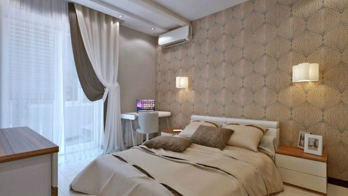
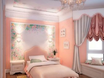
Peach wallpaper in the interior
The color scheme of the walls deserves special attention. It is important to choose the right shade of wall decoration, so as not to darken the room and not disturb the atmosphere of home comfort in the chosen room. Among the variety of finishing materials, one of the non-standard solutions for wall decoration is peach wallpaper. This color is unusual, it needs a careful approach to the choice of wallpaper and furnishings.

Color features
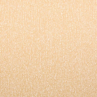
The peach color is multifaceted. It includes warm shades of mixed coral, yellow and orange groups in varying degrees of saturation. Tones are associated with harmony, they have a calming effect on a person. It is believed that this color balances all the elements of life, keeping the warmth of the hearth.
However, it cannot be called simple and universal: the tone is demanding in the choice of interior items. This is also reflected in the choice of texture, which cannot be glossy: this is how the color loses its attractiveness.
To be appropriate in the interior, the peach color needs to limit the amount of color: you cannot fill the space with peach furniture, curtains and other furnishings. Over time, such an atmosphere begins to irritate, creating the illusion of detachment from the reality hidden behind the doors of the home. In addition, the abundance of the same color spots makes any interior boring and oppressive to the household. The combination with furnishing materials is also important: wood, metal, plastic surfaces can change the perception of wall decoration.


Advantages
Peach wallpaper has many advantages. They:
- presented on the market with a wide range of materials of different widths and textures;
- depending on the type of material, they are able to mask small irregularities in the walls;
- in most cases, they are simple and convenient in pasting the surface, hold well, provide for standard wall preparation;
- in models with a dense structure, they provide an additional level of sound insulation, relieving households from extraneous noise from neighboring apartments;
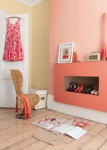
- bring the illusion of space into the room and add illumination, which is especially important for rooms with windows facing north;
- soften dark spots of furniture, accessories, lamps, pulling out any dark environment;
- able to zone the space, connecting with a contrasting companion color.

Minuses
The peculiarity of the shade is that it is legible in the color combination. It cannot be combined with turquoise, mint, blue. Black contrast also looks rough: it makes a soft and delicate peach color easier, especially if there are only two colors in the design. In this case, it is important to combine shades with contrasting transitions, adding gray and coral tones (at least one similar in tone to each of the contrasts).
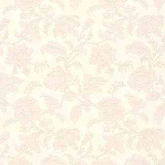
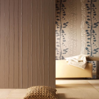
A distinctive feature of this color is the limitation in terms of print. More often the canvases are plain and textured. On the one hand, this is a plus, because the variegation of the pattern does not create a feeling of disorder, and you can use a different number of objects in the same tone or with a different pattern in the interior.
On the other hand, the allocation of premium by means of texture for stucco molding, plastering and other techniques obliges you to add a pattern: if all the objects in the room are without a print, this is boring. It is not always appropriate to combine peach wallpaper in accents with wall decoration made of laminated or plastic panels.
Views
The abundance of materials on the construction market amazes with the variety of rolled and packaged wallpapers (powder and liquid).
Among the mass of options, several varieties of peach wallpaper stand out:
- paper - a budget option with a smooth surface, a short service life (up to 5 years), a simple pattern, made on a single-layer (simplex) or two-layer (duplex) basis;
- vinyl - an elite finish on the basis of vinyl or non-woven, characterized by a textured surface, which is porous or embossed (hard, soft wallpaper and silk-screen printing);
- non-woven - an alternative to non-woven vinyl coverings, which, unlike vinyl canvases, is harmless (does not emit formaldehyde vapors into the air), elastic, masks wall irregularities;
- textile - wallpaper with a paper backing and a textile top in the form of glued fabric fibers (weaves or individual fibers located as close to each other as possible), an expensive finish with a claim to premium, but capricious in pasting;
- liquid - wallpaper in the form of a powder that needs to be diluted, or a ready-made mixture for application to walls (an expensive and extraordinary finish, to increase the durability of which requires varnishing of the lined surface;
- wallpaper - canvases with a pattern, on which the peach color predominates, presented in the form of a solid composition or fragments of a pattern, providing for butt gluing;
- self-adhesive - a separate line of adhesive and electrostatic coatings, designed for finishing a room or renovating old furniture, decorating mirrors, glass (stained glass varieties).
Despite the fact that the lines have glass wallpaper, options with holography and metallic sheen, these wallpapers are not intended for interior decoration: the harmony of the interior requires delicate, embossed, velvety and plush surface types. It is softness that is associated with comfort.

Combination with furnishings
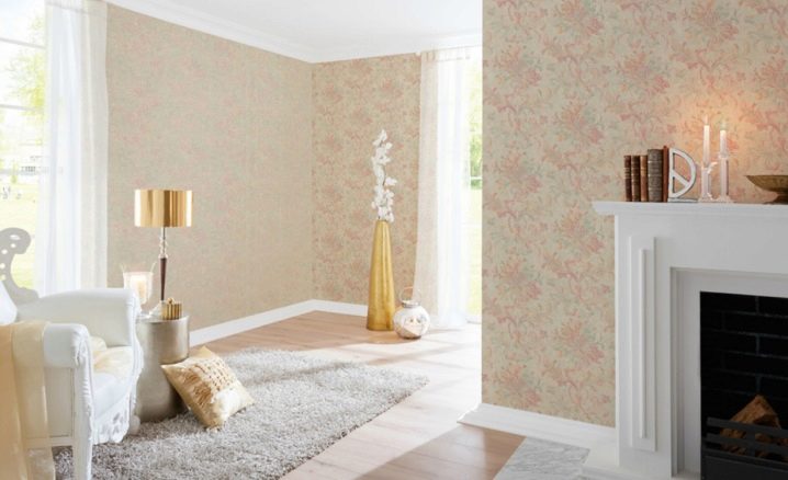
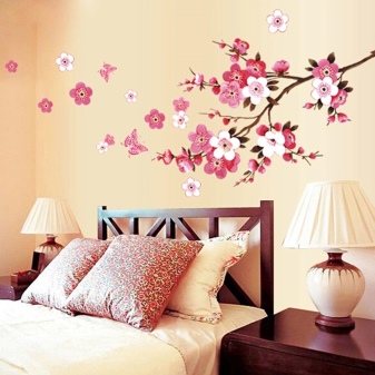
The choice of wallpaper in peach tones does not accept the basis solely on external characteristics. If the surface of the wallpaper has a pattern, it is easier to combine the finish with interior items: one of the shades should be present in the design of the room. These can be curtains, upholstered or cabinet furniture, poufs, decorative pillows, a floor lamp or decoration of a central lighting fixture. Sometimes any little thing can bring harmony, for example, drawing a picture or fresh flowers.
If the print has a gray color, and the upholstered furniture is made in dark colors, you can beat the combination by means of covers or capes. For example, Eurocovers can instantly update furniture in any color and texture.
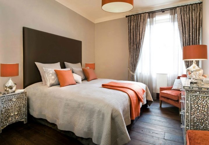
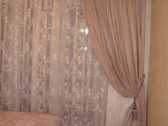
To combine the two shades harmoniously, you need support in the form of gray curtains with white tulle and furniture finishes in brown. Aggressive and acidic tones are unacceptable. In order for the "companion" to match its level, any material must have an expensive look.
The design of the room in peach shades allows the use of curtains of the same range, but of a different tone and with the obligatory addition of strong paint to the interior.
The following combinations are acceptable:
- light wallpaper + dark peach curtains + white tulle;
- bleached peach wallpaper + brown and peach curtains + white tulle;
- cold peach (with the addition of cocoa) + coffee color with a print and gray edging;
- bright peach + white curtains with orange print;
- yellow-orange peach + purple curtains with similar tulle.
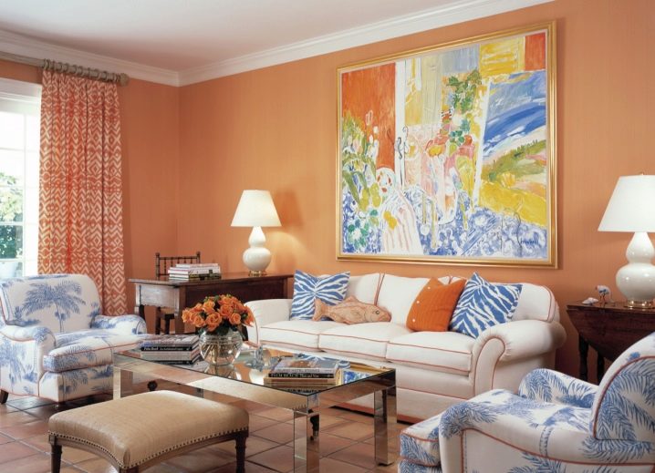
As for furniture, it is difficult to pour cold paints into the environment in their pure form. It is better to use contrasts in the form of furniture upholstery, while it is preferable that one of the shades of the pattern be peach, orange or pale coral. So you can fit blue paint into the interior: the sofa and armchairs can be white with a blue floral print and orange edging of modular parts.
If the color of the furniture is black or brown, you cannot do without light touches: it is worth dressing the windows with white curtains.
It is unacceptable to overload the style with color spots, otherwise the peach shade will be ousted from the overall picture.
It is important to make sure that the design does not have an abundance of print: sometimes the interior is made up thoughtlessly, combining stripes, polka dots and floral motifs, hanging paintings with flowers on the walls, decorating furniture with pillows with bright ornaments.
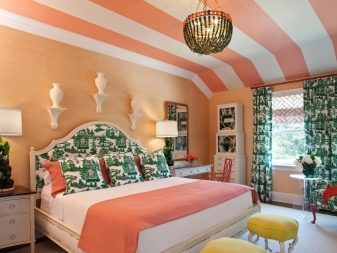
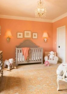
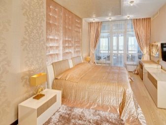
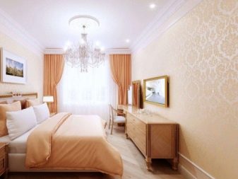
This approach to design is devoid of individuality and sense of style. The shade can indeed be set off, but skillfully: it is better to emphasize the light peach color of the wallpaper with bright furniture, not forgetting to add other contrasts to the peach range (brown, lilac, coral, light wenge, white, silver tone). Color contrasts are preferred to be warm. Lighting is an important component: it is better to use light sources with a soft warm glow (cold light disturbs the harmony of the style).


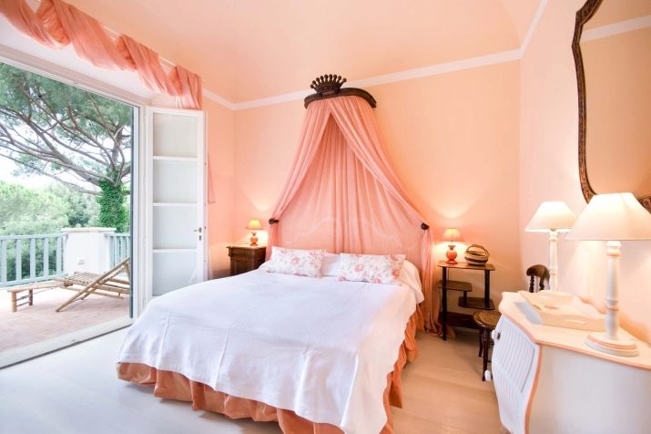
Beautiful examples
To understand how to harmoniously blend wallpaper in peach tones into the interior of your home, you can look at examples of experienced designers.
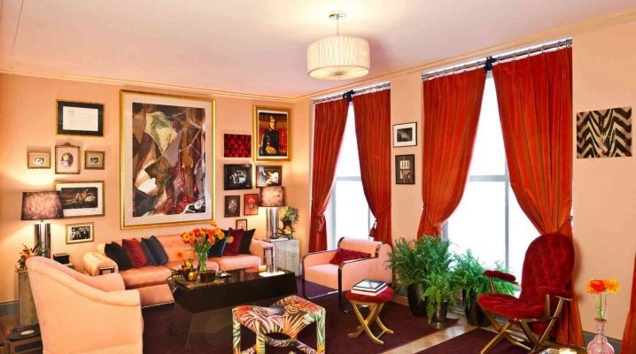
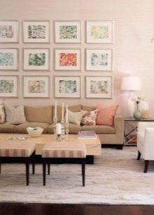
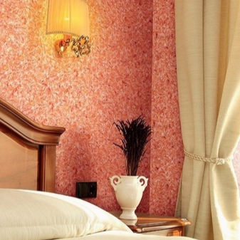
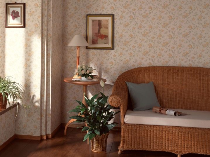
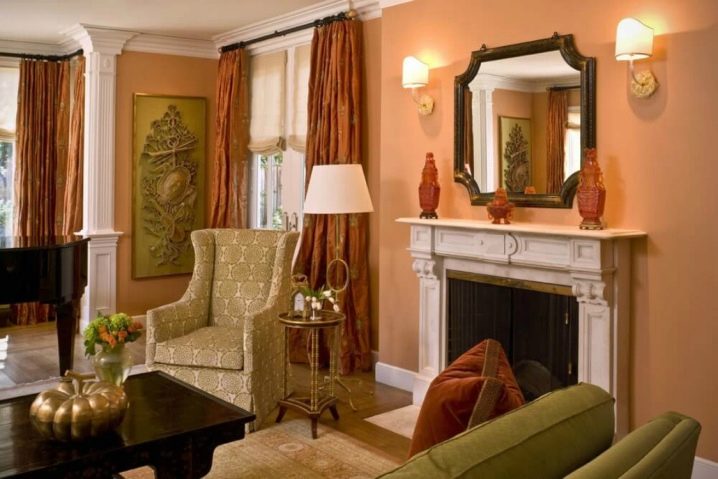
Plain walls can be supported by curtains with a pattern made in terracotta shade, diluting the composition with a beige armchair, a rug of the same color and highlighting the abundance of light spots with dark brown furniture.
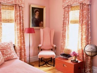
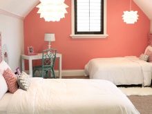
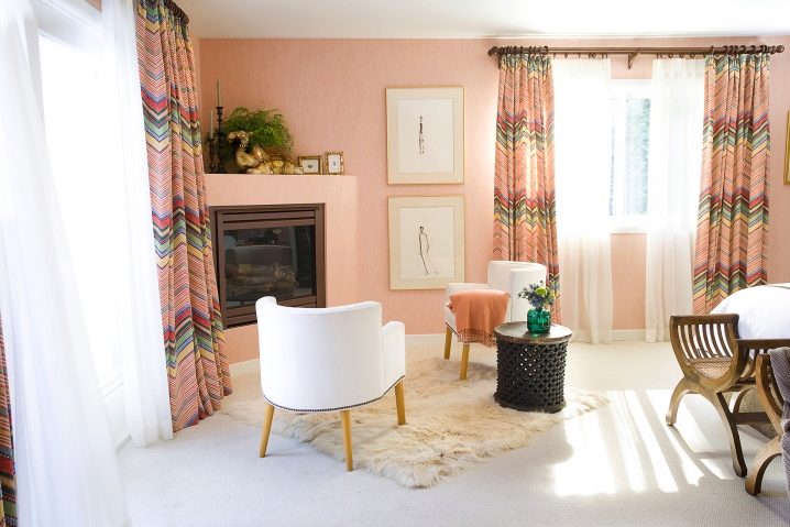
To make the room as comfortable as possible, you can hang pictures in beige frames on plain walls, decorating the windows with bright peach curtains with a zigzag colorful print and white tulle, highlighting the light spots of the interior with a brown cornice, furniture and decorative elements.
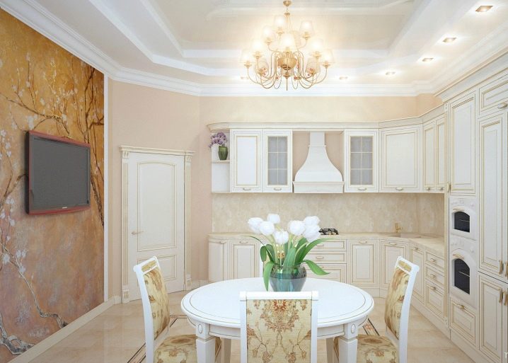
If you plan to clad the walls in the kitchen, you should rely on a light, bleached shade of the headset, supporting the tone of the wallpaper with the floor covering several tones darker and giving expressiveness to the atmosphere with the help of white and brown accessories.
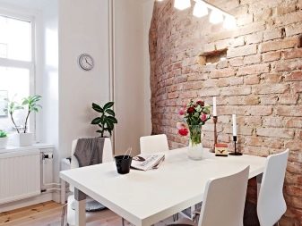
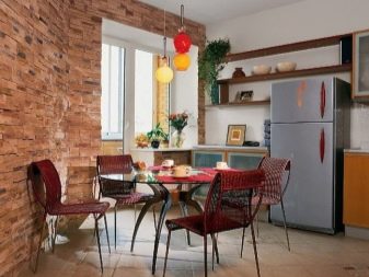
Bold solutions allow you to change the perception of the kitchen: bright furniture, a metal hood and wooden furniture materials are suitable for walls with a brick texture, but even here you cannot do without white curtains and a ceiling.
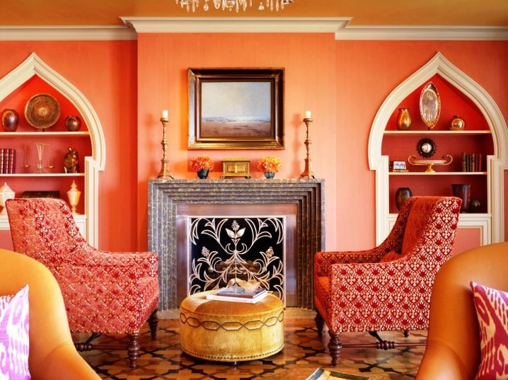
Fans of the Turkish trend will love the combination of a rich peach tone with pink and gold: so that the interior composition does not seem too bright, it is worth diluting the tone of the wallpaper with sand-colored furniture with wood trim, adding a print on the pink textiles of the sofa upholstery and decorating the design with gold decor.
If the combination with blue is taken as the basis, it is worth combining the tone through a picture and decorative pillows, without overloading the room with an abundance of things.
A cool peach print finish can be combined with a solid color companion by adding matte white lamps and delicate tulle to the composition, highlighting the light tones with cocoa-colored curtains.
If you need an intimate atmosphere, it is better to add a warm purple tone to the peach in the form of curtains, a floor lamp, and dilute the composition with coffee bed linen.
In the following video, you can see many examples of peach color in home decor.


The comment was sent successfully.