Choosing the right wallpaper color for the kitchen
Wallpaper for the kitchen is a great option if you want to create a cozy and stylish room at the same time. Correctly selected wallpaper will tie together all the components of the style and harmonize the space.
What to consider when choosing a color?
When choosing the color of the walls, most are guided by fashion or their own taste preferences. This is true, but not entirely. Of course, wall coverings shouldn't be annoying. And ideally it is better if the wallpaper will not get bored for a long time. However, there are a number of equally important factors that should be considered when choosing wallpaper for the kitchen.

Room size
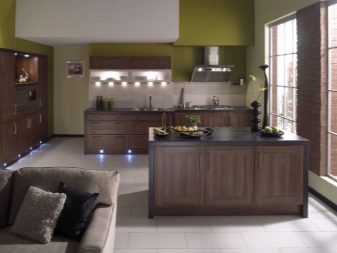
Correctly selected wallpaper can simply change the kitchen and the impression that a set with accessories creates beyond recognition. Dark ones will help make a room with high ceilings more intimate, create additional depth of the room. Bright colors make the room smaller in size, add juiciness to the interior in soothing colors, energize and promote a good appetite.
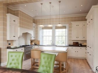
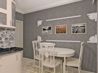
Calm neutral tones will help create a harmonious atmosphere and bring the space together: gray, light green, sand. Visually expanding the walls and making the kitchen as a whole more spacious will help white and its shades from creamy to pink-opal and light pistachio. The lighter the color of the walls, the more spacious the room will look.
Wallpaper with a vertical pattern or stripes will help to slightly raise narrow ceilings. But horizontal in this case are contraindicated. They will even more vertically divide an already not too large room. You can prefer a neutral unobtrusive flower or abstraction.
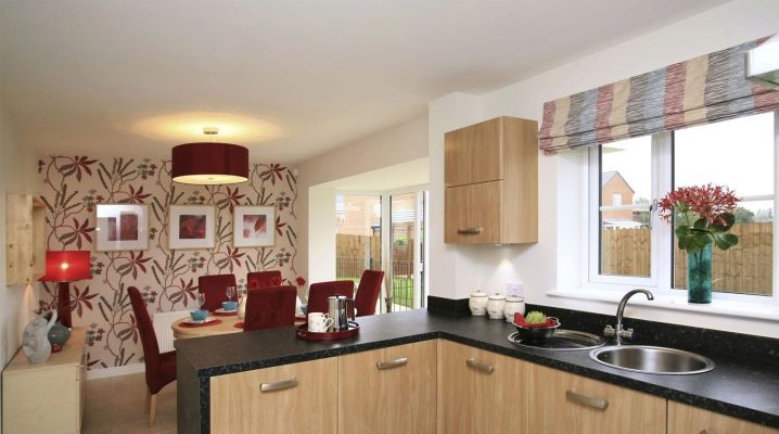
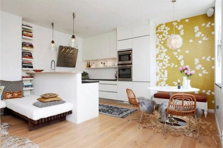
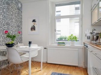
Modern apartments do not imply a special separate room for a dining room. Its function is performed by the kitchen. Recently, it is very fashionable to separate the dining area from the working area. And here the right combination of wallpaper and flooring, which differs from the main area, helps. So, you can also make the dimensions of the room larger.
Headset
The main criterion to be guided by when choosing the color and texture of the wallpaper is the kitchen set. It occupies the main area of the room. Therefore, finishing materials are selected for its color and style, and not vice versa, as some do. The quality and properties of the wallpaper are also important. It is best to choose washable canvases with a thick vinyl layer. Try to choose colors that will not fade, as well as those on which stains are less noticeable.
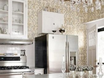
It is easiest to choose wallpaper for a headset of white or neutral pastel shades. With the help of wallpaper alone, you can create completely different kitchen designs. Reds will create a stylish and original space. Pearl - graceful and bohemian, filled with light. With green wallpaper, a white headset will create a feeling of harmony and freshness. And shades of sand or chocolate will make the room cozier.
When combining wallpaper with kitchen furniture, it is worth remembering a few basic rules. Following them will help to avoid annoying mistakes during repairs.
- Make friends with the color palette. It will help you trace the color combination. In addition, you can pick up several samples with a shade of the same color and "try on" them in your own kitchen.
- If there is little natural light in the kitchen, you should buy wallpaper in warm saturated colors. With an abundance of sun (window to the south or east), you should opt for one of the options for a cold color scheme.
- The right wallpaper shouldn't be annoying. They look good in artificial and natural lighting at any time of the day, regardless of the warmth of the light.
- If you are not sure about the selection of complex color combinations, buy wallpaper that matches the headset shade. In this case, it is worth choosing them on average three tones lighter. So, for example, salad or mint wallpapers are suitable for green kitchen furniture, light beige for chocolate ones, and so on.
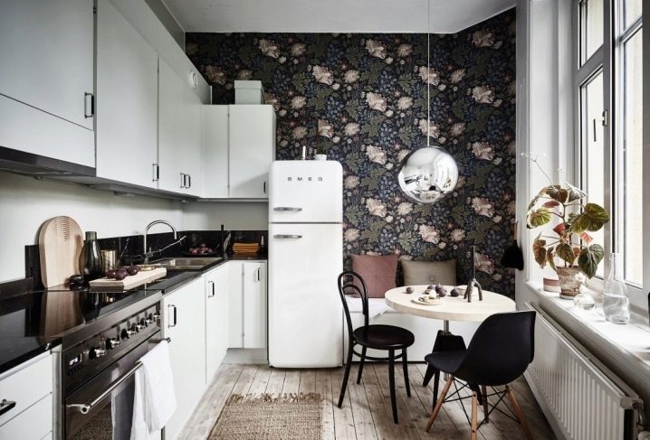
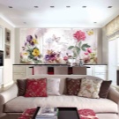
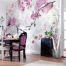
To expand the space of a small kitchen, you can purchase a photo wallpaper with an interesting landscape on the wall that is most free from furniture items. They are usually glued in the work area. A large room, on the other hand, will add additional depth and texture to a panel or wallpaper with a 3D effect.
How to combine?
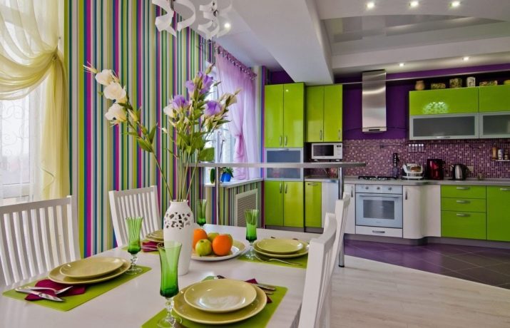
If you want to create a unique and unique kitchen space, don't be afraid to experiment. Feel free to combine different colors and textures. Do not stop at pasting the entire kitchen area with the same wallpaper. Wallpaper that doesn't fit together at first glance can create an amazing effect.
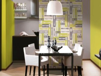
Match the wallpaper to the color of the backsplash in the work area. This way you can create the perfect harmonious space. If at the same time it contrasts in color with the headset (red and gray, white and purple), then you get a doubly interesting effect. You can also play with glossy and matte textures. Often, calm neutral wallpapers are chosen for all walls, and for one - with a catchy pattern or accents that complement the details of the decor.
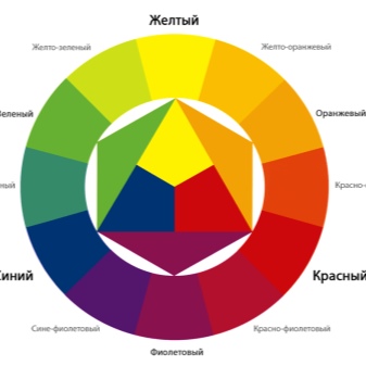
A circle of shades will help in the layout of the wallpaper. Based on the circle, you can create a wide variety of color combinations and shades of the same color. At the same time, it is not worth overloading the space with an abundance of colors. For the kitchen, 3 colors are enough, less often - 4 shades of the same color or very close to it. Otherwise, the decor will look tasteless.
You can use one of the rules for combining colors that professional designers use in their daily work.
- Use wallpaper in the same color as the headset. You should pick them up a few shades darker or lighter. To prevent the space from looking too boring, wallpaper with an unobtrusive pattern will do.
- A harmonious combination is obtained when arranging wallpaper with a headset in colors - neighbors in the color wheel. It can be a combination of the nearest sectors or through one sector. So, for a blue kitchen set of furniture, you can choose wallpaper in aqua or emerald.

- Contrasting combination of colors located in opposite sectors of the palettesuitable for modern modern kitchens with a dynamic character. In this case, it is allowed to use no more than 2 contrasting colors and one transitional or neutral shade (red, black, gray). You need to be extremely careful with bright combinations. Furniture of these colors should be as simple and concise in form as possible.
If you have some design skills and artistic taste, you can work with triangles and squares of color combinations in the palette of a circle, as well as use other, more complex tint combinations.
Popular colors and shades
At the moment, interior fashion does not dictate strict rules for the choice of color and style. Therefore, you can focus on your own taste and capabilities. It is worth choosing not only such currently popular colors as beige, olive or mint. You do repairs for more than one year, so the color should be pleasant to you personally and, of course, not annoying. Universal colors will always help to create a harmonious space: white, brown, gray, light green. They are appropriate in almost any kitchen and create the desired effect.
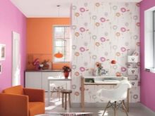
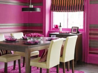
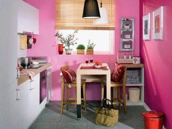
In a purely feminine kitchen, you can find pink wallpaper. Do not immediately imagine a Barbie house. This color is multifaceted.It can be an unripe plum, a noble dusty pink, a delicate nude color, or almost white. It can be used successfully to soften the simple lines of gray furniture. Pink is also appropriate in a Provence style kitchen with a white or milky facade. A brighter tone is often combined with charcoal or black.
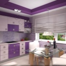
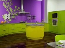
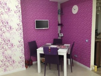
Purple and lilac wallpapers are ambiguous. It is better to choose them for an accent wall or to glue them in a sufficiently large and well-lit room. This is the color of philosophers. It helps to relax and at the same time activates the brain. It includes all three colors of the main spectrum: blue, red and yellow. Therefore, it is compatible with almost any color kitchen. Combines most advantageously with blue, blue, gray, yellow and orange.

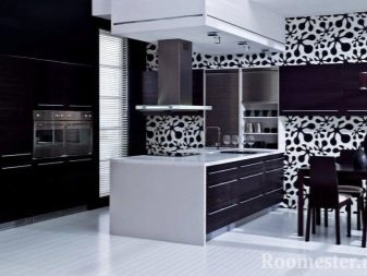
Black, like white, is organically combined with other colors. But while white is versatile, black is pretty dramatic. Use it sparingly. Then, instead of the gloomy shade frightening most, it will make very interesting combinations: bright with red, dynamic with yellow or orange wallpaper, stylish with white and milky.
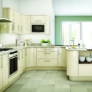
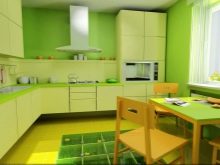
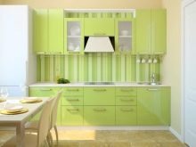
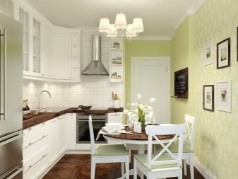
Green or olive wallpaper will help bring freshness, notes of optimism and harmony in any cuisine. They contribute to the establishment of an optimal metabolism, good mood. It is pleasant to be in such a kitchen for all family members.
It is especially good to combine green with brown, black, all natural shades of nature, terracotta, gray and milky. A similar effect will help create a turquoise or mint wallpaper.
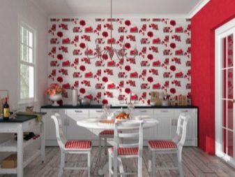
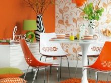
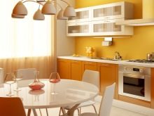
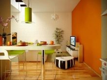
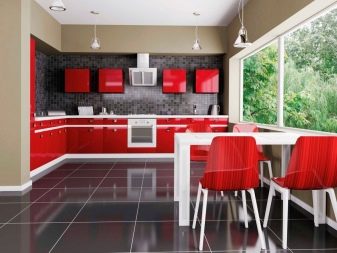
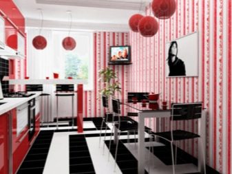
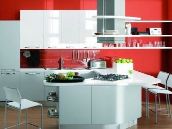
Red wallpaper will add dynamism and energy to the room. They are ideal for those who need to whet their appetite. But it is better to use them only on one of the walls, otherwise you can get the opposite effect, and the wallpaper will tire you. They are combined with black and white kitchens. Perfectly red wallpaper will complement a gray or pearl façade. An alternative to red can be more sunny colors: yellow or orange.
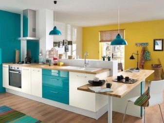
Blue wallpaper can be recommended for those whose windows face the strongly lit south side. Depending on the shade or pattern, you can get completely different effects - a kitchen in a nautical style, with Gzhel painting, geometric motifs, and so on. The ideal combination of blue with gray and blue, shades of green. A white or yellow kitchen will be nicely freshened up with blue wallpaper.
You can choose plain canvases of an interesting shade or with a base to match the color of the headset and a blue pattern.
Original ideas in the interior
Designers offer an endless variety of original wallpaper combinations with other kitchen components. You can take something from their ideas or come up with your own stylish solution on a successful basis.
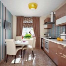
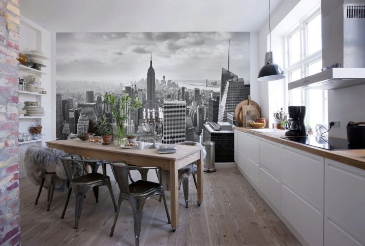
- The loft style kitchen is small. Wall murals, main brick walls and open shelves help to push the space apart.
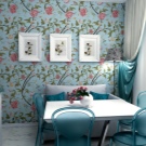
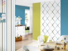
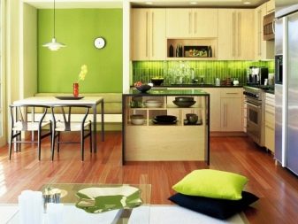
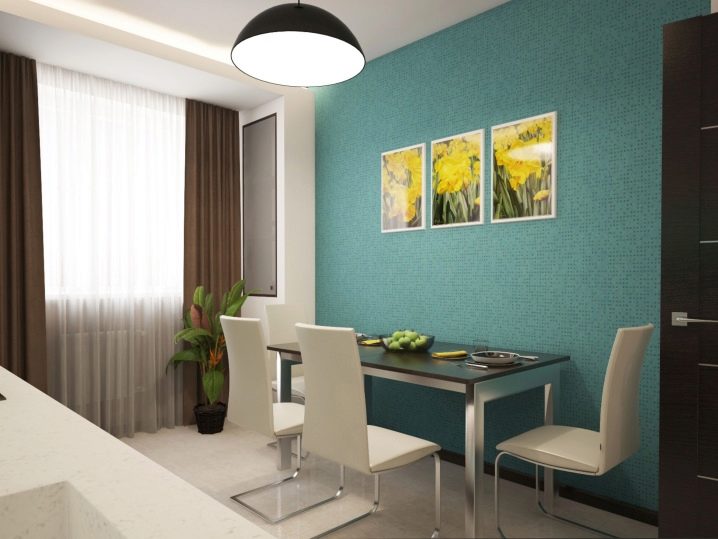
- A blue wallpaper with a pixel effect or a mosaic effect sets the right accent for a simple white kitchen. Paintings with bright yellow flowers add liveliness to a neutral space.
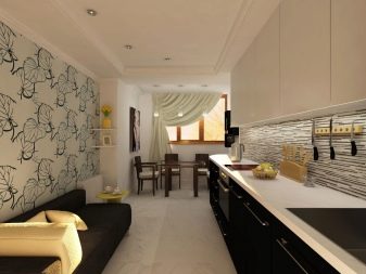
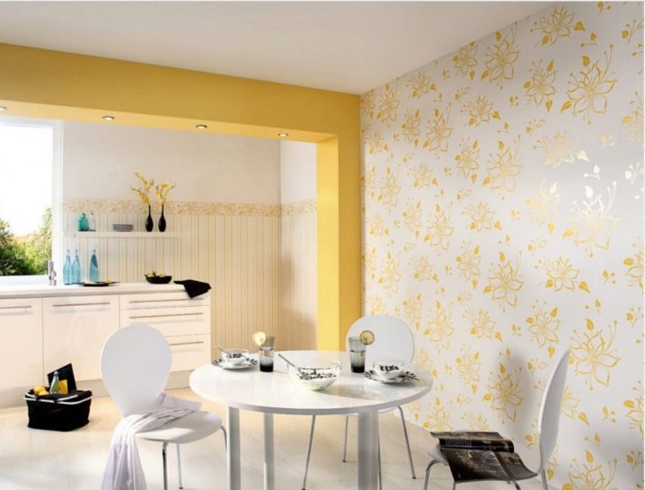
- Kitchen design is created with simple, unobtrusive elements. Neutral white wallpaper does not distract from the main thing. The yellow floral pattern allows you to harmoniously fit into the space a dividing beam between the kitchen area and the corner of the dining room.
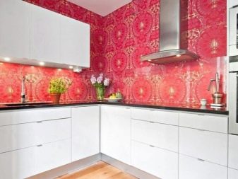
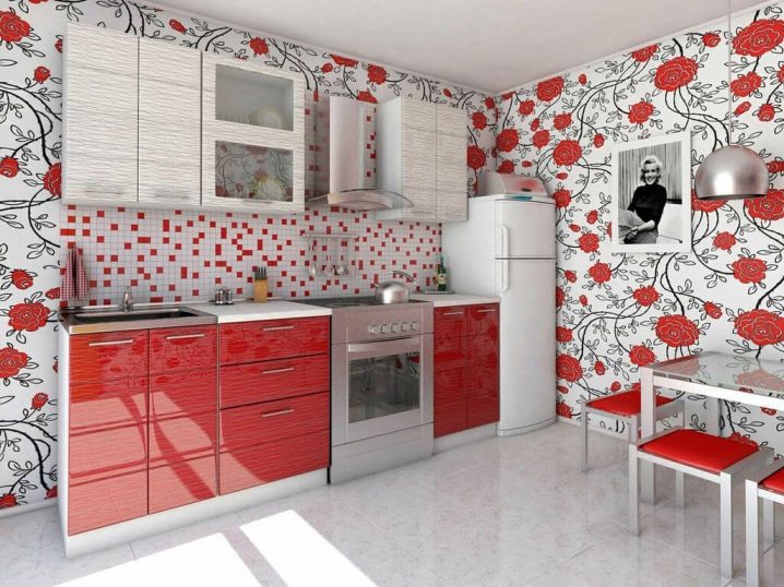
- Wallpaper in red and black tones on a white base successfully repeats the combination of colors of the headset. It turned out very lively and eclectic, but at the same time not intrusive. Such a kitchen is suitable for energetic people.
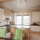
- The table top, wallpaper and cappuccino-colored curtains in its different shades perfectly accentuate the main creamy color of the kitchen unit's facade.
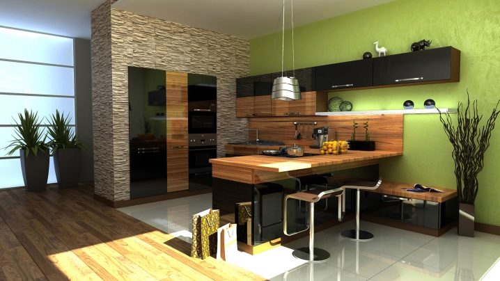
- Pistachio wallpaper in such an ultra-modern kitchen harmonizes the space and resonates perfectly with the simple greenery of plants.
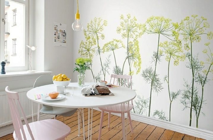
- Airy dill umbrellas add zest to a simple white setting. A small room looks very light and airy.
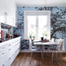
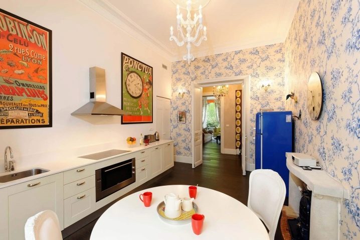
- Wallpaper of a delicate cream color with branches of blue flowers successfully complements the simple design of the kitchen and echoes a bright art object - a retro indigo refrigerator.
For information on how to choose wallpaper for the kitchen, see the next video.


The comment was sent successfully.