Orange kitchens in the interior
It's no secret that positive and optimistic people choose orange. It is associated with the sun and juicy oranges and always gives a good mood. Use its wonderful property in the interior. It is believed that the orange color activates many processes in the body. It improves overall tone, improves digestion and metabolism, speeds up the pulse, so staying in the orange kitchen energizes and invigorates.
In the morning, having breakfast in such a kitchen, you will certainly get a boost of vivacity for the whole day. This is especially important if the landscape is always gray outside your window and you want to add at least a little bright colors to the environment.

Advantages and disadvantages
To understand if orange is right for you in the interior, try to take into account its peculiarities.
Pros.
- An interior in such tones will be an excellent choice for small kitchens, the windows of which are small or face the north side. Bright perky color will "warm" on a cloudy day and give a feeling of comfort.
- Orange adds volume to the space and brings objects far away closer. These properties are actively used by designers when planning interiors.
- If you often invite guests and prefer lively conversations to quiet, calm evenings, then the orange kitchen is the perfect option. She will be conducive to communication and once again emphasize that you are a positive extrovert and the doors of your house are always open to friends.
Minuses.
- If you spend a significant part of your life in the kitchen - cook a lot, watch TV or read on it, such a bright shade can quickly get bored with you.
- Given the property of color to increase blood pressure and pulse, refuse such a headset if the family has hyperactive children or relatives suffering from hypertension. Also, orange blossom will not benefit those who are on a diet, because it speeds up metabolism and increases appetite.
- If you are the owner of today's trendy studio apartments, then be careful with any bright colors, including orange. Furniture of more neutral tones will be more appropriate, which will not tire the nervous system with constant presence in the room.
Combination with other colors
Of course, at first, the "sunny orange" kitchen will delight you and inspire you to new achievements. But it is possible that over time, such an active color will start to tire. To make it comfortable for you and all your household to spend time on it, you should take care of adding calm background colors that will make the space more harmonious.
White will help calm the fiery red a little and balance the overall look of the interior, adding light and spaciousness to it.
Although different whitened colors will cope better with this task: apricot, cream, vanilla, sand, milky, pale pink. Beige and its varieties, passing in the background, will also muffle the flashy orange, slightly dissolving it in itself.
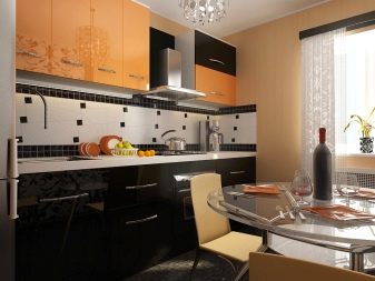
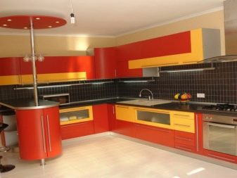
But black, on the contrary, will emphasize the brightness of this color and further emphasize it. Nevertheless, this combination also has its admirers, most often young people choose it.
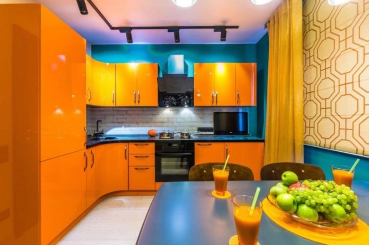
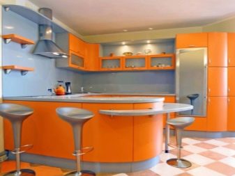
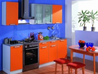
Metallic fits well into the interior with this color, it is relevant for refrigerators, countertops, household appliances and even walls.The combination with the opposite blue or blue spectrum is considered a classic option. If you skillfully combine them together and do not overdo it, then you will get a very interesting extraordinary design of the room.
Olive is also a friendly shade, it does not compete with orange and emphasizes its saturation.
In combination with brown, chocolate or wenge, orange also looks advantageous. The colors complement each other. These two warm shades create a calm, harmonious combination for kitchen decoration, while it is not devoid of sparkle.
Suitable style
Harmony of shades is almost half of the success in room design. Before you go shopping for furniture and appliances, you need to decide on the concept of the interior, and it is determined by the style. Let's consider in detail how to beat an orange kitchen so that it fits in one direction or another.
Classical
Since orange goes well with wood, it can even be found in a modern take on the classics. Of course, in such a tandem, this color does not set the main tone, but serves as a bright accent. Or it will be actively used, but in a lighter version - peach. In general, the result is a balanced, harmonious design that does not fatigue at all. When choosing a setting, do not forget to adhere to standards: natural materials, mirrors, discreet gilded elements, natural stone or its imitation.
High tech
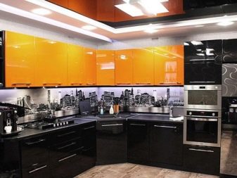
Its inherent gray, black, white and metallic can be excellent friends with orange. Glossy surfaces are just what you need for a trendy setting. And bright accents allow to dilute the brutality and some "sterility" of the interior, in which there is so much steel.
Art deco
This style makes extensive use of both black and white elements as well as multi-colored ones. Eclecticism allows you to combine rich colors, so orange may well coexist with green or purple here. When combining the incongruous, be careful not to overdo it with a variety of shapes, shades and materials.
Pop Art
We can say that the motto of the style is "The brighter the better." Orange looks like acid in it, and it can be combined with many other colors. With a spectacular bar counter, neon lighting and graphic art, your kitchen will not resemble a cozy place for family dinners, but a nightclub. Who needs just such an effect, you can safely bring the project to life.
Modern
Kitchens in this style should be shiny and look as modern as possible. Fancy lighting fixtures, gloss that can be played up with numerous spotlights, and rich colors will make the design relevant and dynamic.
Country
This uncomplicated style is able to bring the warmth of the hearth into the room, because it involves the use of natural materials and matte textures. If you want to get closer to nature, then you will surely like it. Complement the shades of brown and beige with muted orange. This will freshen up a little simple laconic interior with rustic motives.
Minimalism
It will get along without any problems with bright orange and its various variations, but the number of accents should be moderate. After all, this direction does not tolerate any excess, including in vivid details. Focus on individual elements, such as a separate row of facades, a refrigerator, a chandelier, blinds, etc. The texture can be used both glossy and matte. Avoid being overloaded with decorative elements, remove dishes from the tabletop, leaving one bright element, for example, a vase.
Design Tips
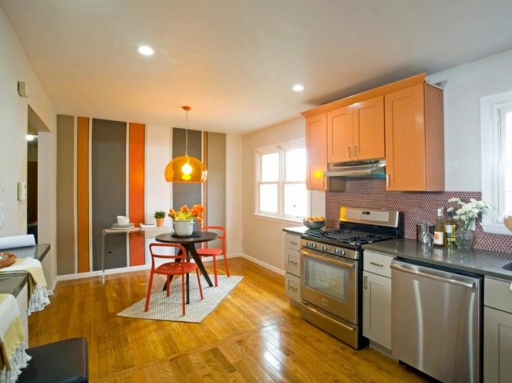
The more modern style you want to recreate in your kitchen, the more saturated shades of orange will be appropriate. It is carrot, cinnabar, acid orange. If the design of the room tends to the classics, and its furnishings are expensive, then opt for such shades as ocher, honey, terracotta or salmon.They look more noble and more status, they will emphasize your refined taste and will not attract too much attention to themselves.
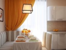
Having taken orange to decorate the kitchen, use it in a ratio of no more than 1: 1 with other colors. Then the interior will not be too pretentious and will not become boring too quickly. Do not forget the fact that orange blossom benefits the human psyche only in a small dosage. Otherwise, the effect of color therapy will be the opposite - it will put pressure on the nervous system.
If you decide to make orange walls, then it is better to apply this shade only on one of them, for example, the one on which the window is placed. Let the other surfaces be decorated in lighter colors. This solution is perfect for narrow kitchens, because this way they "expand" a little.
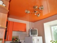
A bright orange ceiling in combination with white walls will also visually "open up" a kitchen that is too narrow. Of course, other elements of the same tone should be adjacent to it. But designers do not recommend making the floor under the ceiling - this deprives the interior of balance.
If you decide to paint all the walls in a shade of orange, then the headset and furniture should be less active, for example, light or woody.
In a small kitchen, where every meter counts, designers advise to make bright only the work area, for example, an apron. This is due to the fact that orange objects look more voluminous and it steals space a little. And so you get a bright touch and the room will not seem cramped.
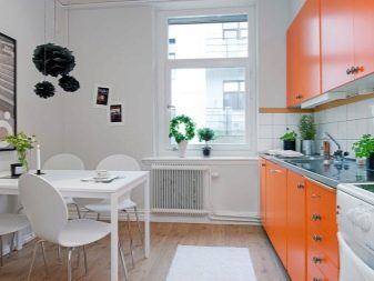
One of the most versatile options is considered to be an orange set with walls several tones lighter, for example, pale red or caramel. As we have already said, this combination brings more harmony than with white, since in the second case, bright elements are too striking. With this simple design, dark wood furniture and dark laminate flooring will look good.
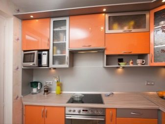
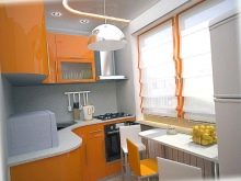
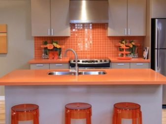
An orange kitchen apron can be chosen only if this color is not the main color in the headset, but only decorates individual facades - top or bottom. It is better to choose a countertop in a different color. Models made of ceramics, glass and even bricks are suitable. Mosaic aprons that combine different tones look especially original.
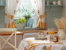
You can use orange fabric curtains only in some styles, for example, country, provence, rustic, art deco. But hi-tech and minimalism do not imply such window decoration. In this case, blinds or roller blinds will be more appropriate.
Successful examples in the interior of the kitchen
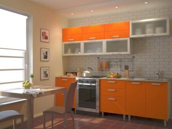
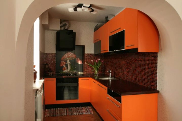
When choosing an apron for an orange kitchen, opt for terracotta brick patterns. It will add elegance, sophistication to the design and will slightly calm the exuberant orange.
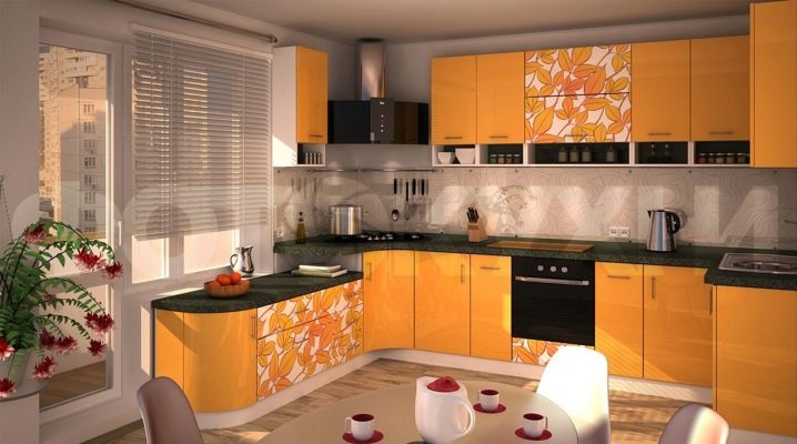
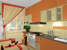
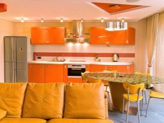
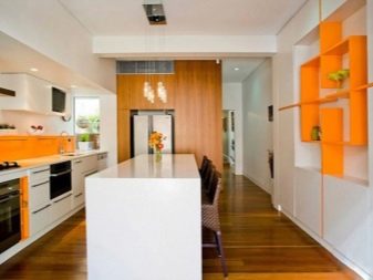
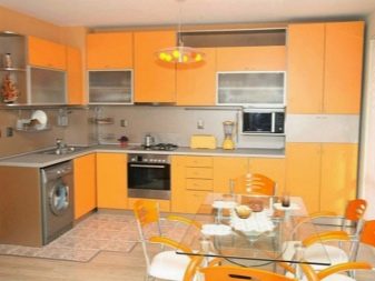
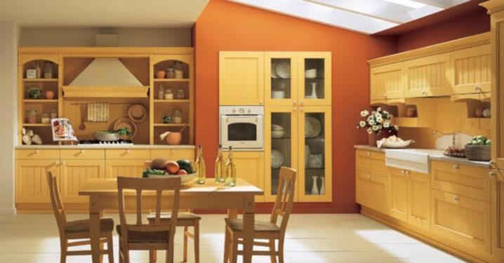
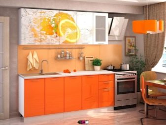
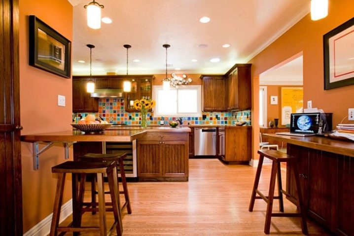
In the design of this kitchen, wood elements are combined with metal parts and indoor flowers, and orange is taken as the main color. In general, the whole picture looks very harmonious, warm and cozy at home.
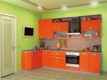
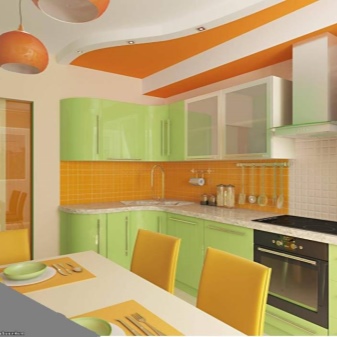
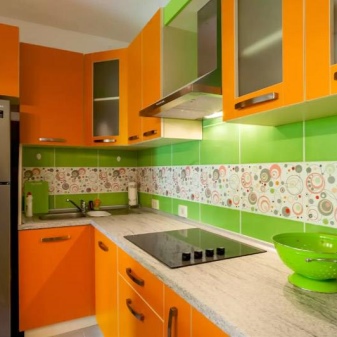
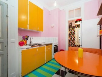
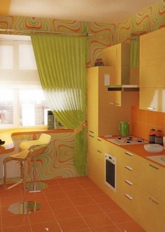
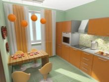
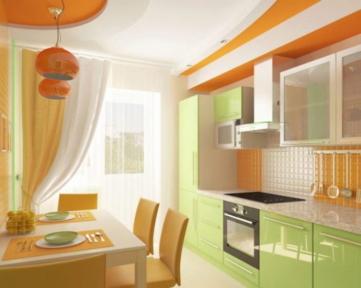
And this is how orange can create a harmonious look of the kitchen in combination with green. Since white is taken as a basis here, both colors, already not too bright, look calm. At the same time, there is no dissonance between them, since the shade of green repeats the color of a mandarin leaf.
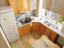
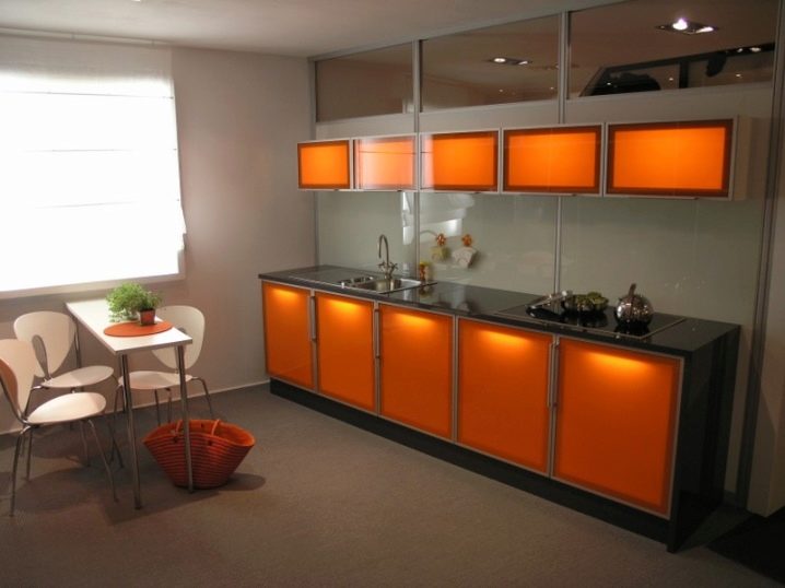
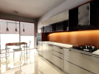
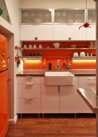
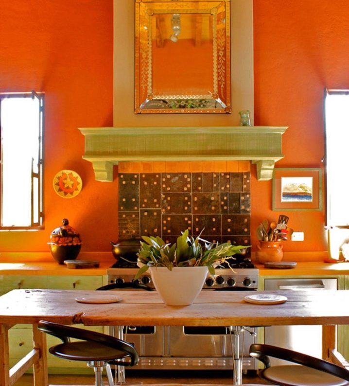
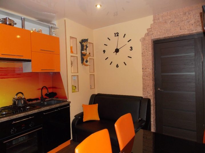
With skillful use, orange will not be conspicuous at all, but will only fill the dark space with light and warmth. A similar effect is achieved due to the competent work of the designer, who managed to think over the combinations of colors and textures, and also successfully placed the lamps.
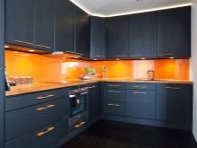
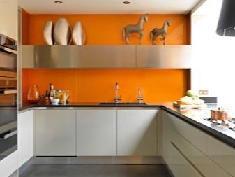
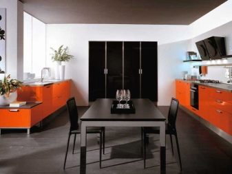
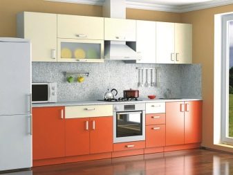
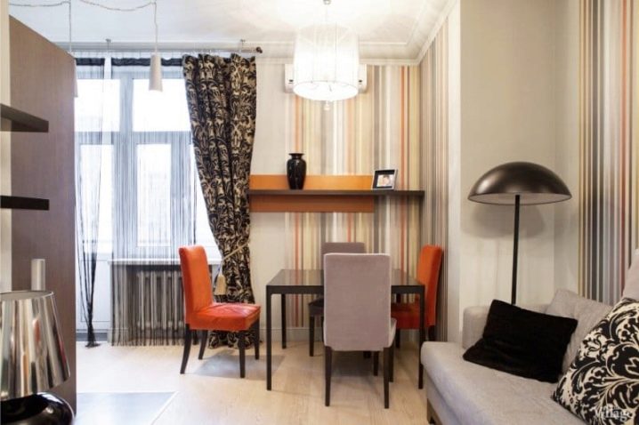
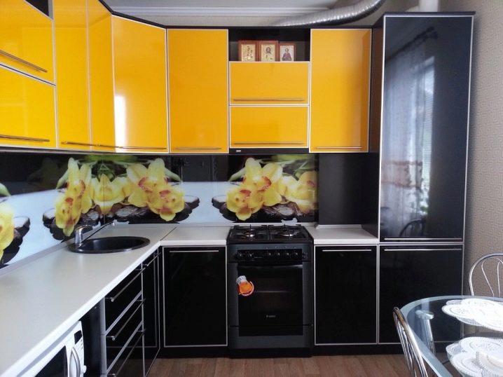
This example clearly demonstrates how cream, gray and black can make friends with red in the interior. It would seem that each of these colors itself looks dull and boring, but together they helped to create a cozy and fashionable kitchen, in which the whole family can spend time.
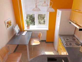
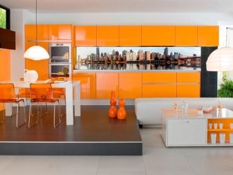
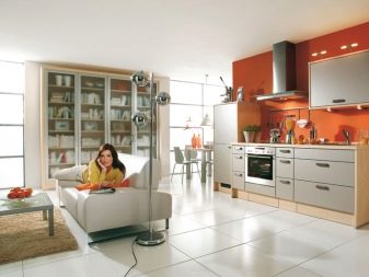
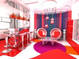
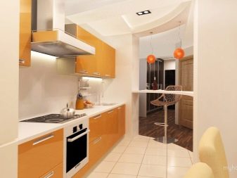
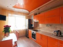
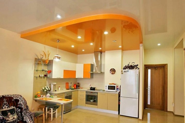
This kitchen is part of the popular studio apartment today.Orange accents - ceiling structure, cabinets and smaller elements - set it apart from the rest of the space. A good solution for dividing the total area of the room into functional zones.
Every housewife dreams of trying herself as a kitchen designer. Here you can safely experiment, because this is your "sphere of influence", it is you who spend the most time here. If you love orange and definitely want to use it in your design, then arm yourself with our advice and go for it. You can try hanging orange curtains, buying chair covers or matching accessories to start with, and then go for some more drastic changes. Whichever style you choose, with the advent of sunny orange, the room will become a little warmer and more comfortable.
For information on which curtains and wallpapers to choose for an orange kitchen, see the video below.


The comment was sent successfully.