Rules for combining colors in the interior of the living room
The choice of the dominant color for the living room interior determines the atmosphere that will reign there. Indeed, in addition to the fact that you like or dislike some colors from an aesthetic point of view, they can also influence you in different ways.
How to create harmony?
The correct combination of colors is an individual concept. Someone tries to choose light colors in order to create a relaxation area in the room, while someone, on the contrary, dilutes the space with bright colors, trying to cheer themselves up in this way.
It is also important to remember that interior colors can affect how the surrounding space is perceived. Some shades make the room look larger, while others help to visually increase the height of the walls. If you want the room to appear taller, paint the ceilings light colors and the walls darker. And to expand the space, use cool shades.
Texture also plays an important role. Glossy surfaces always appear brighter and their colors more intense. But embossed wallpaper or a wall finished with plaster seem muted and calmer.
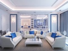
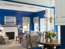
Blue
If you are looking for some unusual option for decorating the walls in the living room, then you can pay attention to the blue color. It is rarely used to decorate living rooms, more often found in bedrooms. But if you decorate the walls in the common room with blue wallpaper of different shades, you will get a calm place where you can enjoy your time.
The deep blue color makes the room look noble. And light shades help to tune in a peaceful mood. Harmoniously blue wallpaper looks in the interior of a room decorated in a Mediterranean style. Intense shades of blue, aquamarine or even indigo will perfectly fit into the interior of a spacious room in a youthful style. Light blue surfaces will decorate the room in the classicism style.
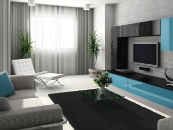
Gray
Another interesting color scheme is the gray walls. At first glance, this color seems dull and dull. But, in fact, it is he who is universal. It has many shades that go well with pastel colors and bright saturated colors.
Gray can make other colors more expressive and emphasize their depth. Against the background of gray walls, bright furniture in the hall looks especially good.
Beige
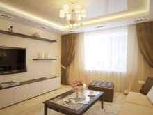
Like gray, this color can be called neutral. Basically, the shades of beige are warm and contribute to a cozy atmosphere in the room. The beige color is soft and muted. So if you have a lot of colored details in your living room, then you can use beige wallpaper, to soften the variegation a little.
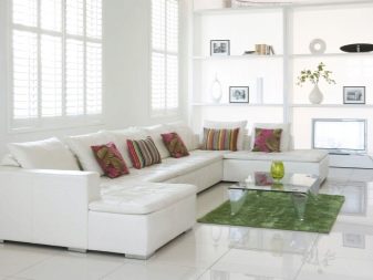
White
White wall coverings can be used for the same purpose. True, here it is worth taking into account the fact that white always dominates the interior. The rest of the shades, even bright and catchy, act as accents.
But white color allows you to create really harmonious and peaceful atmosphere in the room... Such an interior turns out to be very light, bright, and the room seems to be many times more spacious.
In the living room, white wallpaper is used if the room itself is small.
Such light wallpapers are often found in modern or high-tech interiors.The use of light shades is also typical for European styles: Scandinavian, for example, or Provence.
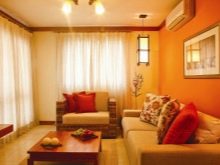
Orange
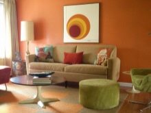
Bright orange walls in the living room are also quite rare. This rich color lifts the mood and makes the interior warmer. Orange will be useful for those who are prone to melancholy, because in such a sunny atmosphere your activity will increase.
Orange color goes well with the same warm shades - brown, red, yellow. Best bright orange wallpaper fits into the interior of youth living rooms in the Art Nouveau or loft style. In this case, not only walls, but also furniture and decor items can be bright.
And so that the room does not seem too monochromatic, dilute the interior with colors such as green, terracotta or sand.
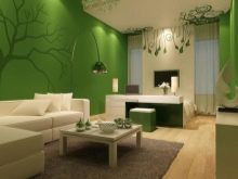
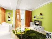
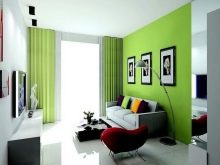
Green
This color is more versatile. Shades of green are believed to be beneficial for vision. Especially if you use its light colors. These colors allow, among other things, to visually expand the space. For this purpose, designers recommend using mint, olive or any other pastel shade.
However, dark shades of green also look advantageous. Intense emerald, pistachio or dark green looks luxurious. True, they should be used in spacious rooms, since small rooms with dark wallpaper seem even smaller.
To prevent the room from looking too gloomy, dark walls can be supplemented with light curtains or furniture. This will make the room much more comfortable.
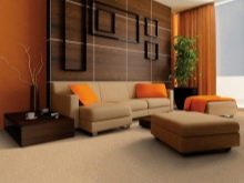
Brown
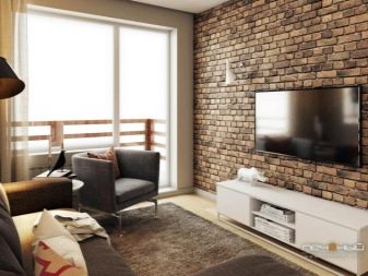
Many people ignore this color, considering it too dull. But in practice, shades of brown can make a room feel cozy. From a psychological point of view, it is brown that we associate with stability and well-being. That's why it is recommended to use it when decorating a living room. A brick wall and brown wallpaper looks equally good in a common room.
Since brown is a color that occurs in nature, details such as animal skins, natural wood furniture and natural flowers go well with it. They can also be replaced with artificial imitation. For example, sofas with animal hide, artificial plants in wooden tubs, and so on. This combination will allow you to recreate the peaceful atmosphere of the forest in your home.
As you can see, almost all colors can be used in the apartment. The main thing is to combine them correctly., and then any color combination will look organic.
Tone Compatibility Rules
Each color has warm and cold shades. Depending on which tone you choose, the same color can create a more cozy or work atmosphere.
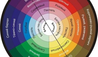
Warm
When decorating a living room, most people prefer warm colors. They provide a cozy atmosphere. Both shades of light and dark colors can be warm.
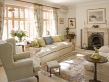
Light wallpapers look good in a small room. A room in the style of classicism with such wallpaper will appeal to romantic natures and those who admire the style from past eras. Complement the light walls with dark natural wood furnishings and you can create the atmosphere you want.
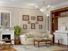
From darker colors, you can also pick up shades that are warmer. For example, chocolate, burgundy, and so on. Wallpaper in brown shades looks noble and makes the room more luxurious. Dark shades of yellow, orange or red will make the room cozy. For example, mustard, terracotta, peach or lilac.
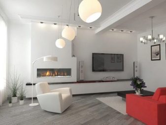
Cold
In order to visually enlarge the room and make the walls taller and wider, cold shades are used. The palette of cold shades is quite rich.
Cool shades of blue or green look fresh and modern, such as mint, pistachio, olive, lime or aquamarine, for example. Different shades of purple will make the interior of the room more luxurious and richer.And for the decoration of the room Scandinavian or minimalist style it is worth using cold monochrome tones: black and white.
It is undesirable to mix cold tones with light ones if you want to adhere to clear rules of one style.
How to match the color to the overall style of the room?
In many ways, the choice of color for the living room depends on the style in which you decorate it. At different times, different colors and their combinations were fashionable.
For example, in the Victorian era, houses were decorated with dark fabric wall coverings. To recreate the atmosphere of that noble era, use darker colors. Ideal choices are marsala, dark burgundy, emerald or deep blue.
True, even such shades should be diluted with light accents so that the room does not seem gloomy. A dark living room will not only have less space. The combination of gloomy wallpapers and the same dark decorative elements will make you, on a subconscious level, constantly remain in suspense.
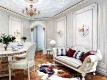
In a classic interior, there is also a place for dark colors. But the light color scheme also looks good here. In the classicism style, light beige or white walls look great.
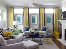
Bright color combinations are inherent in the retro style. Geometric or floral prints, consisting of bright color spots (pink, lilac), will appeal to lovers of this famous era. You can complement such an interior with the same bright decorative details or colorful curtains. The more colors the better.
The same cannot be said for stylistic trends such as minimalism or loft. Here, on the contrary, there should be nothing superfluous. It is better to choose a light background in a living room decorated in this style. For example, white, beige or milky plastered walls, light brown brickwork, or wallpaper in different shades of gray. In a modern interior, bright colors are best used to create accents.
The right solution is to use colored pop art or impressionism paintings, colored pillows, decorated curtain patterns and other eye-catching details.
Choose the style that you like and use the advice of designers to create the perfect interior in which you will feel comfortable living and receiving guests.
Spectacular examples
You can understand the features of all colors and their shades, as well as figure out how to best combine them with each other, by looking at examples of beautifully decorated rooms.
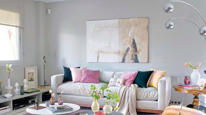
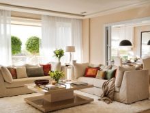
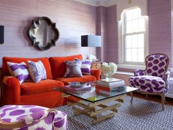
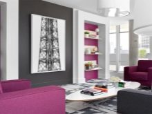
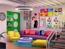
A modern living room in pink is the option that will appeal not only to young girls, but also to young creative people. The background in this room is light - a combination of white and beige, and rich pink is used as bright accents. This is a richly colored door, an armchair and an abstract painting that combines pink, green and beige. The interior is lively and uplifting.
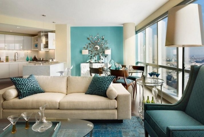
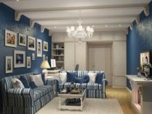
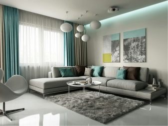
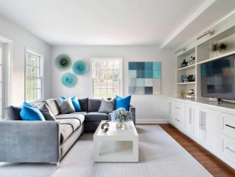
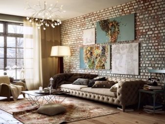
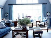
You can create a peaceful atmosphere by using different shades of blue. The sample room uses a combination of blue, vibrant blue, and gray. The light blue tone sets the atmosphere. To prevent the wall from looking too empty, it is filled with several paintings in monochrome shades. Almost all the free space is occupied by a gray sofa. There is a low gray table next to it.
And so that the room does not seem too gray and boring, it should be diluted with bright details... In this space, the designer uses colored pillows and blue decorative containers. Lighting also plays an important role. It uses a pendant lamp with several bulbs that give a subdued soft light.

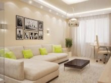
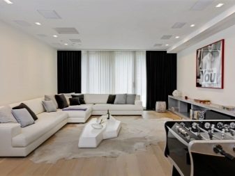
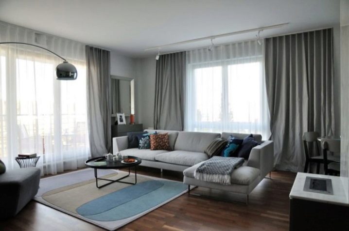
The last example is a modern living room in gray tones. The lightest shade is used here as a base. Both the walls and the ceiling are decorated in the same color. The sofa, armchair and carpet chosen by the designer are literally several shades darker.The room is decorated with plain curtains in the color of wet asphalt and matching pillows. Tables and lighting fixtures are made in dark colors. A small amount of bright details dilutes the interior: pillows, a photo frame and a lamp.
The working area, for which there was a place in the corner of the living room, is made in the same color scheme and does not violate the harmony. As a result, the design looks cozy, but there is absolutely nothing superfluous here.
All colors from both warm and cold palettes are equally good and are suitable for decorating living rooms. There are no prohibitions or frameworks - choose the shades that you like, but do not forget that to create a harmonious interior, they must be combined with suitable tones.
All about the rules for combining colors in the interior, see below.


The comment was sent successfully.